Project Reveal – The Modern Scandi Apartment – Part II
Created by Vinithra Amarnathan on November 7, 2019
We hope you soaked in all the design details from the first part of the Modern Scandi Apartment Reveal, cause we’re here to spill the tea on the more private bedroom sections of the home.
The bedrooms in this home carry through the Scandi spirit, are full of personality and bring in the warm and cozy. The master bedroom, guest bedroom and study are each young, easy on the eye and we had such a great time putting these spaces together!
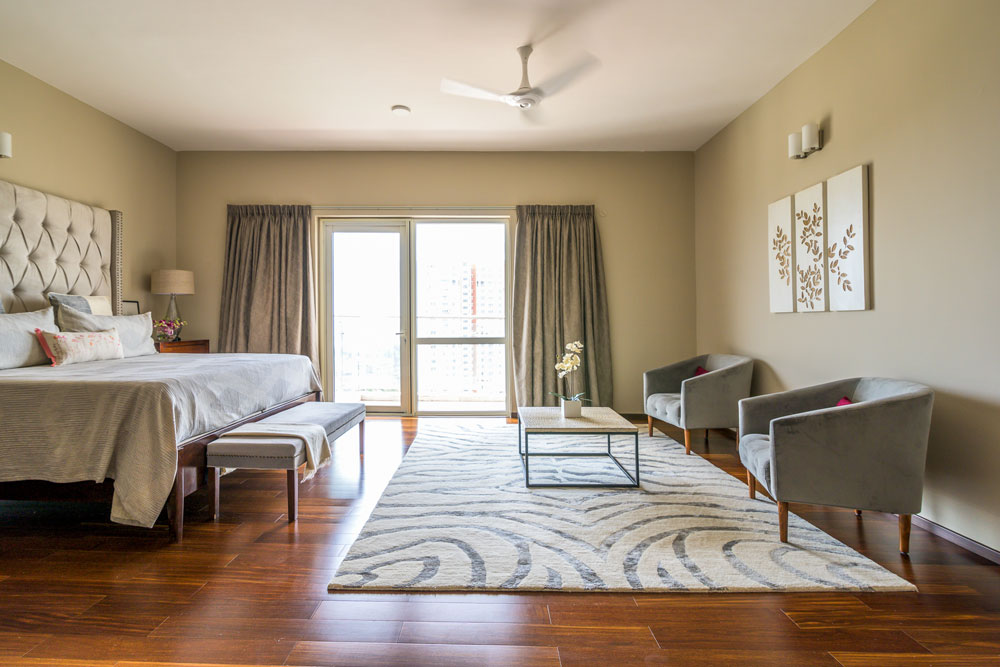
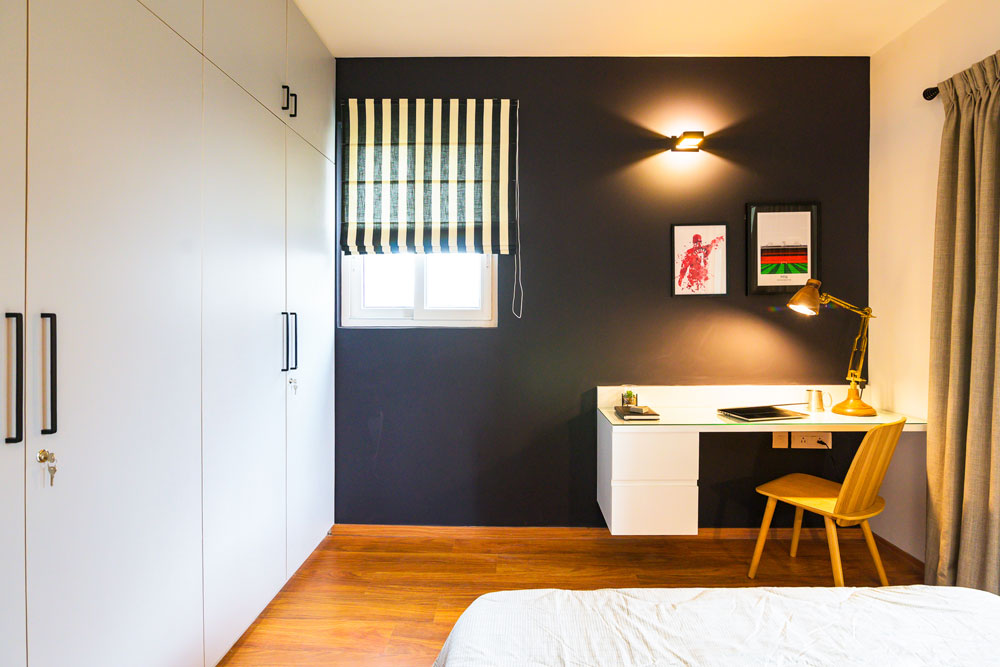
Master Bedroom
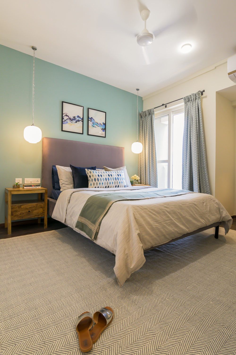
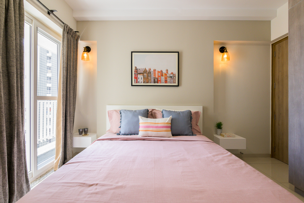
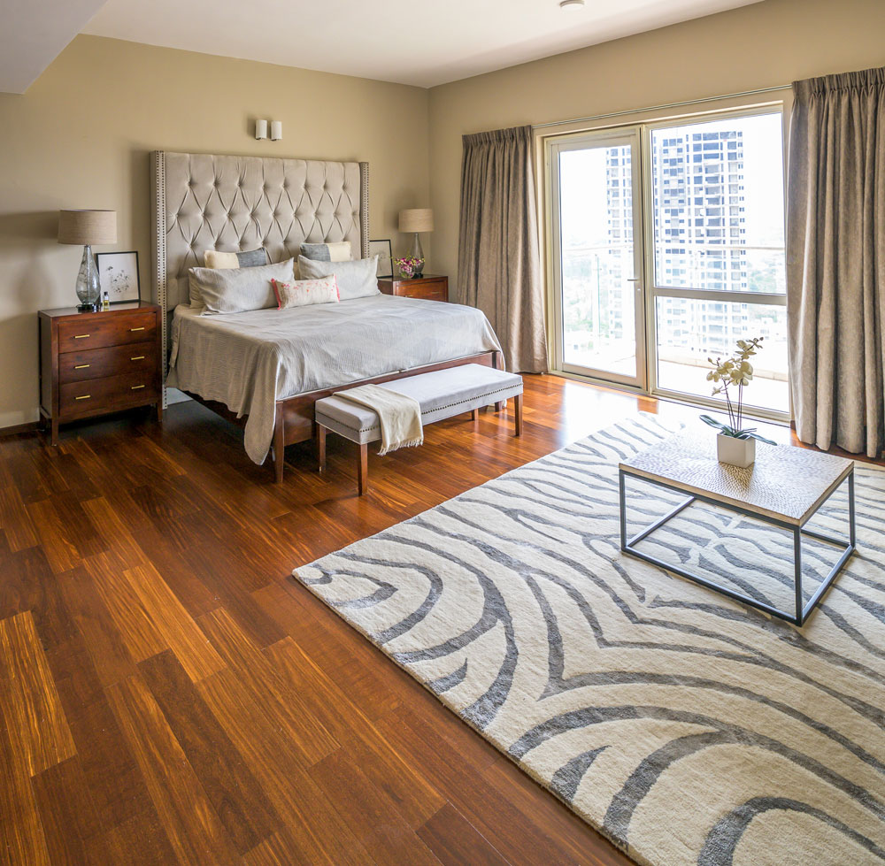
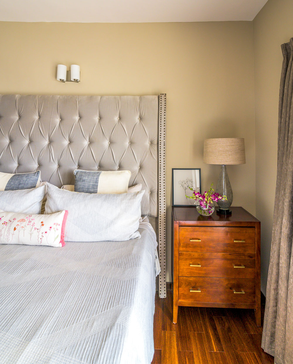
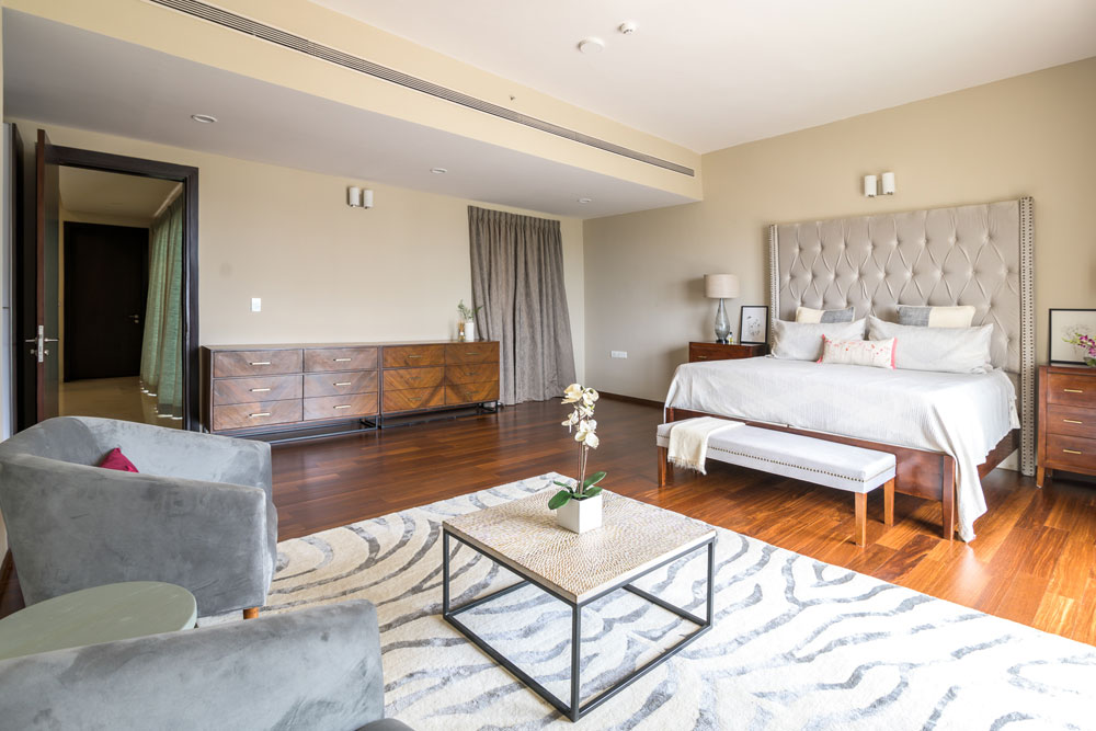
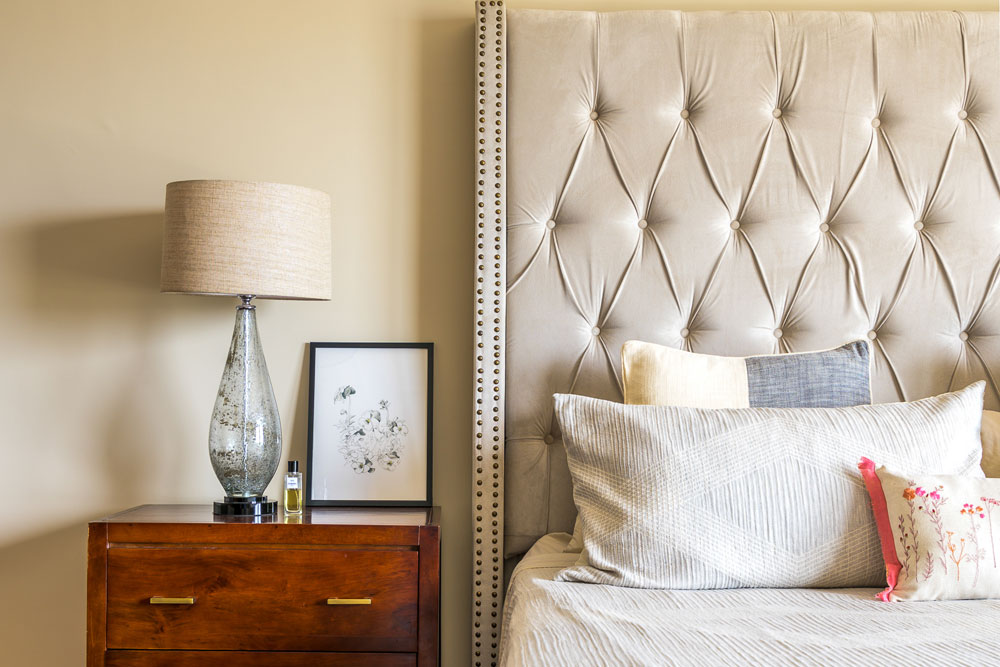
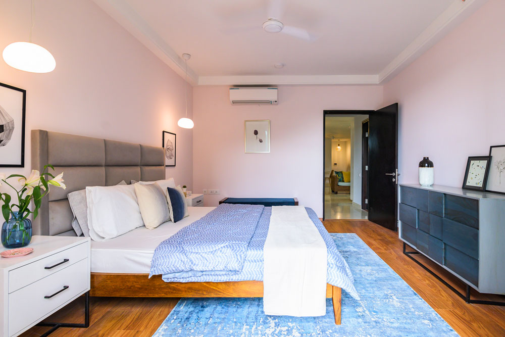
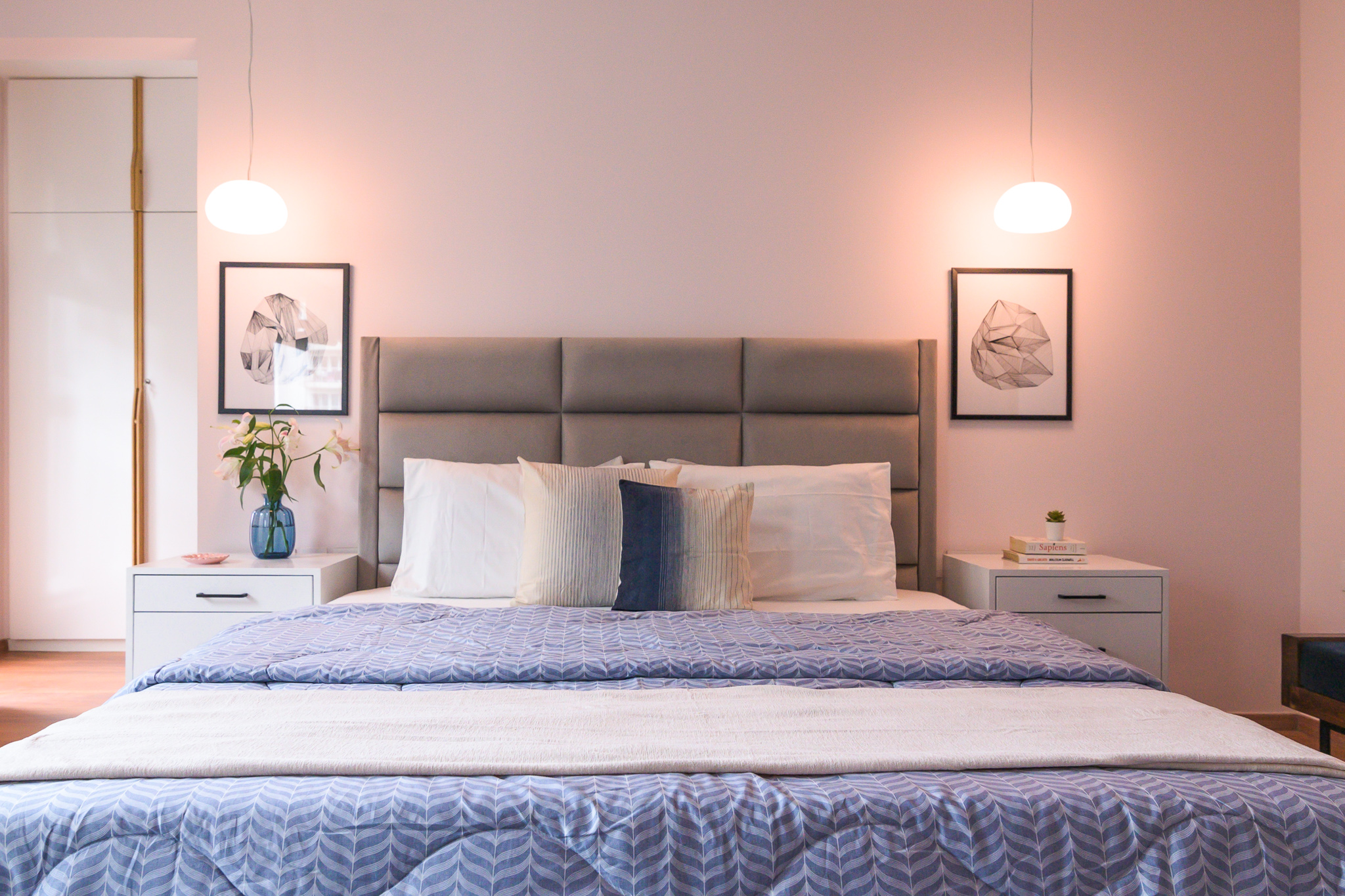
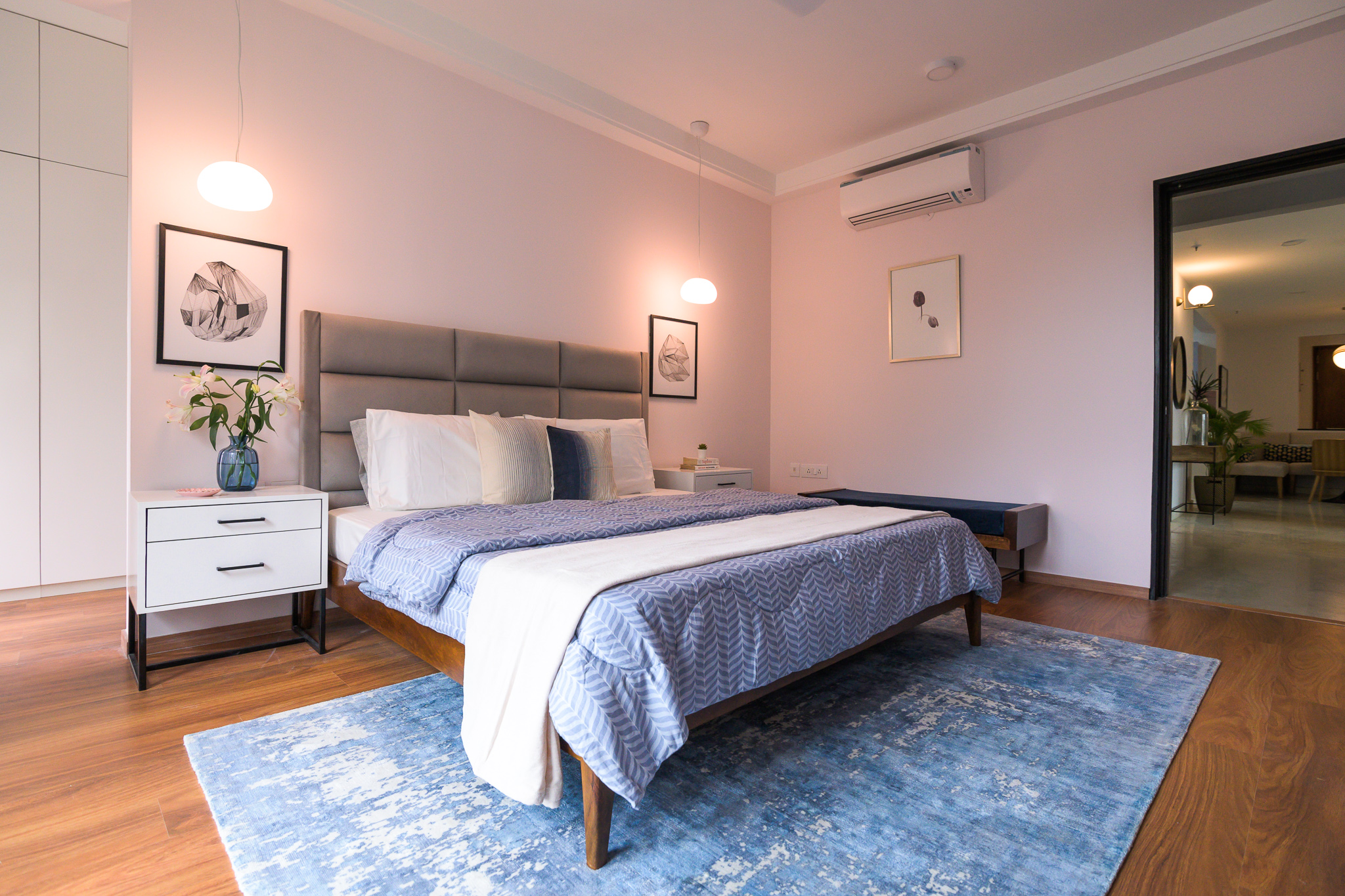
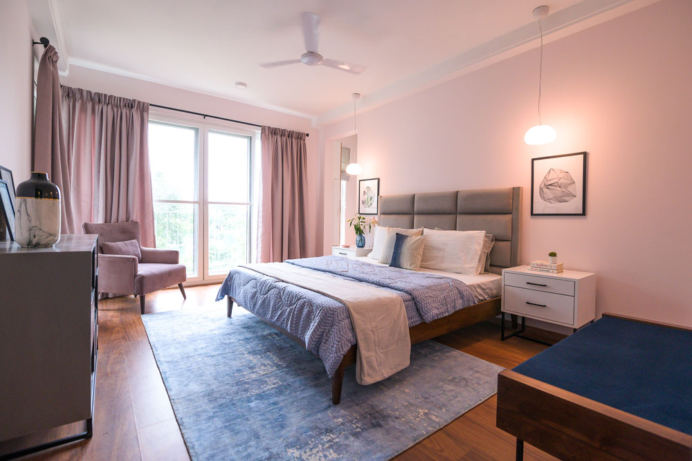
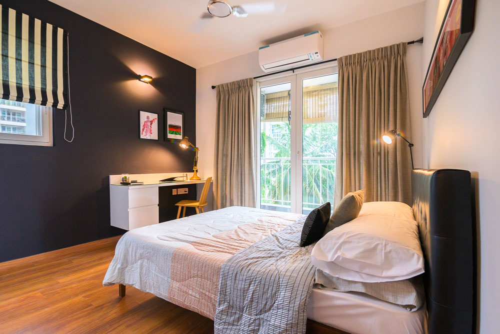
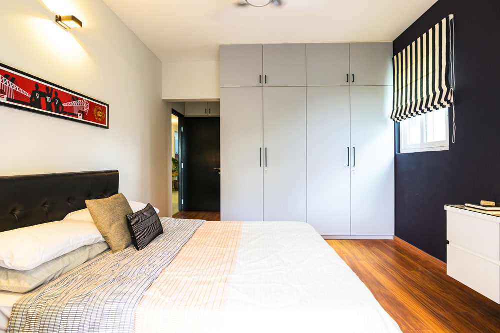
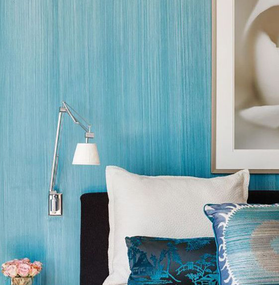
This compact master bedroom was designed with a great emphasis on function. The room is the perfect union of comfort, understated luxury and functionality. We’ve used a breezy and cool color palette, simple art to tie the colors in and a bold chair for visual interest.
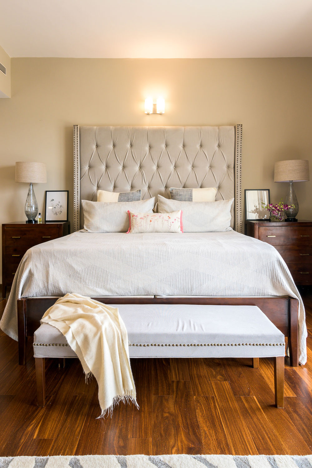
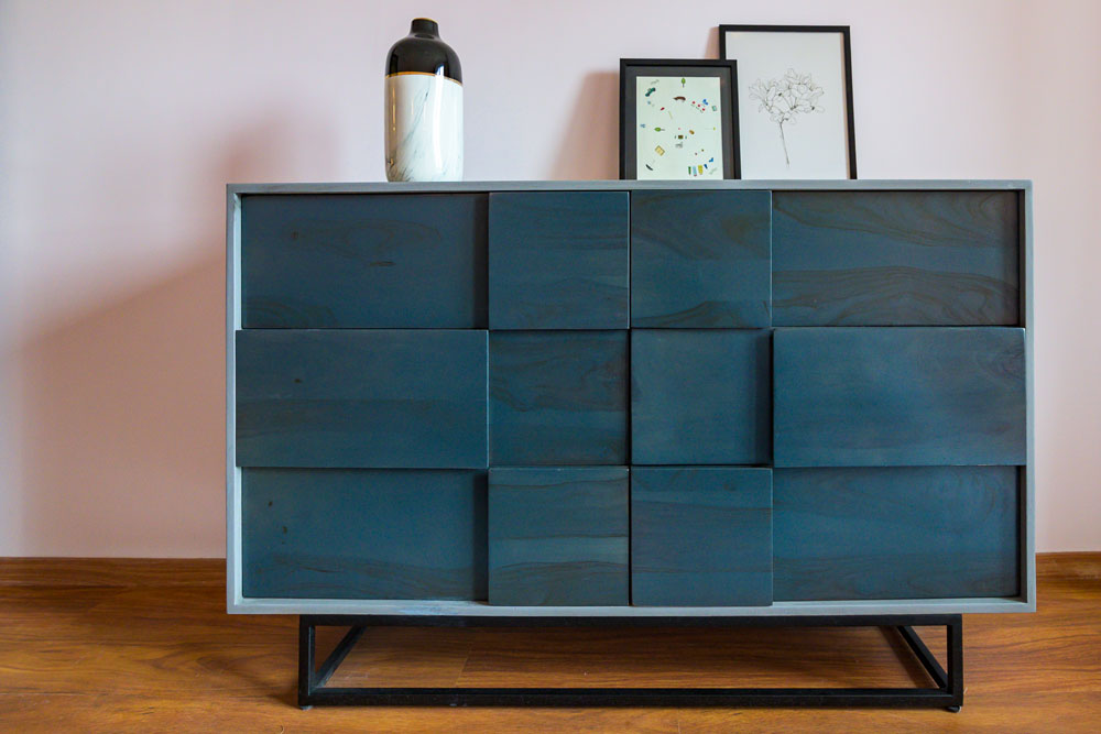
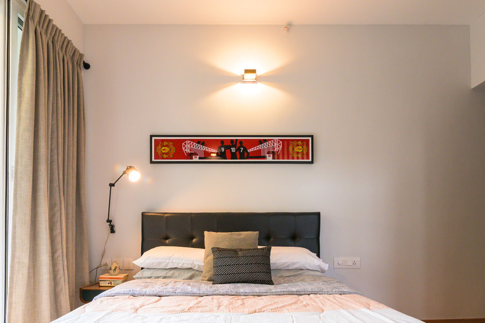
The accent wall in the bedroom is a treat to the eyes! It’s that quintessential shade of blue with undertones of green that marries warm and cool beautifully. The high back grey upholstered bed anchors the accent wall and becomes the focal piece in the space.
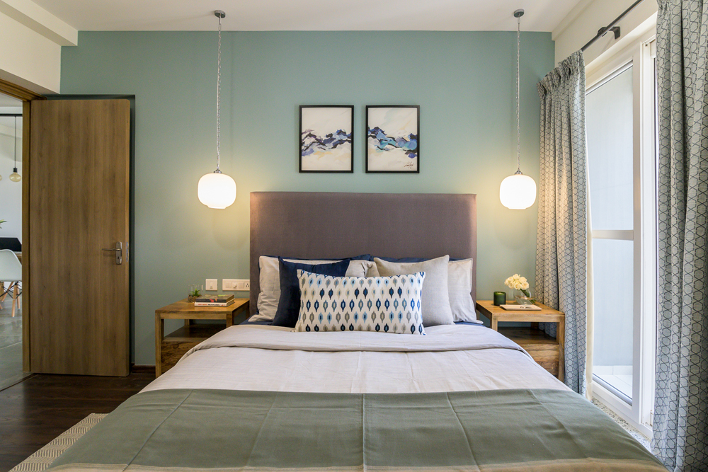
The lightwood custom nightstands further build on the Scandi vibe of the space with their minimal persona. It was a conscious decision to increase the length of the bedside pendants so they’d come down to the bed’s headboard level and we love the drama it creates as it becomes an integral part of the visual frame. 😉
The art on the bed wall is minimal and reigns in the colors beautifully! The upholstery in the form of cushion covers, pillows and the lumbar on the bed are all custom made and pick on the colors in the space and tie things together.
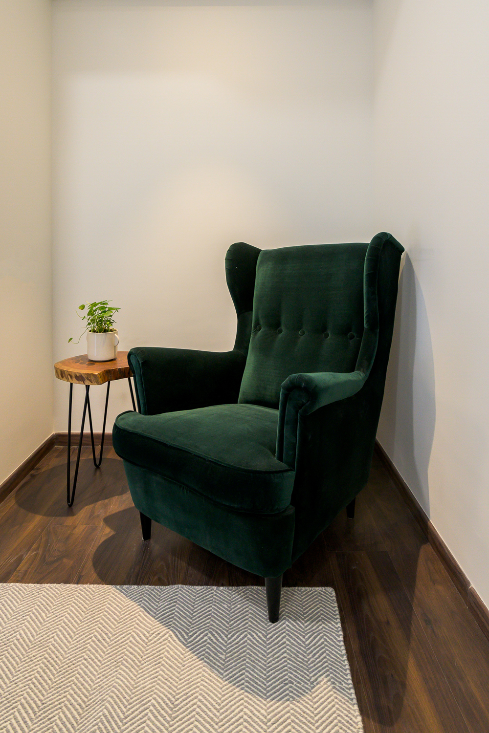
The minimal geometric patterned grey & off-white rug grounds the whole room, letting all the elements stand out. We’ve created a cozy reading nook with a bold forest green high-back chair from Ikea and a live-edge round side table.
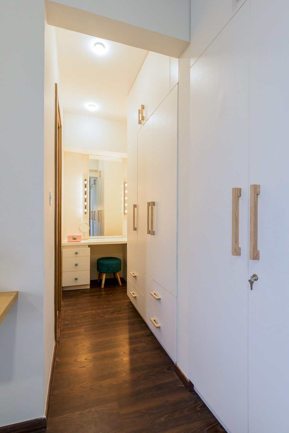
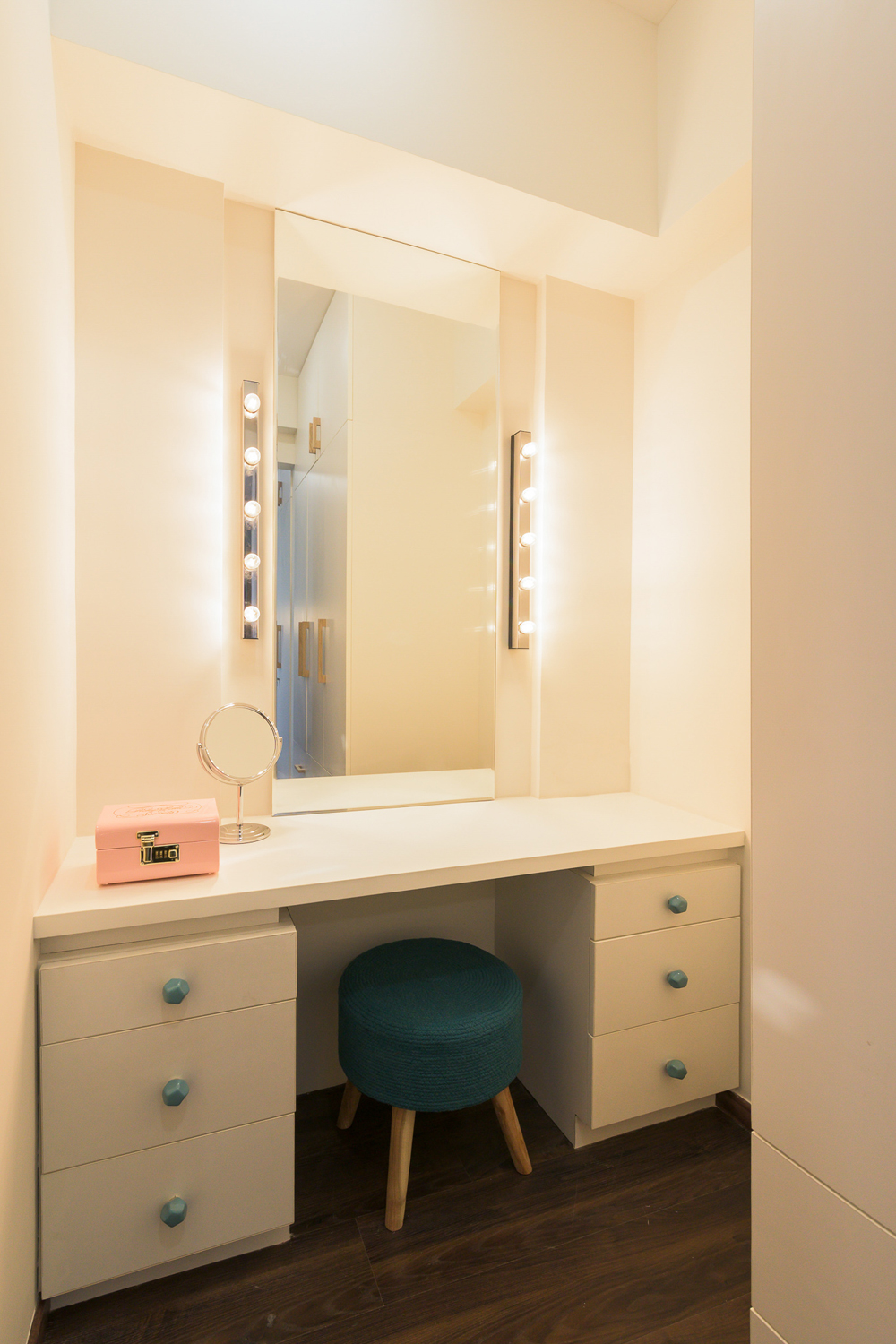
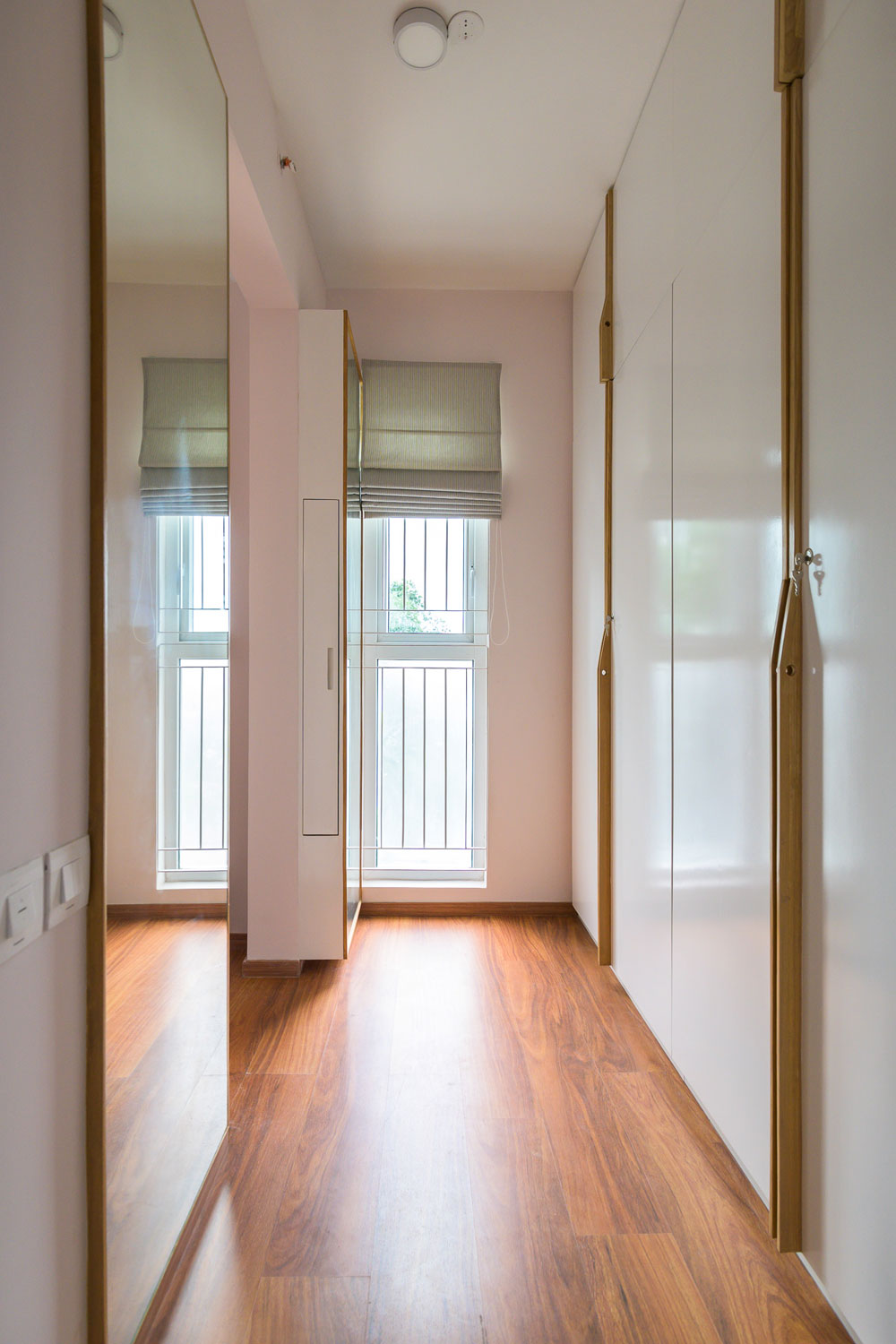
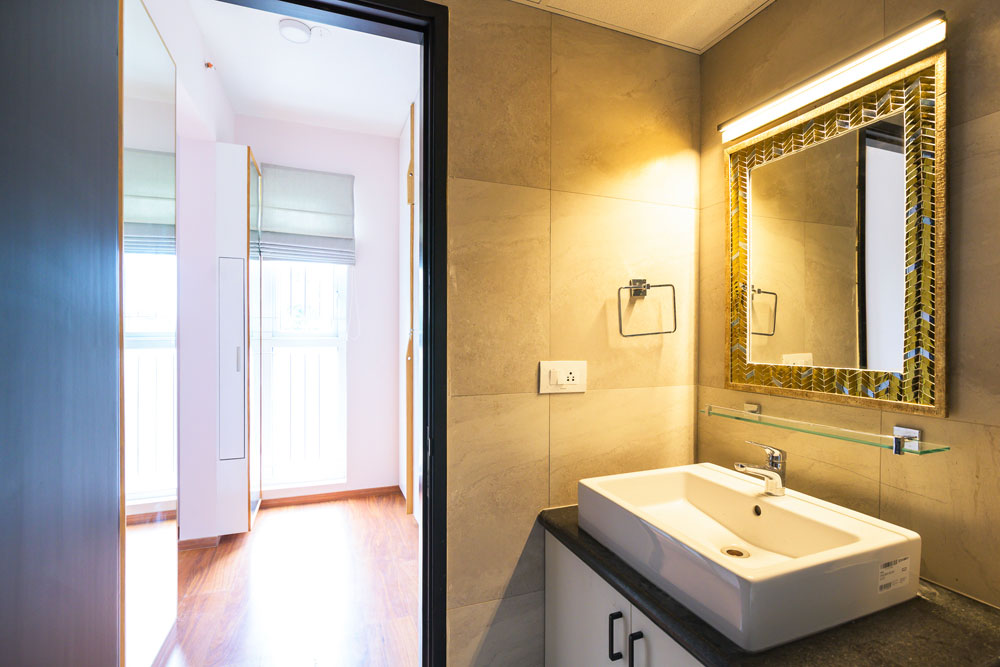
The lady of the home had a special request right from the start regarding a custom vanity unit! The walk-in wardrobe section of the room was converted into the same accompanied by the clean-lined white wardrobes with gorgeous custom handmade wood handles. The nook has a nice long mirror flanked on two sides by strips of vanity lights and ample storage. The master bathroom is sleek with a countertop mounted sink, a long mirror & a white wall light fixture.
The master bedroom brings together the Scandi palette so effortlessly- we love how the blue palette makes us feel anything but gloomy! 😊
Guest Bedroom
Would you believe us if we told you that the palette of this room came together all kudos to the artwork on the wall? We loved this cityscape art print for all its colors which had hues like orange, red, pink and grey. This warm scheme of colors has been carried through with the upholstery on the bed, hence making the space look tied in together.
The bed is the Malm bed by Ikea which has clean lines and an all-white look which perfectly complemented the pops of color across the space. Custom wall-mounted platform bedside drawers add to the functionality in the space available. Antique wall sconces add that touch of whimsy and bring in warmth into the space.

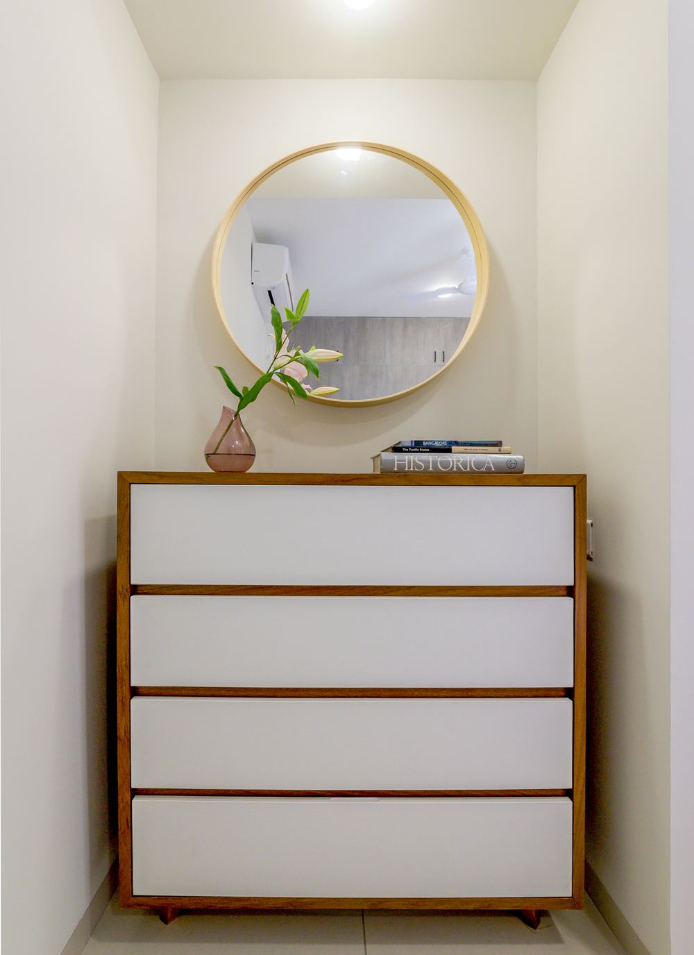
A small dresser space was created in the niche that preexisted in the room. The custom white & wood chest of drawer’s unit has our heart as it marries efficient design and the perfect Scandi theme. 😊
The ash-brown wardrobe laminate is one of our personal favorites in terms of laminate choices across the house, it’s a twist on the generic laminate choices and adds a lovely touch to the guest room as it was a large unit in the space.
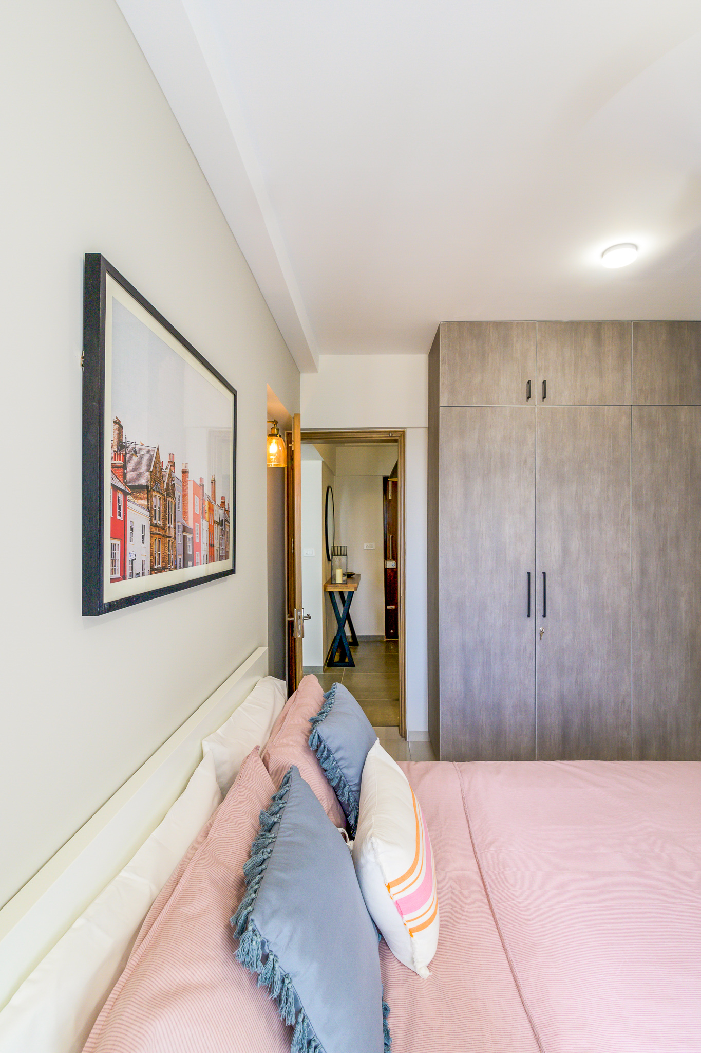
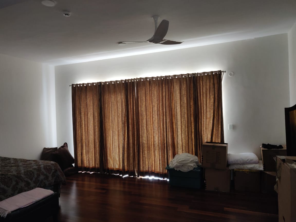
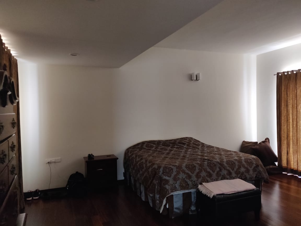
One of our favorite elements in this space is the subtle paint variation we created on the bedroom wall. We had two small niches and decided to paint them a shade lighter and add sconces as well as recessed wall mounted bedside tables there. We highlighted the larger offset wall which has the headboard in a slightly darker shade and this brings in depth and dimension to this very small space!
Understated and warm. Perfect to hosts any longtime guests, this space is super cozy!
Study
It’s safe for us to say that this part of the home was one of the most loved sections during the Open House! The study was designed for the client whose only brief was for it to be comfortable, functional and travel-inspired.
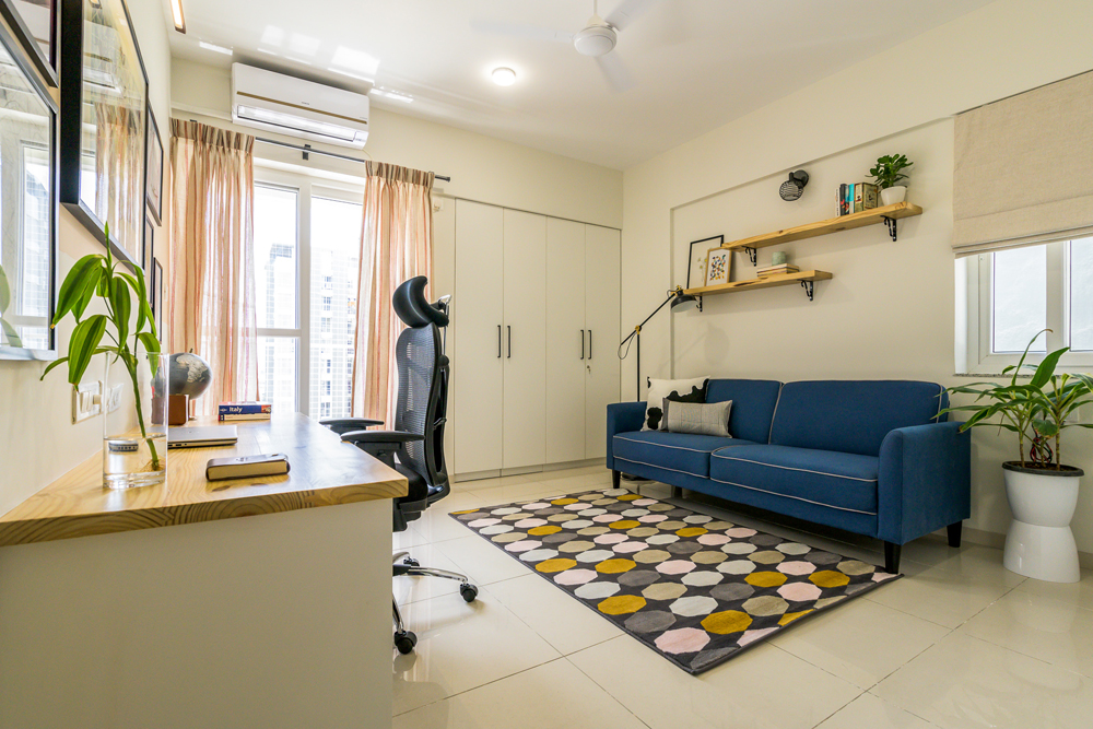
The hero of the space has got to be the desk wall where each element engages with the other to create sheer magic! The custom-made desk has a pinewood top and file cabinet style pull-outs that make it perfect to work from home.
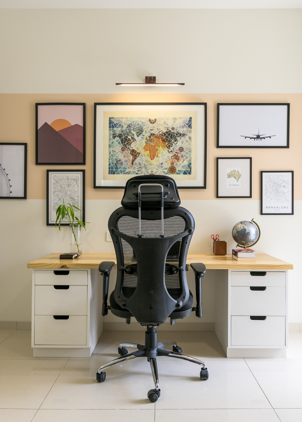
The gallery wall has been created with a beige-pink hue rectangular band that hosts travel-themed art pieces including an intricate color-soaked world map print and maps of the client’s favorite cities like Paris & Bengaluru! 😊
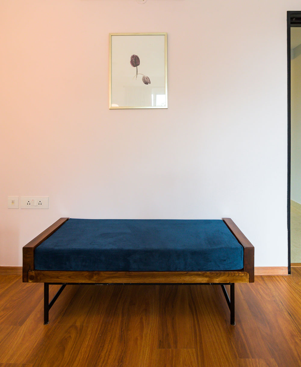
The opposite side of the room has been curated as a warm nook that doubles up as a lounging section and reading corner to sit back and unwind in. The ink-blue Urban Ladder sofa cum bed has been paired with a bold geometric rug from Ikea. A stark black Ikea floor lamp and the wall mounted pinewood shelves add that touch of personality to the whole space, making it the perfect spot to relax in.
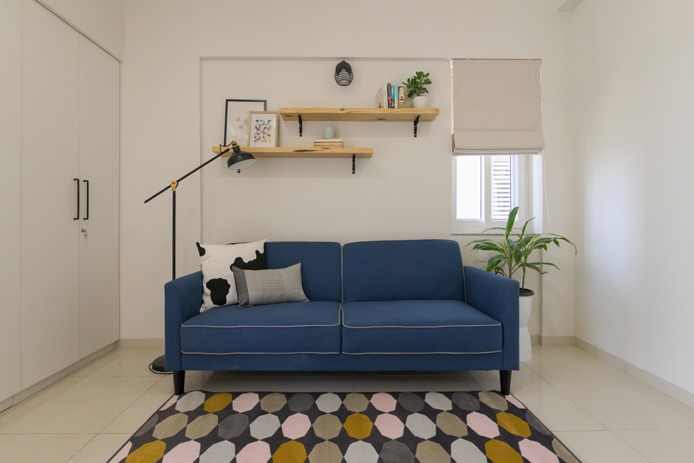
An ideal space to hunker down and get some work done but also to wind down at the end of a long day.
We’ve reveled in the joy of designing and curating this home at every stage and this concludes the two-part reveal of the Modern Scandi Apartment. Hope you’ve enjoyed this process as much as we did!
Stay tuned for our newer projects and more😊
Content by Lavanya Chopra for Weespaces
All Pictures Shot by Parth Swaminath
Project Reveal – The Modern Scandi Apartment – Part I
Created by Vinithra Amarnathan on October 25, 2019
A perfectly Scandinavian inspired home in the middle of Whitefield, Bangalore. So scandi that when we did the open house, one of the people who walked in said it felt like their sister in laws Stockholm apartment 🙂
We got here over a design journey that was fun and engaging. I don’t think we could have got here if it wasn’t for the trust our clients had in us and the focused vision we all shared for this home!
This was also the first project where Lavanya worked with me through the entire project from start to finish and I’m going to share here a few of my favorite aspects of this project before handing over to her to take you through how this home came together and the lovely details.
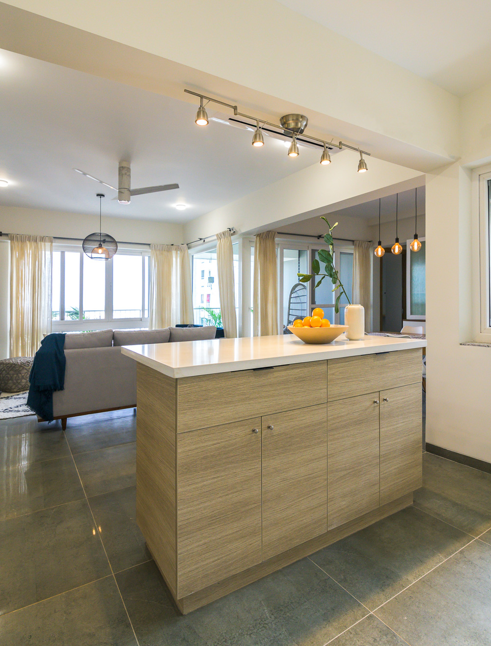
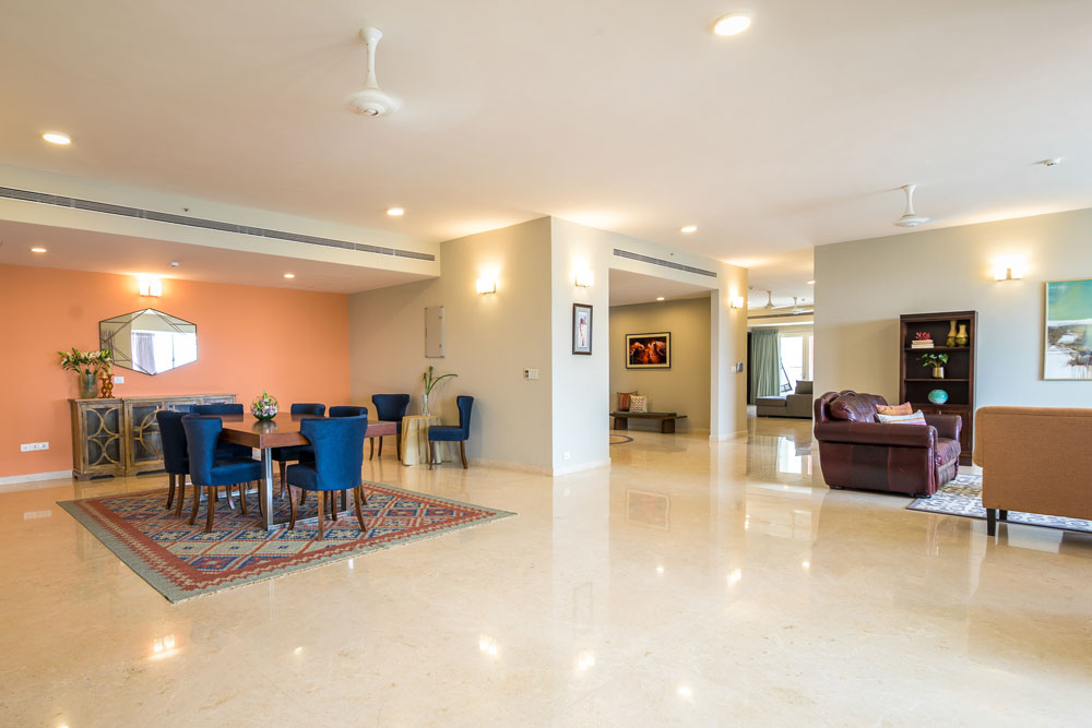
If you follow me and have seen our work, you would know how much I love working on open floor plans and creating distinct spaces within a larger living space without compromising the flow and the openness of the area.
In this home from the moment I first walked in, that was the one thing that struck me most! The first thing I imagined when I saw this space was an island that connects the kitchen and the living and I must say this is possibly my favorite element in this home!
I love the palette we used which is largely neutral but punctuated with pops of color and some lovely modern art prints. The gallery wall for the study is another favorite…. simple but comes together beautifully!
My other favorite is the round back chairs we custom made inspired by the Room and Board Chloe chair and it’s my favorite piece of furniture in the house 🙂
The Modern Scandi Reveal – Part 1
Greetings everyone! This is Lavanya and I can’t wipe that smile off my face while I type the fact that I’m the Design Assistant at Weespaces Interiors 😉
It’s my absolute pleasure to walk you through the journey of this home’s design and my mind is bubbling with snippets that I’m going to dish out. Firsts are always special and the Modern Scandi home, our stellar clients and this whole creative journey will be something that I’ll always hold close to my heart!
We’ve decided on presenting this much-awaited project with a two-part reveal (I know, we always make you come back for more 😉). The first part of the reveal will cover zones like the entryway, large open floorplan kitchen, living, dining zone and the balcony nook.
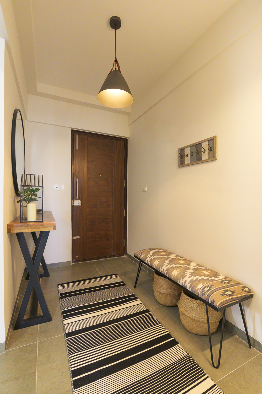
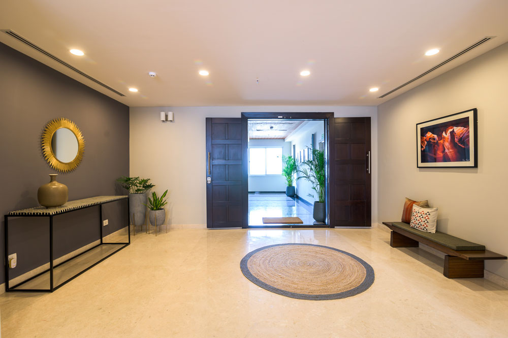
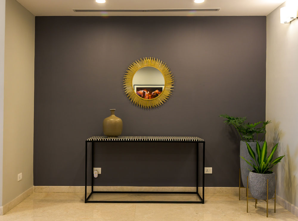
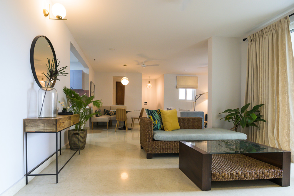
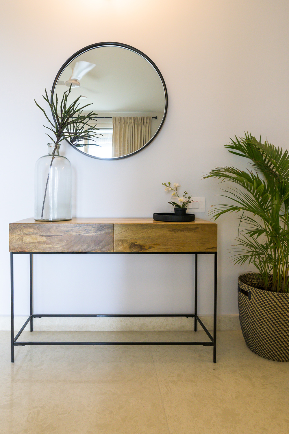
Entryway
This little entryway was a preface of sorts to the entire design palette. We worked towards ensuring that we brought in both function and visual impact with each of the elements while staying true to the personality of the home.
A large striking botanical piece of art is the first thing you see when walking into the home and it totally has our hearts! The hairpin leg bench with an Aztec print upholstered top in neutral tones brings that dose of pattern into the space.

A solid wood and black metal console against the oversized minimal round mirror give the entryway a bold yet minimal vibe. And a monochrome striped runner by Ikea grounds the whole space and gives it that chic touch!
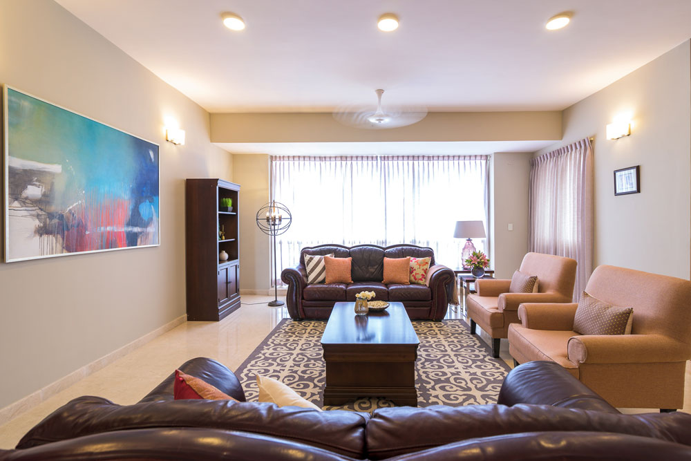
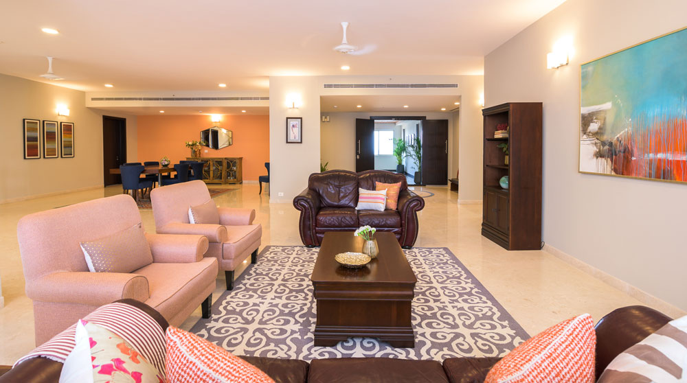
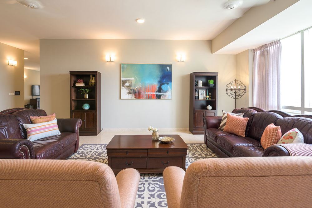
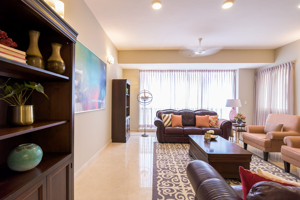
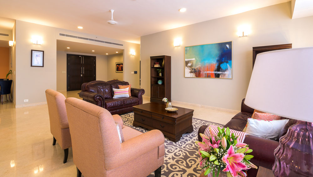
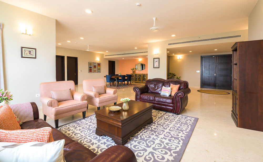
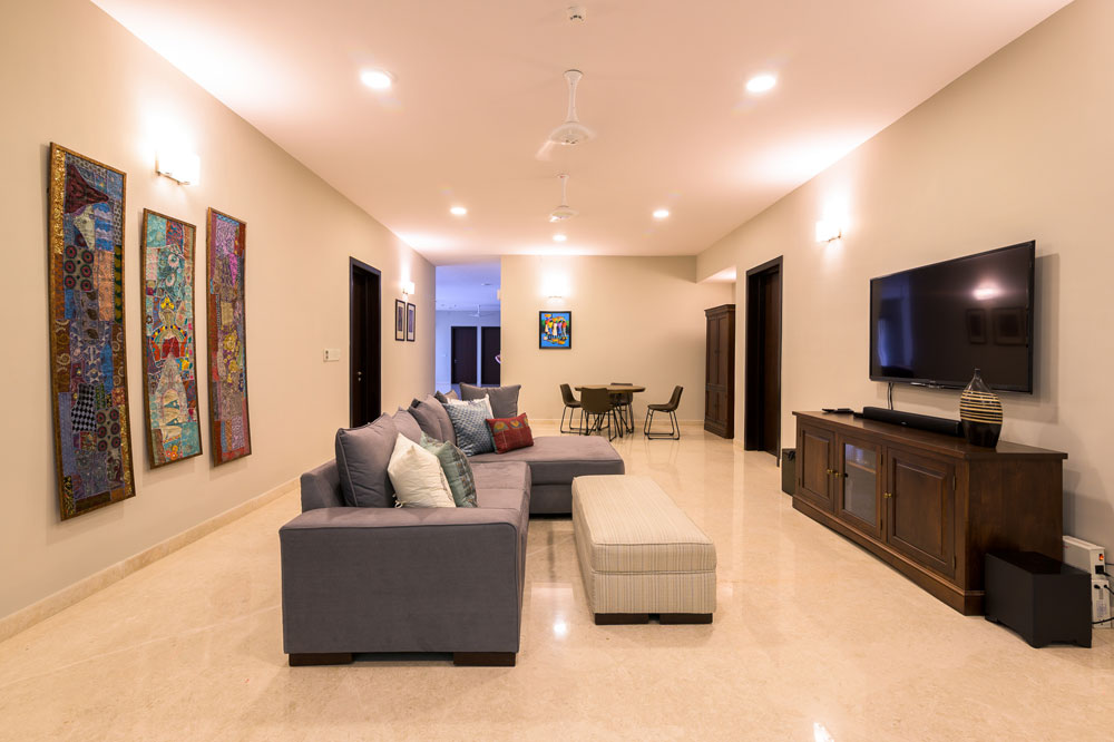
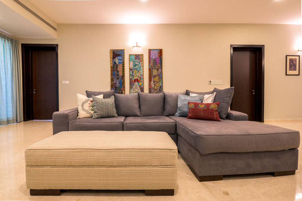
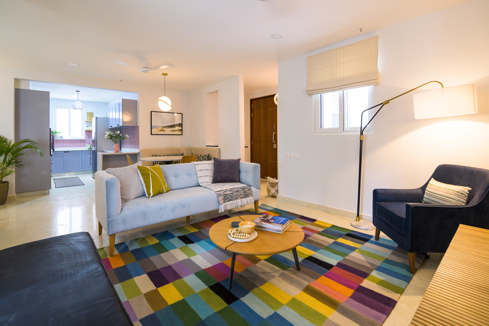
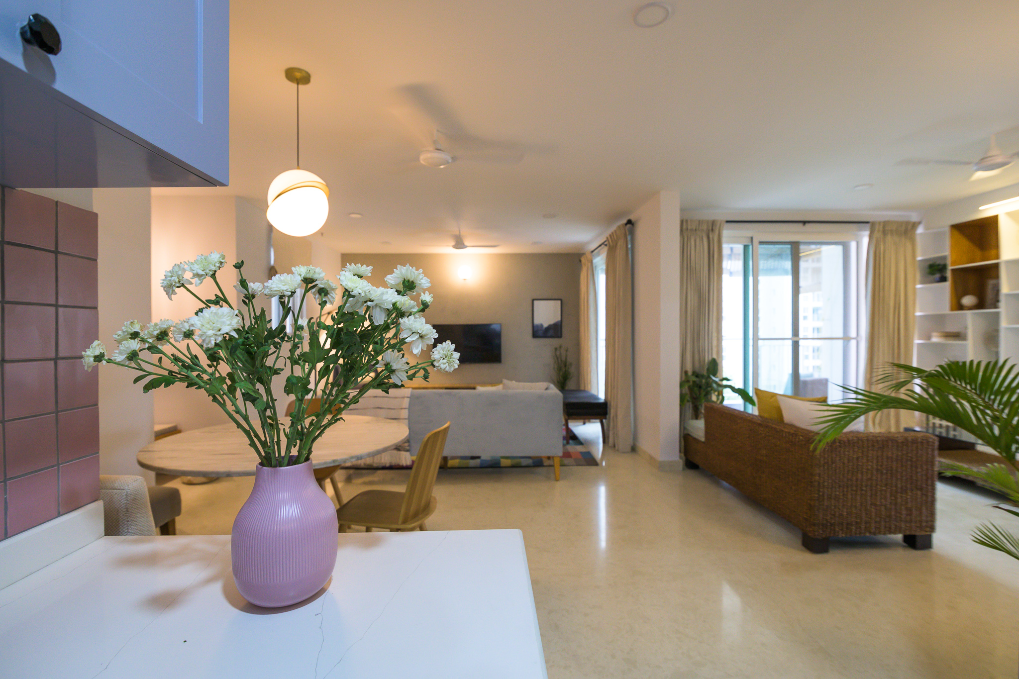
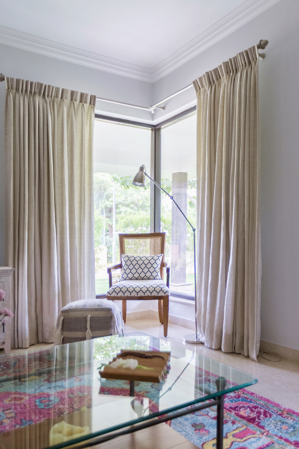
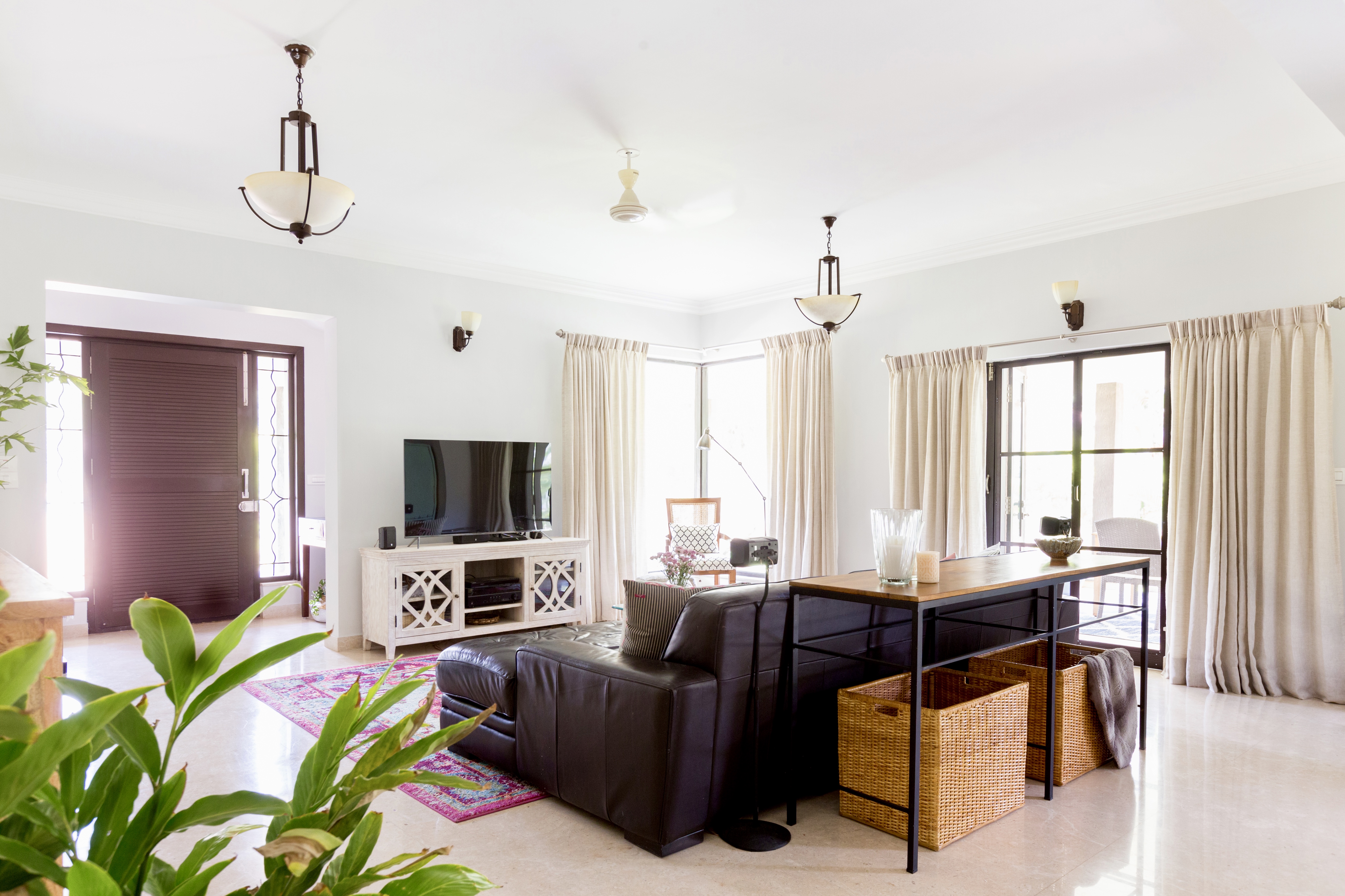
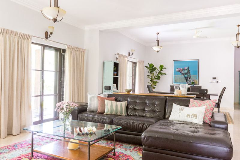
Living
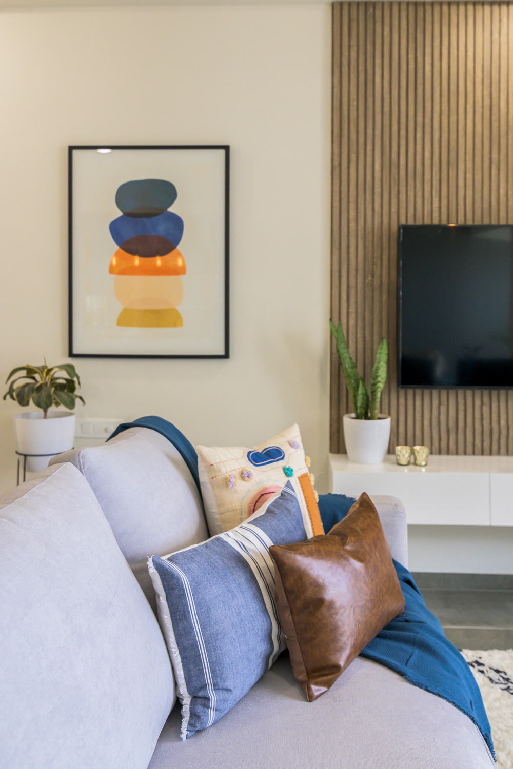
The living, kitchen and dining are blessed with an open floorplan which allows one to experience all three spaces at once while taking in each for what it is. The living section of the home has a quintessential scandi palette in terms of neutral tones with little pops of color, large scale artwork, clean-lined furniture and a light-airy feel.
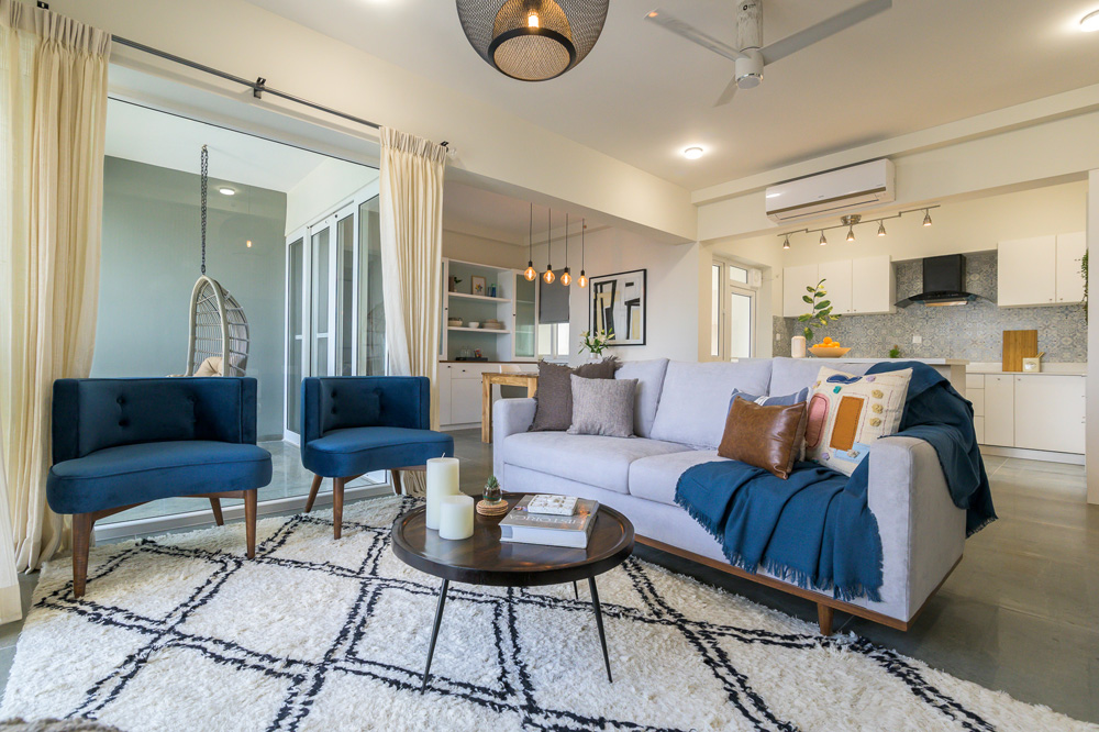
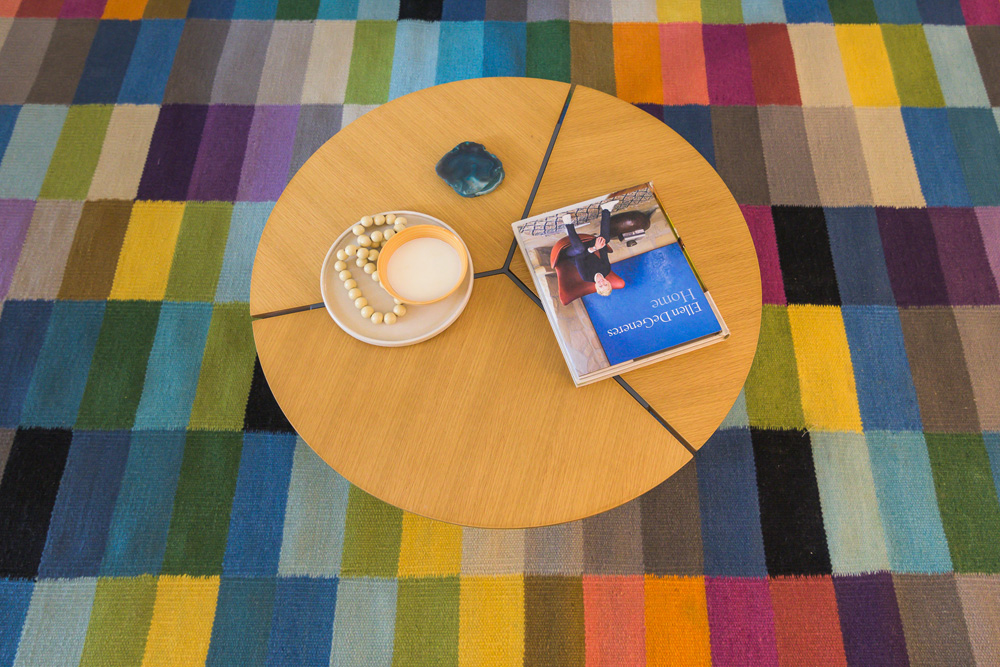
Let’s take a moment to swoon over this monochrome shag carpet which was a suggestion pitched by the lady of the home and we’d say she hit it out of the park with this one! We love it when our clients have a vision regarding something and it all comes together so effortlessly.
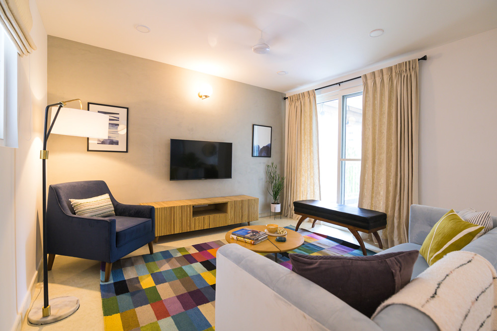
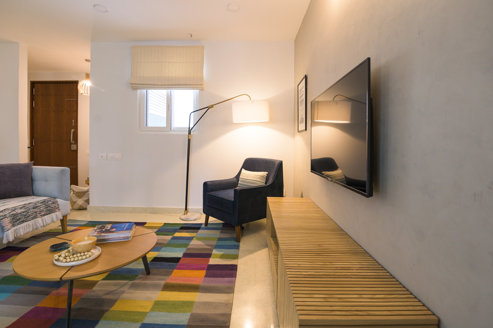
The grey-toned sofa demarcates the living space and is so well complemented by the custom midnight blue round back chairs. We paneled the TV wall in a German oak finish that gives the space that added sense of warmth. We even went ahead and changed the laminate on all the door frames and shutters to match the smoky tone the TV panels had to maintain the lightwood tone across the spaces.
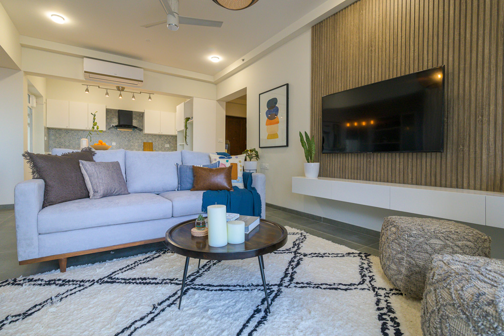
Art has played such a vital role in adding that element of detail and pulling the spaces together. The minimalistic color-blocked print in the living picks up on the color palette beautifully and its scale is what gives it the strong presence it has!
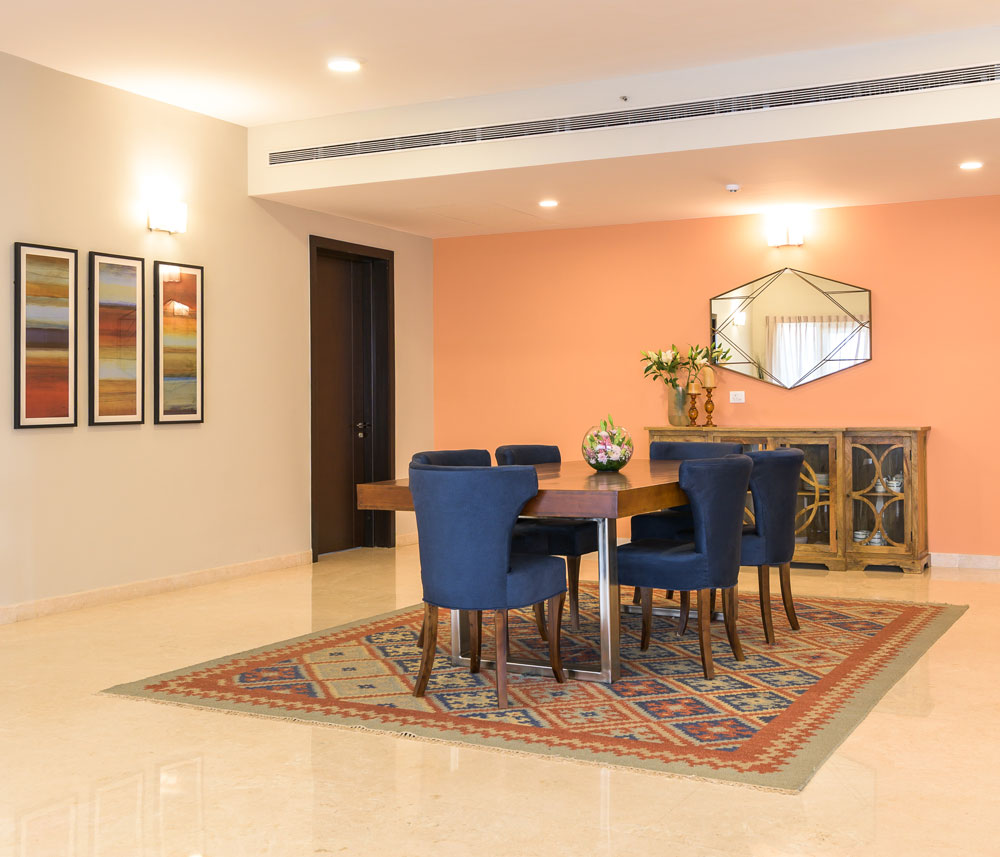
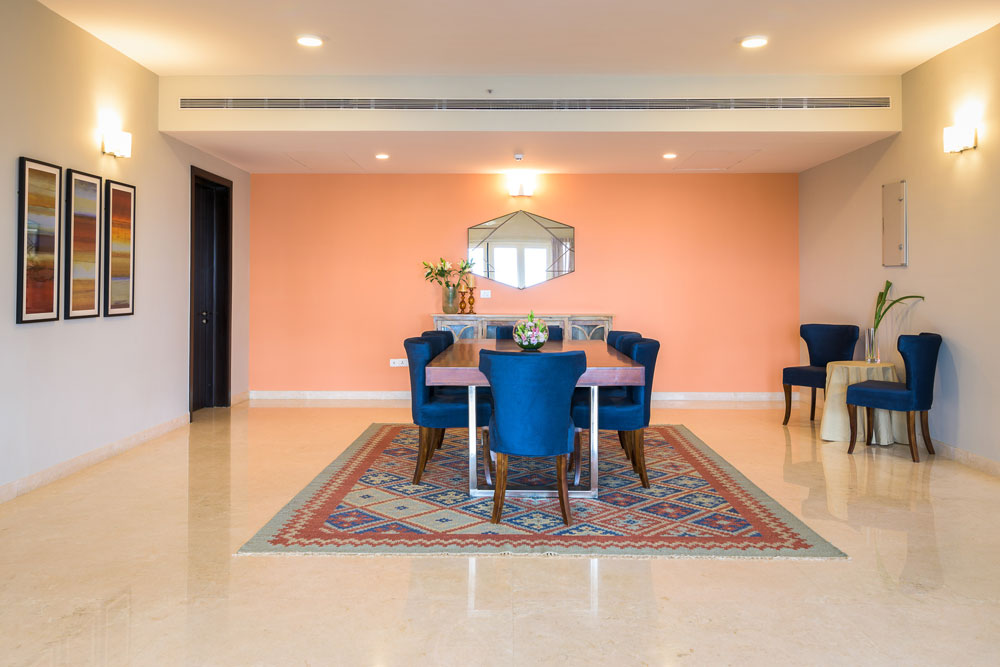
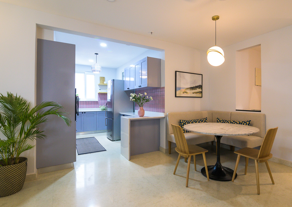
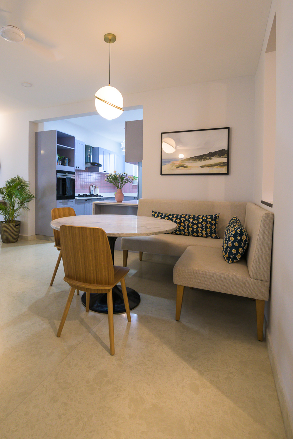
Dining
During the open house what we heard a lot whenever anyone walked through the dining area was “This looks like its straight out of a picture-perfect magazine/catalogue/design board!” and we couldn’t have been more thrilled! In all honesty, the beauty of this nook lies in the acclaimed principle of Less is More. The simple yet impactfully designed built-in crockery unit is the hero of this space. We initially had dark-stained wooden shelves and shutters. But it was Vinnie’s call to have them painted all white and voila! What a difference that simple change has made 😊
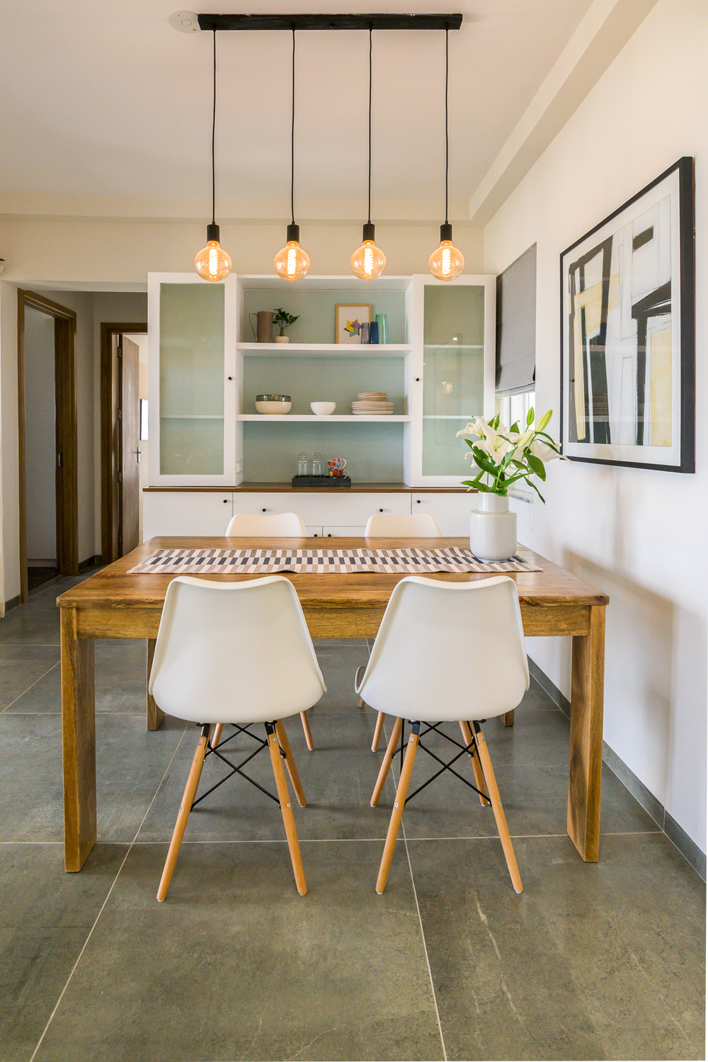
We added in a hint of color with the background wall being made a lovely crossover between a mint green and a powder blue. The fluted glass shutters flanking the gorgeous white open shelves give the whole unit such a weightless appearance with no compromise on function whatsoever!
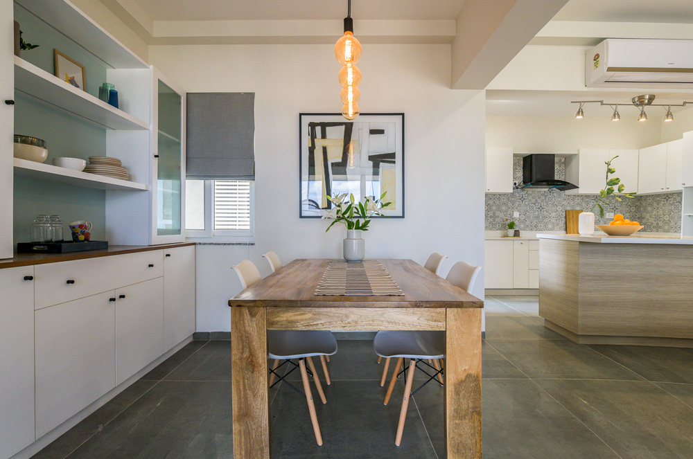
The natural wood tone dining table exudes a modern vibe and the white Eames chairs carry through the simple scandi vibe. A custom exposed bulb pendant fixture adds a hint of edginess to the whole look!
The geometric abstract art print on the wall looks like it was made just for this ensemble. Serendipitous moments that make our hearts soar with joy. 😊
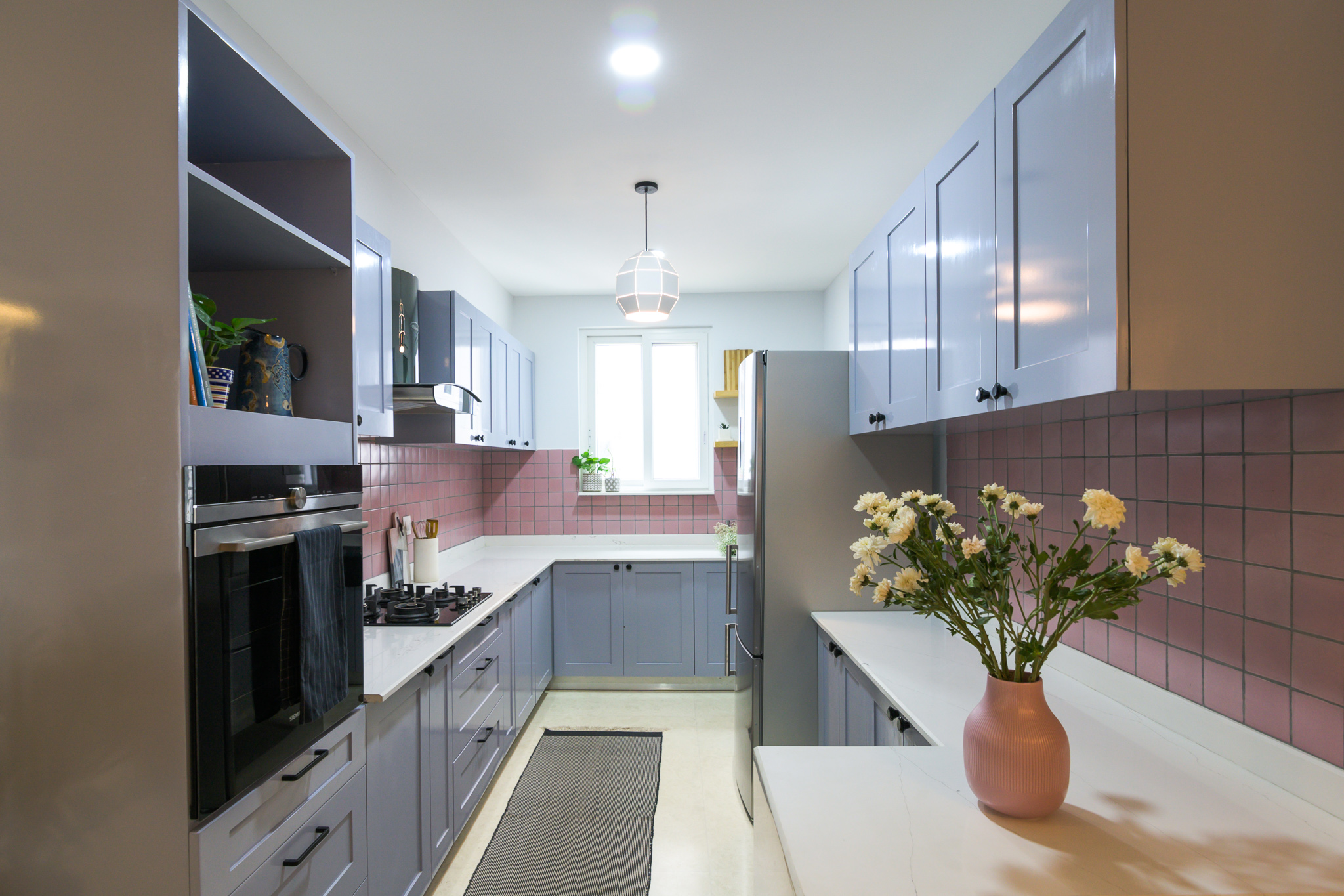
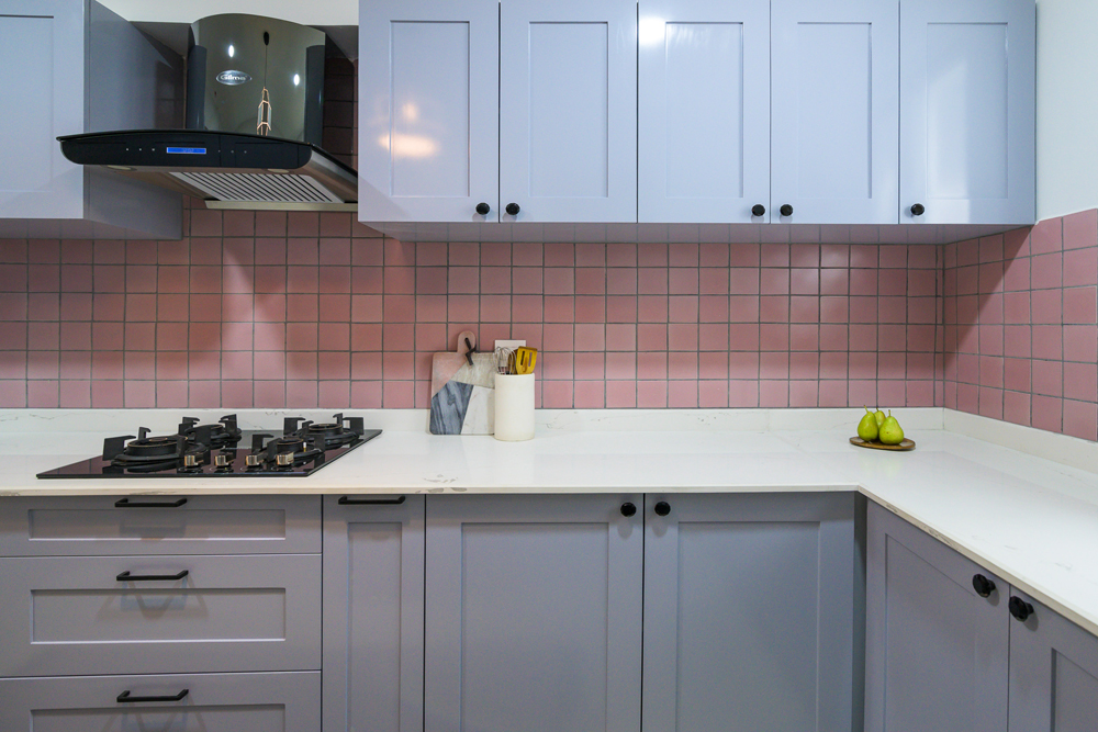
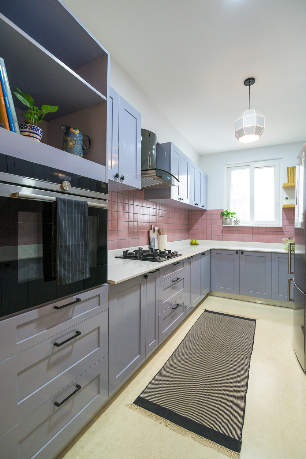
Kitchen
Are we allowed favorites in a space where every niche is curated with so much love? Well, I guess we are! I’m in complete agreement with Vinnie when she says that the open kitchen and the island are the show stoppers and personal favorites!
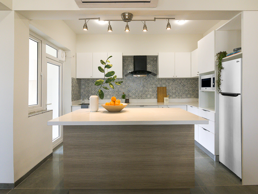
The island makes for the perfect spot to stay connected to the family space while getting tasks done in the kitchen. It’s that spot in the home towards which everyone will organically gravitate. Be it for a quick morning breakfast or just over a chat at the end of the day with a glass of wine. 😉
It’s ideal while hosting loved ones and friends because this entire kitchen-dining-living triad doubles up as an entertainment zone; spaces that beckon one to move around and to interact!
The base of the island has been finished off in a laminate shade that matches the light oak hue of the doors of the home and the paneled TV wall. We love the visual harmony!
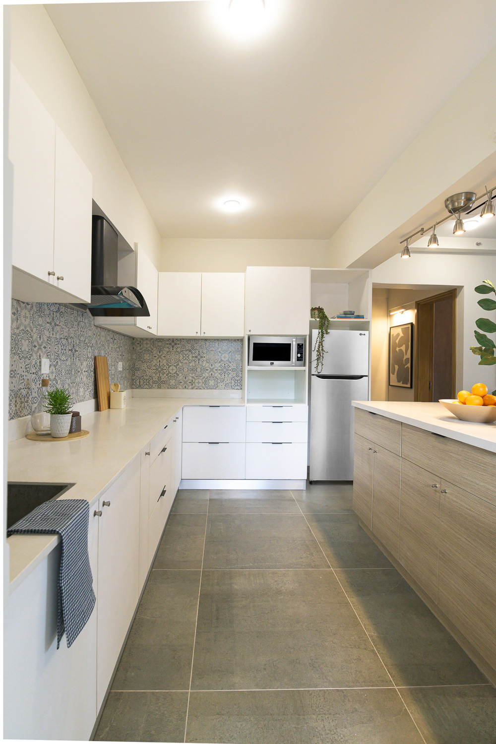
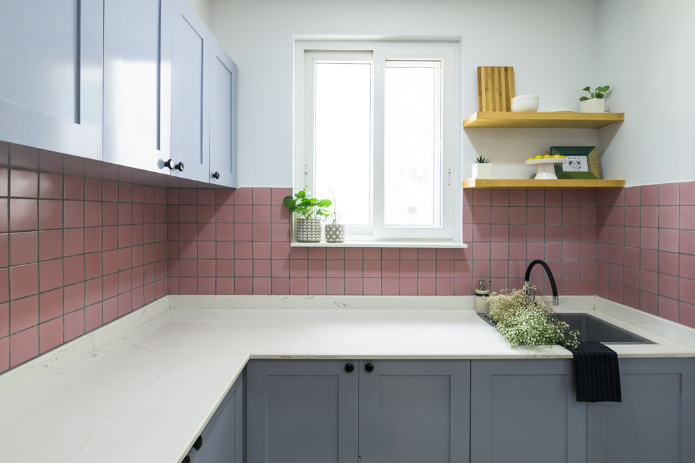
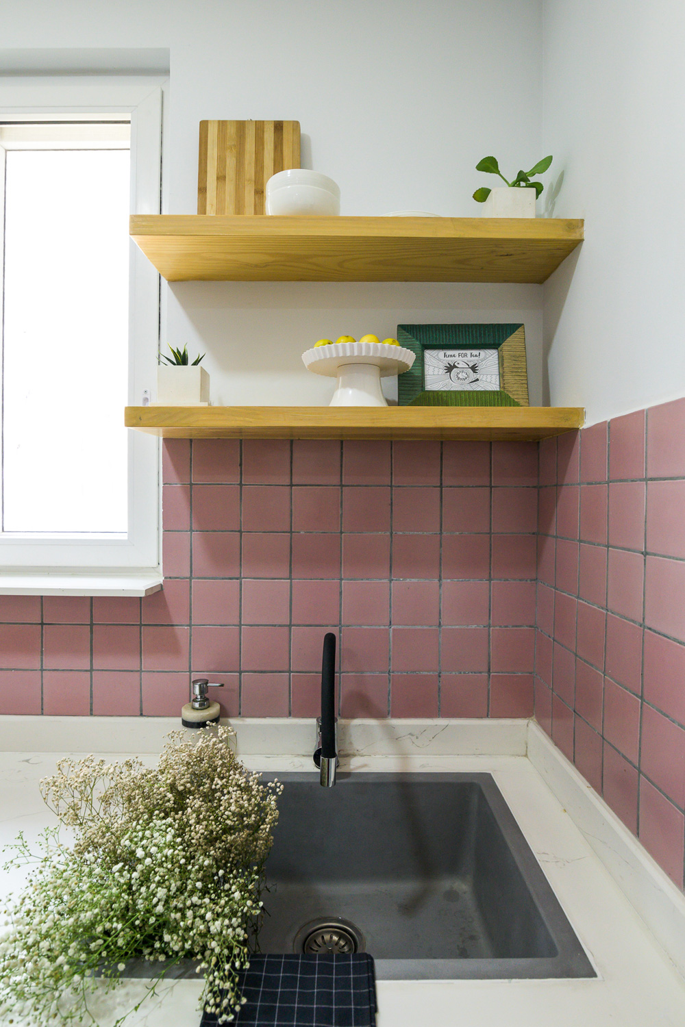
A transitional style-inspired blue and off-white tile adorns the walls of our sleek white kitchen. Our clients were intrinsically a part of the tile selection process and we all knew the visual presence the tile would have in the space kudos to the open floor plan. The kitchen section looks directly into the living area and that was one of the first few spaces we put down on the design board to see how it would all come together!
I remember working on the first draft of the drawings and thinking – “If we pull this off, this would be incredible!” and I believe we’ve delivered!
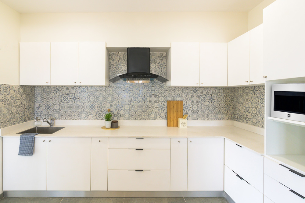
Matte white cabinetry units with suave black and stainless-steel hardware give the kitchen a clean modern feel! The white quartz on the kitchen countertops and island further build on the all-white aesthetic of this zone! We can confidently say that this part of the home is the soul of the space.
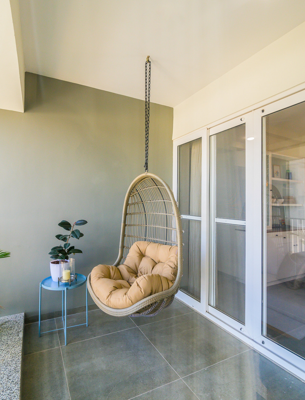
Balcony Nook
It’s sometimes as simple as giving a small corner of one’s home that touch of personalization and giving it room to grow. The apartment in this case was blessed with a running fixed glass wall on the façade which opens into the main balcony from the dining area.
The main balcony has been envisioned as a sit-out section for the young couple and frames boundless views of the city while they settle down every day with their cuppas!
We hung a cane swing as it was one of the ‘must-have items’ for our clients. A sky-blue round top metal table adds that element of fun to the space and brightens up the nook!
This brings us to the end of the first part of the reveal of the Modern Scandi! I hope that I’ve been able to share with you the moments and details that have made us fall in love with every aspect of this home! 😊
We promise to come back here real soon to fill you in on all the details of the bedrooms of the house and how they’ve each managed to become spaces that have a strong sense of personality while retaining the DNA of the rest of this home. Stay Tuned, a whole lot of design detail coming your way!
All Pictures Shot by Parth Swaminath
Project Reveal – A Timeless Transitional Master Bedroom
Created by Vinithra Amarnathan on August 30, 2019
We’re bringing to you today the master bedroom that we designed for this home. It’s a departure from the rest of the home in having a serene, tone on tone look. I love how this space has come together!
We had a lot more freedom designing here because Shalawn wanted to create a beautiful master that she would love coming back to and one that could transition easily to their own home when they moved back.
She we wanted it to be a calming neutral oasis but at the same time luxurious and welcoming. And I hope we delivered 🙂
Given the large space we were dealing with, I thought splitting it into an ensuite seating area and having the bed on the other end would help create two zones in the same space.
Before
After
We had to custom make every piece from the rug to the chairs to the beautiful American king size velvet upholstered master bed. Here’s an interesting story for you!
We worked with the clients to custom make the bed to the specific box spring and matress size they had. The first time around the headboard came out too short, so we had to remake the whole headboard. And the second time around it was too big to get through the doors of the stairway or the elevator in their apartment building. And we had to get the bed up to the highest floor of the apartment!!
I told you’ll this was a challenging project for us 😉
After exploring everything from forklifts to cranes, we finally had to resize the headboard to fit through the doorways and then reupholster it back.
But when you see this beauty, you’ll understand it was well worth it!
Before
After
We added two dressers on either side for nightstands and glass table lamps.
Keeping the overall look neutral allowed us to play with patterns like adding an animal print rug, a hand carved wood top coffee table (that originally, we got for the living but it turned out to be too small and we ended up using it here;)) and some beautiful wood inlay art.
We custom built two his and hers dressers in a chevron wood finish to fit the length of the wall and I would have loved double mirrors to go above the dressers to round off the look.
Before
After
I was very excited to see how this space came together and it looks beautiful and calming just like we had expected.
I hope you enjoyed this little master bedroom tour! We had so much fun and such a learning experience putting this space together.
Project Reveal – A Timeless Transitional Makeover! – Part I
Created by Vinithra Amarnathan on August 23, 2019
In most cases having a large space to work with is any designer’s dream. When I walked in to meet our clients who had just moved from Texas, US to Bangalore, I was struck by how large and massive the apartment was.
Larger even than a standard American home! That became our biggest challenge combined with the fact that it was a rental and the client had a relatively short term stay in Bangalore.
The idea of making this expansive apartment feel cozy and warm within the constraints of not being able to make any permanent changes, staying within a reasonable budget and focusing on adding pieces that the client is able to take back home was quite the challenge.
Added to that the fact that almost every piece had to be tailor made as most retail options would simply not cut the size requirements we had.
Shalawn and James wanted a home that was classic but with clean modern lines. Something that was vibrant yet understated. We used paint, soft furnishings, furniture and accessories here to make an impact. The home is punctuated with some beautiful art and color that bring in that vibrancy.
I was excited to work with the clear vision and thoughts they had and the effort they put into their home, no matter how temporary it may seem. I am so grateful I got the opportunity to work on this project.
Entryway
The entryway is a large space that opens into the formal living room. We wanted to make a bold impact here and at the same time be conscious of not bringing in oversized pieces that cannot fit elsewhere.
We painted one side of the entryway a dark charcoal to add some interest and visually recede and ground the space. A gold sunburst mirror and a custom made black and white bone inlay console bring sharp contrast.
On the other end we have a wood bench flanked by a David Mead print of the sun shining through the Grand Canyon. I love this piece with its bold colors and modern abstract feel!
We added a round jute rug to further define the space.
Before
After
Living Room
We already had a traditional leather sofa that the clients owned and added to it custom made oxford roll arm chairs in a soft peach. Now that might seem like an odd choice for a living room, but I loved the idea of a soft pastel to complement the bulk of the leather sofas.
We added a beautiful gray and white hand tufted wool rug to ground the space. The rug is heavy and bold on pattern but the colors are neutral which allows it to sit comfortably and balance the space out without letting the leather couches take over.
Before
After
What pulls this space together beautifully is a commissioned art piece by Gulrez Ali. We all loved the style of his art which embodies modern bold brushstrokes of color and the drip.
The colors in the piece with warm blues and whites and grays perfectly ties the room together and makes it feel cohesive.
While there was a lot of ceiling lighting, we wanted to add some accent lighting to bring in that coziness and warmth. Because it was a rental we couldn’t really add chandeliers or pendants. I opted for a standing chandelier lamp that adds a touch of traditional and perks up the corner.
On the other end of the large couch, we added a set of nesting tables and a beautiful pink glass lamp that’s one of my favorite pieces.
Dining Room
The dining room was massive and even after we planned to have an extra-large custom eight – seater dining table in solid wood and metal legs we felt the need to connect the dining and the living.
I love the metal leg detail we used here that brings in a touch of modern to the classic wood top dining table and sort of updates it.
Color has been the biggest tool we used to unify the space. The coral wall does a great job of connecting the living and the dining by picking on the art and the pastel peach tones of the chair.
We reframed some of the existing art that the clients already had that complement the colors of the space beautifully.
Before
After
We added custom made indigo chairs and a patterned rug that picks on all the colors but has an earthy neutral base that grounds the dining area.I think the rug brings together this space so well with its different kinds of wood, upholstery and the accent wall.
A cabinet for crockery and storage and a metal framed cut work mirror add interest to the coral wall.
Family Room
We didn’t do much here except small changes like new window treatments, reupholstering the sectional to a lighter gray and a lovely striped fabric for the ottoman.
We replaced the country style dining table with a more modern game table for the family to hang out and play games on.
Some throw pillows and art on the walls tie it all in.
Before
After
If you thought color was the predominant story in this home, wait till you see the neutral and serene tone on tone master bedroom that we designed from scratch!
Stay tuned for that coming up next on the blog 🙂
It’s All in The Accent!
Created by Vinithra Amarnathan on August 6, 2019
How many times have you stared at that blank wall and wondered what you could do to give the space more character? Or how many times have you caught yourself feeling like your room lacks a focal point and needs a revamp? With this blog post, we’ve worked with Berger Paints to bring to you the simplest Accent Wall hacks that can transform your spaces in a quick, cost-effective and impactful way! 😊
The idea of creating an accent wall is a simple way to bring personality to a space. An accent wall in a room will have attention drawn to itself effortlessly (and for the right reasons 😉) and will act as that perfect conversation-starter. We hope that with this detailed post, we’ll be able to help you find your perfect accent wall design match!
Before we get into details about the various ways in which you can create an accent wall in your room be it the living area, dining space, bedroom or just any space you want to freshen up the look in, let’s answer the more pressing question.
Which type of wall can be turned into an Accent Wall?
This step is probably the most important one and also confusing for most! Start with picking out a clean wall that has preferably no breaks or structural elements like doors, windows etc. The wall picked could be the one behind the bed or the one behind the couch or even a wall where you want to highlight a focal point like a large piece of art or a gallery wall! Keep your focus on picking a wall that does not have to compete for attention with something already present on the wall surface in the form of a structural or a feature element.
You can pick a wall that has a dominant presence in the space and then introduce elements that will complement the accent wall. Against the accent wall feature, you can get creative and decide on what type of décor items, furniture or focal pieces may go with the statement wall. A bright couch, a gallery wall or just an iconic piece of art can all be options that anchor the wall visually!
A key element to keep in mind is natural light. A wall that receives a good amount of light is a good candidate for an accent wall. Accent walls are also a great tool to visually create dimension in a space. For example, painting a wall on the far end of a long or large room a dark/bold color, visually brings the wall closer and reduces the length.
Once the accent wall is in place, it is sure to create impact in terms of visual drama and highlight the features you were seeking to.
Moving onto the most fun part now!
How to create an Accent Wall?
The answer to this is in many different ways! 😊Accent walls much like paint in any form are an expression of your unique personality, the effect you want to create or the characteristic vibe that you are going for. Let’s explore a few different techniques that we can use to bring to life your custom accent wall feature with the help of some Berger Paints products:
Paint – The Most Versatile Medium:
Paint has been the cheapest and easiest way to give a space a whole new look (read more on this: https://www.wee-spaces.com/expressing-style-one-paint-swatch-at-a-time/). With paint options, there are a variety of directions of design you can head into.
Start by deciding on the overall palette of the space. You can choose to work with warm colours (reds, oranges, yellows, browns) or cool colours (greens, blues, purples) to create a visual ambience of your choice. Dark, bold and striking colours work well to create an engaging backdrop in a space. Softer toned colours work well to tie the space together.
Within the color wheel you choose to work with you can choose hues that create a complementary or contrasting palette! Some trending combinations could be: teal and white, mustard, grey and white, shades of blues with orange for something vibrant or mint for something fresh and cool!
You can spruce up your accent wall colour wise with design options like ombre shades of a base colour, a solid hue on the wall, metallic finish walls, textured walls, wallpapers in sections, panelling and even decals to complement the colour story of the space. The options are endless!
You can create a statement accent wall using Berger Paints Silk Illusions range.
Stencils:
Stencils are a great option if you want to infuse pattern and make your wall a feature wall even without any further accessories! They’re customizable and can make for a fun DIY project in your home. The use of stencils allows you to give your space a quick makeover that can follow a certain theme and set the mood of the space. Choose from a range of abstract, geometric, form-inspired or a collection of shapes to create that personalized accent wall.
Stencils work great in kid’s rooms, study spaces, offices or anywhere you need to feel creatively inspired!
Go ahead and let your imagination free when it comes to choosing a base coat color and the pattern color to layer on top of that. Here too, you can choose to pair colors that complement each other or create an interesting visual with their contrasting pairing! Stencils are that perfect blend of pattern and personality that come together to create magic on your walls.
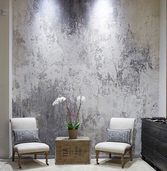
Pic credit – Pinterest
Berger’s range of Interior Emulsions can be paired well together in various shades to create that desired stencil accent wall feature.
Color Blocking:
Now coming to one of our personal favourite techniques! Color blocking is a technique in which two or more solid colours are paired together in a symmetrical or asymmetrical fashion to create an interesting composition. The goal is to visually break up the space by splitting it into geometric portions that each have a distinct colour, thus creating that picture-perfect accent wall!
You can start by dividing the wall into a few sections. Use any pre-existing elements as guides to divide the wall as per your requirement. Use complementary colours for a striking effect or even subtle hues if that’s your palette. The technique is perfect for demarcating zones & adding character to your space!
Pic credit – Pinterest
Have a look at some of Berger Paint’s Silk Luxury Emulsion range to get cracking on your colour blocked wall.
Here is the golden rule: there aren’t any rules!
Remember to have fun while you freshen your walls up and know that your take on accent walls is your own. It is an interior design feature that can go a long way in adding that bold touch of persona to your space and make it seem anew!
Until next time, keep it chic and colourful! 😉
Content by Lavanya Chopra for Weespaces
Project Reveal – Modern Colorful Apartment – Part II
Created by Vinithra Amarnathan on July 29, 2019
I hope you all enjoyed the reveal of the living spaces in this apartment. We’re sharing with you today the reveal of the bedrooms in this home.
The bedrooms are designed to reflect the individual personalities of the inhabitants and marry color and aesthetics to create bold yet chic spaces.
Master Bedroom
The master bedroom was imagined as a dreamy luxurious space for the couple to come back to after a day at work. They wanted a relaxed yet luxurious feel. Pink was the wife’s favorite color and we decided to paint the room a very soft pink with undertones of lavender.
We used blue and grey through the rest of the room. The bed is an upholstered bed in soft gray velvet like fabric with beautiful horizontal tufting to amplify length. We added sharp white bedside tables with black hardware for contrast.
The Muuto Fluid pendant hangs on both sides and I love how it brings in that dreamy feel with its soft white light and the bubble shape!
One of my favorite elements in the room is the beautiful blue gray abstract rug we picked. It reflects the abstract fluidity that we were going for in the space and provides enough contrast to the soft pink walls and the gray bed. We added a custom navy bench with a teak wood trim for seating and a custom blush velvet chair by the large window.
We played with tone on tones in this space, by keeping the window treatments a shade of pink and the chair in similar blush pink tones. I love how this brings in the dreamy soft vibe against the pink walls. There’s nothing like too much pink 😉
A blue gray dresser with an asymmetric front from Freedom Tree carries through the blue gray color story as well as the abstract feel that we wanted to contrast with the soft dreamy elements.
The art again echoes the same sentiment. The tulip print adds a beautiful calm vibe and was the wife’s favorite flower. We added geometric black and white prints from Ikea on the bedsides to bring in the sharp contrast.
One of the most functional and chic parts of this room is the walk-in closet area where we created a his and hers closet. The wardrobes are white with handmade wood handles that are so chic and simple.
We added double full-length mirrors on either side opposite the wardrobes with a concealed pullout storage on ‘her’ side for storing bottles and accessories.
The master bathroom has a beautiful gold and silver mirror from Neter Living and a custom gold bar light on top.
Teen bedroom
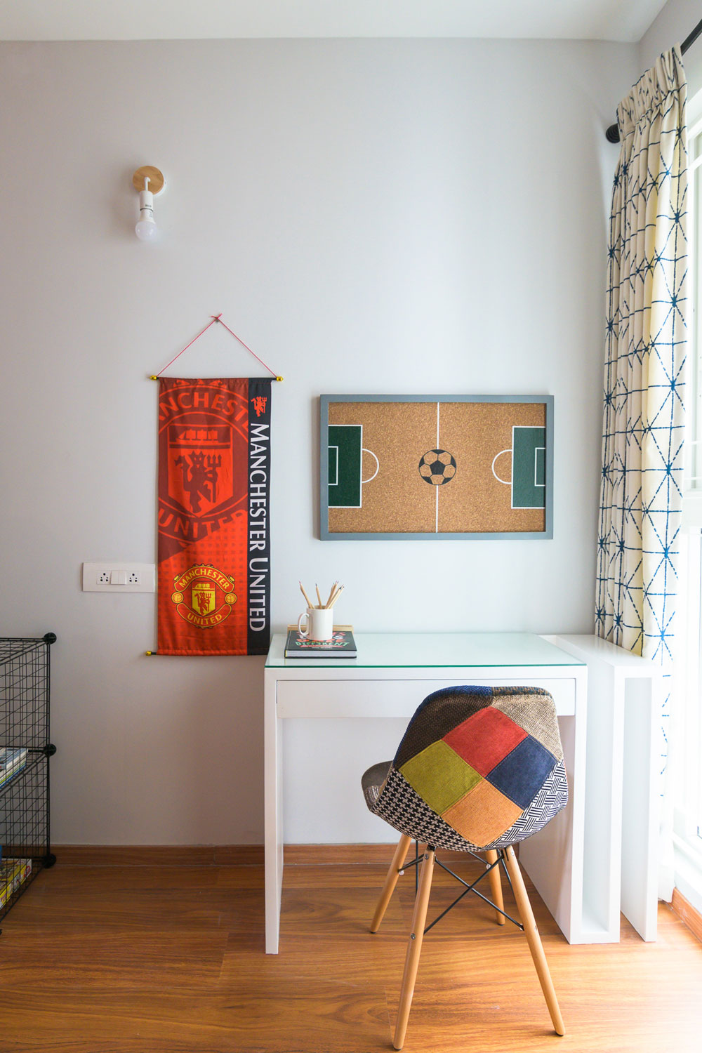
The second bedroom in the home belongs to the teen son who is a Manchester United and Soccer fan. When I heard that his favorite color was black, my first reaction was ‘Lets do a black wall!’ 🙂
And that is my favorite part in this room! A bold sharp black wall that houses a custom wall mounted white desk. We added some striking Manchester united inspired art to the wall and a beautiful wood desk lamp…..the black, white and wood come together beautifully!
On the other end we have a black leather bed and a small bedside table in teak and black. We framed a Manchester United scarf to hang above the bed and added a black arm sconce on the bedside for extra lighting.
The window treatments are gray curtains that have a small-scale grid pattern and bold striped blinds on the window.
We kept the wardrobes a light gray and added simple black hardware.
I like how this is a neutral room except for pops of red in the art but still has so much personality!
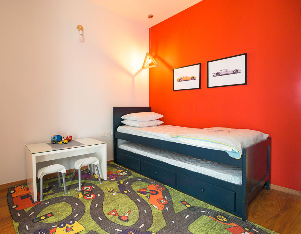
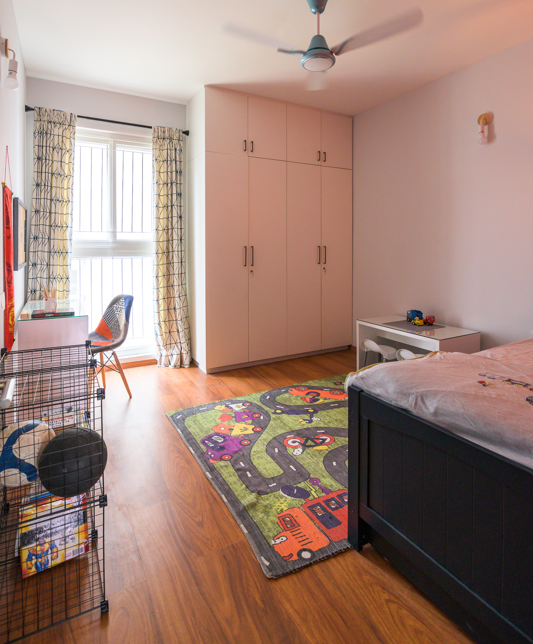
Kids room
The last bedroom in the house is a little boy’s room. His love for cars and soccer is pretty evident in the room. We did a bold red wall and a race track rug to bring in some fun.
The red wall is balanced by a light blue all through. The room has a navy trundle bed to accommodate guests on occasion and is the perfect color for a boy’s room!
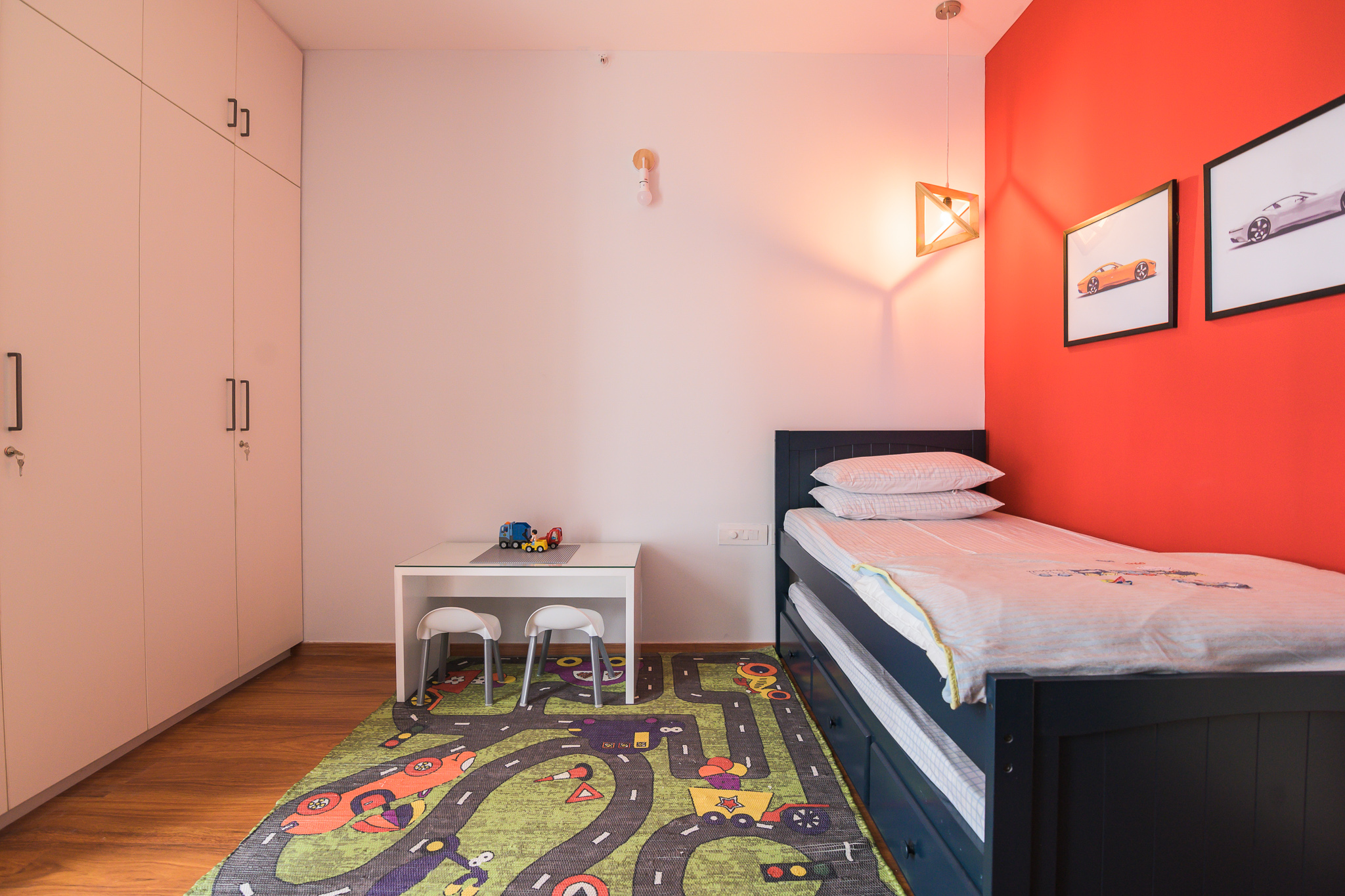
We added a white custom-made desk with an open side storage for large sheets and art that the client wanted to store. A fun patchwork chair and some simple wire storage round up the space.
We added a small white play table and some kids chairs for assembling legos and crafts.
The wardrobes are a simple white and balance out all the color in the space so well.
I loved working on this project and bringing personality to each of these spaces. I love how they are so different from each other but stay true to the overall aesthetic of the home!
All pics by Parth Swaminath.
Expressing Style. One Paint Swatch at a Time!
Created by Vinithra Amarnathan on July 11, 2019
Need to give your space a makeover and new personality without having to splurge on it? Paint is your best option hands down! For the longest time, while décor trends have swayed across different styles and periods, paint has continued to be the most durable, economic and simplest option that can change the entire look of a space in a matter of days.
From protecting your surfaces to becoming a medium of self-expression, paint can anchor a surface effortlessly and create just the perfect mood you want to set in your space whether it’s the interiors or exteriors! We explore a few ways in which you can use various paint product ranges by Berger Paints and techniques to create spaces that are an extension of your style!
Interior Paint Finishes
Interior paint finishes can literally make or break a space. The colors, textures and finishes can influence greatly the identity a space has. By using paints in a complementary or even a contrasting color scheme one can create a binding visual language. We take you through some of our favorite paint interior finishes that we find trendy and we hope you’ll be inspired to explore some of them!
Concrete Limewash Paint
Created originally using a mineral base, limewash paint has a lovely chalky & nuanced texture. The material dries to create a suave matte surface which gives any wall surface visual depth and a standout look. Limewash paint works great on porous surfaces like brick, plaster or even stone and gives spaces a natural and neutral-toned look. We used this in our most recent project in the modern colorful apartment and its one of our favorite looks with its cool concrete finish. This grey tone gives the space a super modern, clean & stark look that is oh so swoon-worthy! Limewash finishes can also be achieved in color ranges of browns, taupe & shades of grey.
Metallic Finishes
Metallic finishes on walls are such a chic way to glam up your room’s vibe! Playing with metallic finishes can give the room an edgy & elegant look which is out of the box and unique. These walls can be created as accent walls in spaces so they have visual attention drawn up to them and can be the perfect backdrops for art / wall décor on the wall. Unleash your creativity and choose from a range of golden, champagne, silver or jewel tones to create that statement backdrop!
Berger paints offer some great products like Silk Illusions Design Metallica or the Silk Illusions Metallica that can help you achieve the metallic magic you’re going for! Find the products here:
https://www.bergerpaints.com/products/interior-wall-coatings/4/designer-finishes/54/silk-illusions-design-metallica
https://www.bergerpaints.com/products/interior-wall-coatings/4/designer-finishes/24/silk-illusions-metallica
Textured Paint
If you like to have fun with your walls and would like to take a little leap into a versatile palette of interior paint finishes, textured paint is just for you! With this type of paint finish, you can achieve unique patterns with absolute ease. Textured paint is perfect for a room facelift, is durable, versatile and can be customized to create the look you want. What better than the freedom to create and implement just the right texture for your walls?
Berger Paints has some products that can help you create some intriguing textural play for your walls. The Silk Illusions Marble Finish & Silk Illusions Vintage Finish are some of our top picks! What’s more? These are Green Pro certified and are eco-friendly too! Check these products out:
https://www.bergerpaints.com/products/interior-wall-coatings/4/designer-finishes/25/silk-illusions-marble-finish
https://www.bergerpaints.com/products/interior-wall-coatings/4/designer-finishes/71/silk-illusions-vintage-finish
Exterior Finishes
An exterior paint finish is a functional and aesthetic layer that protects a building from all external factors from sun exposure to rainfall and any sort of wear and tear. Exterior finishes can set the tone of a built space literally at first sight!
One must ensure that the finishes picked for the shell of the building matches the weather conditions of the site and the potential weather-related factors the building may need to endure. Properties like durability, water repellency and fungal prevention should be of prime focus while picking your finishes for exterior surfaces.
We’ve shared with you two of our personal picks that we feel can add to the façade of your home.
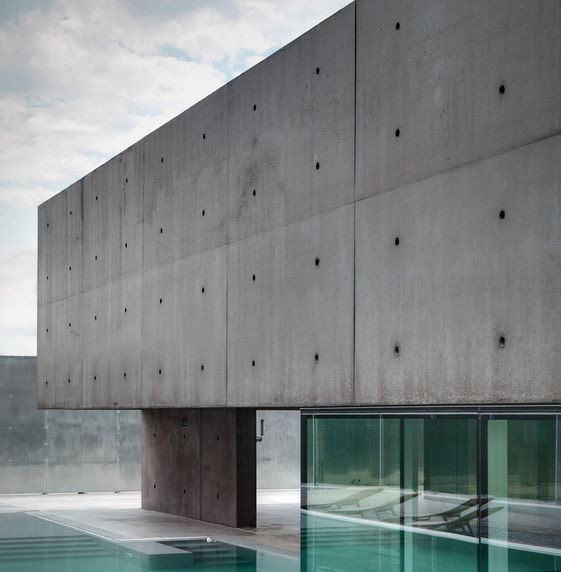
Exposed Concrete Finish
High on the style scale, the concrete exterior finish can give anybuilding a sharp stylish feel. You can channel some great Brutalist expression with exposed concrete facades and elevations to make your built space stand out and make its presence felt! There’s something so alluring about the rawness of this look and we feel it fits well with modern architecture and design especially with an industrial chic vibe.
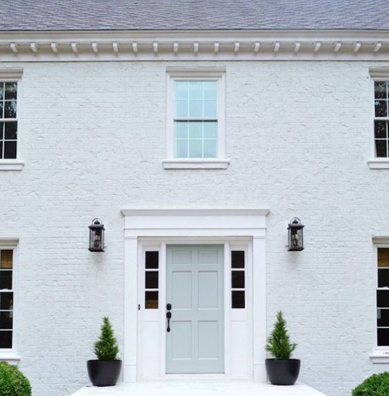
Painted Brick Finish
This style of exterior wall treatment is a throwback to classic style! Painted brick walls add an earthy look and feel that has an unconventional beauty of its own. The choice of colors can range from the classic earth tones to brick to bright hues! We are seeing a big trend towards dark exteriors and painting your brick exterior a sharp black or deep green or charcoal lends it a bold sharp look.
The WeatherCoat Long Life or the WeatherCoat All Guard paint finishes by Berger Paints is a great pick for you to keep your external walls looking fresh for years to come! Do check the paint varieties out:
https://www.bergerpaints.com/products/exterior-wall-coatings/15/exterior-emulsions/34/weathercoat-long-life
https://www.bergerpaints.com/products/exterior-wall-coatings/15/exterior-emulsions/69/weathercoat-all-guard
All in all, paint as a material is timeless. It’s the perfect medium for creative & visual expression that can be altered and customized to suit each homeowner’s personal style. So, the next time you are contemplating the perfect makeover for your spaces, whether at an interior or exterior level, be rest assured that paint and the plethora of finishes available in the market will breathe new life into your abode!
It’s all about finding the perfect shade, combination, texture and finish that will complement your style and give your space a whole new look. Don’t be afraid to play around with paint and colors…. it’s your cheapest and easiest tool for major impact
Check out Berger Paint’s detailed and expansive range of products that can give your home a dose of love, be it on the inside or the outside.
Stay tuned for more from us about our thoughts on paint and other accessories that can help you create a home truly reflective of you.
Project Reveal – Modern Colorful Apartment – Part I
Created by Vinithra Amarnathan on July 7, 2019
A home that’s not afraid of color!
Let me rewind back to September of 2018 which is when I first met the clients for this home….It was a long detailed meeting and I knew I was with people who had a keen sense of aesthetic and were invested in their home and the design process.
Weeks went by and almost a couple months later we signed up to get started. We had our first design chat and when my client said ‘I want a pink kitchen’…..I part laughed and part squirmed! And then I thought to myself….how often do you get that brief?
Lets just say that sets the tone for the fearless, yet thought through use of color through this home. From the pink and gray kitchen, to the color packed living to each of the bedrooms having their own distinct color story, this home is an eyeful.
We achieved balance in the clean lines, sharp accents, natural wood and a simple chic aesthetic.
We’re bringing this project reveal to you in two parts. The first part is the large connected living space that comprises the entryway, living, dining, kitchen and family room.
Entryway
The entryway was small and narrow leading directly into the living dining space. We kept it very clean and simple by adding a quartz ledge framed in black metal to go over the niche and the wall separating the entryway from the living dining. The ledge has a simple round mirror on top. A small cross leg custom seat and a modern bent wood pendant ground the entryway.
Living
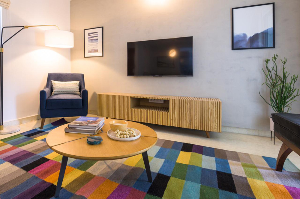
Walking into the home, the living room is the first space you see. The whole space comes alive with the bold colorful rug! A powder blue custom velvet couch is in the center of the living and dining space. We added a modern upholstered navy corner chair and a black leather bench for additional seating. A beautiful arc lamp perks up the corner and adds extra lighting.
One of my favorite elements in the space is the natural wood slat media console and the limewash wall that gives a muted concrete look to the wall! They balance all the bold colors in the rug perfectly.
 A round coffee table and simple abstract art round up the space. We kept the window treatments neutral and added a striped roman shade to the window.
Dining
When we started out we knew we wanted a round table to seat a family of four. We all loved the classic clean lines of the iconic Tulip table and decided to recreate the classic in a high contrast sharp black leg and marble top!
The dining space by itself wasn’t very big and had a big corner that was to go unused if we had a dining table in the center of the space. And that’s when the idea of having a banquette seat seemed like such a charming and space saving option…..not to mention the comfort of sitting on a couch and having your dinner 🙂
We created a custom banquette seat to fit the area and the beautiful tulip table with sleek wood chairs bring this dining space together.
The Montauk print from Juniper Art makes for a beautiful addition to this already chic space.
Kitchen
Aah here we are with our beautiful pink kitchen 🙂 The lady of the house was keen on a pink kitchen and I wanted to bring that in without it looking overly feminine or like a barbie’s kitchen.
We found the perfect pink tile that was handmade ceramic and had subtle color variation that adds depth. Gray cabinets balance the pink beautifully and sharp black hardware provide that hint of masculinity. The countertop is a satvario quartz that has beautiful gray veining which is perfectly picked up by the gray cabinets.
The kitchen in itself wasn’t too big at a modest 8X13. We incorporated a tall unit for the appliances on one end to balance the refrigerator on the other and gave the clients a long running L counter on one side that incorporates the cooktop, the sink and the refrigerator in a perfect work triangle. The other end has a shorter L that adds extra counter a small breakfast counter like extension. I love the waterfall stone edge on this little counter!
One of the features I loved was the window soon as you walk into the kitchen and we wanted to make it a feature. We added a custom quartz ledge at the window and open shelves by the window in natural wood to add to the open feel in the kitchen. A granite sink and matte black faucet fit perfectly.
Family Room
The family room is an extension of the dining and the kitchen space and we wanted to make sure that all these areas integrate well with each other. We created a built-in cabinet here that houses the client’s puja at the bottom behind lattice doors and an asymmetrical open top unit that’s just great for books and memorabilia!
This is one of my favorite elements in the home with the veneer clad pockets popping so beautifully against the white.
A rattan chaise makes this the perfect spot to lounge with a book 🙂
This home has so much detail in every little corner and that’s what makes it a unique personal space…..much like the ones we try to create!
I hope you enjoyed walking through this home with me….stay tuned to see the bedrooms and how the bold color choices make their way into those spaces next 🙂
All pics shot by Parth Swaminath.
The coming together of a global eclectic living space!
Created by Vinithra Amarnathan on May 3, 2019
I love it when people who move half way around the world for a relatively short time still want to work towards creating a home that’s reflective of them and one that feels welcoming.
When I met our clients, a young family from Minneapolis on an assignment to Bangalore, their ask was simple….we want it to feel like home! And thats just what we did!
We used the already lovely pieces they had and their clear sense of style that was about an eclectic collected look, bold color and clean lines to put together a space that was now elevated and welcoming!
We’ve filled the home with strategic pieces to pull together the look and make the space come alive!
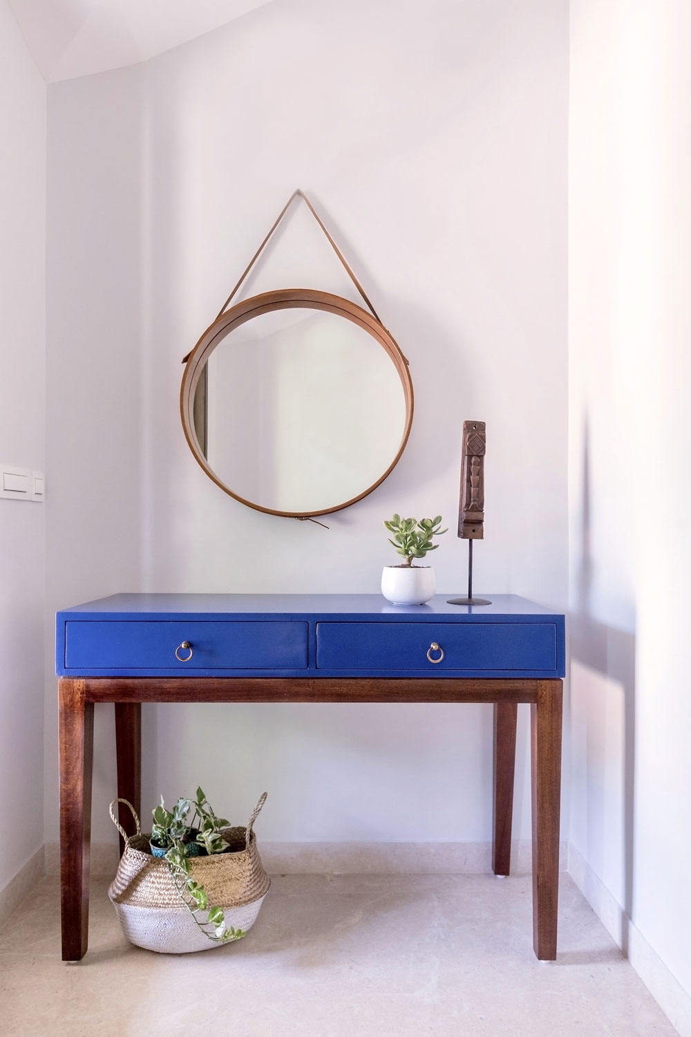
Entryway
We wanted the entryway to make a bold impact! I knew the clients loved blue and the thought of a bright blue console soon as you enter was so fun!
We paired that with a simple modern leather framed strap mirror and a few accessories like a wood tribal sculpture and a basket!
Living room
The minute I saw the large window, I thought of a chair in that corner with a pouf flanked by flowing curtains….and now that its put together, its one of my favorite visuals in the home!
We custom made the chair with a cane back for an airy feel and upholstered the seat in a morrocan tile print fabric! A pouf in a neutral shade with some textures completes the look!
The earlier curtains got swapped out to simple linen curtains that allow all the other elements to stand out.
Along with that the idea of having a large console behind the couch was something that gave the client much needed storage as well as helped in anchoring the living area.
We also added a cabinet in raw natural wood for storage. A simple update of adding hardware in black and some hand painted ceramic knobs elevates look of this cabinet.
We added accessories like pillows, lamps and baskets under the console to carry through the vibe. I love how the pieces balance out the colorful rug and big sofa!
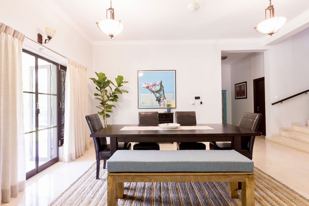
Dining
The client wanted to use their existing dining table. So we added a bench with a cushion on one side to make for an uninterrupted view from the living and a pretty centerpiece.
One of my other absolute favorites is the braided handwoven jute and hemp rug! It’s the perfect balance to the bold colorful rug in the living area and brings in warmth and texture to the space.
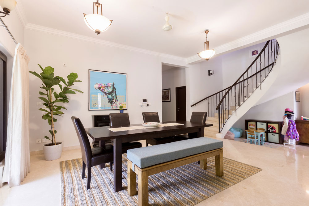
How can I miss the showstopper camel ☺ The art print was picked by the clients on a trip to Dubai and it brings in color and pattern and beautifully adds to that global eclectic feel.
I hope you loved this makeover! Stay tuned for our next upcoming projects…..a full scale new home and a big makeover ☺
From boring basement to a Mancave!
Created by Vinithra Amarnathan on April 24, 2019
Cocktails, a game on the television and the company of friends and family. Doesn’t this make for a great mental visual at the end of a long day? With this space, the family wanted to create an entertainment den which could also flexibly double up as a guest room if need be.
The tight area of less than 500 sqft posed as a challenge, but also was a great impetus towards conjuring to life a dark, moody but definitely not dingy space! This room was conceptualized as the laid-back section of the home where the clients could lounge, entertain and even indulge in watching television together.
The dark grey wall in the mancave was certainly a tough call to make. The clients were initially a little hesitant as they felt that a dark palette such as the one used, may make the space seem smaller and dingy. Although, what we had in mind was to utilize the color as a protagonist in the space and layer the rest of the space with light and bright elements to create visual contrast.
The overall feel of the space is a modern industrial vibe but with undertones of vintage old-world charm. We used a clean white look for the bar unit cabinetry which complemented the collage of colors and patterns exhibited by the dado tiles which the client already had. Since the space also had to double up as a guest room, a day bed and closet space were included in the scheme of the design. The custom-made grey leather chesterfield sofa binds the room together with its suave presence and comfort. The sofa is the perfect spot for the family to sink in and enjoy a game together! The raw wooden high table and stools behind the sofa add an earthy and stylish touch to the space. The aim behind the strategic placement of the high table behind the sofa was to allow users to grab a beverage at the bar and to comfortably view the television. The addition of the table not only makes for comfortable seating and a better viewing experience but also best utilizes the tight space we had to work with. The rug of course, adds a great deal of color and vibrancy to the space, which acts as a great contrast to the statement grey wall.
The modern industrial mancave makes for the quintessential union between upbeat aesthetics and functionality in a space that the family can just kick-back, relax and entertain in, all with great ease. We hope you have been able to take away some design inspiration for your spaces with this project reveal. Don’t forget to take a moment to unwind while you’re at the grind!
Stay tuned for more project updates 🙂
Content by Lavanya Chopra for Weespaces
Photography Credits: Dileep Kumar