Bringing a beautiful home to life – A modern take on old world charm!
Created by Vinithra Amarnathan on April 26, 2018
This renovation was all about marrying the modern and updated aesthetic of a young modern family with their love for the old world and traditional! What started off as a small project of adding a partition to an open kitchen and creating a coffee station went way beyond that and truly was an update of almost the entire home! I am so proud of how we managed to bring in an updated fresh and young vibe to this home filled with character pieces!
Kitchen
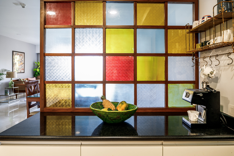
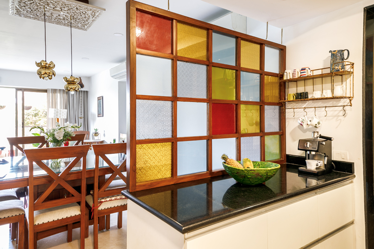
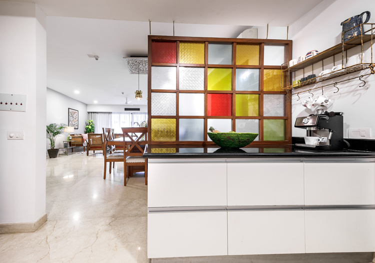
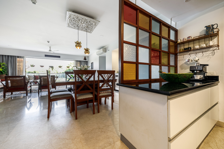
Our key project was to create a partition between the open kitchen counter facing the living dining area and offering some privacy while the kitchen is in use. While we could have done a glass partition or a sliding door or even a lattice screen, I thought something more unique and in line with the old world charm they loved would be great! Like a drop down/ hanging window frame with colored glass pieces almost reminiscent of an old house window that had been repurposed! We initially wanted to use tiles on the screen but due to the weight of tiles we settled for glass.
It was something that the clients loved, but being a unique custom piece execution was key! After many sketches, pinterest pictures, whatsapp messages, hunting for etched colored glass and three iterations to get the right finish and colors, we finally had what we set out for!
Behind the screen we created a lovely coffee station supported by a vintage looking wall shelf from Fabuliv.
Teak finish framed, vintage glass screen window suspended from brass chains was now the screen that we dreamed of! Originally made to create privacy and now something that’s a piece of art in line with the rest of the home! Here are some pictures!
Terrace Bar
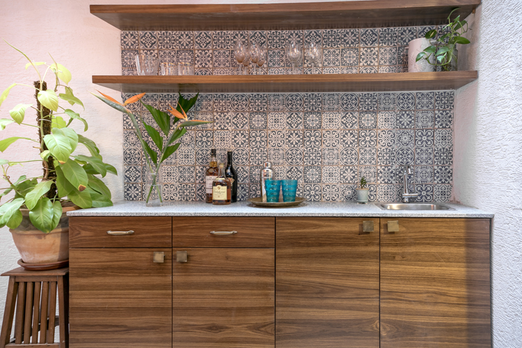
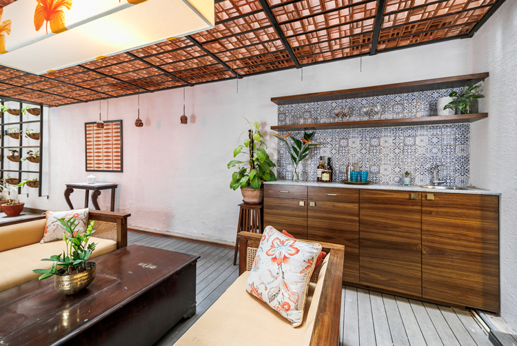
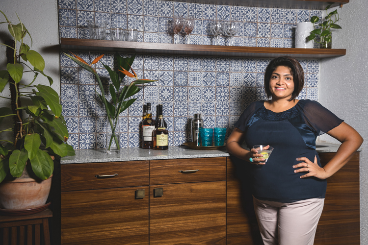
The next ask the client had was to create an area in the terrace where they could make and enjoy their morning coffee and also entertain in the evenings. I loved the idea of a wet bar with a sink because it serves both purposes and is a great way to entertain with drinks and cocktails.
Once we decided on this, I thought this might be a great spot to incorporate those chettinad / patterned tiles my client loved. So we designed a beautiful backsplash with patterned tile that now became the feature of this beautiful bar unit!
We picked a beautiful blue and white Spanish patterned tile that complemented the warm oranges and mustards used in the rest of the terrace so beautifully. This is probably my favorite transformation in this project and totally completes the terrace!
Living
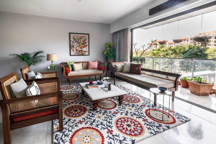
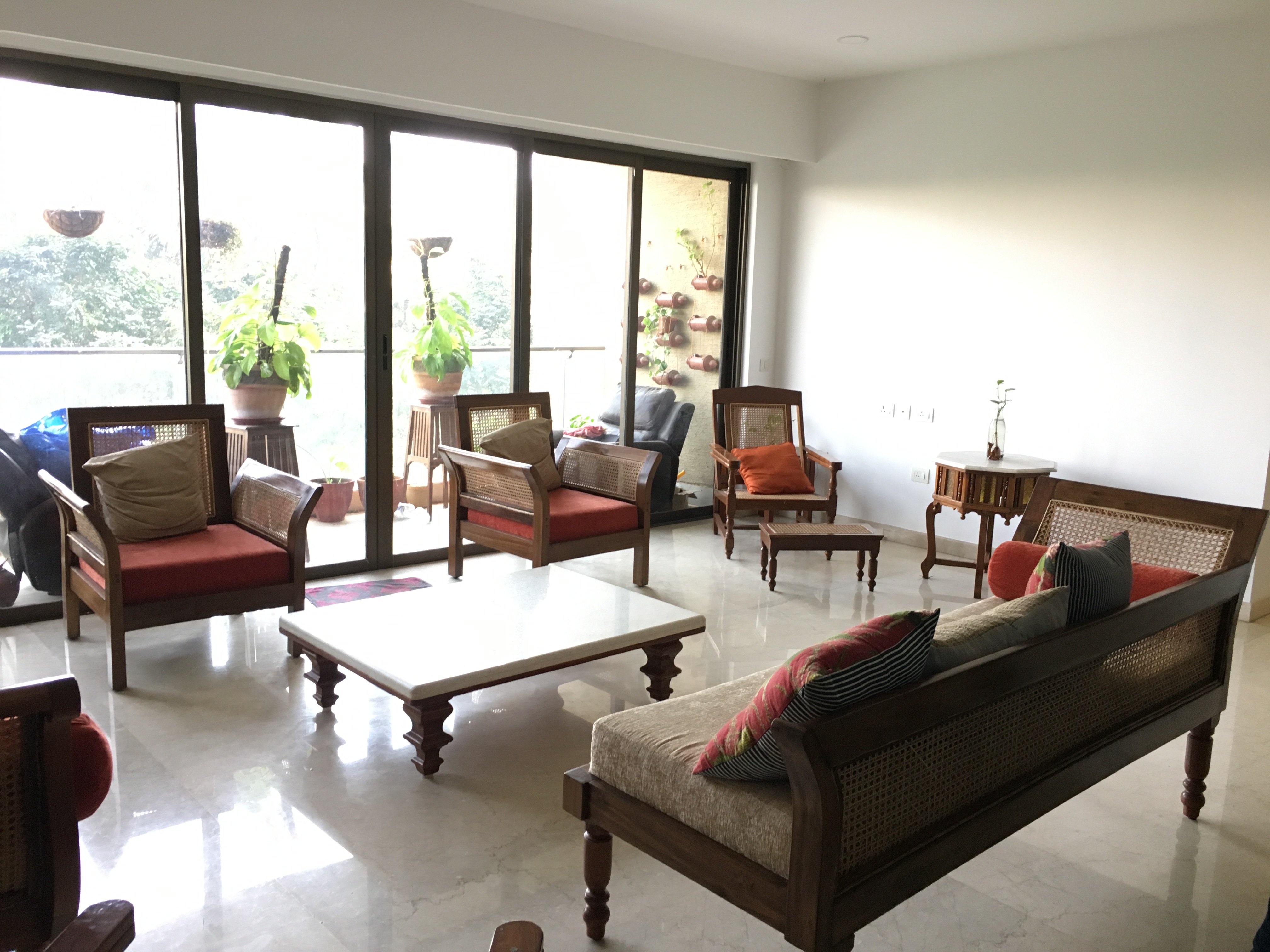
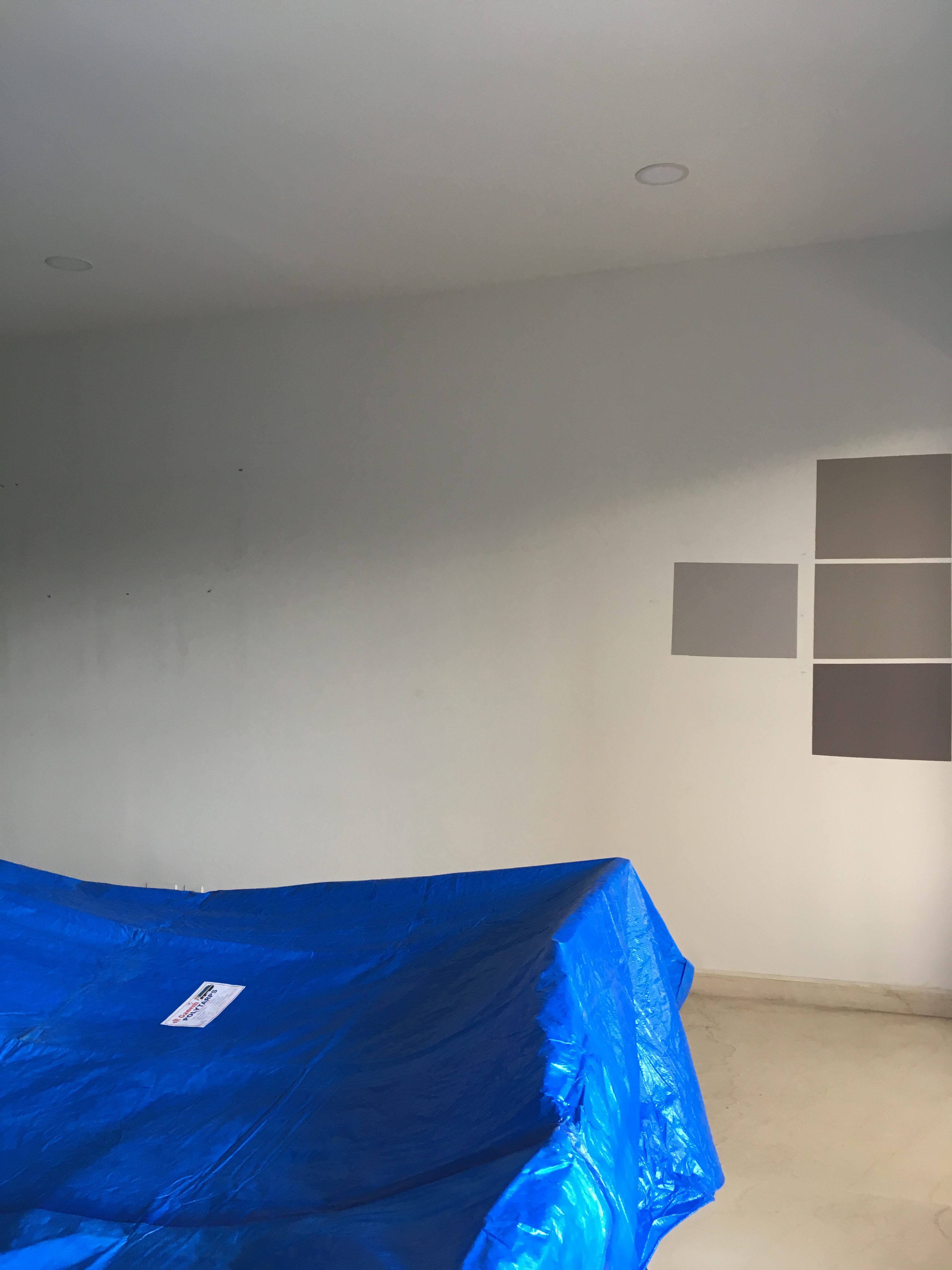
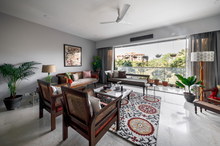
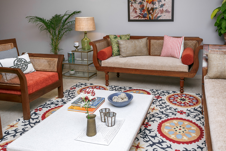
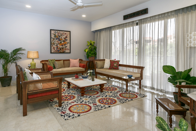
We also started working simultaneously on the large living dining area that already had a lot of large teak furniture pieces but didn’t really have a story or a vibe. My job here was rather challenging, having to work with large pieces of existing furniture that were all beautiful but one too many of the same style. So the challenge was to create a story and break the monotony of the furniture. We decided to paint one of the large walls a warm grey which took a lot of discussions and going back and forth;) but worked out so well in the end! We chose smoky grey from Asian paints and it does a great job of bringing in that warmth and grounding the space. Here’s a look at the before!
Before
The next thing I did was bring in a bold, bright rug! This was a bit contrarian because one would imagine with a heavy furniture a simple clean rug is of the order….but actually we needed something bold enough to stand up to all the big heavy furniture and still make its presence felt! So in walks our stunning navy and orange suzani hand tufted beauty from Imperial Knots! And she brought with her that wow and drama that we were looking for…showstopper 🙂
A look at what it looks like now!
After
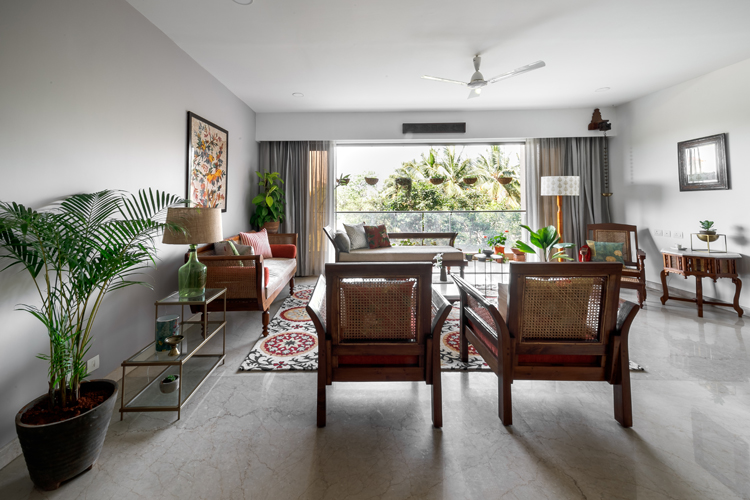
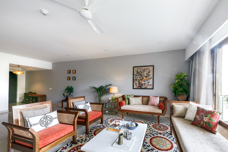
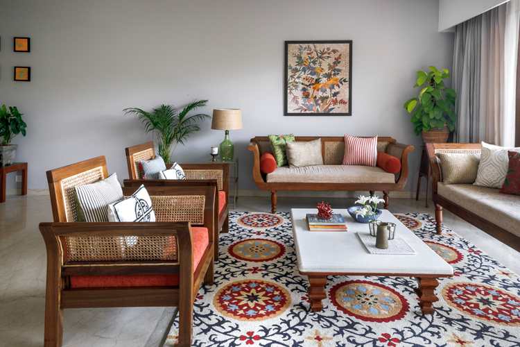
We added corner tables in brass and glass to lighten up the space but still add some glam and shine from Asian Arts and Lohasmith, accessories like a beautiful green lamp from Fabuliv and some smaller accents. We rounded off with simple modern pillows from Nicobar blended with some vibrant patterned ones from Good Earth.
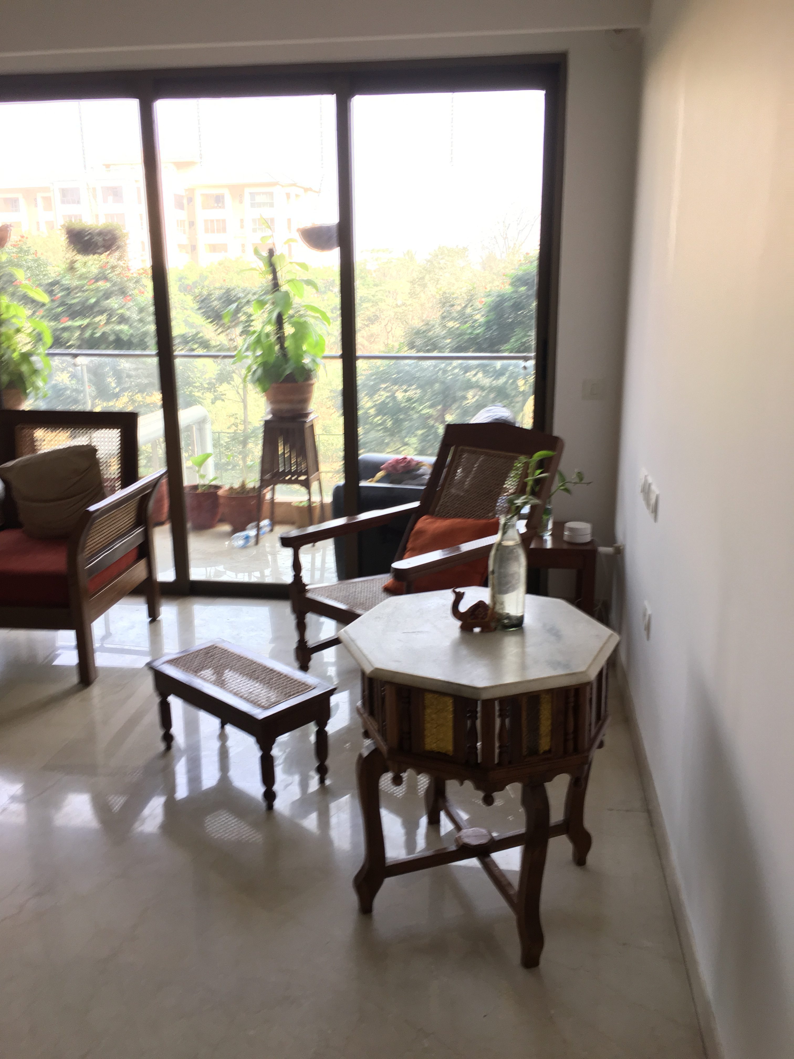
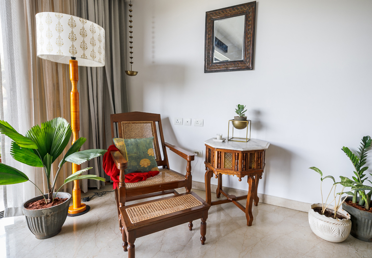
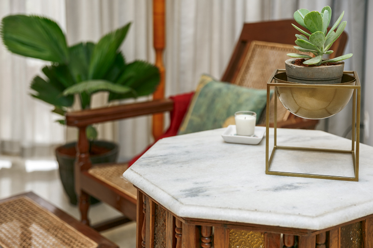
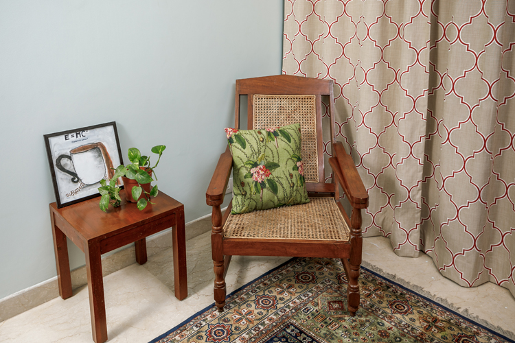
We also broke down the large space into two distinct areas to create visual balance and created a reading nook in the far end with a planters chair and a marble top table the client already had! We added a simple floor lamp with a mustard base and white shade from Purple Turtles and used small accessories like a chic planter from Nicobar and vintage wooden brackets and hanging lamps the client had. I love the charm this little spot brings to the space!
Before
After
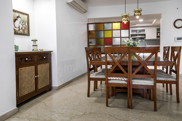
Dining
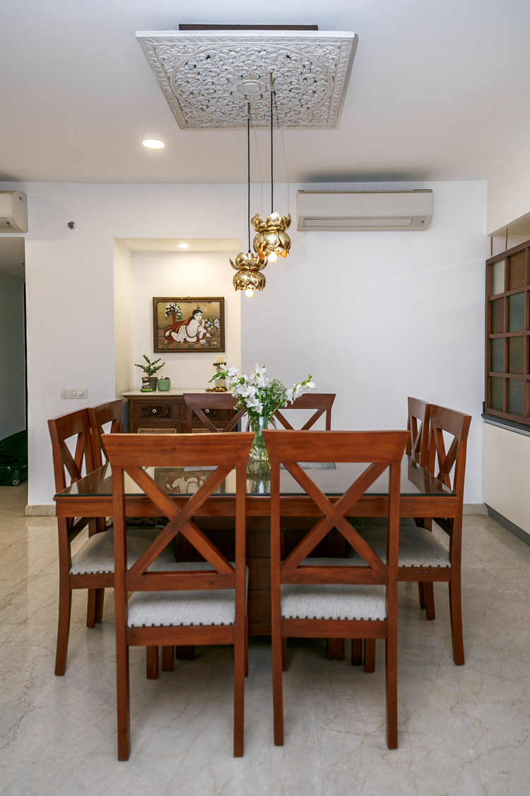
The dining area already had a large dining set and we just added two brass lamps suspended from a ceiling panel that the client already had. I love the way the brass lamps look against the glass screen in the background!
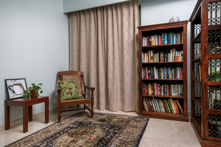
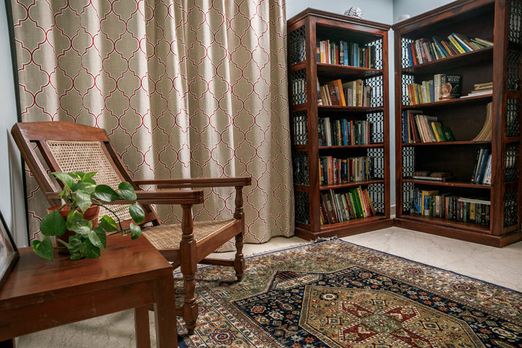
Study
We also refreshed the study room by working with the furniture the client already had and a beautiful navy rug. We chose to paint the walls a pastel seafoam (ocean cliff from asian paints) to complement the rug and added curtains in a Moroccan tile pattern in beige and rust. One of the very simple things we did that changed the feel of this room was to put the two large bookshelves next to each other in a L pattern to create the feel of a little library! Another contrarian approach here….normally you’d want to separate larger pieces to visually lighten the space. But actually grouping them together creates that visual impact and also leaves more open floor space!
Before
After
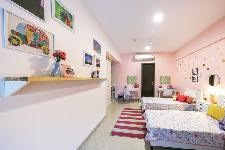
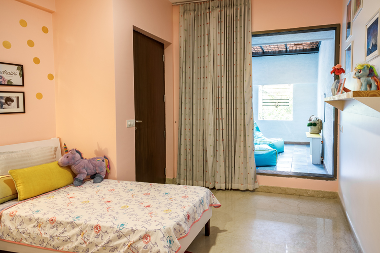
Kids room
Our last and probably the biggest project was to transform the kids room in the house and give it a new look! The girls hadn’t really got the chance to have a well designed room for themselves and this was their chance to create a shared room of their dreams….some of my toughest clients I tell you 😉
But this room has gotten such a transformation, I’m so glad they knew what they wanted and had great ideas for me to work on! Combined with their love for pinks and purples, unicorns and polka dots and my love for modern sleek white elements, we came up with a rather chic room 🙂
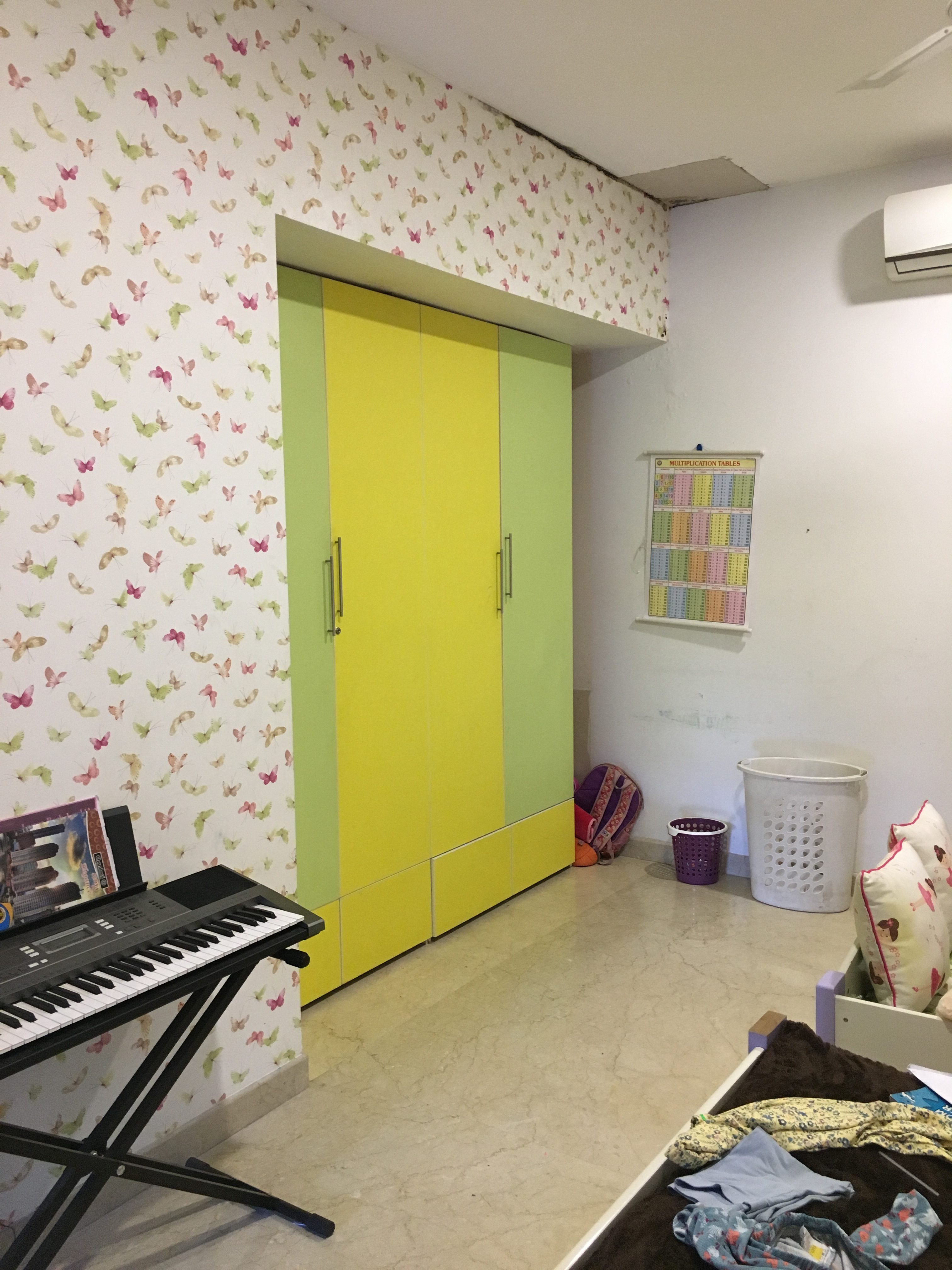
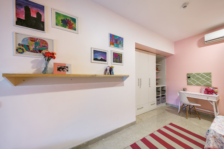
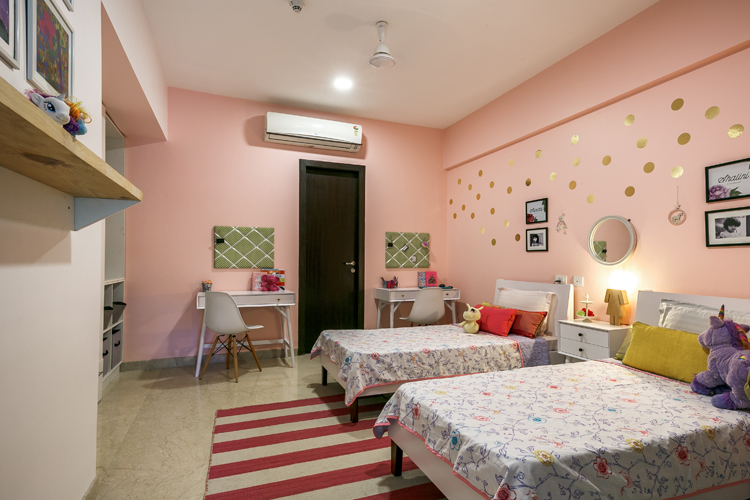
We started with a white room, butterfly wallpaper and wardrobes that were green and yellow. We decided to paint over in a pretty shade of pink (summer pink from asian paints) on two sides and leave one side white, to let the pink pop! The wardrobes got refinished white and we added drawers at the bottom. On the far end of the wardrobe to utilize the space better we added a simple white built in shelving unit to hold books, toys, arts & crafts material etc.
Before
After
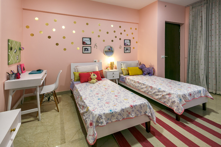
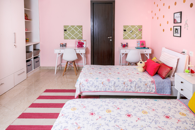
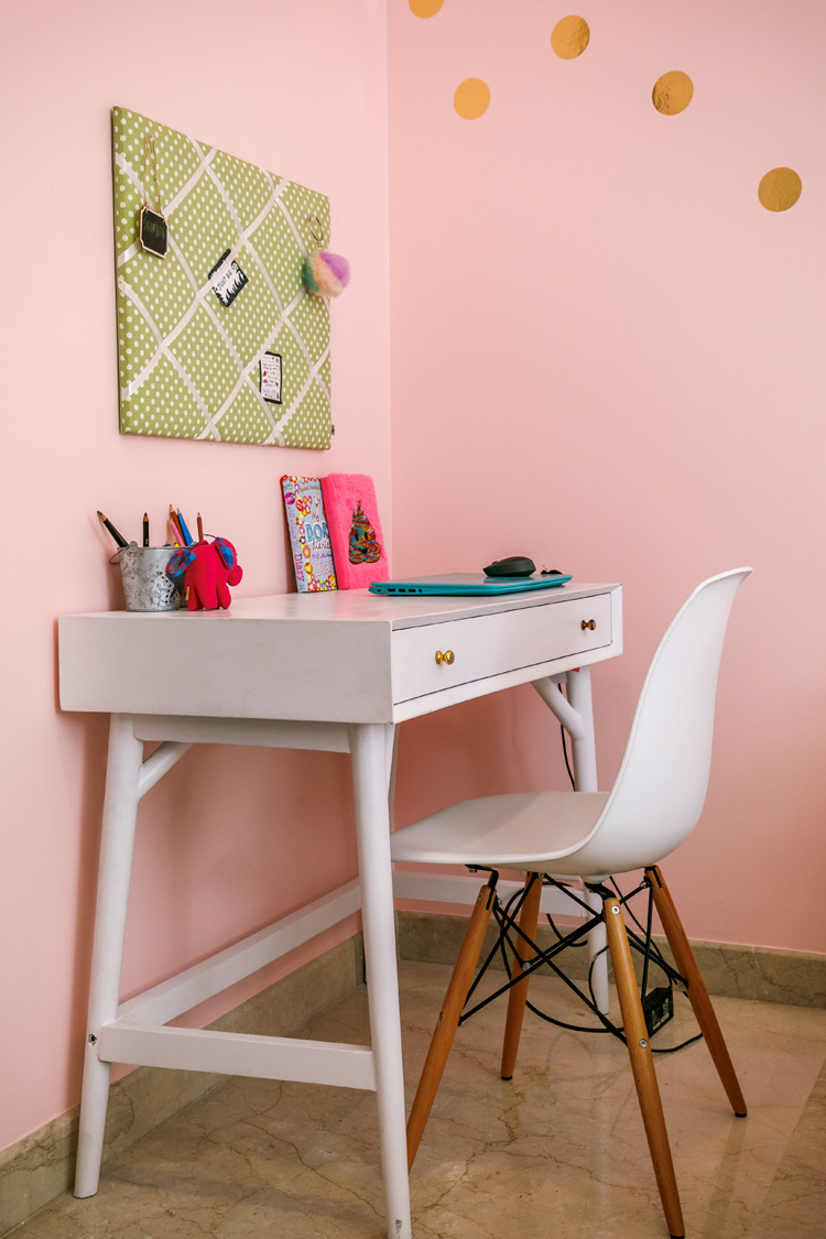
The furniture in the room is simple and modern! White midcentury inspired beds and desks from Asian Arts and simple white eames replica desk chairs from Urban Ladder. It totally freshens up the space and makes it feel lighter and brighter!
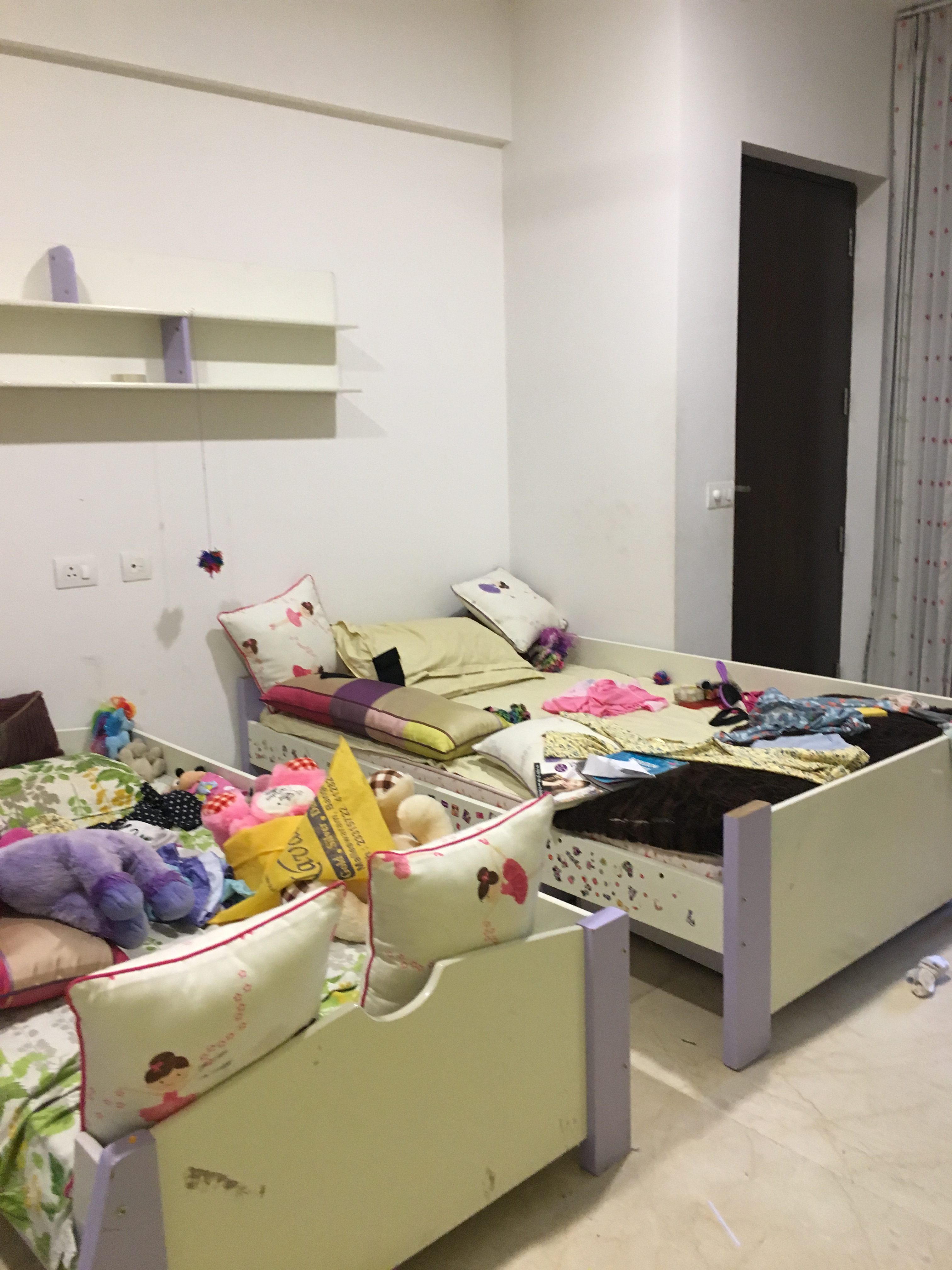
Before
After
Before
After
We added a small nightstand in the middle and one of my favorite accessories in the room is the little girl shaped wood lamp from Purple Turtles…so unexpected and cute!
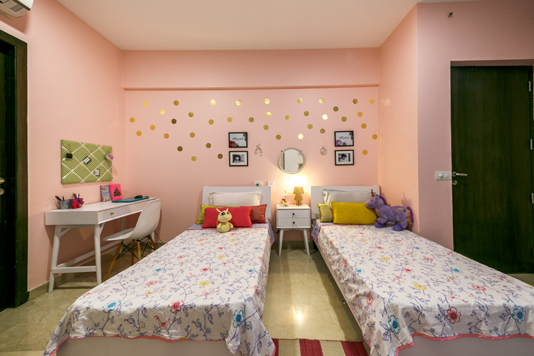
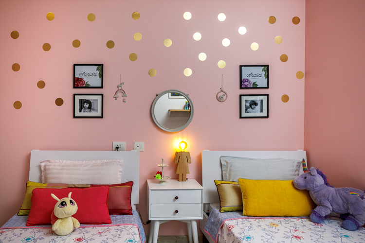
We added polka dot decals in gold on the wall above the bed and personalized the beds with simple black and white photographs of the kids and their name prints that I got custom made from Kookinuts on Etsy. We added a simple bold striped rug from Jaipur rugs in white and fuschia under the beds.
The girls also wanted their own desks and we hung polka dot pin boards from the Wishing chair above each of their desks to give them a spot to pin their stuff!
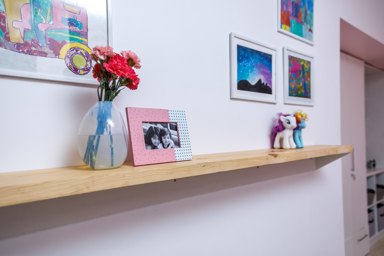
Since both the girls loved art we thought what better art for the room than their own artwork framed. We added a simple natural wood ledge to display photographs and art and created a gallery wall of their artworks above that. I love how this turned out…so simple but so much impact!
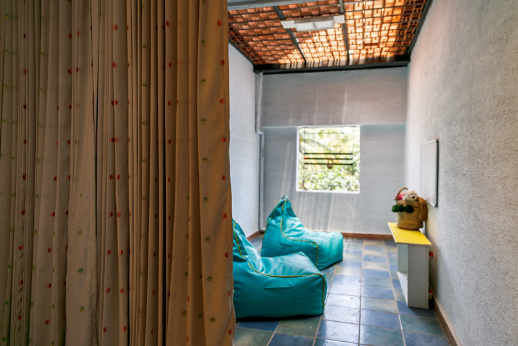
Lastly the girls had a little terrace outside that we dressed up with simple beanbags and a little area for arts and crafts.
Such a transformation this space has undergone!
I loved working on this project and my favorite thing was how we have worked on every different space but kept in line with the character of the house!
I hope you enjoyed this walk through! For more pics and updates check out our portfolio section and follow us on Instagram!
All sources linked and pics by the amazing Matrioshka Media.