Weestyled – A woven basket from Vajor styled three ways!
Created by Vinithra Amarnathan on March 26, 2018
Ever caught yourself browsing an online shop or walking past a physical store and stopping at a product that looks ‘oh so cute!’ but umm, not quite sure how much I can really use it!
Sure that happens to a lot of us! One of the reasons I have one too many black blouses in my wardrobe but nothing to wear when its time to dress for a cocktail party!
I bet the story isn’t too different when it comes to home décor items! We see a lot of lovely decorative items out there for our home but then wonder how often we will use it or if it can be used in a variety of ways rather than have it sitting on the mantle once it got there!
When I got this jute tote basket from Vajor, I instantly thought ‘oh wow! That’s so cute!’ But what really attracted me to it was its versatility – a basket, a tote bag, a plant holder, a storage bin….it could take on many roles! Just what you need whether it’s a fashion purchase, an apparel or from your home décor items – a true workhorse! And this one truly is….stay with me and see how I used this woven basket in three different ways, in three different areas of my home!
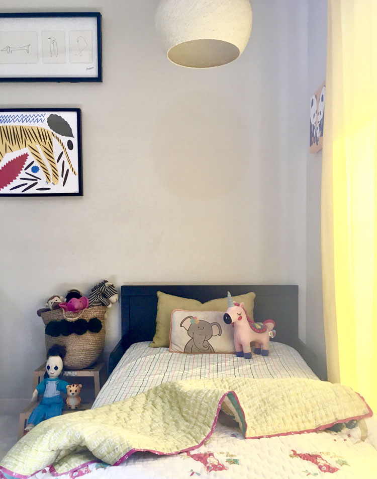
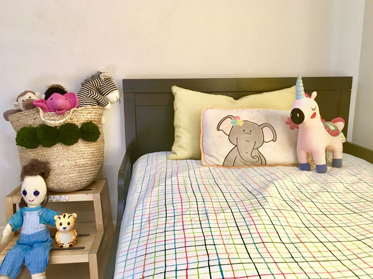
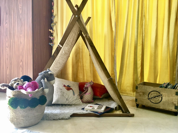
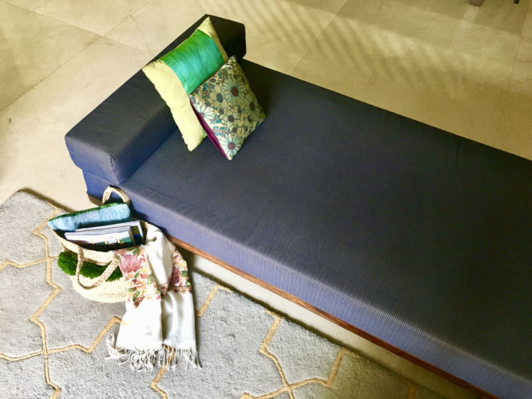
In my kids room
The rounded soft shape and the cute pom poms on the basket screamed kid friendly accessory the minute I saw it! And what mom will undermine an item of storage for her kid’s room! Stuff all their soft toys right in and you not only have something functional but something that also looks sweet in a child’s room! Use it to stow away books, pillows, blankets etc and the best part is it’s so accessible your kids can clean up and put things away all by themselves when they’re done….winner ☺
In my living room
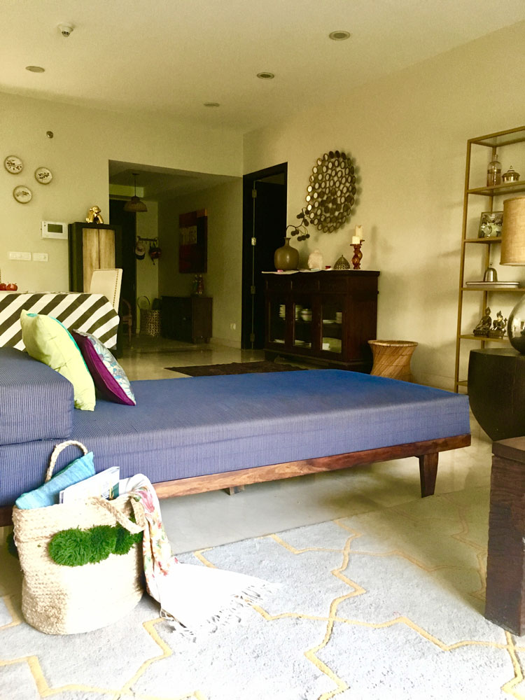
I love making my living/family room cozy with blankets and throws, a few magazines and books and more than necessary pillows 😉 A basket to hold these items is genius! Every time I want to put my feet up and chill, I have to go bring that magazine or blanket before I settle down. Wouldn’t it be nice to have all my favorite essentials lying in an accessible basket that also looks good and fits in with my décor!
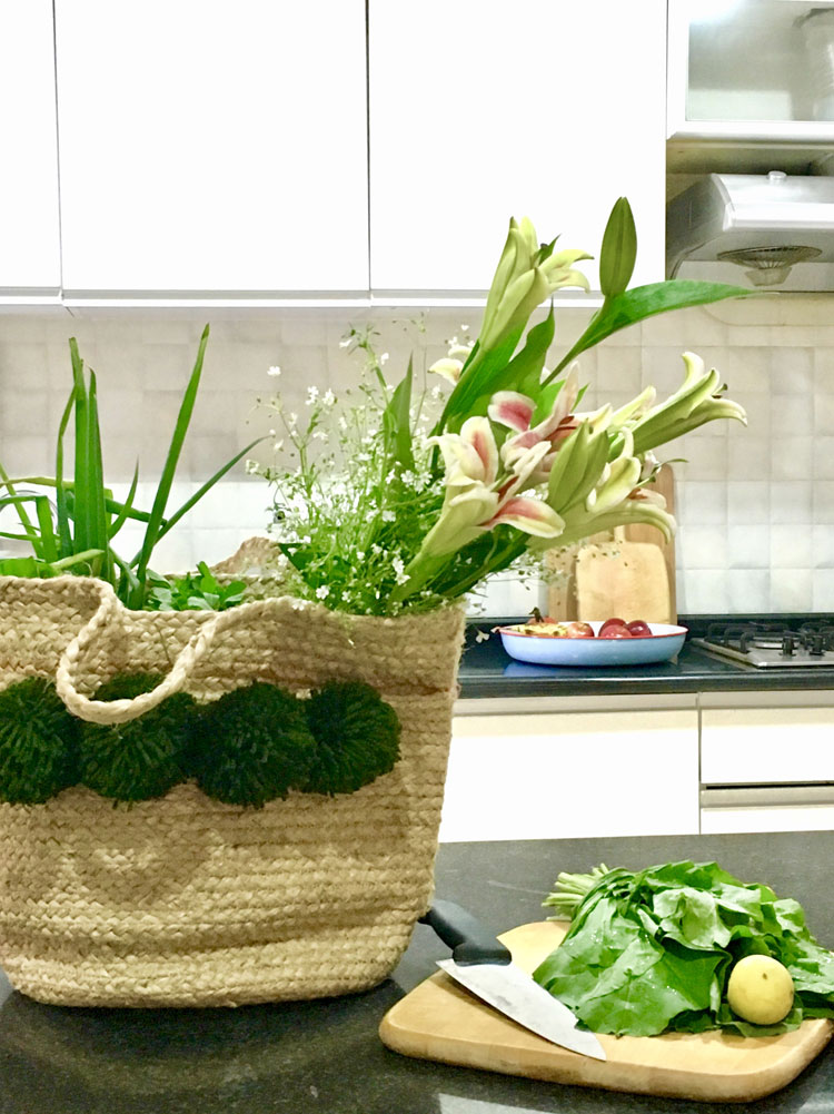
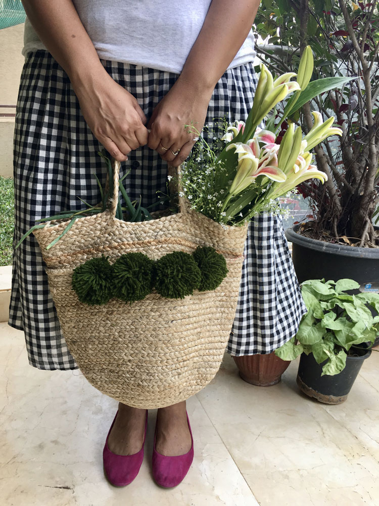
A farmer’s market bag/ In my kitchen
I have never been a big fan of stuffing cloth bags into my purse while running out the door and I invariably end up buying one of those every second time I go shopping! The other day while running out, this pom pom basket was sitting right at the entryway and I thought that’s cute enough to carry to the farmers market or for my errands out! And its one of my favorite ways to use this basket….stuffed with the freshest produce and some flowers for good measure, that bag looks like its made for the Sunday market!
So there you go, three completely different ways to style and use this jute tote basket! Let us know how you used it and send us a picture 🙂 We’d love to see your creative uses for this versatile tote!
A story in color, texture and details – Traditional meets Farmhouse Living/Dining!
Created by Vinithra Amarnathan on March 17, 2018
This one large space is really a beautifully laid out story of the family who lives here and their love for tradition, and the timelessness of it juxtaposed with a modern open world view! And when I look at how seamlessly the design spells that out, I let out a silent hurrah!
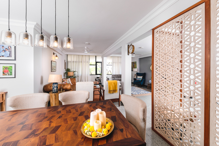
From the sunshine coming through those gorgeous windows and the large expanse of space to the large pillars right in the middle of the room and the dark dining room it was a study in contrasts!
It needed definition of the areas, light and a lot of the new and modern aesthetic while still retaining that old world traditional charm! This was also one of the first times I was working on an older building and it was important to keep that history and tradition intact. Always a tough one when you’re designing with an attempt to bring in the new!
My clients were a small family with two boys in middle and high school and they were finally looking at creating a space that was mature, refined and echoed their taste. Well traveled, well read and with a keen eye for details, they definitely made my job easier! To work on a project with a client who is passionate and interested is half the battle won.
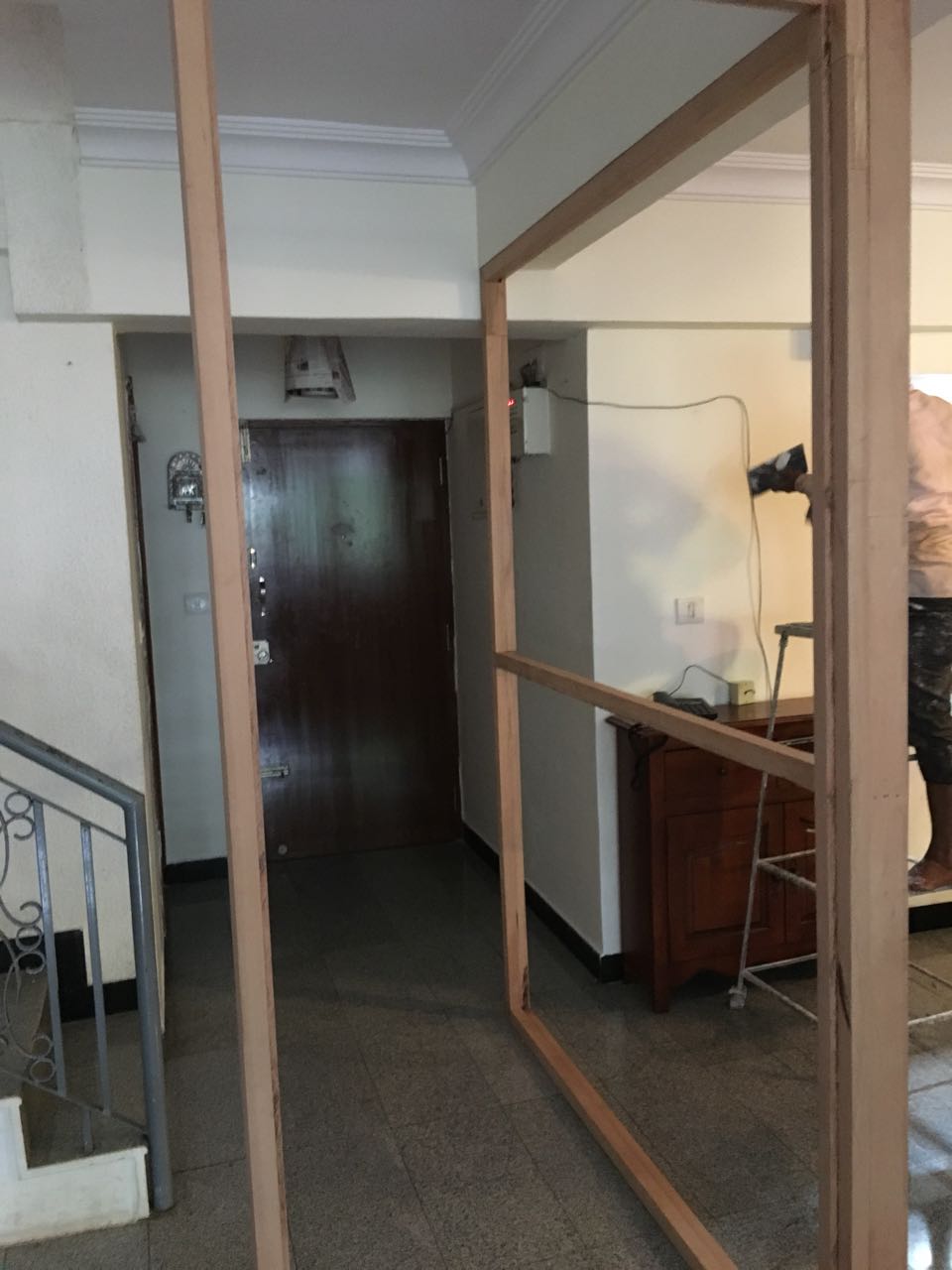
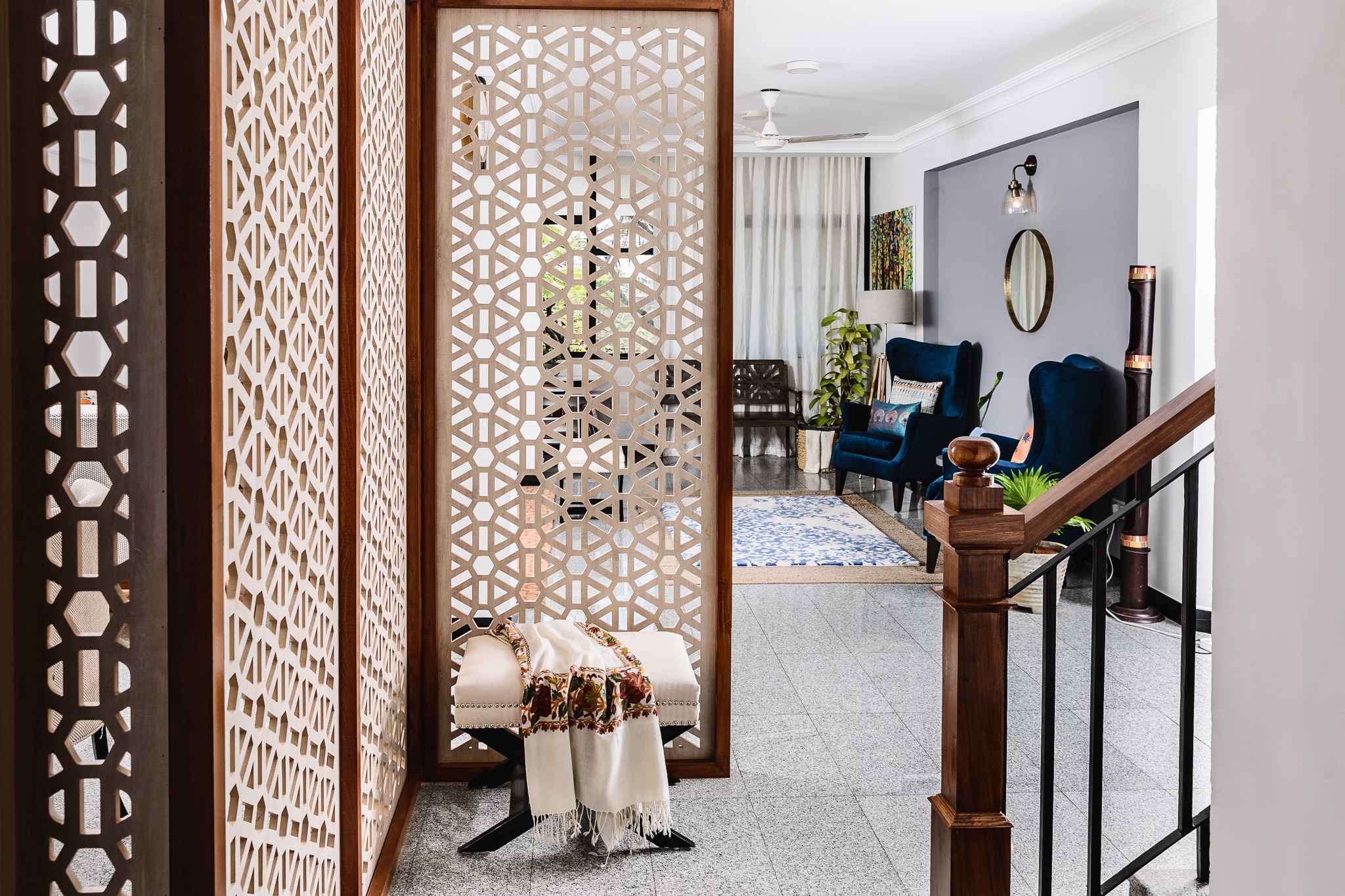
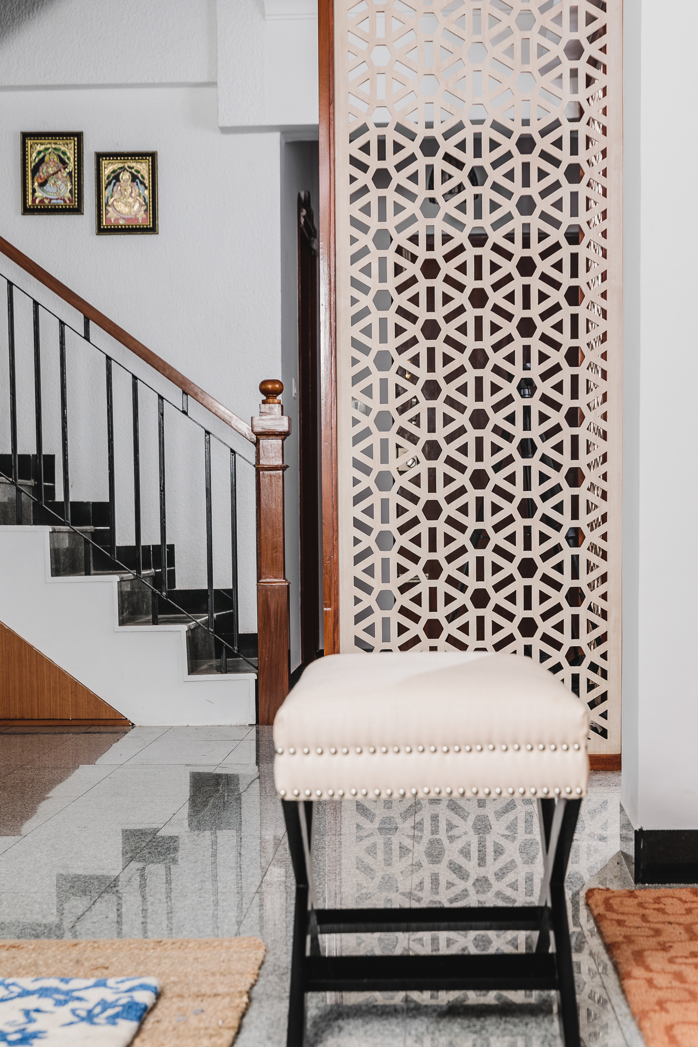
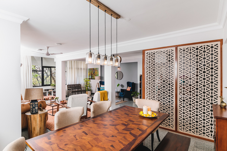
ENTRYWAY
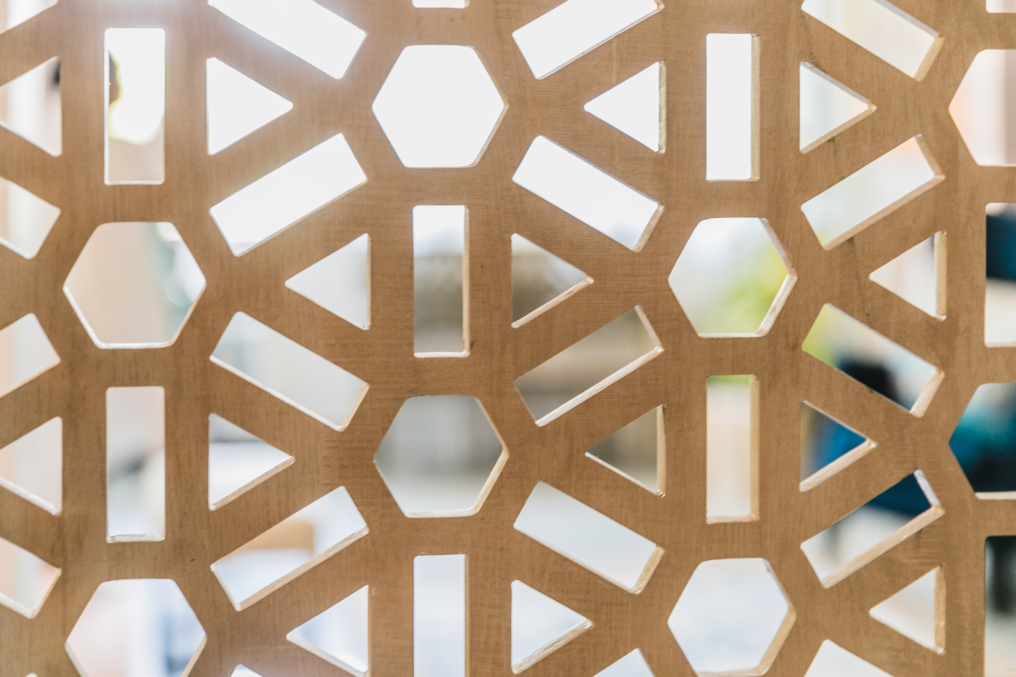
One of the first things the client wanted was a defined entryway and some privacy. Given it was an open living space the entryway looked into the dining as well as living spaces. Our solution was to come up with a screen to partition off a portion of the open space and create an entryway!
The screen is made in a beautiful Moroccan inspired tile pattern in a light ash wood finish with a teak finish frame to give it some weight and plain glass on top to allow light. It’s a great way to define an entryway, get privacy but at the same time retain that open flow! I was initially apprehensive because I’m a sucker for open spaces, but I must say I couldn’t be happier with how it has turned out!
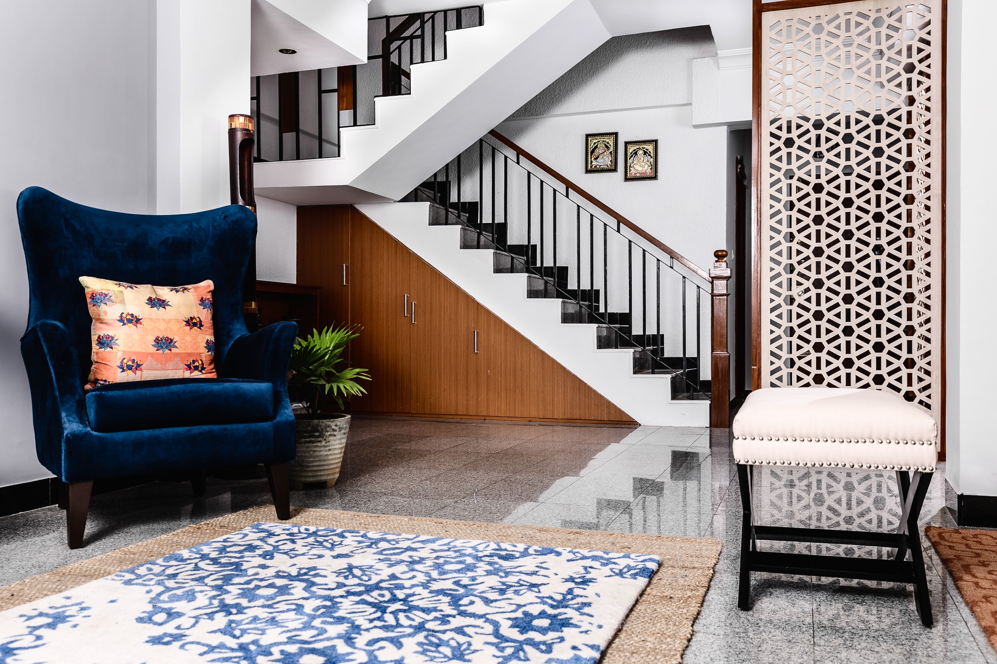
With the new screen coming in we also completely remodeled the stairway and the difference is night and day! Its probably one of my favorite transformations in this space….I mean talk about the kind of change and the impact!
Before
After
Before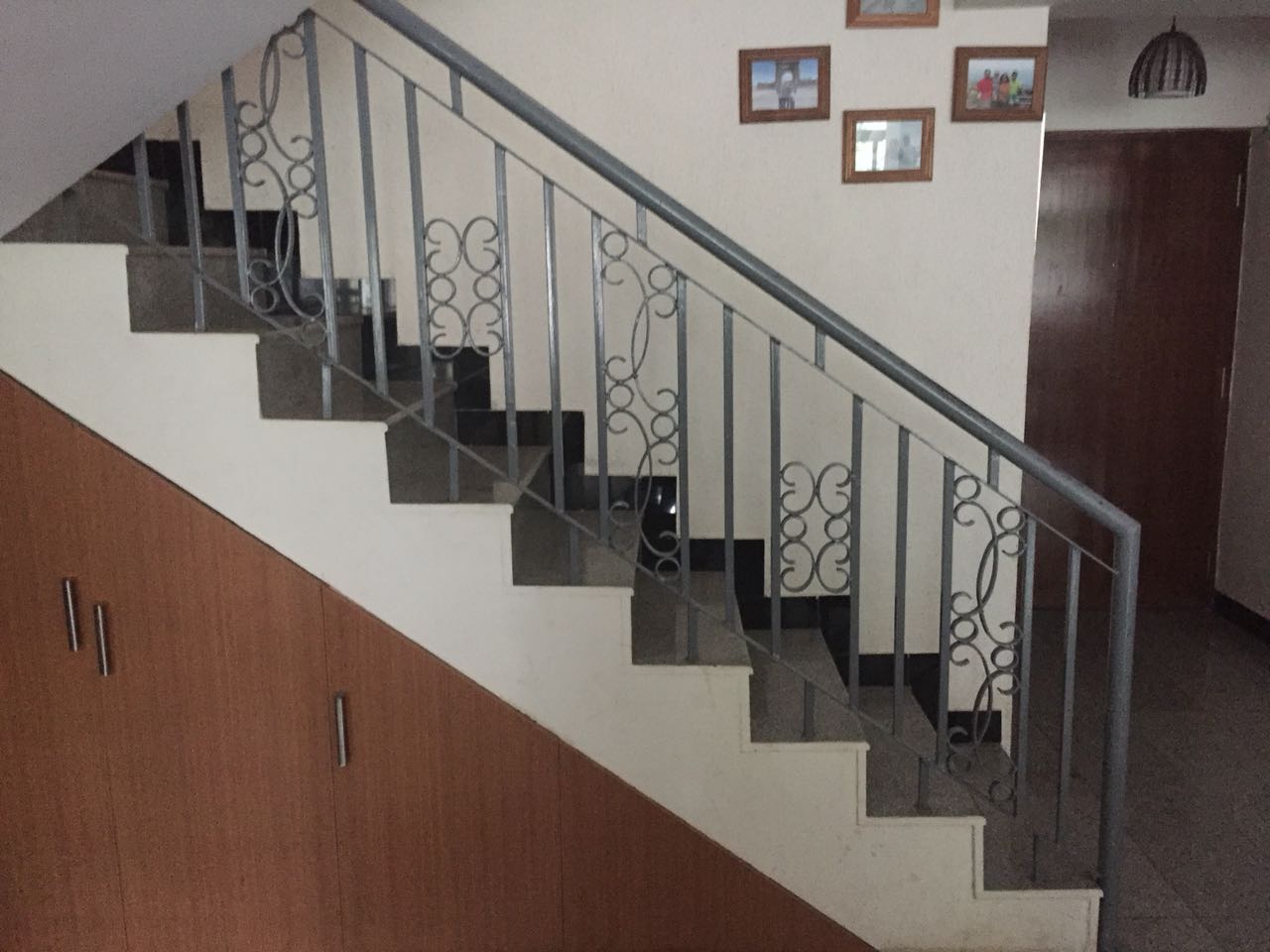
After
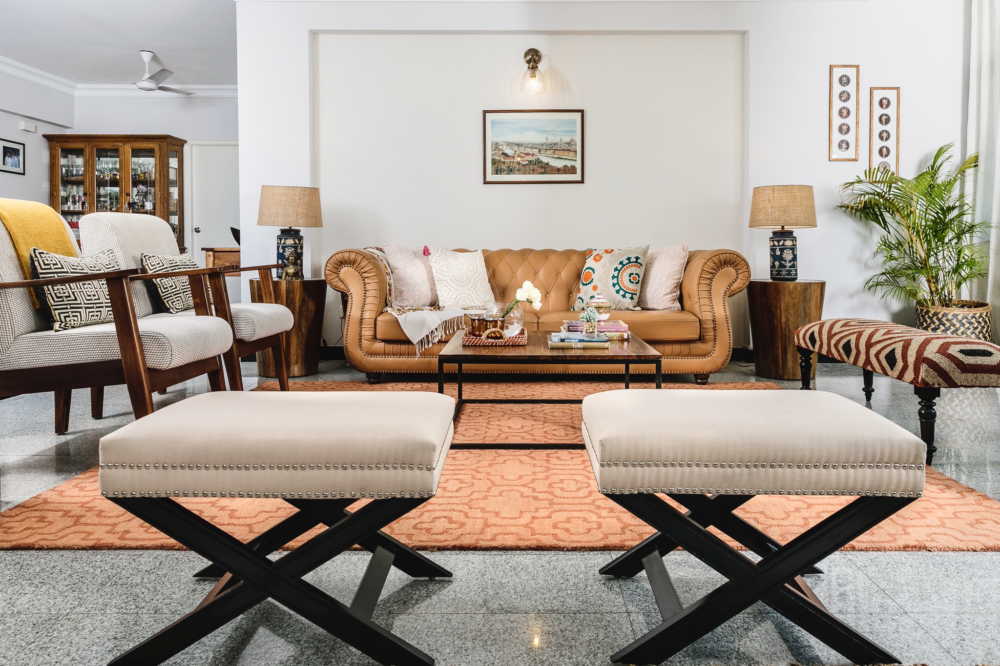
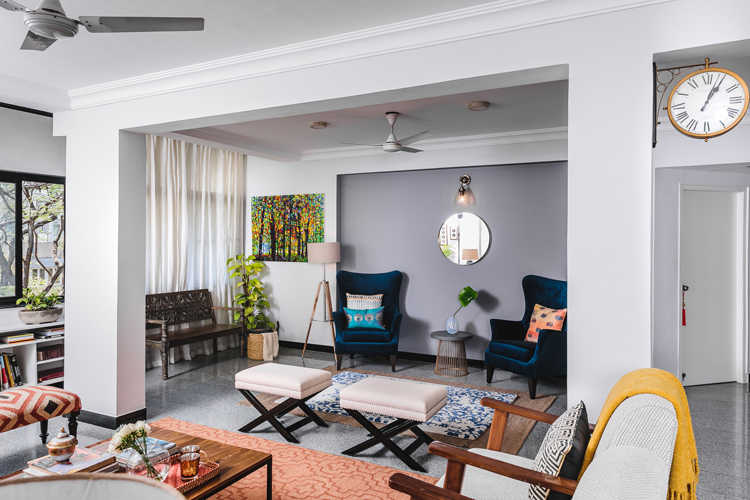
LIVING ROOM
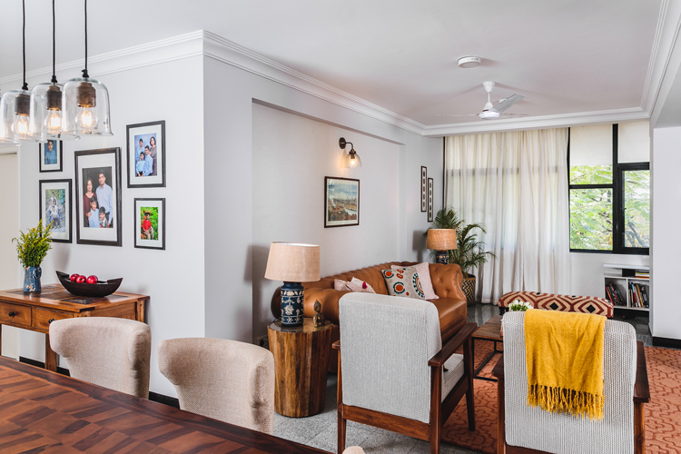
The next step was working on defining areas in the living room to create flow in the space and spots for the eye to rest in. The pillars were structural and had to stay…. so we made friends with them and used them to build two separate areas – a formal living room and a more casual conversation area.
The other element that we wanted to play up was the large windows and the natural light coming through. We kept the curtains easy off white linen and left the window in the center open! What that did was, not only did it allow more light to filter in but it also reiterated the definition of two separate areas in the large living room!
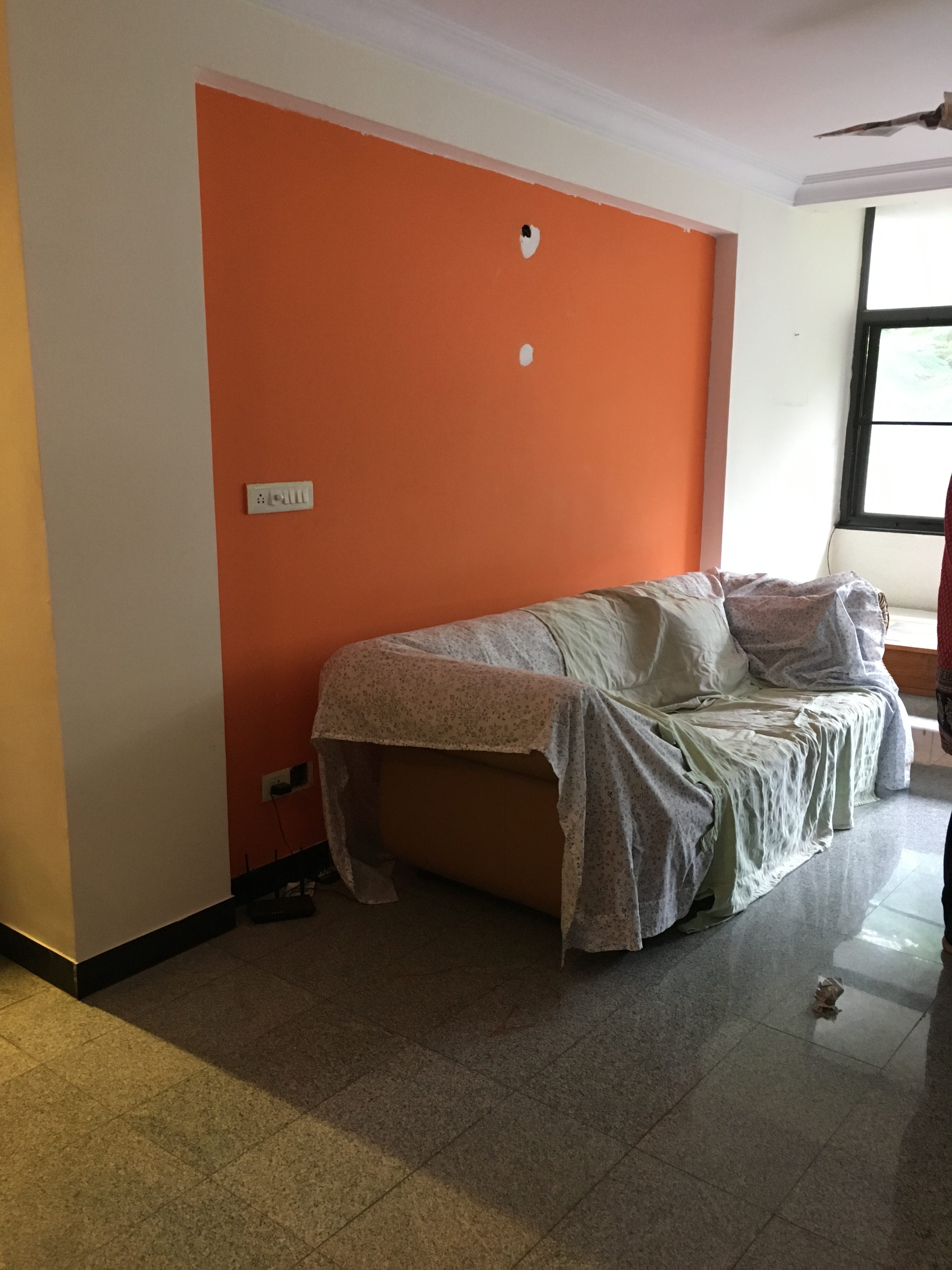
We had two wall nooks on both sides of the living room that were originally painted yellow on one side and orange on the other. We decided to keep all the walls a fresh subtle tone of gray in one of my favorite shades – Autumn Day by Asian Paints and used a textured grass cloth finish wallpaper in a crisp silver on one end in the formal living and a darker gray – Pigeon Gray by Asian Paints on the other end in the conversation area! The paint choices are winning!
Before
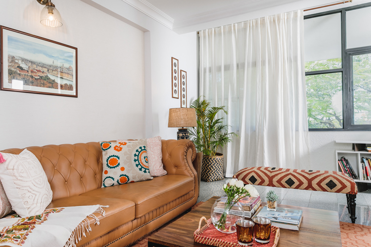
After
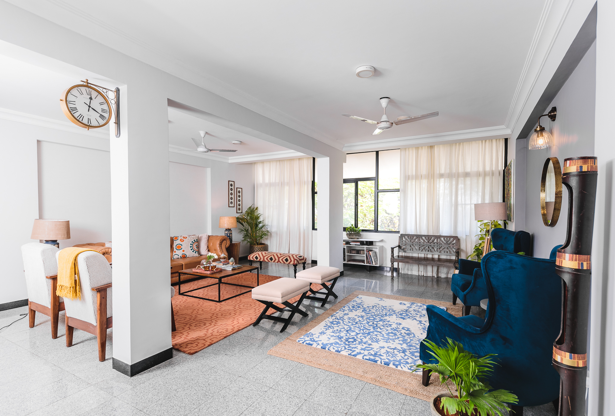
The furniture and the layout were based on comfort and functionality first. That said we agreed on the need to have more versatile pieces like ottomans and a bench so they don’t limit the flow of the space! The large leather couch was something the client already had and wanted to keep. So we worked our design around it and lightened up the rest of the formal living area with custom midcentury inspired chairs upholstered in a beautiful dotted ivory and gray fabric by Maram Furniture and a couple of very chic cross legged ottomans in ivory with contrasting black legs from Rainforest Italy.
One of our favorite pieces in this living room is the gorgeous Terra rug in beautiful earthy terracotta with a subtle tone on tone Moroccan grid pattern from the Rug Republic. It envelops the whole room in its warmth and looks even more gorgeous when the sun shines on it! The kilim bench on the far end from Jaypore is another striking piece that helps tie in all the colors used seamlessly – earthy oranges, black and ivory.
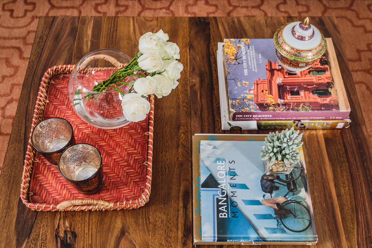
The coffee table from Saraf Furniture and side tables from the Armchair company were simple clean lines with warm wood. I love the round solid wood side tables against the sharp square of the coffee table. We brought in deep blue table lamps with a floral pattern and a rustic jute shade from Fabuliv to pull in some of the blues from the other side. The pillows from Idam, Nicobar and some custom made are kept light and neutral with little pops of color in the pattern.
Before
After
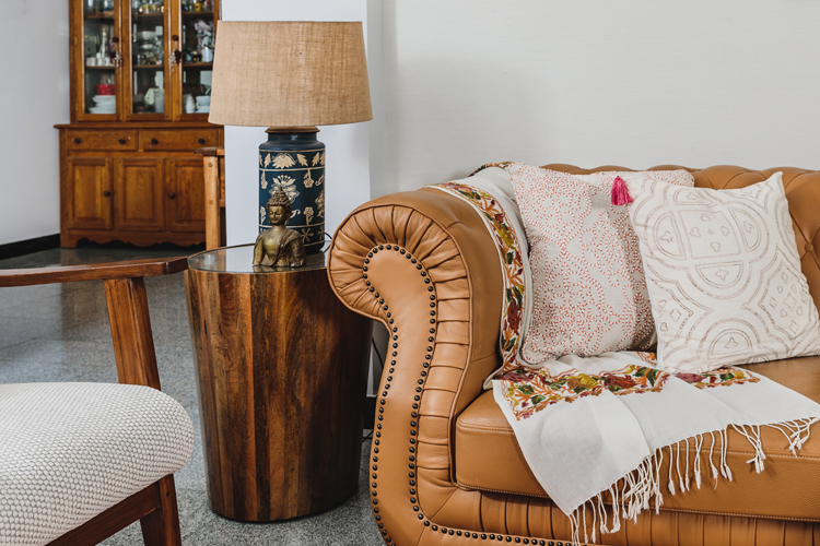
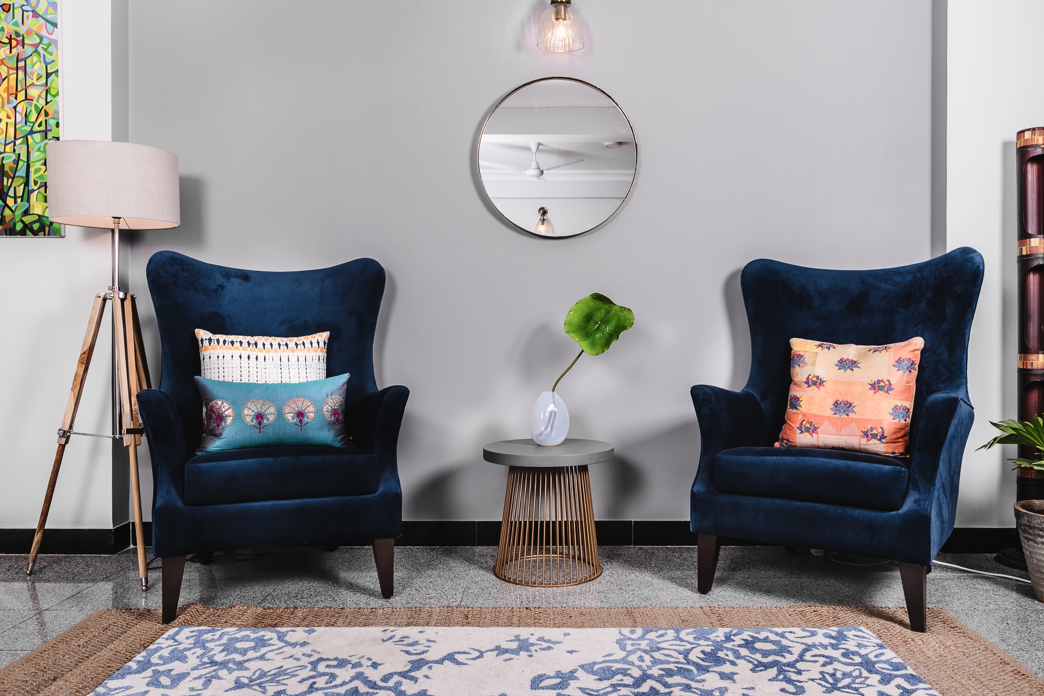
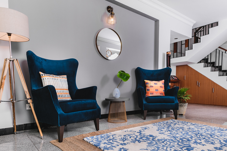
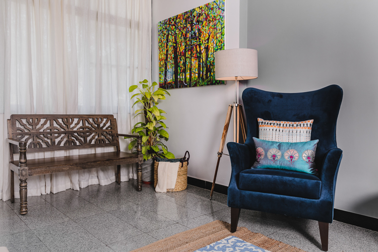
On the other end to ground our conversation area we custom made large wingback chairs in luxurious indigo velvet and I tell you, if you sit on those you ain’t getting up ☺ The warmth of the darker gray and the richness of the saturated indigo velvet are the perfect contrast! A sleek round mirror in a brass frame from Lohasmith and a small round table from Gulmohar Lane to rest your drink on were all we needed to round off this space. The rug choices here also were crucial in pulling the look together. The client loved the idea of a layered rug look I shared and we went with an inexpensive jute rug at the bottom and a smaller vibrant rug in blue and white from Imperial Knots on top. The texture of the jute looks so warm and chic against the blue and grays! Some pillows pulling in the oranges and reds from Idam and a tall floor lamp from Urban Ladder adding some mood lighting are the finishing touches!
Before
After
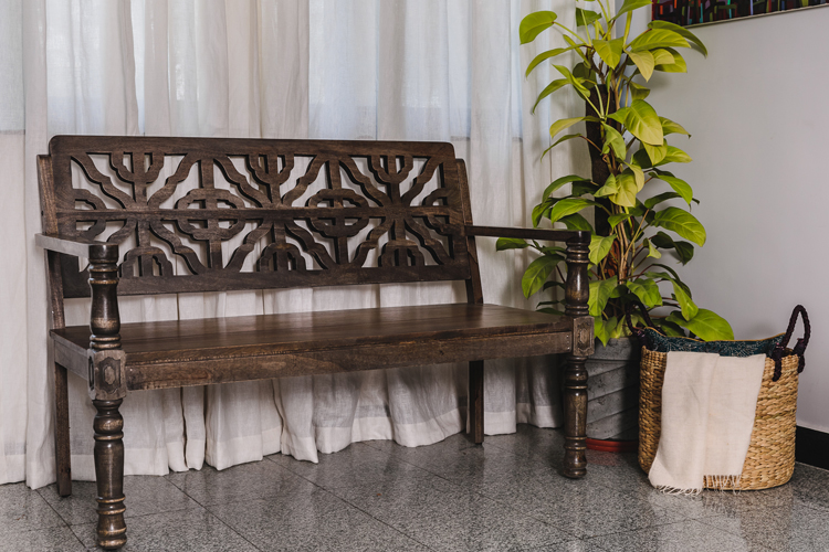
One of the last things we added was that beautiful bench with a carved back from Fabindia by the window and its now a favorite spot for a cup of morning coffee ☺
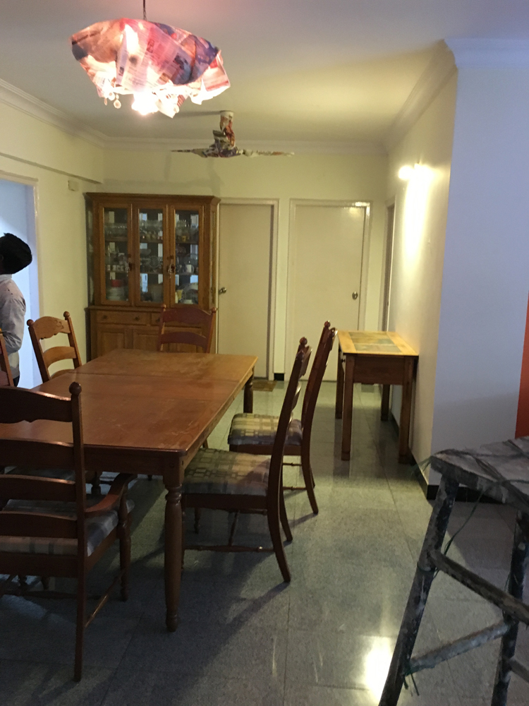
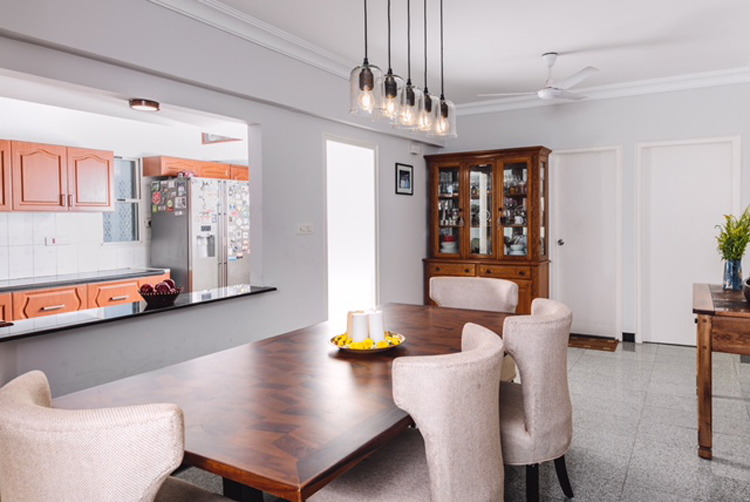
DINING
The dining area was tricky as it didn’t get enough light being on the far end. The first step was to pick a light fixture that would look sleek and modern but also provide light. The client also wanted a larger table and preferred a bench on one side to access the open kitchen counter. So we went with a large farmhouse table with a chevron top from Gulmohar Lane and upholstered chairs in a jute inspired fabric from Asian Arts to give it a chic comfortable look. But the best element is the lighting….a perfect modern farmhouse pendant light on a rustic wood panel from Purple Turtles! It totally makes this dining space come alive!
We complemented the dining room aesthetic and used simple glass sconces that echoed the same modern farmhouse vibe in the living area!
Before
After
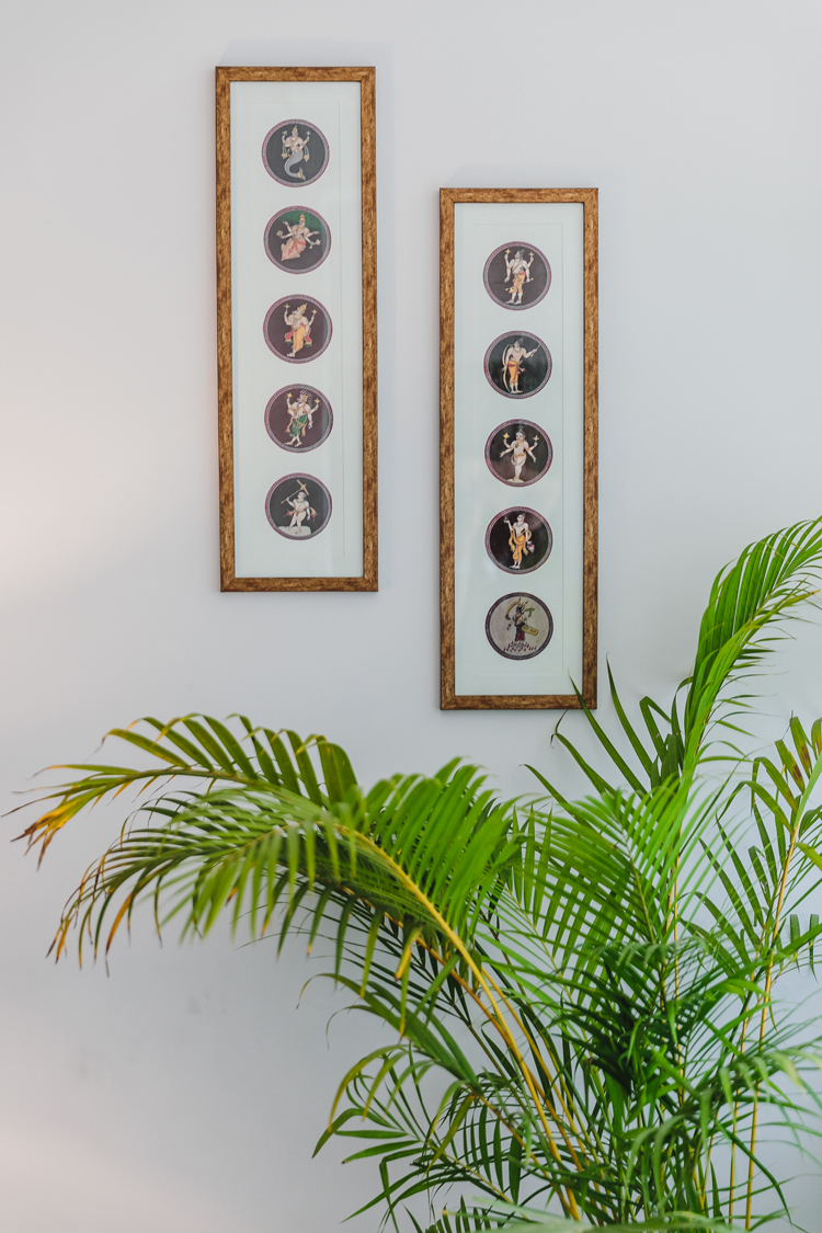
And lastly the art we used here was not just beautiful in tying the space together but also so very personal to the people who live here! In the living room the large painting by the window is the client’s pick and is a burst of colors that sits beautifully against the white walls and flowing curtains. On the opposite end we used an ethnic Indian art called Ganjifa art, which was again, the clients personal pick and framed it in a modern vertical format to amp up the high ceilings in the corner.
The painting above the couch is a watercolor painting of Florence and brings in some beautiful blues and pastels to complement the warm earth tones.
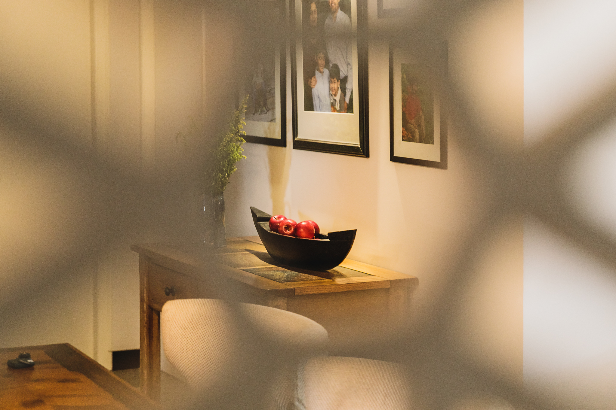
A wall of family photos all framed in cohesive black frames anchors the console in the dining area. A vintage painting of a lady sits pretty on the other end of the dining room flanked by a traditional hanging Indian lamp or diya. A couple of tanjore paintings add interest to the stairway leading to the terrace.
I hope you enjoyed walking through this home with me. Pictures shot by Matrioshka Media.
Follow us on Instagram for more picture updates and sources all of which are tagged.