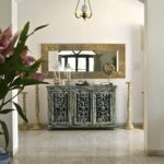
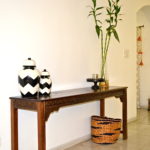
Weestyled – A woven basket from Vajor styled three ways!
Created by Vinithra Amarnathan on March 26, 2018
Ever caught yourself browsing an online shop or walking past a physical store and stopping at a product that looks ‘oh so cute!’ but umm, not quite sure how much I can really use it!
Sure that happens to a lot of us! One of the reasons I have one too many black blouses in my wardrobe but nothing to wear when its time to dress for a cocktail party!
I bet the story isn’t too different when it comes to home décor items! We see a lot of lovely decorative items out there for our home but then wonder how often we will use it or if it can be used in a variety of ways rather than have it sitting on the mantle once it got there!
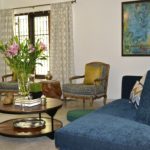
When I got this jute tote basket from Vajor, I instantly thought ‘oh wow! That’s so cute!’ But what really attracted me to it was its versatility – a basket, a tote bag, a plant holder, a storage bin….it could take on many roles! Just what you need whether it’s a fashion purchase, an apparel or from your home décor items – a true workhorse! And this one truly is….stay with me and see how I used this woven basket in three different ways, in three different areas of my home!
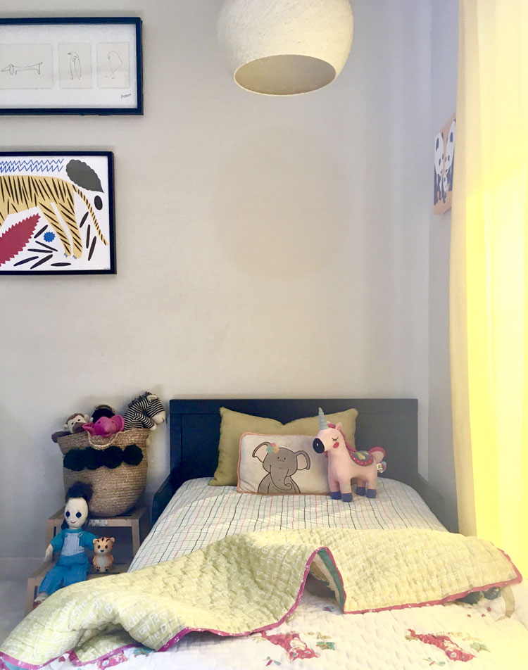
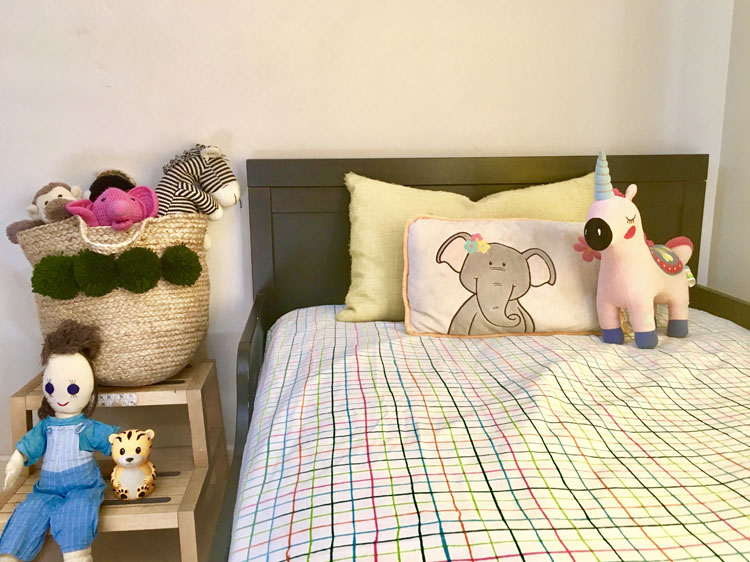
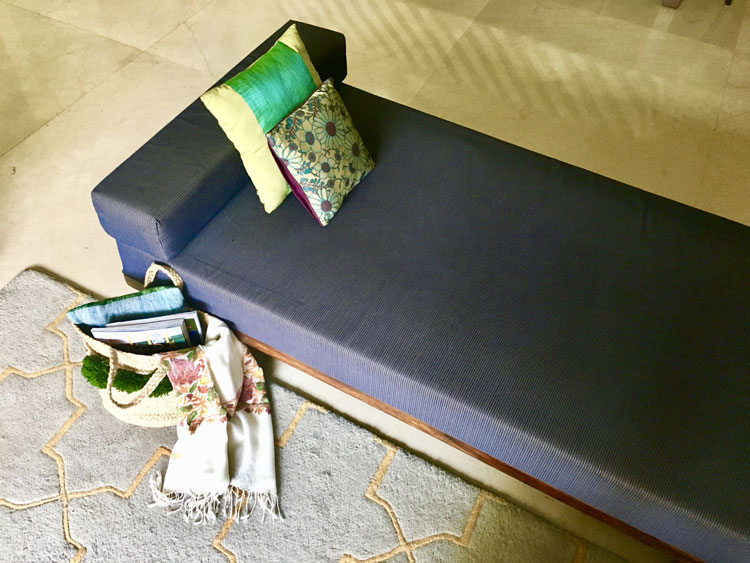
In my kids room
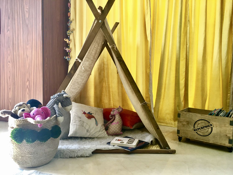
The rounded soft shape and the cute pom poms on the basket screamed kid friendly accessory the minute I saw it! And what mom will undermine an item of storage for her kid’s room! Stuff all their soft toys right in and you not only have something functional but something that also looks sweet in a child’s room! Use it to stow away books, pillows, blankets etc and the best part is it’s so accessible your kids can clean up and put things away all by themselves when they’re done….winner ☺
In my living room
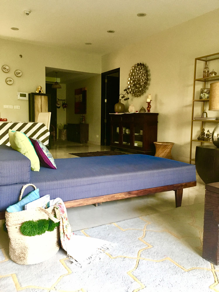
I love making my living/family room cozy with blankets and throws, a few magazines and books and more than necessary pillows 😉 A basket to hold these items is genius! Every time I want to put my feet up and chill, I have to go bring that magazine or blanket before I settle down. Wouldn’t it be nice to have all my favorite essentials lying in an accessible basket that also looks good and fits in with my décor!
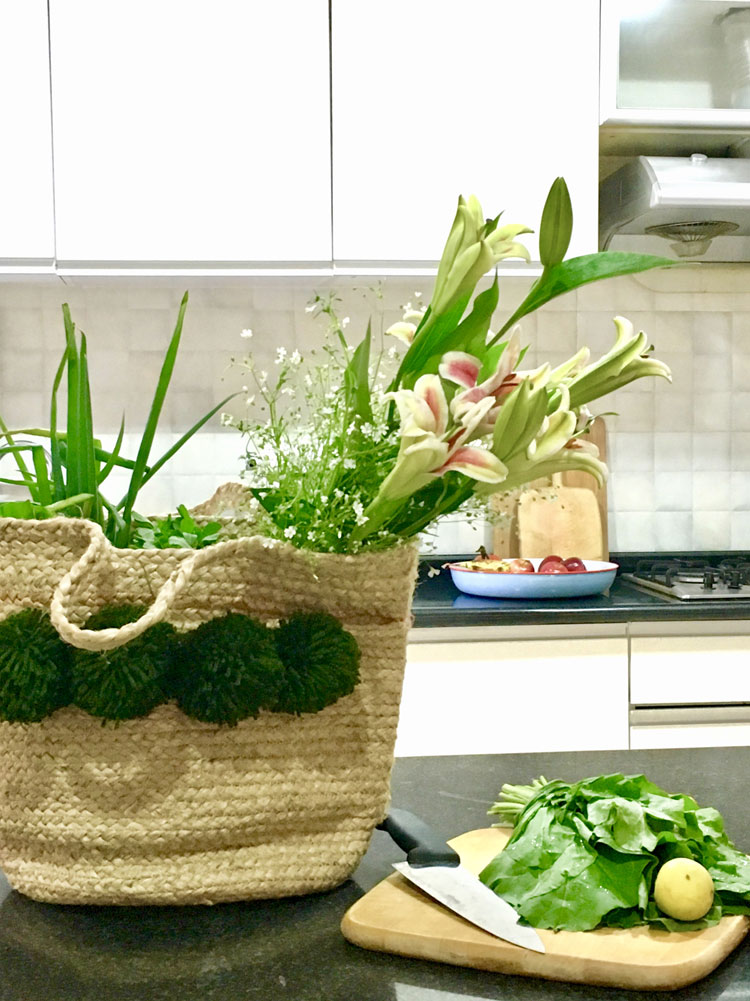
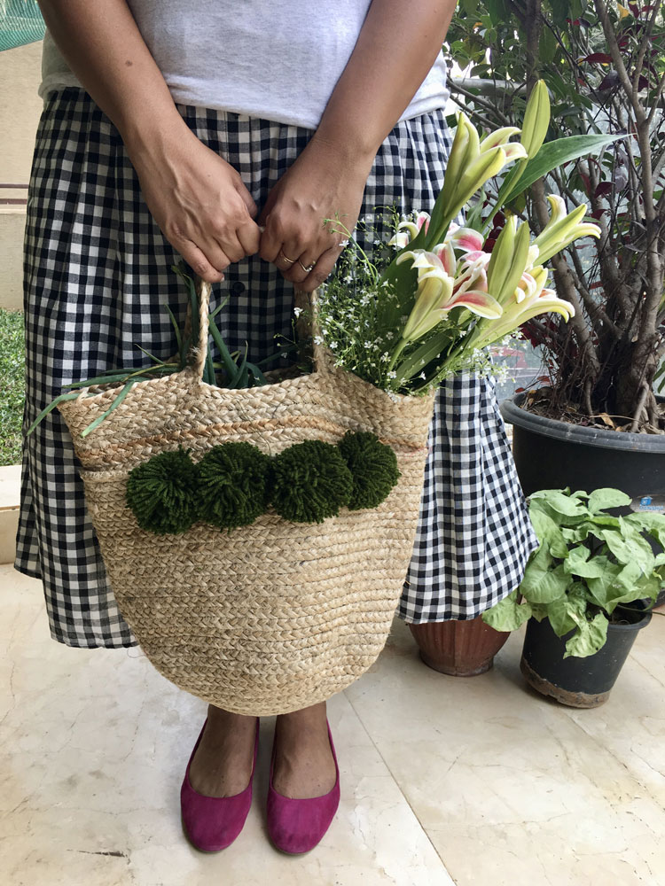
A farmer’s market bag/ In my kitchen
I have never been a big fan of stuffing cloth bags into my purse while running out the door and I invariably end up buying one of those every second time I go shopping! The other day while running out, this pom pom basket was sitting right at the entryway and I thought that’s cute enough to carry to the farmers market or for my errands out! And its one of my favorite ways to use this basket….stuffed with the freshest produce and some flowers for good measure, that bag looks like its made for the Sunday market!
So there you go, three completely different ways to style and use this jute tote basket! Let us know how you used it and send us a picture 🙂 We’d love to see your creative uses for this versatile tote!
A story in color, texture and details – Traditional meets Farmhouse Living/Dining!
Created by Vinithra Amarnathan on March 17, 2018
This one large space is really a beautifully laid out story of the family who lives here and their love for tradition, and the timelessness of it juxtaposed with a modern open world view! And when I look at how seamlessly the design spells that out, I let out a silent hurrah!
From the sunshine coming through those gorgeous windows and the large expanse of space to the large pillars right in the middle of the room and the dark dining room it was a study in contrasts!
It needed definition of the areas, light and a lot of the new and modern aesthetic while still retaining that old world traditional charm! This was also one of the first times I was working on an older building and it was important to keep that history and tradition intact. Always a tough one when you’re designing with an attempt to bring in the new!
My clients were a small family with two boys in middle and high school and they were finally looking at creating a space that was mature, refined and echoed their taste. Well traveled, well read and with a keen eye for details, they definitely made my job easier! To work on a project with a client who is passionate and interested is half the battle won.
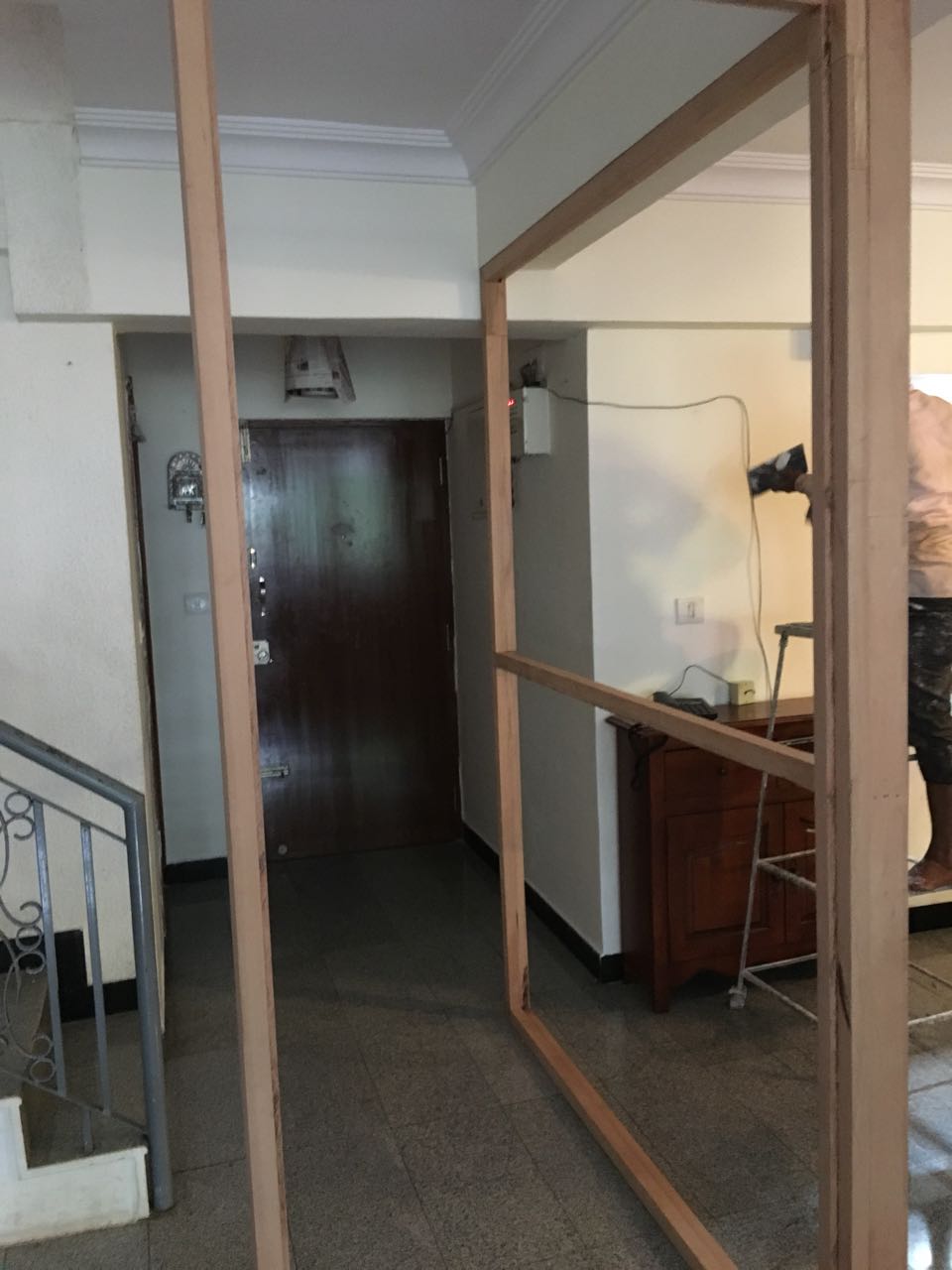
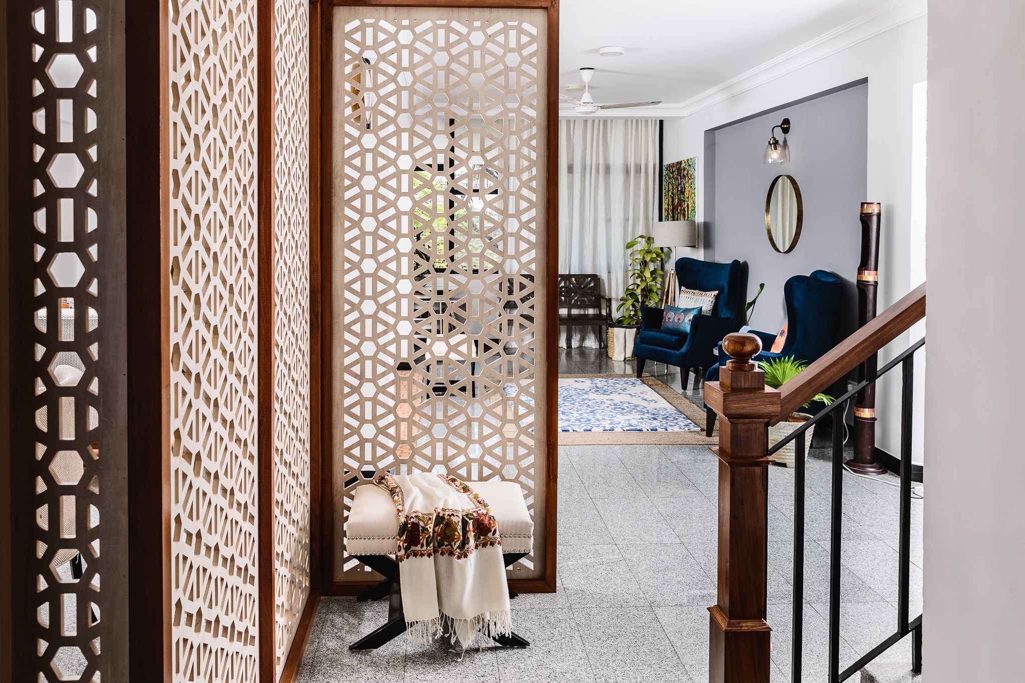
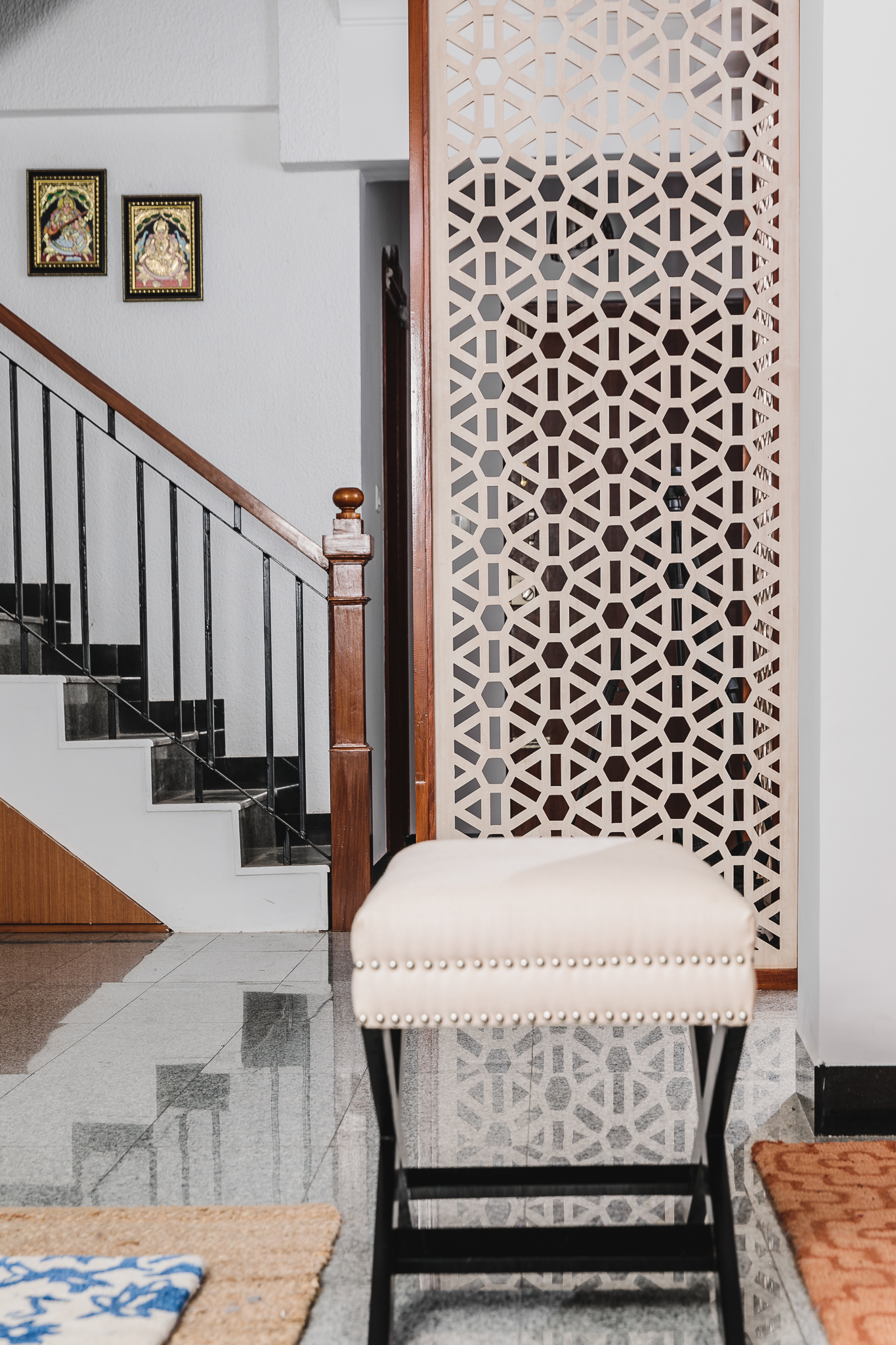
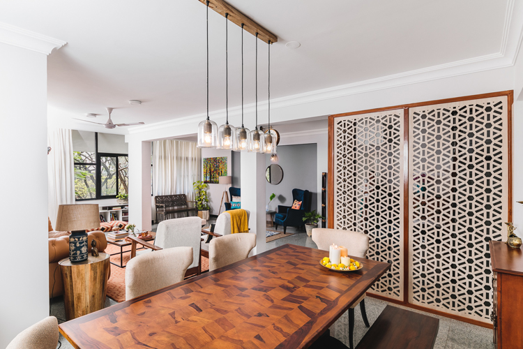
ENTRYWAY
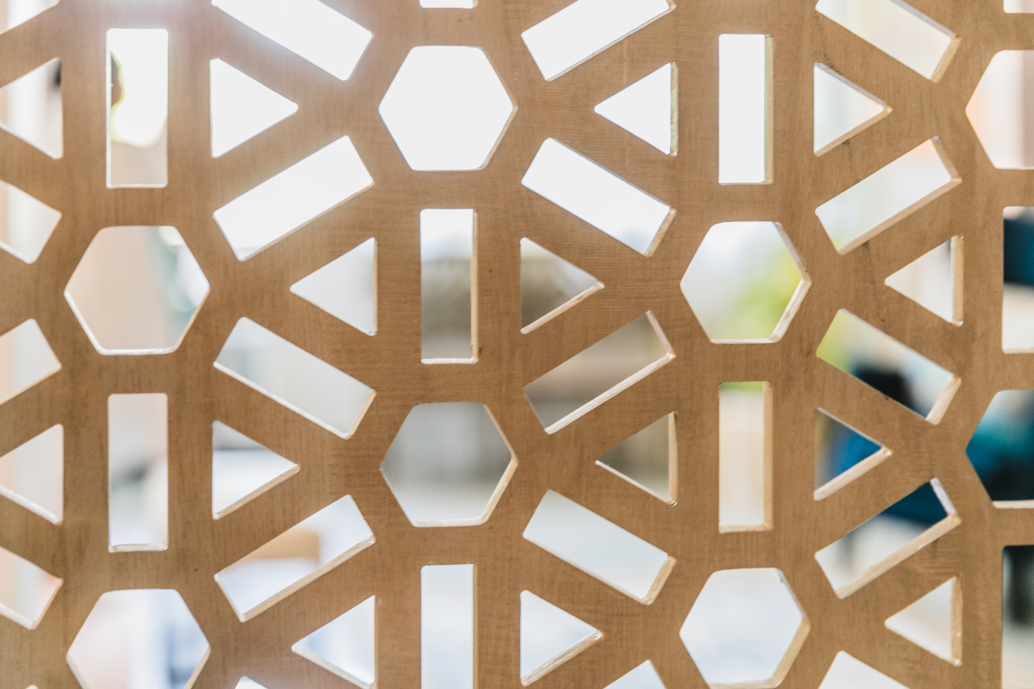
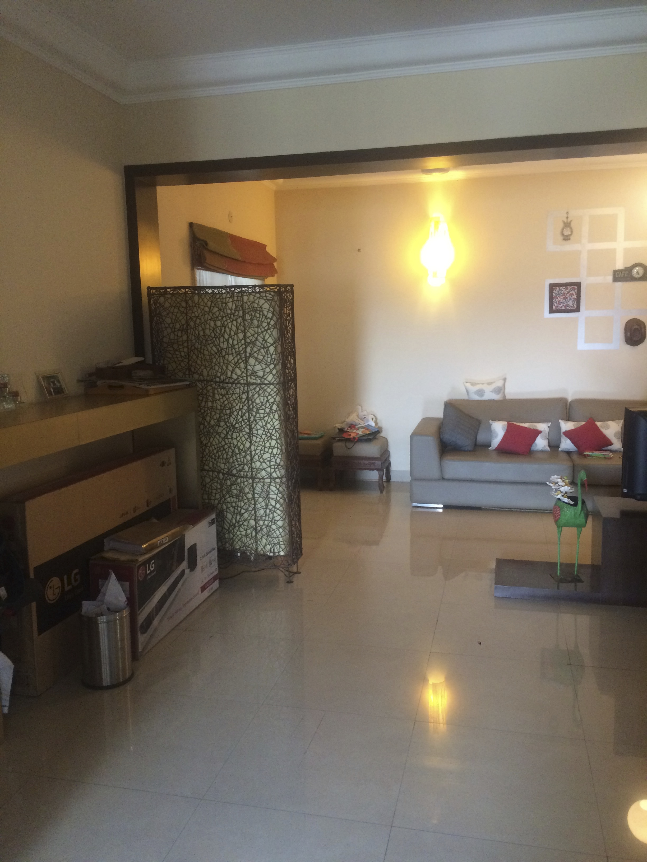
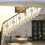
One of the first things the client wanted was a defined entryway and some privacy. Given it was an open living space the entryway looked into the dining as well as living spaces. Our solution was to come up with a screen to partition off a portion of the open space and create an entryway!
The screen is made in a beautiful Moroccan inspired tile pattern in a light ash wood finish with a teak finish frame to give it some weight and plain glass on top to allow light. It’s a great way to define an entryway, get privacy but at the same time retain that open flow! I was initially apprehensive because I’m a sucker for open spaces, but I must say I couldn’t be happier with how it has turned out!
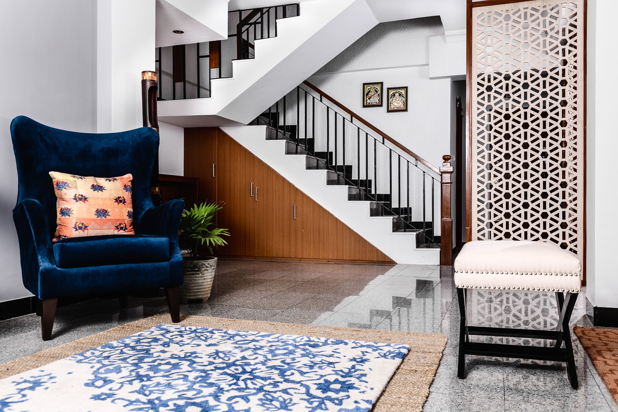
With the new screen coming in we also completely remodeled the stairway and the difference is night and day! Its probably one of my favorite transformations in this space….I mean talk about the kind of change and the impact!
Before
After
Before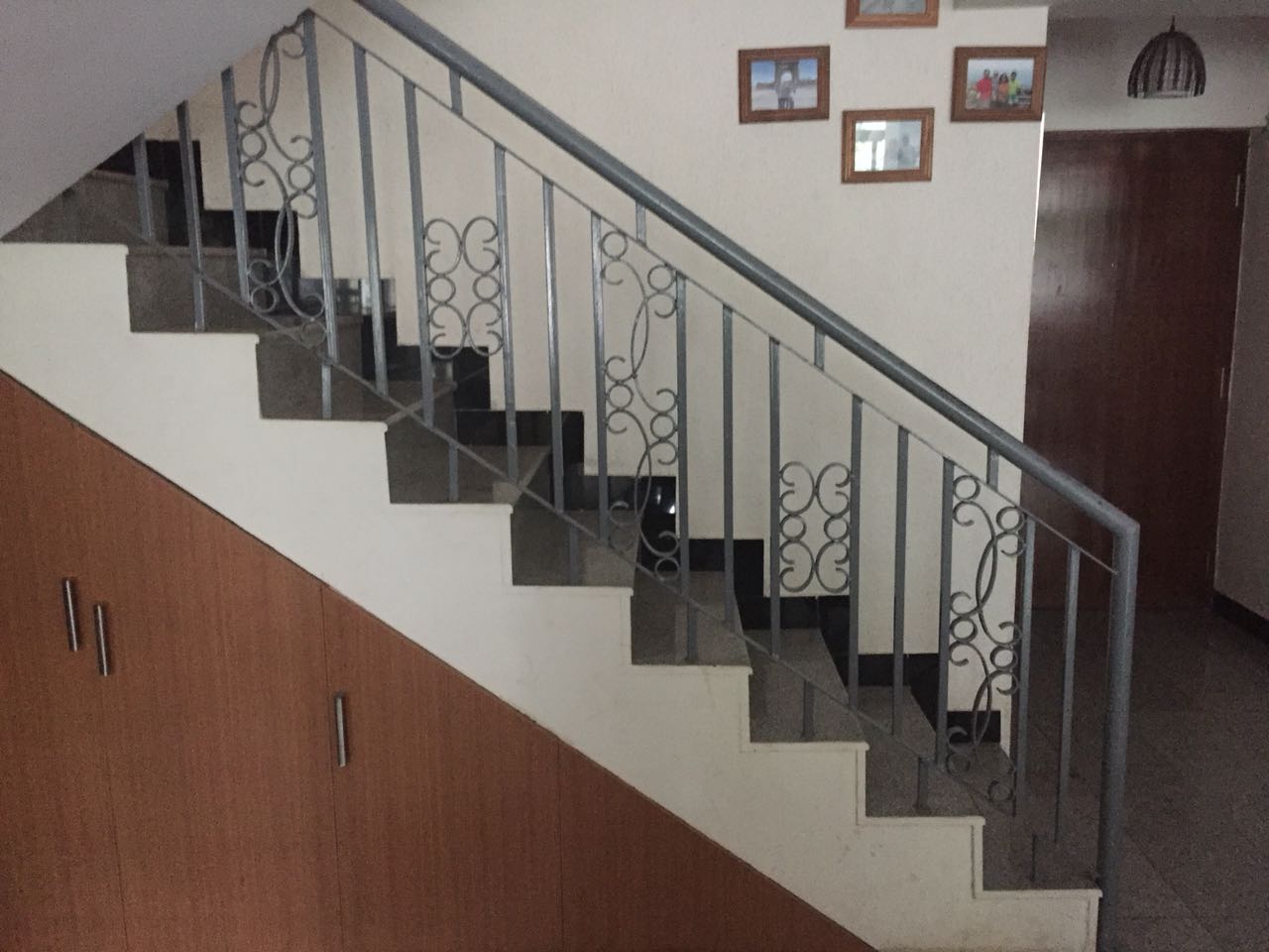
After
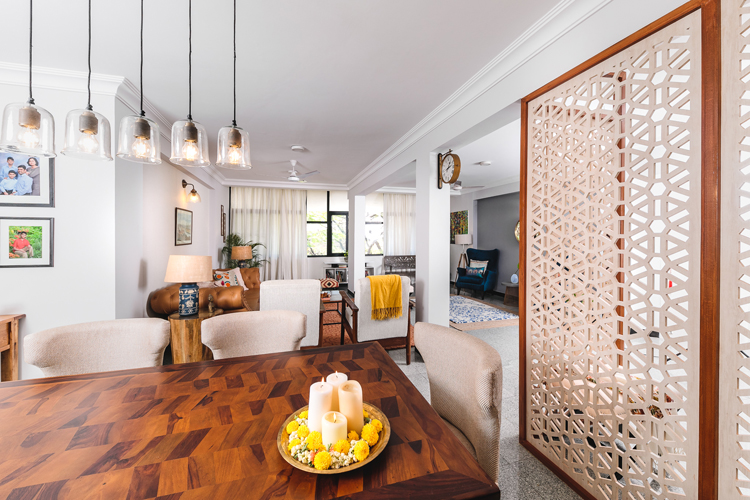
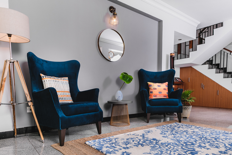
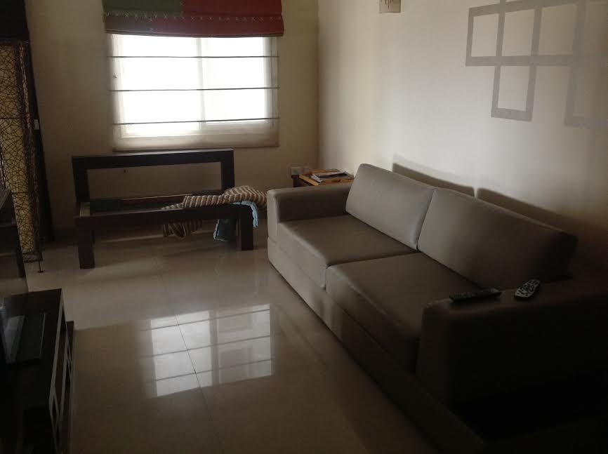
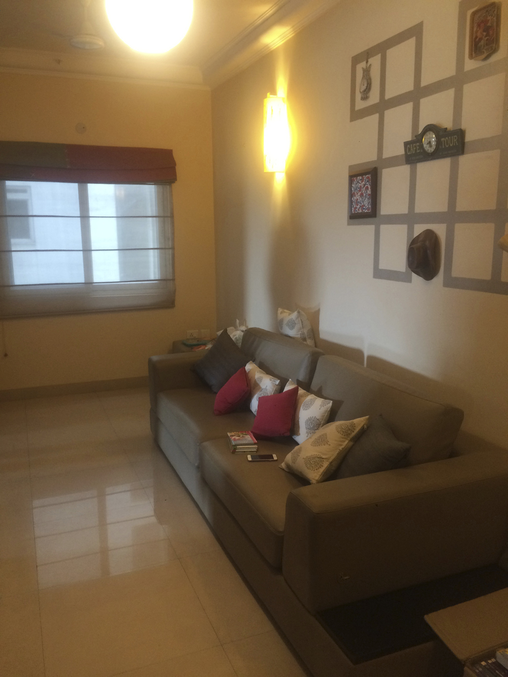
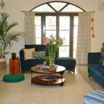
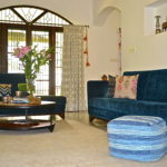
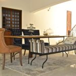
LIVING ROOM
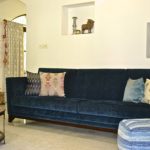
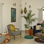
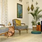
The next step was working on defining areas in the living room to create flow in the space and spots for the eye to rest in. The pillars were structural and had to stay…. so we made friends with them and used them to build two separate areas – a formal living room and a more casual conversation area.
The other element that we wanted to play up was the large windows and the natural light coming through. We kept the curtains easy off white linen and left the window in the center open! What that did was, not only did it allow more light to filter in but it also reiterated the definition of two separate areas in the large living room!
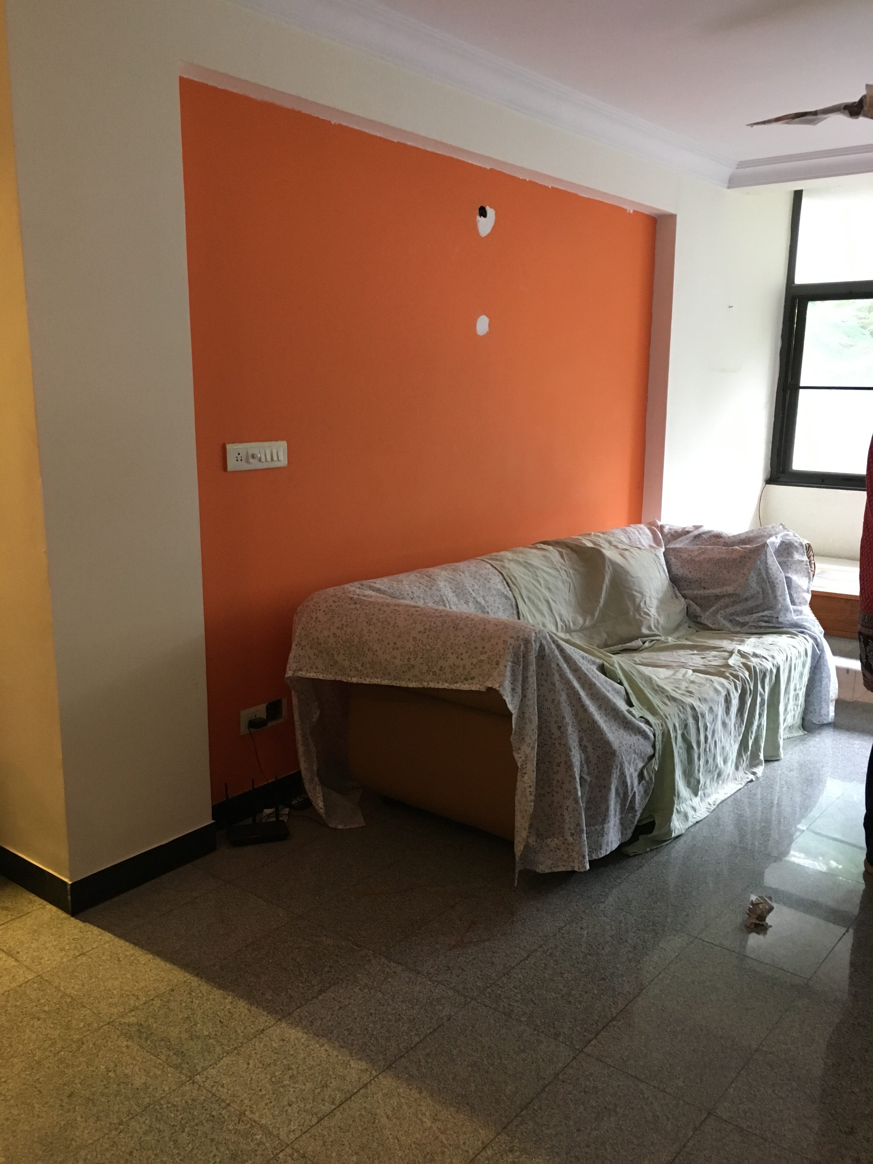
We had two wall nooks on both sides of the living room that were originally painted yellow on one side and orange on the other. We decided to keep all the walls a fresh subtle tone of gray in one of my favorite shades – Autumn Day by Asian Paints and used a textured grass cloth finish wallpaper in a crisp silver on one end in the formal living and a darker gray – Pigeon Gray by Asian Paints on the other end in the conversation area! The paint choices are winning!
Before
After
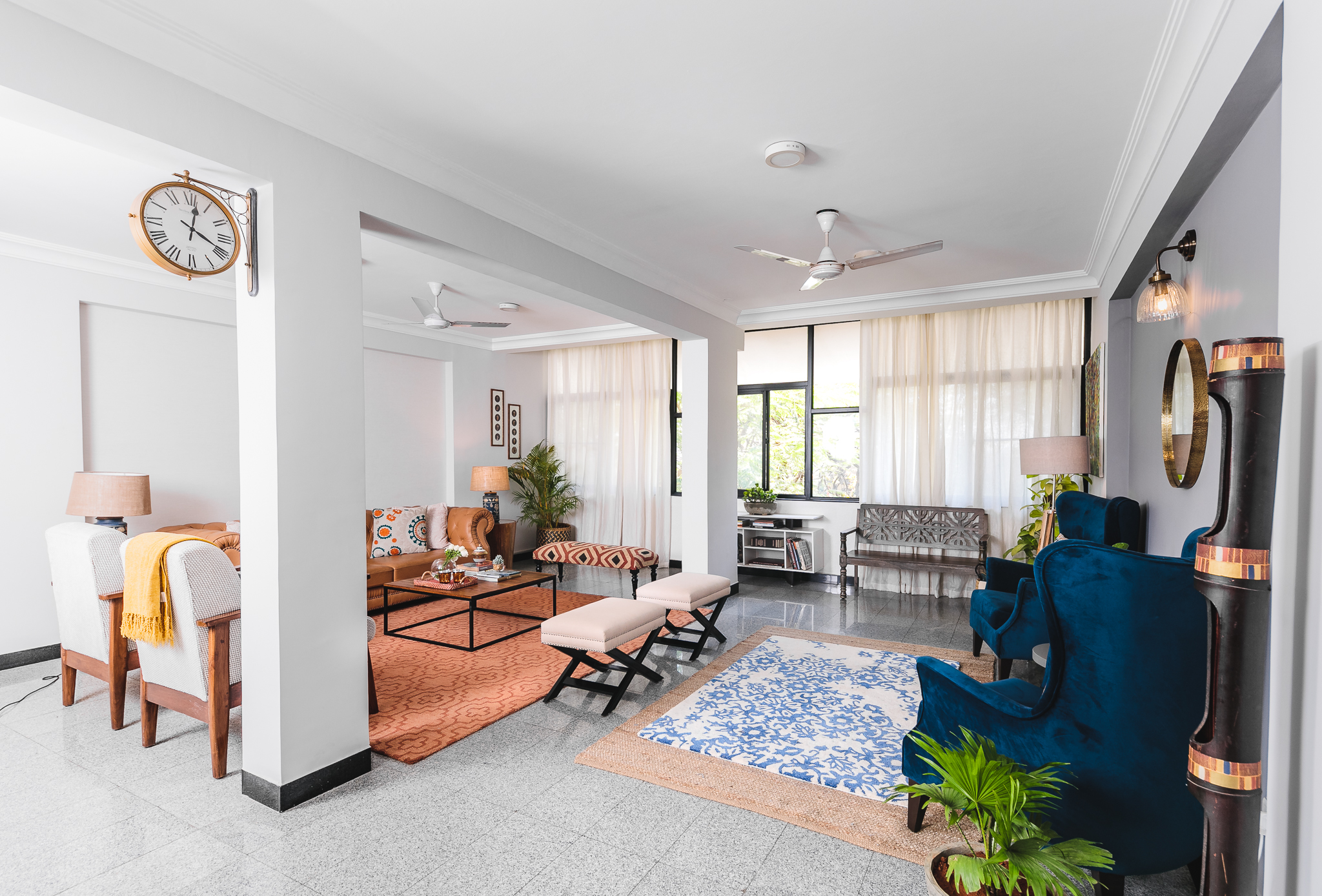
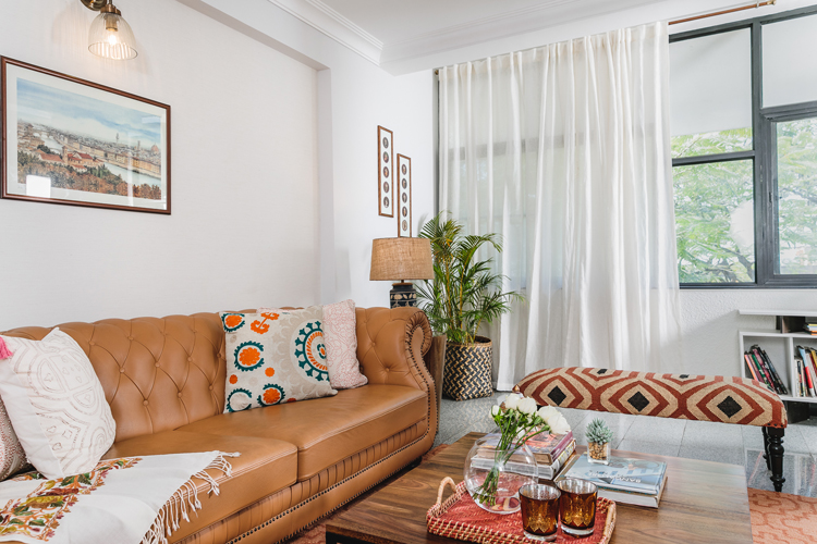
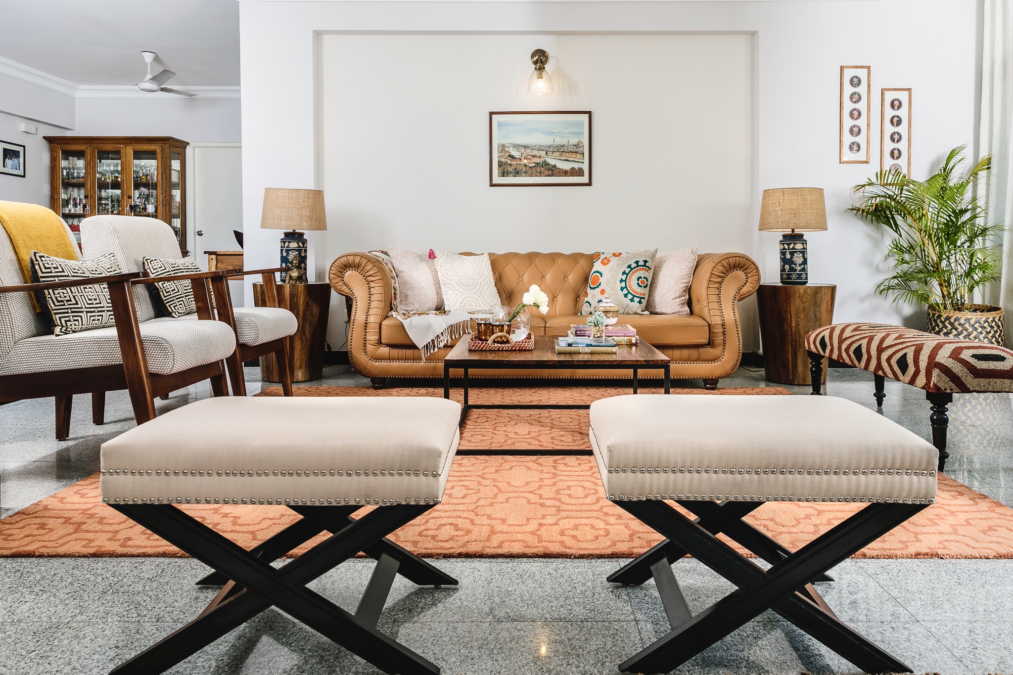
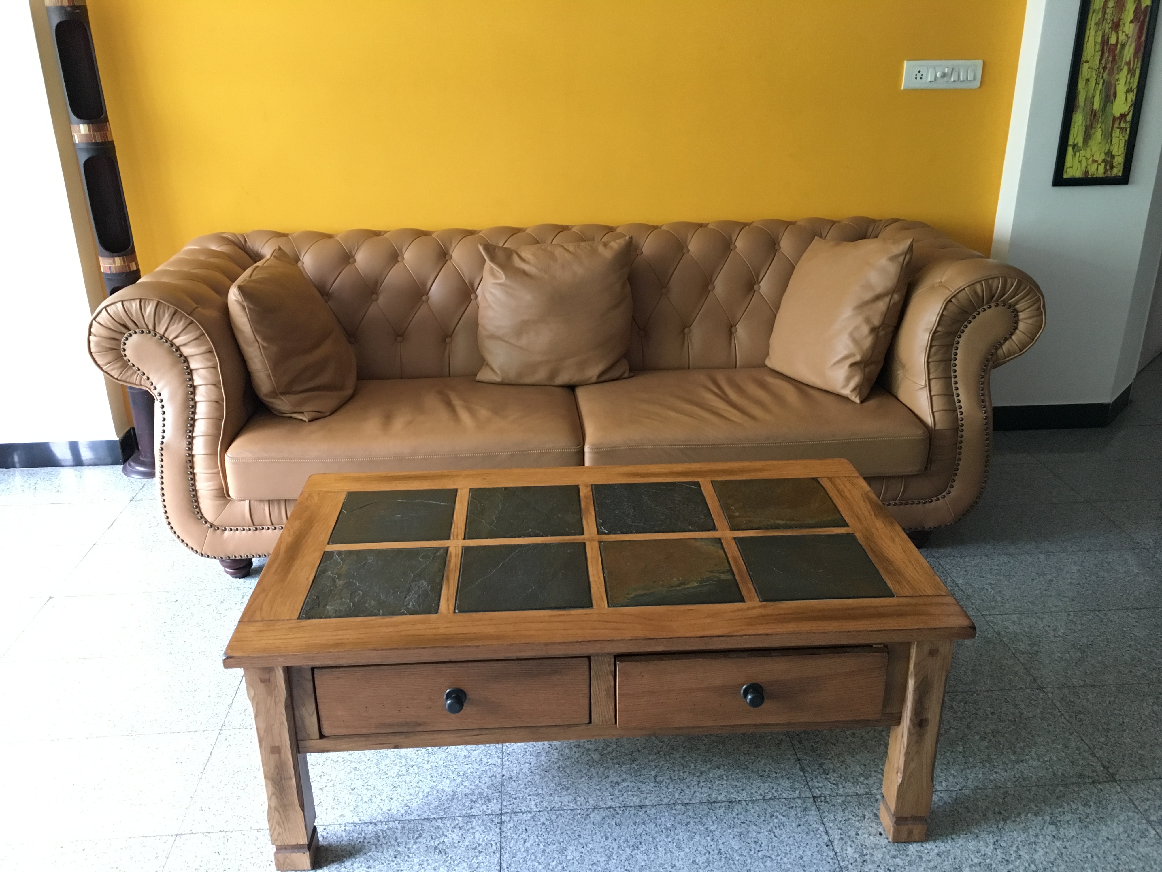
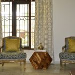
The furniture and the layout were based on comfort and functionality first. That said we agreed on the need to have more versatile pieces like ottomans and a bench so they don’t limit the flow of the space! The large leather couch was something the client already had and wanted to keep. So we worked our design around it and lightened up the rest of the formal living area with custom midcentury inspired chairs upholstered in a beautiful dotted ivory and gray fabric by Maram Furniture and a couple of very chic cross legged ottomans in ivory with contrasting black legs from Rainforest Italy.
One of our favorite pieces in this living room is the gorgeous Terra rug in beautiful earthy terracotta with a subtle tone on tone Moroccan grid pattern from the Rug Republic. It envelops the whole room in its warmth and looks even more gorgeous when the sun shines on it! The kilim bench on the far end from Jaypore is another striking piece that helps tie in all the colors used seamlessly – earthy oranges, black and ivory.
The coffee table from Saraf Furniture and side tables from the Armchair company were simple clean lines with warm wood. I love the round solid wood side tables against the sharp square of the coffee table. We brought in deep blue table lamps with a floral pattern and a rustic jute shade from Fabuliv to pull in some of the blues from the other side. The pillows from Idam, Nicobar and some custom made are kept light and neutral with little pops of color in the pattern.
Before
After
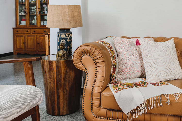
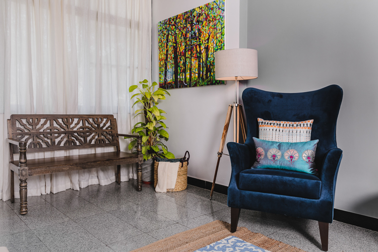
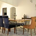
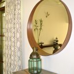
On the other end to ground our conversation area we custom made large wingback chairs in luxurious indigo velvet and I tell you, if you sit on those you ain’t getting up ☺ The warmth of the darker gray and the richness of the saturated indigo velvet are the perfect contrast! A sleek round mirror in a brass frame from Lohasmith and a small round table from Gulmohar Lane to rest your drink on were all we needed to round off this space. The rug choices here also were crucial in pulling the look together. The client loved the idea of a layered rug look I shared and we went with an inexpensive jute rug at the bottom and a smaller vibrant rug in blue and white from Imperial Knots on top. The texture of the jute looks so warm and chic against the blue and grays! Some pillows pulling in the oranges and reds from Idam and a tall floor lamp from Urban Ladder adding some mood lighting are the finishing touches!
Before
After
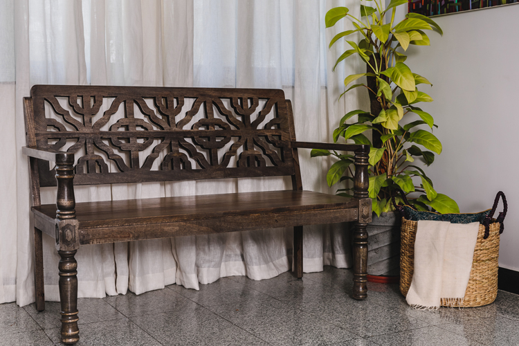
One of the last things we added was that beautiful bench with a carved back from Fabindia by the window and its now a favorite spot for a cup of morning coffee ☺
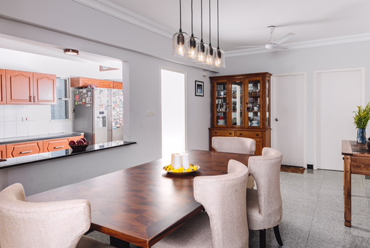
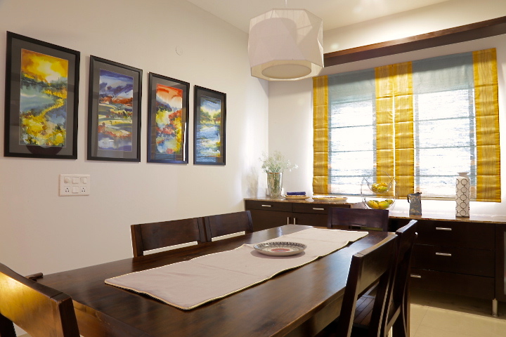
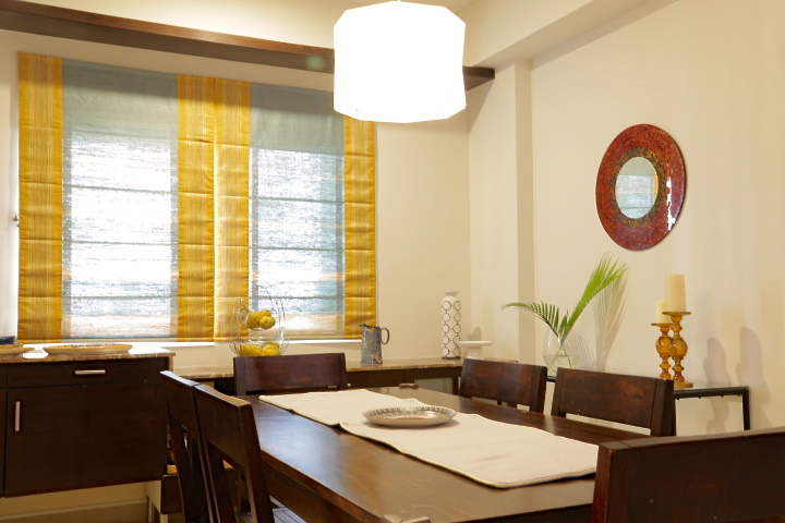
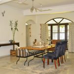
DINING
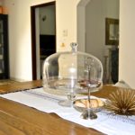
The dining area was tricky as it didn’t get enough light being on the far end. The first step was to pick a light fixture that would look sleek and modern but also provide light. The client also wanted a larger table and preferred a bench on one side to access the open kitchen counter. So we went with a large farmhouse table with a chevron top from Gulmohar Lane and upholstered chairs in a jute inspired fabric from Asian Arts to give it a chic comfortable look. But the best element is the lighting….a perfect modern farmhouse pendant light on a rustic wood panel from Purple Turtles! It totally makes this dining space come alive!
We complemented the dining room aesthetic and used simple glass sconces that echoed the same modern farmhouse vibe in the living area!
Before
After
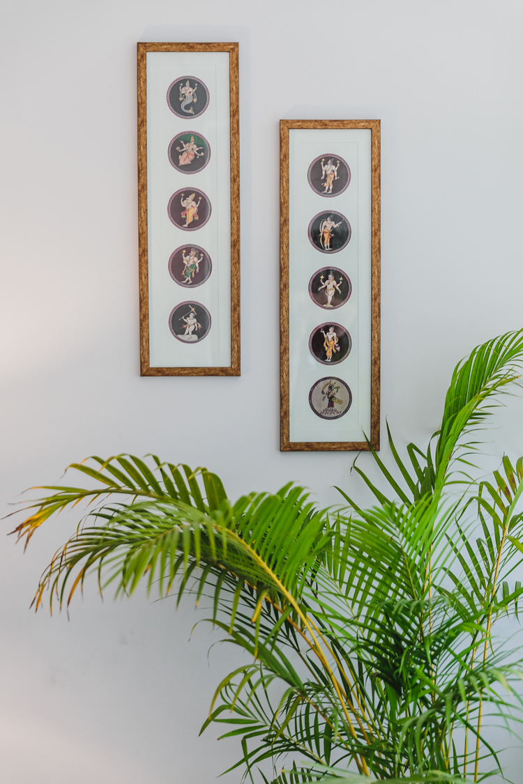
And lastly the art we used here was not just beautiful in tying the space together but also so very personal to the people who live here! In the living room the large painting by the window is the client’s pick and is a burst of colors that sits beautifully against the white walls and flowing curtains. On the opposite end we used an ethnic Indian art called Ganjifa art, which was again, the clients personal pick and framed it in a modern vertical format to amp up the high ceilings in the corner.
The painting above the couch is a watercolor painting of Florence and brings in some beautiful blues and pastels to complement the warm earth tones.
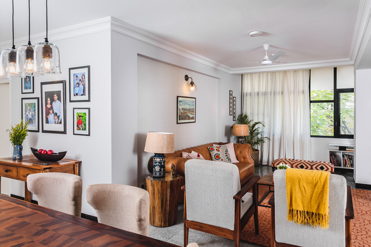
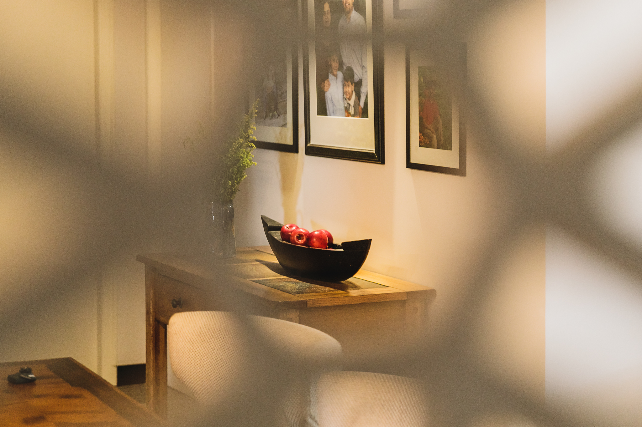
A wall of family photos all framed in cohesive black frames anchors the console in the dining area. A vintage painting of a lady sits pretty on the other end of the dining room flanked by a traditional hanging Indian lamp or diya. A couple of tanjore paintings add interest to the stairway leading to the terrace.
I hope you enjoyed walking through this home with me. Pictures shot by Matrioshka Media.
Follow us on Instagram for more picture updates and sources all of which are tagged.
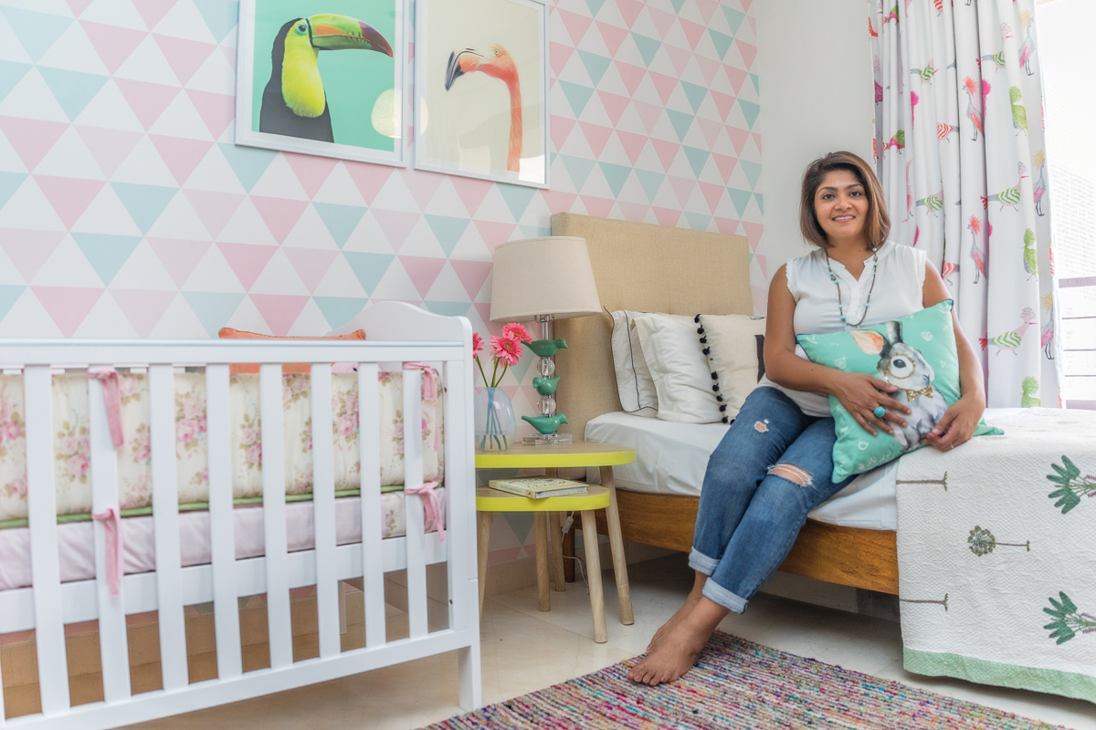
A picture perfect nursery!
Created by Vinithra Amarnathan on December 10, 2017
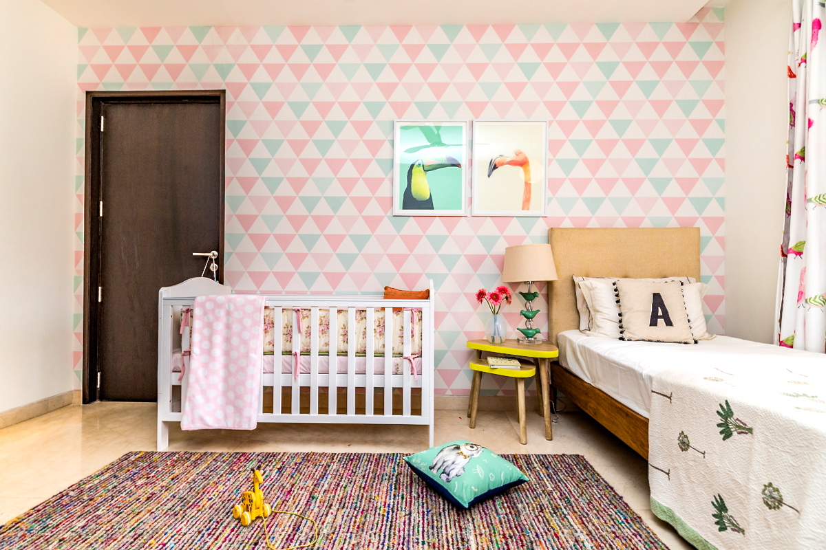
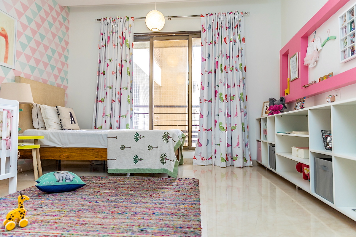
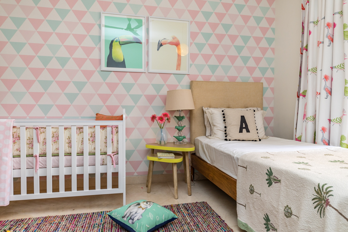
When I first met my client and saw what was then a guest bedroom with dark dingy wallpaper and brown curtains covering the only window, the idea of converting it to a nursery for a 3 month old baby seemed rather far fetched!
But when I look at what we’ve achieved and how far this room has come, I couldn’t be more proud! This post is to walk you through the entire design process of how this huge change came along.
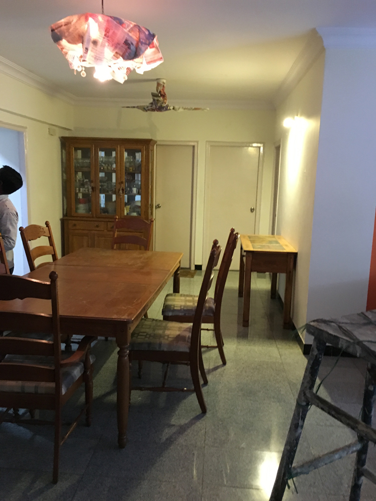
To begin with here are some of the before pics of the space. In all it was a small tight room with one large window!
The first thing the clients wanted was a bright, open and cheery room for their little baby girl! White with pops of color and a fun vibrant space is what they were looking for!
One of the my favorite things about this space was we started with an open slate. A lot of kids rooms and nurseries start with ‘I want it pink and butterfly themed or princess themed!’ or ‘Can we do a car themed nursery?’. Not this one and for that I commend my client…..her only brief was ‘I want it to be a fresh and bright and happy place….I don’t even know what my little baby girl likes at this stage and I wouldn’t want to impose my views on her!’
That put us in a great place…to have the ability to truly imagine and be creative! And that is the reason this nursery has turned out to be a space where a child can truly grow and still love the room. It’s fresh, modern, bright and still happy and cheery enough to be a kids room!
Here’s a look at our design board and starting point!
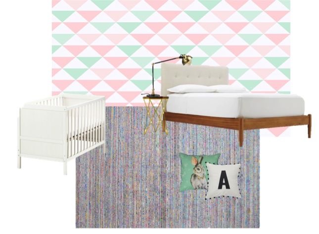
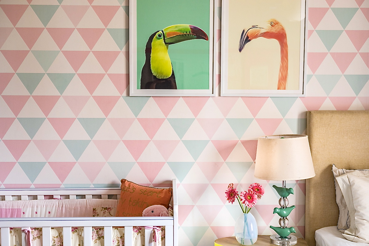
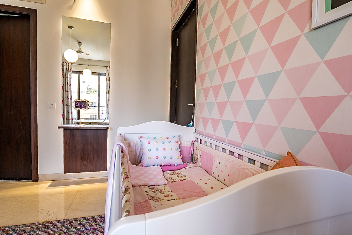
Lets start with the wallpaper….we knew we wanted to have wallpaper on the large wall and most of the wallpaper we saw either had fairies, butterflies and predictable patterns on them or were simply not unique enough. So we decided to make a custom wallpaper in a geometric pattern! We worked with my graphic designer to design this beautiful wallpaper in shades of pastel pink, mint and white! I am so in love with this wallpaper! Totally makes this room! Here are some pictures!
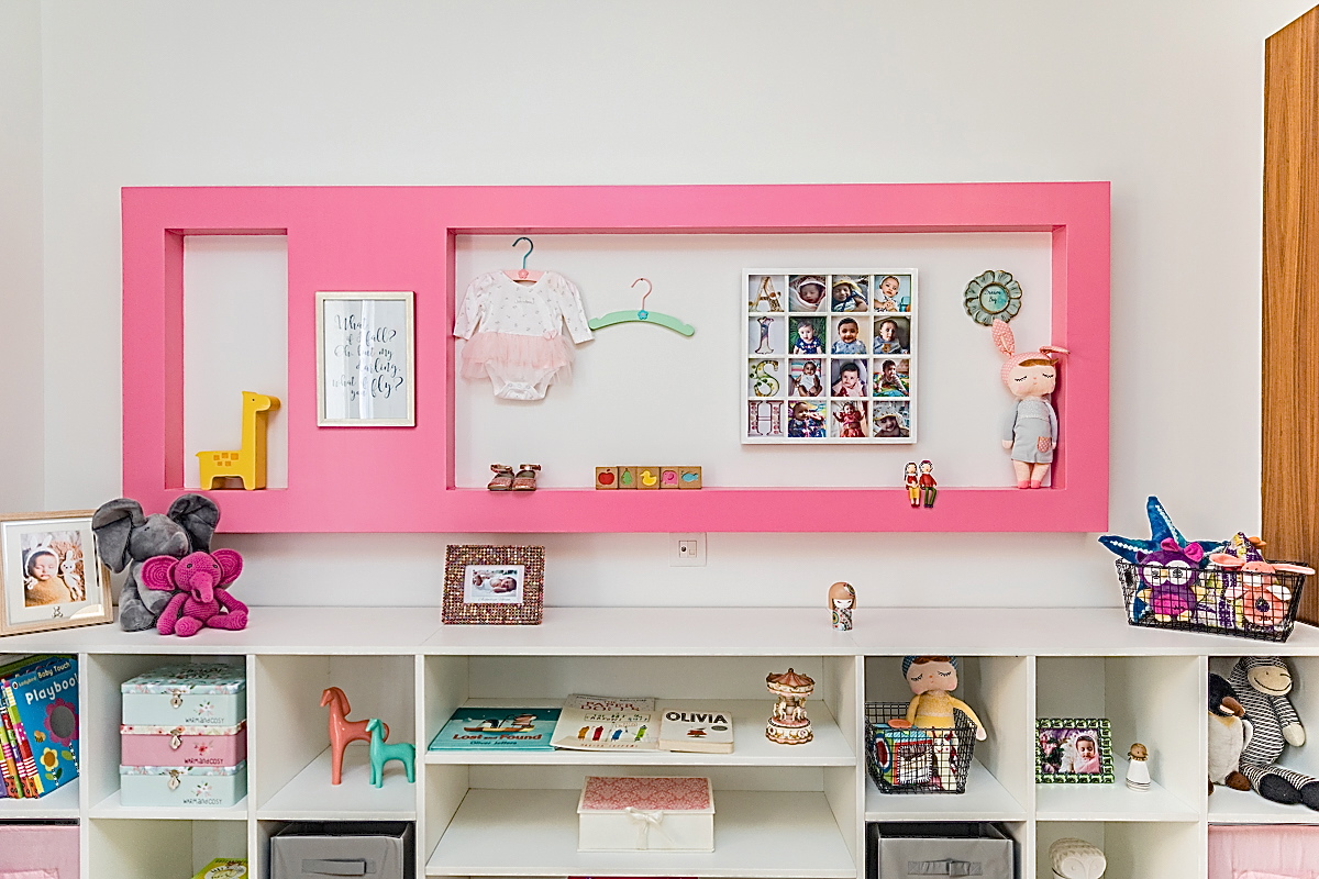
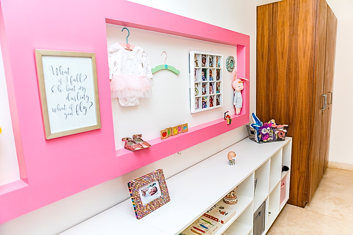
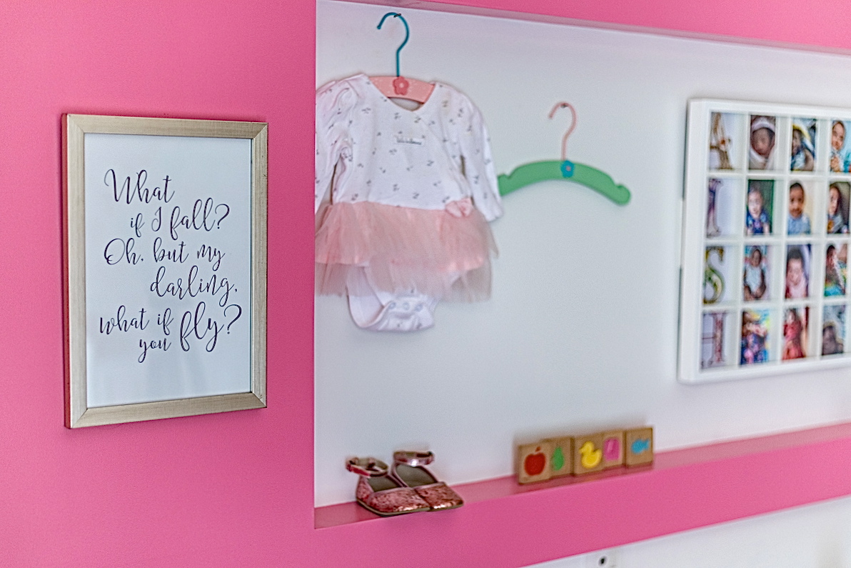
The rest of the walls were to stay a nice crisp white. The wall on the opposite end had a wall nook which we painted pink to create contrast and add a pop of color. Below the wall nook there was a long wall and we decided to create simple built in storage here. Clean and simple shelving in white with chrome legs that not only looks modern but is super functional for storing kids toys, books etc. We added a few bins to carry smaller things and left some open! Here’s a look at the built in unit and the pink wall nook!
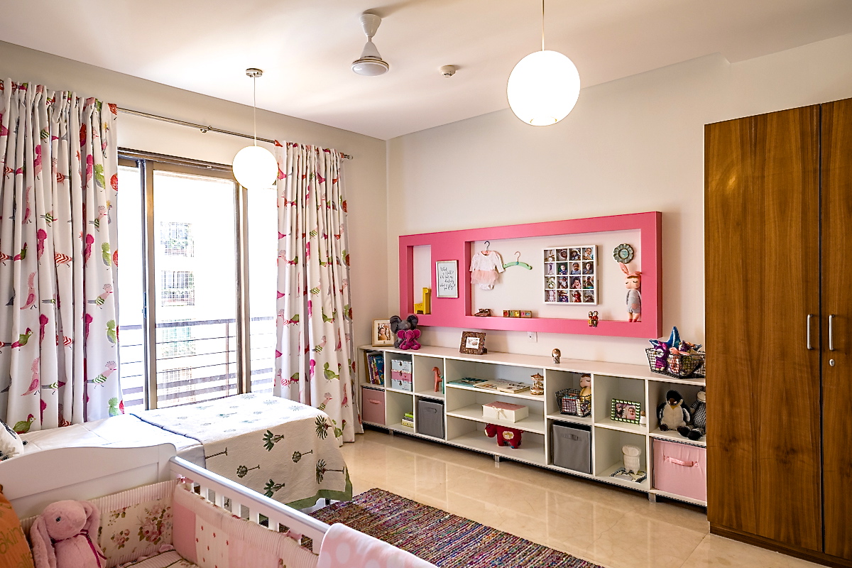
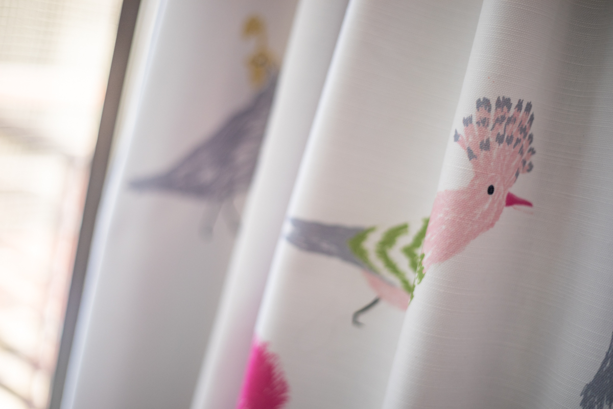
The next step was picking our curtain and rug! I stumbled upon this beautiful curtain with cockatoos and hornbills and we were sold! Such a vibrant yet elegant pattern for a kids room! We kept the rug neutral in gray with subtle multicolor stripes running through in silk threads woven through the wool carpet.
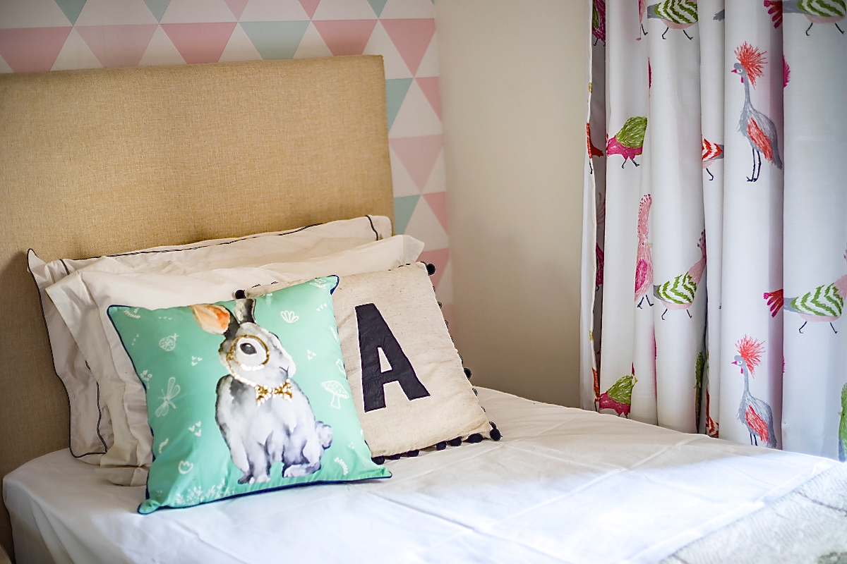
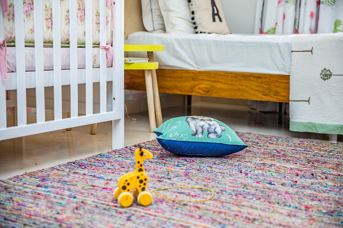
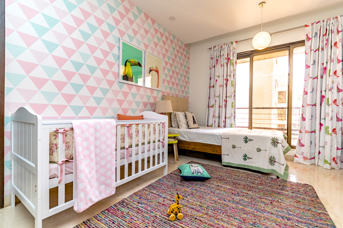
The crib is a simple white crib from mother care and the bed from Asian Arts was a great choice with a comfortable upholstered headboard that’s great for sitting back with baby. The design is modern and clean with a neutral fabric to keep things light and bright.
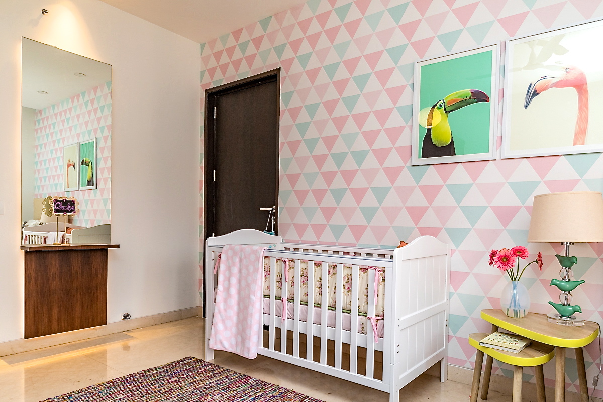
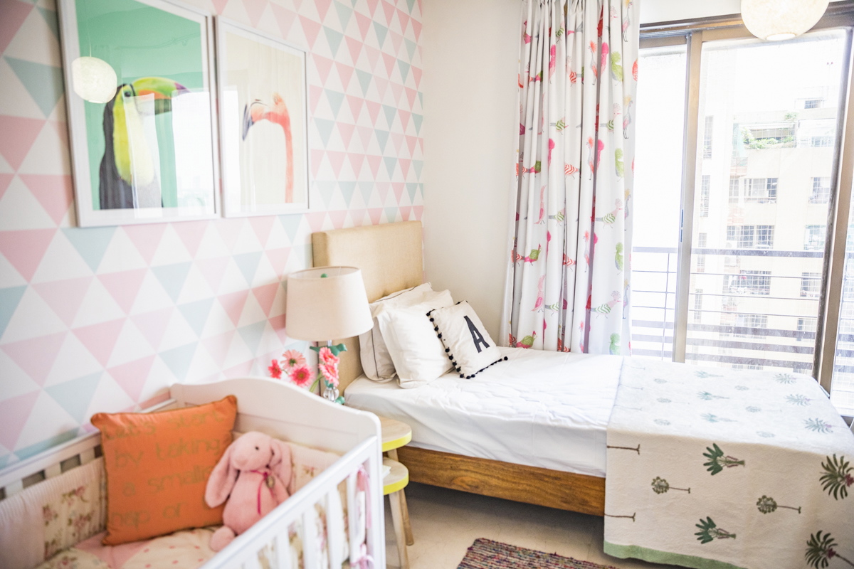
We added a nesting table for the bedside from the Wishing chair and a beautiful bird lamp from Vajor. A few lovely pillows and accessories to round off the look!
Last but not the least, our custom wall art! These prints are from Etsy and we got them printed and framed here. These stunning one of a kind bird prints of a Toucan and a Flamingo are the perfect addition to the wallpapered wall!

Hope you enjoyed a walk through of this renovation. A huge thank you to Katya Matrioshka from Matrioshka Media for the fantastic photographs!
Do share your thoughts with us! And dont forget to call us for your next renovation or interior project 🙂
We are Hiring!
Created by Vinithra Amarnathan on November 4, 2017
I’m so excited that we are hiring and growing!

Job Profile – Interior Design Intern
If you’re interested in interior design, love playing with pattern and color, have a thing for clicking pictures of your feet perched on gorgeous floors and basically want to redecorate every home you walk into, you’ll love this job!
But along with the fun comes a lot of project management, deadlines, vendor and supplier building and management or put more bluntly chasing people, answering the phone 20 times in an hour, working on design renders and blog posts on (some) friday nights!
We are very small…so far its I and that means a lot of this job is shadowing me through the design process, assisting me in project execution and managing every little detail that goes into my design projects! Coupled with design assistance, the job also entails social media management and content writing, so its important that you have a flair for writing and are comfortable with the social media platforms.
Key Skills – Creativity, problem solving, project management and great communication! A good understanding of Auto CAD/ Sketchup!
Education – Graduate/ Interior Design Student
If you think you fit the bill – send your resume and creatives if any to vinithra.amarnathan@gmail.com with a short write up on why you think you are right for the job!
Weestyled – How to style your dining table?
Created by Vinithra Amarnathan on October 5, 2017
We’re back on the blog….summer is gone, kids are back in school and the festive season has kicked off!
What better time to talk about how to style your dining table! Whether it’s for a formal intimate dinner with a small group of close friends, or for a casual relaxed brunch, these tips will get your dining table party ready!
And don’t forget to scroll down to see the two ‘shop the looks’ I put together for your shopping pleasure 😉
-
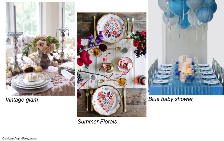
Start with a look/vision
It’s important to start things off knowing where you want to head! Pick a theme based on color, occasion or a look you want to achieve…it could be summer florals for a relaxed brunch, rustic vintage glam for a high tea or a blue and yellow for a baby shower!
-
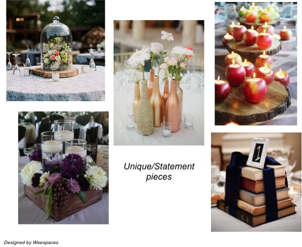
Pick a unique statement or centerpiece
Once you have a theme, its time to pick something unique for your centerpiece or as a recurring statement! A large vintage inspired cake stand holding candles, jars and votives and vases of all kinds holding simple hydrangeas, driftwood branches and dried leaves on a lace cloth, the choices are endless! Remember the key is it to keep things simple yet unique and in line with your overall theme.
-
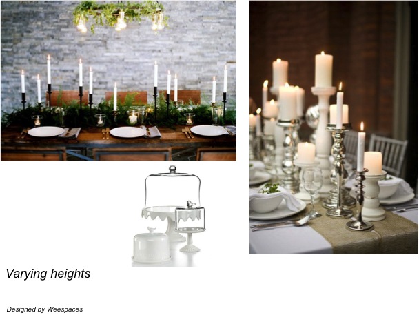
The short and tall
A key styling tip is to vary the heights in your table setting so as to draw the eye and create more visual interest. Its also important to note that you don’t want to create a table setting that has elements that are too high as they disrupt eye contact when seated.
-
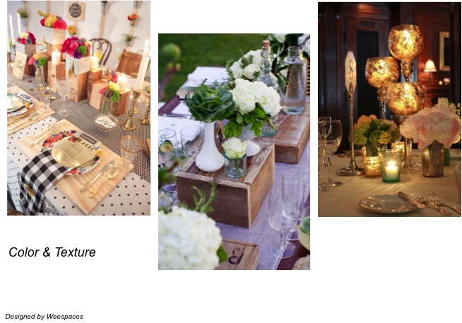
Color and Texture
Another way to create interest is to play around with colors and texture. Work with no more than two to three colors and consider repeating them through the entire table setting to bring a cohesive feel to the table. I love incorporating texture through plants, natural materials and textiles used through the table.
-
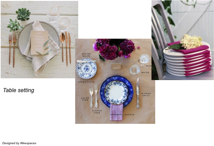
Don’t forget the details
However pretty a table might be styled, its crucial to get the place settings right. Keep in mind the occasion and decide on how the table will be set…formal, casual or buffet. Choose your dinnerware, flatware and barware accordingly and set them right. Unless it’s a casual buffet set up I don’t recommend paper plates, cups or napkins.
Hope these tips will help you get your dinner table festive and party ready. To take things a step further, I put together two looks for you – casual chic and festive glamour!
California casual chic – Organic, modern and fresh! Just perfect for a relaxed brunch in your backyard or terrace! Of course just as chic in an indoor casual setting! This look blends high and low, balances rustic charm with refined chic and is elegant yet inviting! Click on the item to shop!
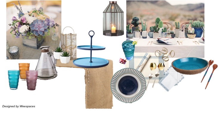
Source List (from left to right);
Colored glasses, Water pitcher , Faux cacti , Turquoise cake stand, Jute table runner, Large dinner plate, Salad plate, Table mat,Printed napkin, Gold salt and pepper shaker, Gold criss cross napkin rings, Wooden salad bowl, Salad server, Dessert spoon, Metal Lantern
Festive glam – Vibrant, luxe and perfect for a festive soiree! Warm rich red paired with gold and muted grays makes for a glamorous setting, while the bold suzani print offset by linen and stripes keeps the look refined! Click on the item to shop!
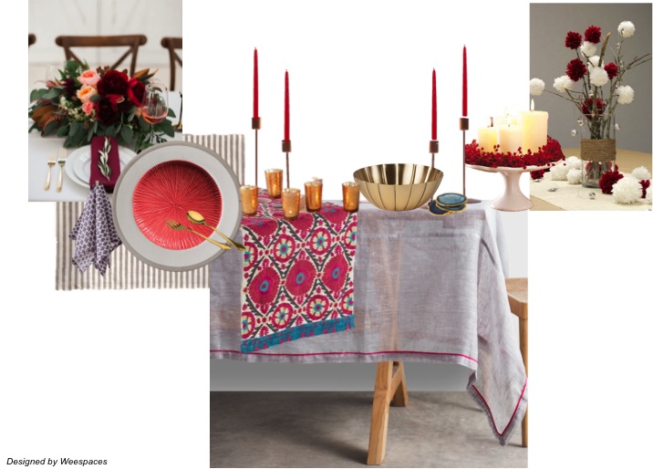
Source List (from left to right);
Striped table mat, Printed napkins,Large dinner plate,Small dinner plate, Gold cutlery, Set of votives, Copper candle stands,Suzani table runner, Brass bowl, Agate coasters
Which is your look? Happy shopping 🙂
Customizing Cushions Your Way!
Created by Vinithra Amarnathan on September 28, 2017
We’re back with lots of good posts to share on the blog and are kicking off with a guest post (sponsored) from Shopper’s Stop!
With the festive season here in full swing, here are their tips on how you can customize cushions your way to create the perfect look for your home!
How often do you feel the need to change the look and feel of your rooms? We guess many a times☺ Changing wall finishes and paint or your furniture for every such ‘I need a change’ feeling isn’t quite possible! But what you can definitely do is, change those cushion covers!
Go for different styles, materials, and patterns and create a fresh look every time!
Here are some of our favorite tips on how to create different looks;
The Print Selection
Prints are a great way to stay on trend! Whether its to bring out the different seasons or for a festive makeover, you can have different prints for every season, occasion, or event. Keep changing them time to time so you can follow the changing trends!
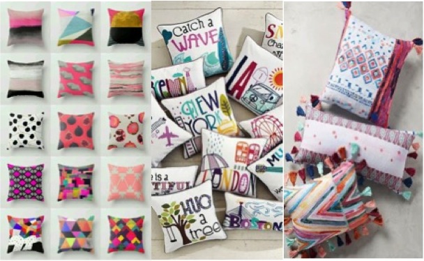
The Fabric and texture
Cushion covers come in a variety of different fabrics and textures. For the festive season consider richer fabrics like silk and velvet, while for casual gatherings you can go for patterned fabrics. Cotton cushion covers are the best for your everyday casual setup as they are low in maintenance and wear well.
Patch it good
The new trend is the Patchwork cushion covers. They look stylish and also maintain the softness in texture. The variety in color combinations and textures are great. You can also do a fun festive DIY activity at home to create your own patchwork covers as they’re really easy to make. You just need to choose those colors and patterns right!
Shapes that fit
Different homes and people mean different preferences! Different furniture means different kinds of cushions! Cushions come in a variety of shapes and sizes, from bolster cushions to chair pads to regular square cushions. Decide the size and shape that works best for you and your space.
Ornate and Festive
The festive season is here and it’s the best time to bring in a fresh and ornate look to your rooms. Embroidered covers are a great choice to give your room that wow factor. The detailed handwork is beautiful and the colors are bright and festive enough to keep them all year long!
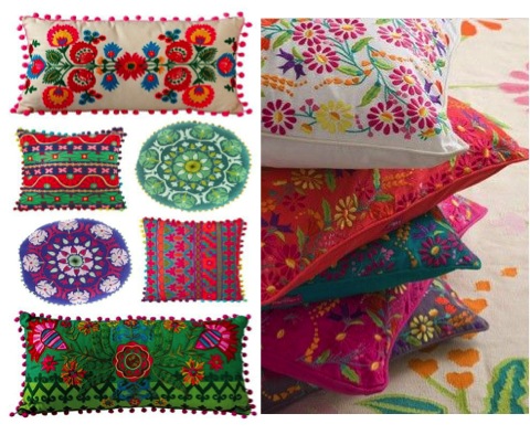
Pick your choice of the Cushion Cover this season from the Shopper Stop’s Cushion cover section online and enjoy your home’s new look 🙂
Image source: Pinterest & Shoppers Stop
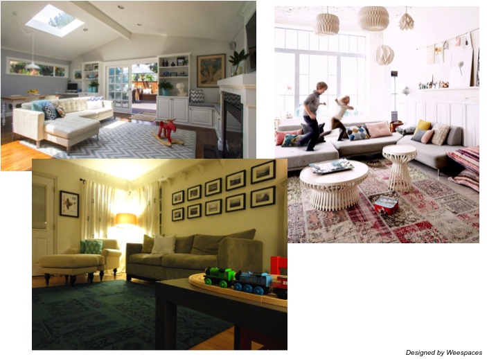
The Reno Journey!
Created by Vinithra Amarnathan on June 10, 2017
From dark, dreary and dysfunctional to modern, bright and functional!
When I met my clients their brief was simple….’we find most of our larger living spaces too dark, too dull and not functional to our needs and what we’re looking to do is make it all bright and inviting!’
They are a lovely warm young family with a 5 yr old daughter and they wanted their home to be warm, welcoming and at the same time functional and modern!
We decided to work on three spaces in the home – the large living dining space, their daughter’s bedroom and the large family living area on the upper level of their duplex!
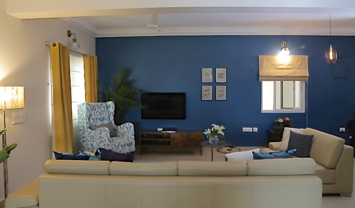
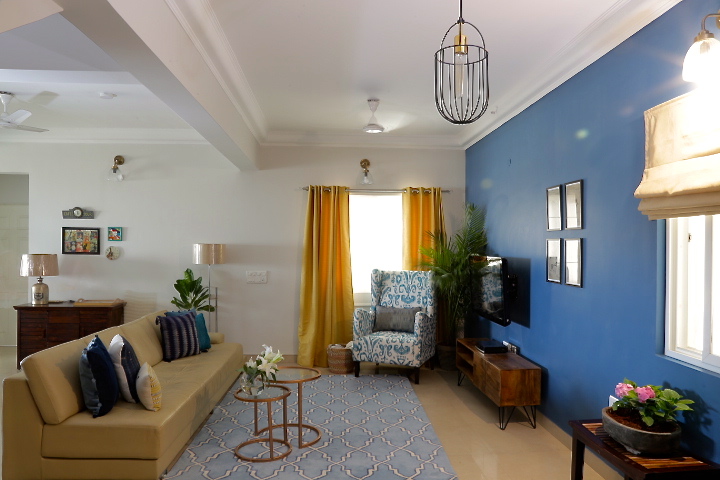
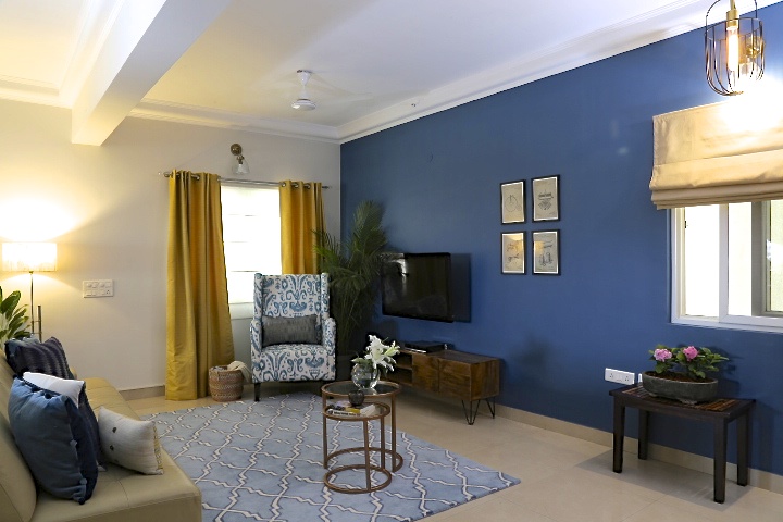
Living & Dining
This space though large came with its own set of challenges….there was no clear entryway, the walls were painted in two colors leaving the ceilings looking shorter and the room smaller, the layout of the space didn’t allow for conversations or TV viewing and all in all just a dull, cluttered space!
The clients wanted to paint the entire space white for a light and bright look and when I suggested a bold indigo blue wall, there was shock and discomfort! But with time and their trust in my point of view, we plunged right in and had a bold blue wall on the far end of the large space, which made the space look cozier and grounded. The rest of the walls were painted a beautiful shade of white to brighten things up. And voila, we had a completely different space in front of us….what a transformation it was!
Lighting was a crucial element in this project and we had to work hard to get the right fixtures and look. We went for sleek simple industrial modern lights through the entire space and recessed ceiling lights for a modern look. The black wire drop pendant in the entryway is a favorite and so are the glass sconces.
Mustard drapes to balance the blue wall with simple white sheer blinds for function and a beautiful blue tile pattern wool rug pull together all the colors in this space. We already had a very large beige sofa that the client owned and to break the beige we added a beautiful ikat statement chair in blue and white.
A sleek wood media console, industrial influenced prints as wall art and metallic nesting tables round off this space! Take a look at some of the shots of our living room!
Here’s a picture of how it looked Before
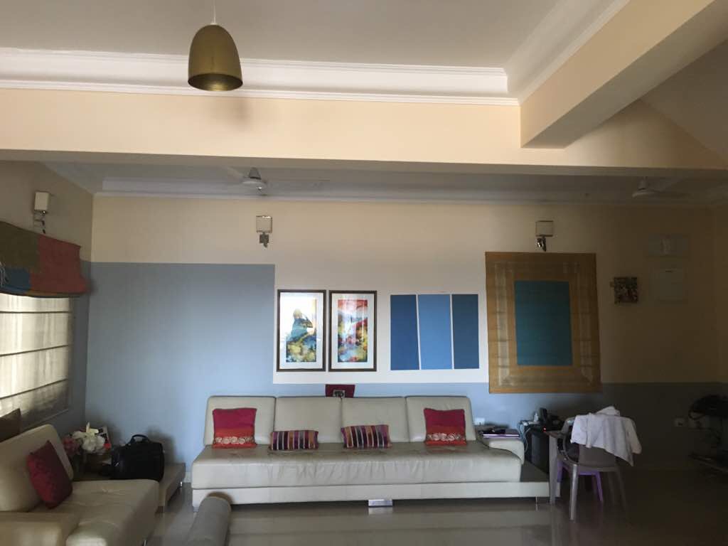
And here are some shots of the After!
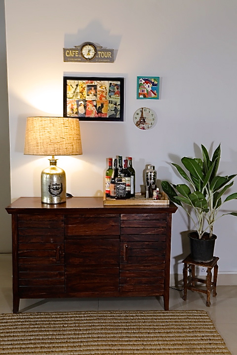
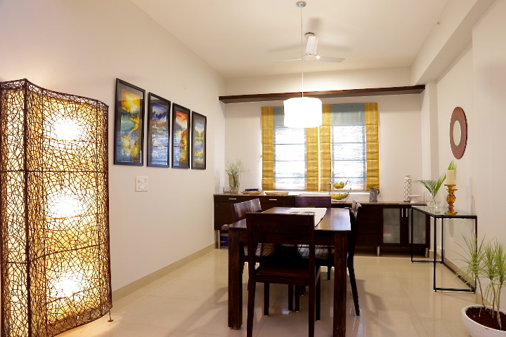
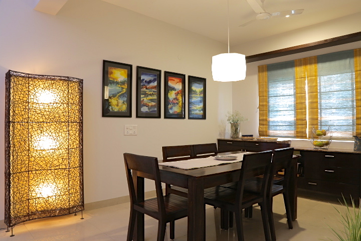
The dining area lacked in lighting and the clients wanted to have a separate functional bar. We used one of their existing wooden cabinets as a bar cabinet and added a beautiful metallic table lamp for some light. I framed some of their travel treasures and made a little gallery wall of sorts using travel memorabilia to give the bar table a Parisian vibe and it makes for such a lovely use of otherwise empty space.
We brought in a sculptural white pendant light to go over the dining table and added a modern glass and black console table to give this space some freshness.
One of my favorite elements in this space, are the four repurposed watercolor paintings (you can see two of them in the ‘before’ pics of the living room) that we framed with a black mount… and lined up together they make for some bold statement art!
Here are some shots of the dining room.
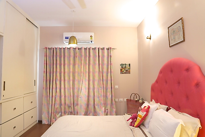
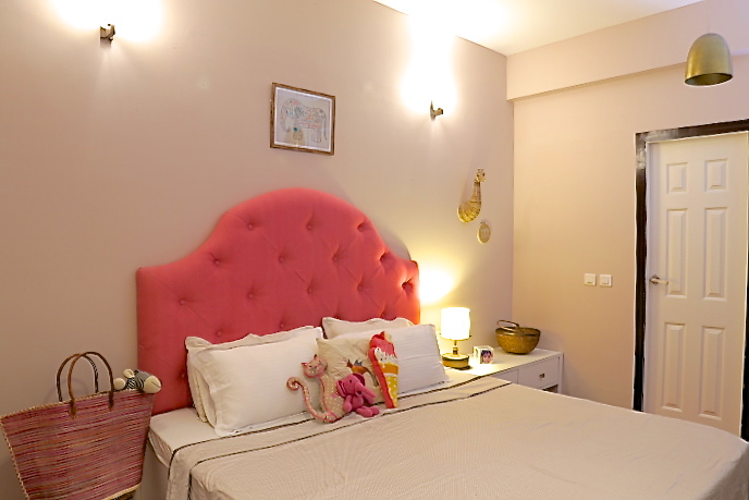
Bedroom
This room had a dark built in bed and a wall full of dark built in wardrobes. The only way to shake things up here was to refinish the wardrobes and the bed!
So we refinished all the wardrobes and the built in bed in bright white and added a custom pink upholstered tufted headboard for some drama!
Brass pendants, simple wall sconces and beautiful hand embroidered drapes pull this space together giving it a fun yet elegant feel.
I love the small elements that we brought in like the basketweave giraffe head, the elephant print, the patterned ikat rug and simple clean bedding that give it a chic but fun vibe!
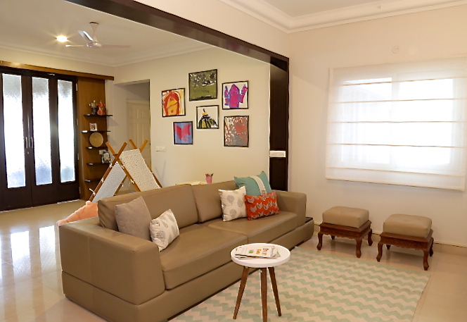
Family Room
By far the biggest challenge in this renovation project was the family space on the upper level. It had a difficult layout with a staircase landing leading into the space and not to mention very little natural light with one window and dull beige paint to further add to the dreary look!
Here are some pictures of how it looked ‘Before’!
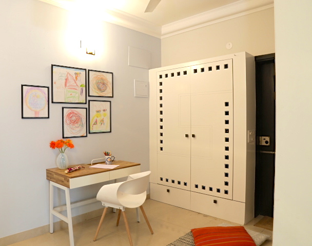
We tore down the dark built ins on the landing and creating gorgeous floor to ceiling white built ins with simple cube shelving. This provides much needed storage for books and all the toys and clutter that comes with having kids!
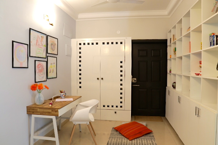
Next we painted the largest wall a light beautiful shade of blue and extended the same white to the rest of the walls from downstairs. Much needed lighting was added through recessed ceiling lights, a beautiful nickel finish white pendant light and sconces on the large wall. We used the clients existing furniture and added a desk and chair to create a small home office. Sheer white blinds and modern chevron pattern rug keep it light and bright.
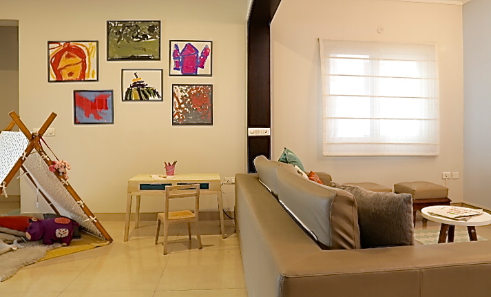
On the far end of the room we created a play space for the little girl by adding an A frame tent, a small kids table and chair and using the clients repurposed shelving unit for some storage.
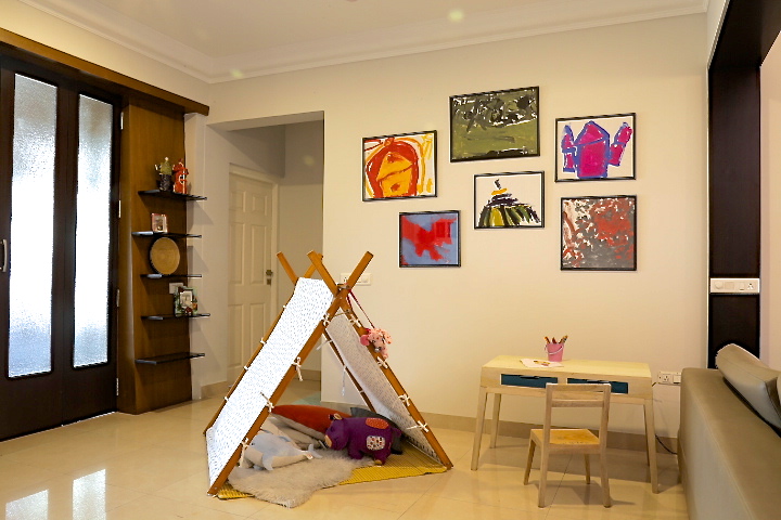
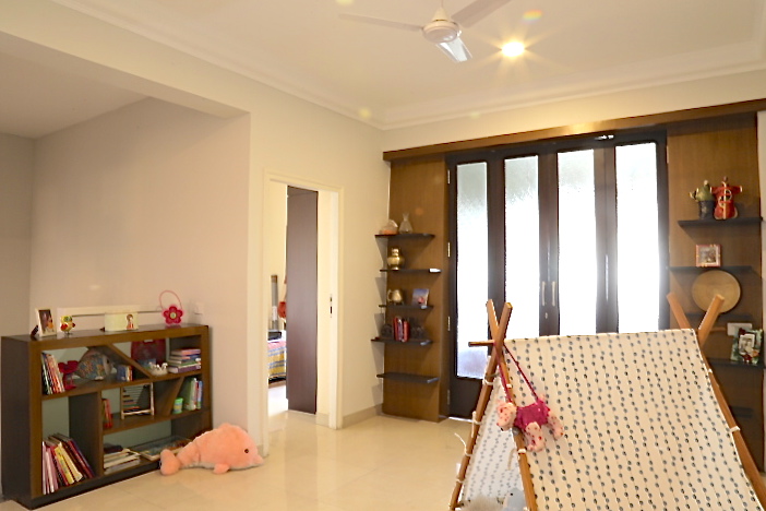
One of my favorite things in this space is all the artwork done by the little girl as wall art. There are pencil sketches and doodles that form a small cluster of art over the desk and bold paintings that are framed and hung in her play area.
This renovation was challenging because of the difficult layout, the amount of change we needed and the tight budget we had! But when you see your clients feeling happy and enjoying their home the way they should, it makes it all worth it!
Hope you enjoyed the pictures as much as I did making these spaces happen 🙂
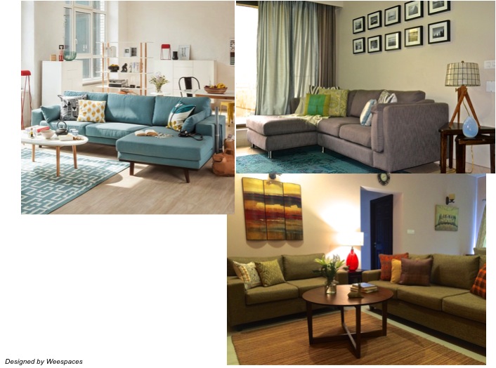
Hometour – Anne’s Traditional with a dose of Cali Chic!
Created by Vinithra Amarnathan on April 21, 2017
I met Anne through a common friend but had no idea of her love for design and decor! When I decided to start a home tour section on our blog, my friend connected us saying ‘Anne’s home is a work of art!’. And you will see as we go along, it sure is 🙂

Sean, Anne and their beautiful son Dominic recently moved to Bangalore. And Anne has taken the time to set up this beautiful home with a lot of furniture and accessories purchased locally in addition to what they had.
Having grown up in California, Anne brings in a generous dose of relaxed chic California style to their otherwise traditional home! Blended beautifully the space is warm, inviting and filled with stylish elements all through. A walk through brings up a variety of styles from coastal chic, eclectic boho to california glam all effortlessly mashed up to create a space as beautiful as the family that lives in it!
Go on and enjoy the tour!
-
-
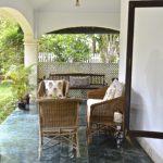
The sunny verandah
-
-
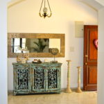
Entryway
-
-
-
Coastal elements on the entryway console
-
-
Living room
-
-
Indigo blue upholstered sofas
-
-
-
-
A pair of traditional chairs with a raw wood table
-
-
-

-
A buddha figurine on a wooden trunk
-
-
Dining room
-
-
-
-
Dining area console
-
-
-
Here’s more about Anne”s decorating style and her influences…
Style – An eclectic blend of boho, soft glam with a bit of California thrown in (which is where I’m originally from).
Inspiration – I am inspired mostly by nature, my travels and textiles.
Favorite piece/element/item – My wooden dining table. It’s solid, simple and beautiful. It’s also the center of many of the activities and and where i generally congregate with family and friends in my home.
First big purchase/biggest splurge – Our home by the beach in Los Angeles.
Influence of your family on your style – You don’t have to sacrifice aesthetics and design for functionality. I have an active 5 year old who loves to bounce from sofa to chair to sofa. Thats why I chose durable dark sofas and kid proof carpets that can be cleaned easily. There are so many choices out there.
Dream buys – A customized Viking stove and customized walk-in closet.
Weestyled – How to style a family friendly living room?
Created by Vinithra Amarnathan on April 1, 2017
One of the questions I get asked most often is how can I have a living room that’s stylish but at the same time kid friendly.
And while I must admit our definition of style must change after kids, it’s absolutely possible to still have a stylish well-designed living room.
Stylish doesn’t have to mean a murano glass vase teetering on a three legged gold side table or a pristine white sheepskin thrown on your chair! There are many ways to do stylish while still making the space comfortable for a family to hang out.
Here are my 5 favorite tips!
1. Knock off the coffee table
It instantly makes your room feel larger, allows for more space to move around and makes for a cozy yet comfortable living area! Get down on the rug with your kids to play a board game, have your kids play legos and throw a few floor cushions/poufs when you have guests!
Well if you really must have one, consider an upholstered ottoman instead. Top it with a tray to serve food and drinks or use it as a footrest while watching your favorite show, the soft edges make it kid friendly and offer extra seating all in one!
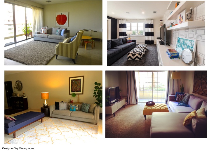
2. Invest in a good quality soft rug with color and pattern
If you are a parent, you know that a busy pattern is your friend! Hides spills and stains like a pro while still looking good…what’s not to love!
Think soft wool rugs in medium tone rich colors, vintage Kilims/Persian rugs, carpet tiles or cotton dhurries in bright colors and pattern.
They help ground the whole room and are a great way to bring in color and pattern!
3. Keep large pieces of furniture neutral and comfortable
A sofa that’s neutral and has good bones is the backbone of a well-styled and kid friendly living room. Look for one that comes upholstered in an easy to maintain fabric like a microfiber or chenille or if you prefer a casual laidback look slipcovered sofas are a great option!
Neutral medium tone colors like gray, taupe, blues and mustard work as a good backdrop that can be dressed up with pillows and throws!
4. Layered storage
We all know storage is essential with kids and all the stuff that comes along with them! However it’s not just about the cabinets, storage shelves and designated cupboards in their rooms.
Its more about the layers of storage that are built into your shared living space….the bins under the media console, the basket next to your sofa or the storage bins in your bookshelf. These small storage pieces let you hide away those blocks, board games and toys in a jiffy!
5. Make the most of your walls
Open floor space is valuable when you have little kids. One of my favorite tips is to make use of your walls by using tall bookshelves that can hold your prized possessions and knick-knacks on the top shelves keeping them safe from little hands and the lower shelves can be used as storage.
Another way to use your walls is as a decorative tool to bring in color and visual interest. Think bold paint, mirrors, art, wall hangings or even create a gallery wall of your kid’s favorite art amongst other pieces to bring in an element of fun and whimsy!
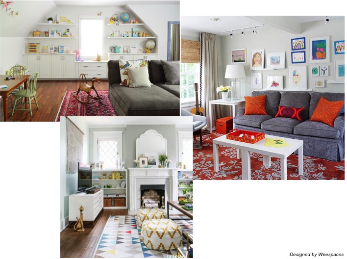
I hope we have been able to give you some ideas on how to decorate your very own family friendly living room! While you are at it, do send us some pics of your space 🙂
Shop the Trend – Botanical
Created by Vinithra Amarnathan on March 21, 2017
The botanical trend has been everywhere lately…..with the palm leaves, tropical vibes and the island feel whats not to love! I love anything green and leafy, but how do you get the vibe of this trend in an already designed or existing space?
Here are my tips – pillows/cushions are an instant way to bring home a new/trendy look, so are smaller pieces like dinnerware, vases and wall art. A great tip here is to break the pattern by adding a calmer pattern or color like the white floral cushion which still has the island vibe but is calmer because of the white!
And if you’re feeling this a bit more and want to plunge right into some tropical leafy goodness…I love the idea of wallpaper, an accent chair, a pendant light or even curtains!
Go on and shop my favorite picks 🙂
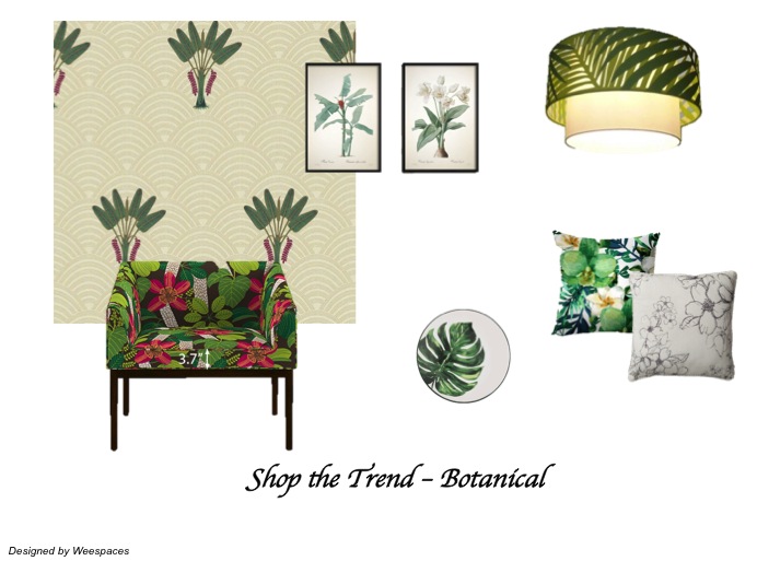
Source List (click on item to buy)
Tropical Print Arm Chair
Palm Grove Wallpaper
Botanical Illustration Wall Art 1
Botanical Illustration Wall Art 2
Palm Print Pendant Lamp
Green and white tropical print cushion
White floral cushion
Tropical print plate