Project Reveal Part I – The Modern French Country Inspired Home – Living Spaces
Created by Vinithra Amarnathan on January 16, 2021
A year back when I was in Goa for a holiday break, I got a call from our clients to design their home in Bangalore. They had a tight schedule and we were unable to take on new projects at the time…..so we signed off saying “lets hope we get to work together in future”!
A few days later one of our new projects didn’t go forward as planned and I reached out back to them saying if you’re still keen we may be able to explore this 🙂
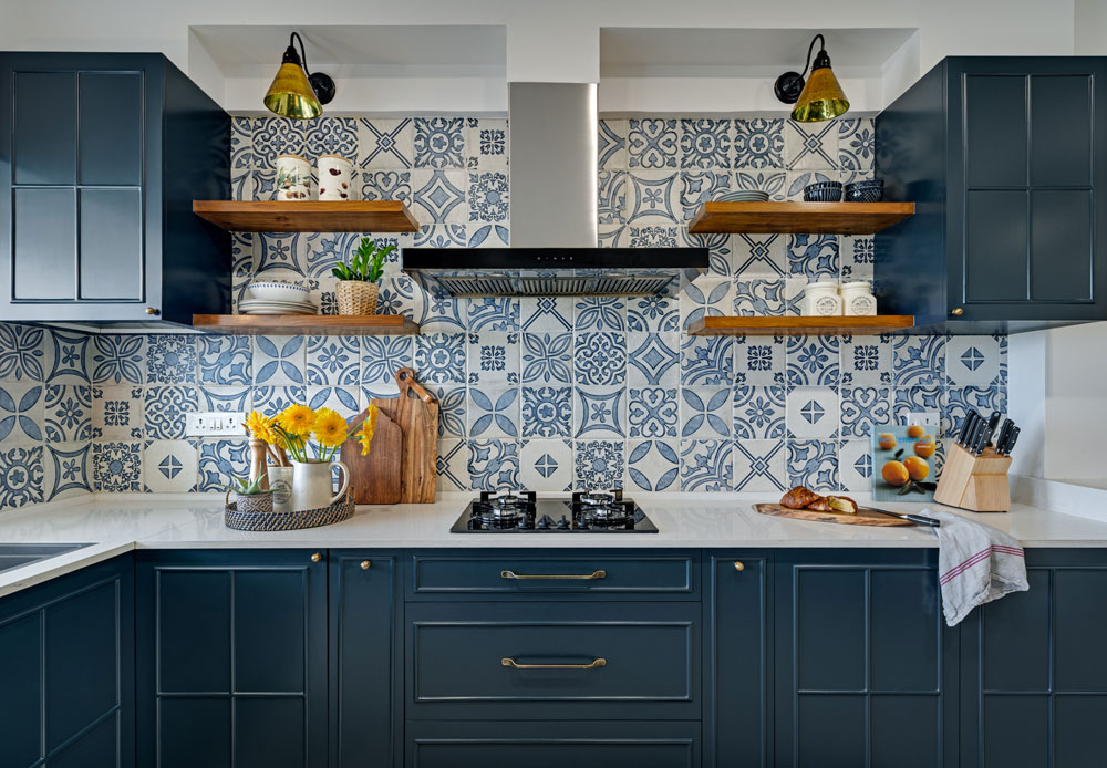
A year later and what a crazy year it’s been, here we are sharing all about this project with you! This space is home to a beautiful warm family and I hope we have been able to bring forth their love for colors especially tones of blue, Pallavi’s love for the classic French country aesthetic and Tarun’s love for the warmth and ruggedness of natural wood!
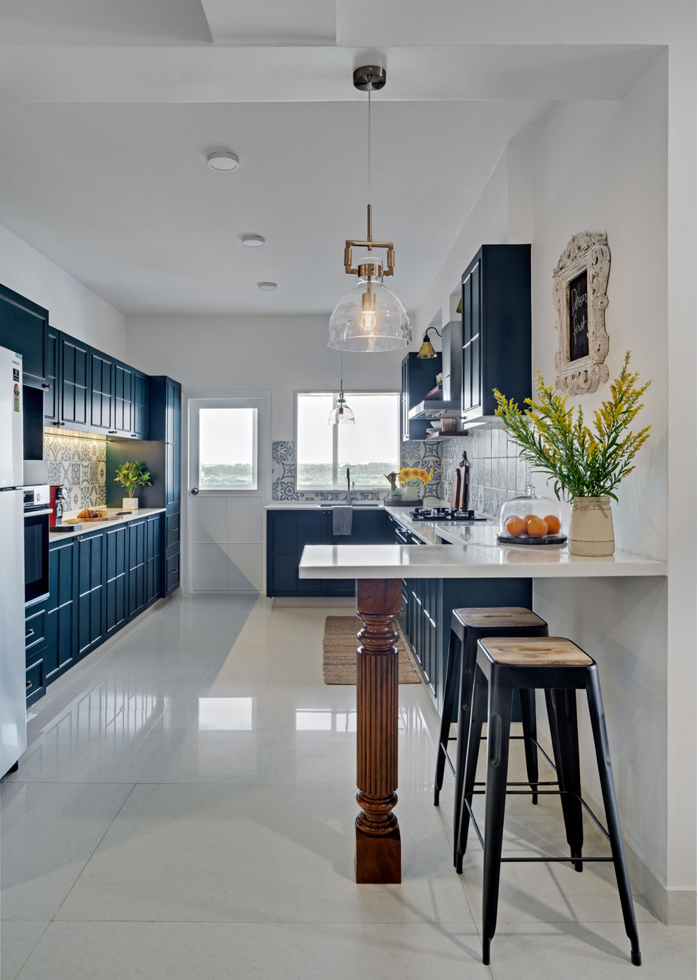
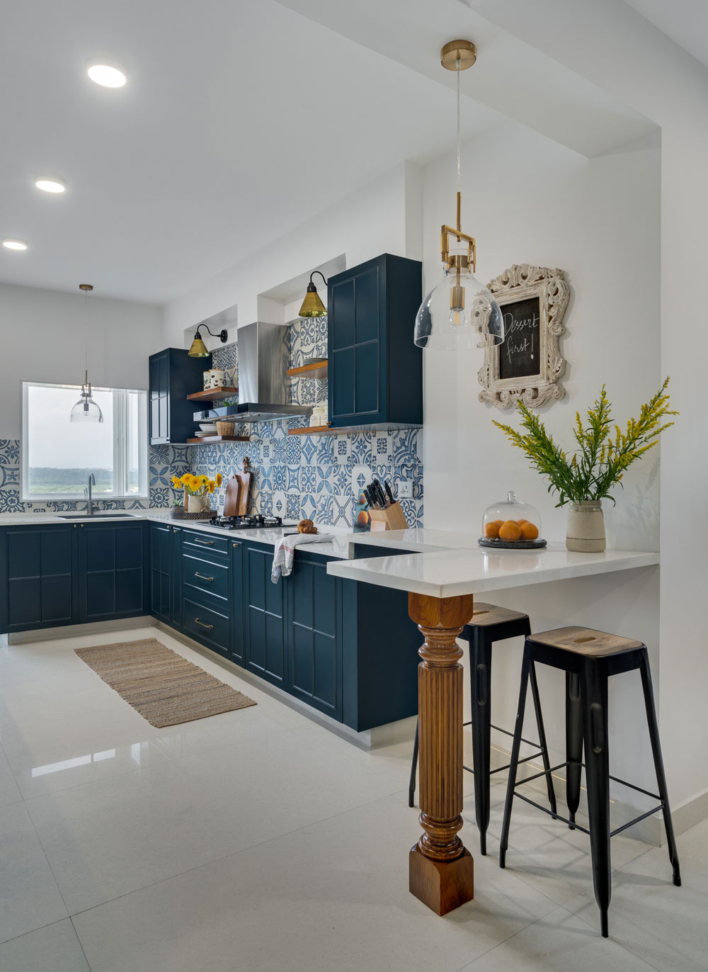
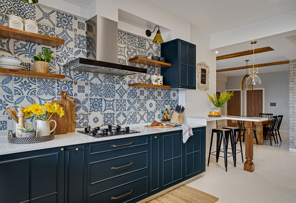
The home itself as in all of our designs centers around functionality and making the most of every space have its own character and identity in a large open plan home. We broke down a large living area into a living, dining, bar area, a kids nook and entryway. We made a whole lot of structural changes in this home especially in the utility area creating a functional space for the clients help, changed a bathroom into a walk in closet for Pallavi and opened up the kitchen wall to create flow between the kitchen and the dining.
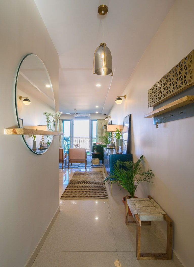
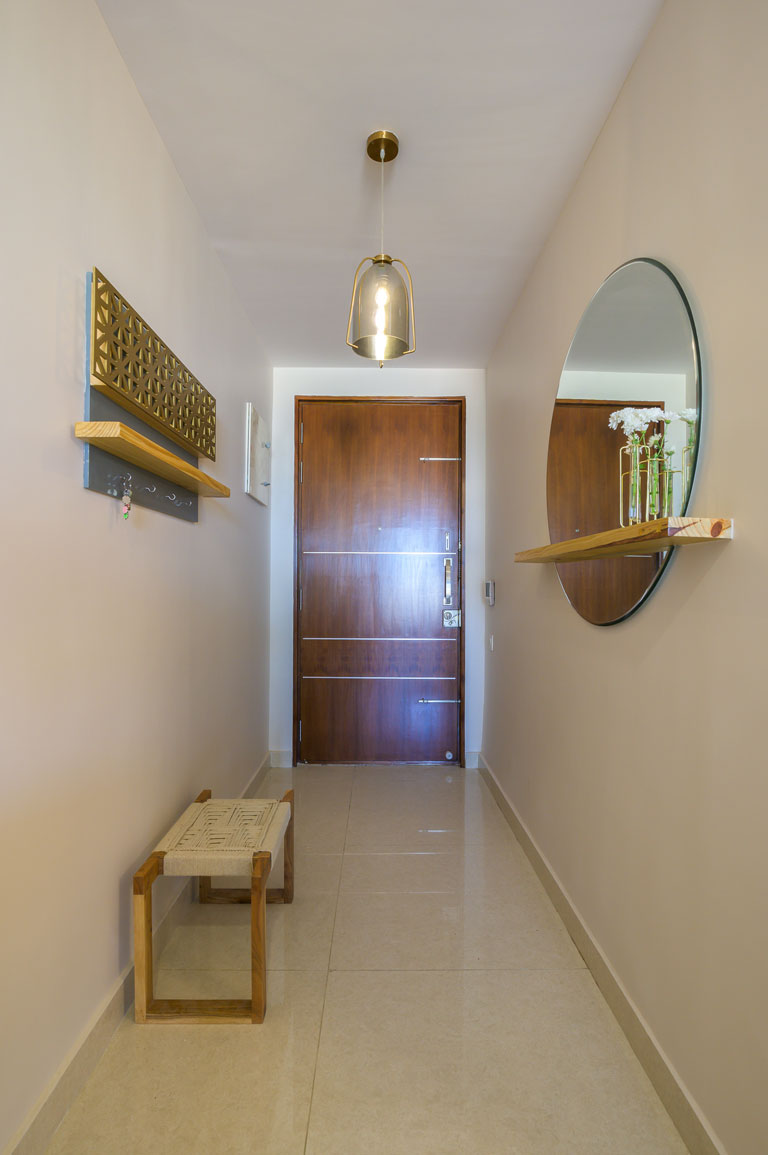
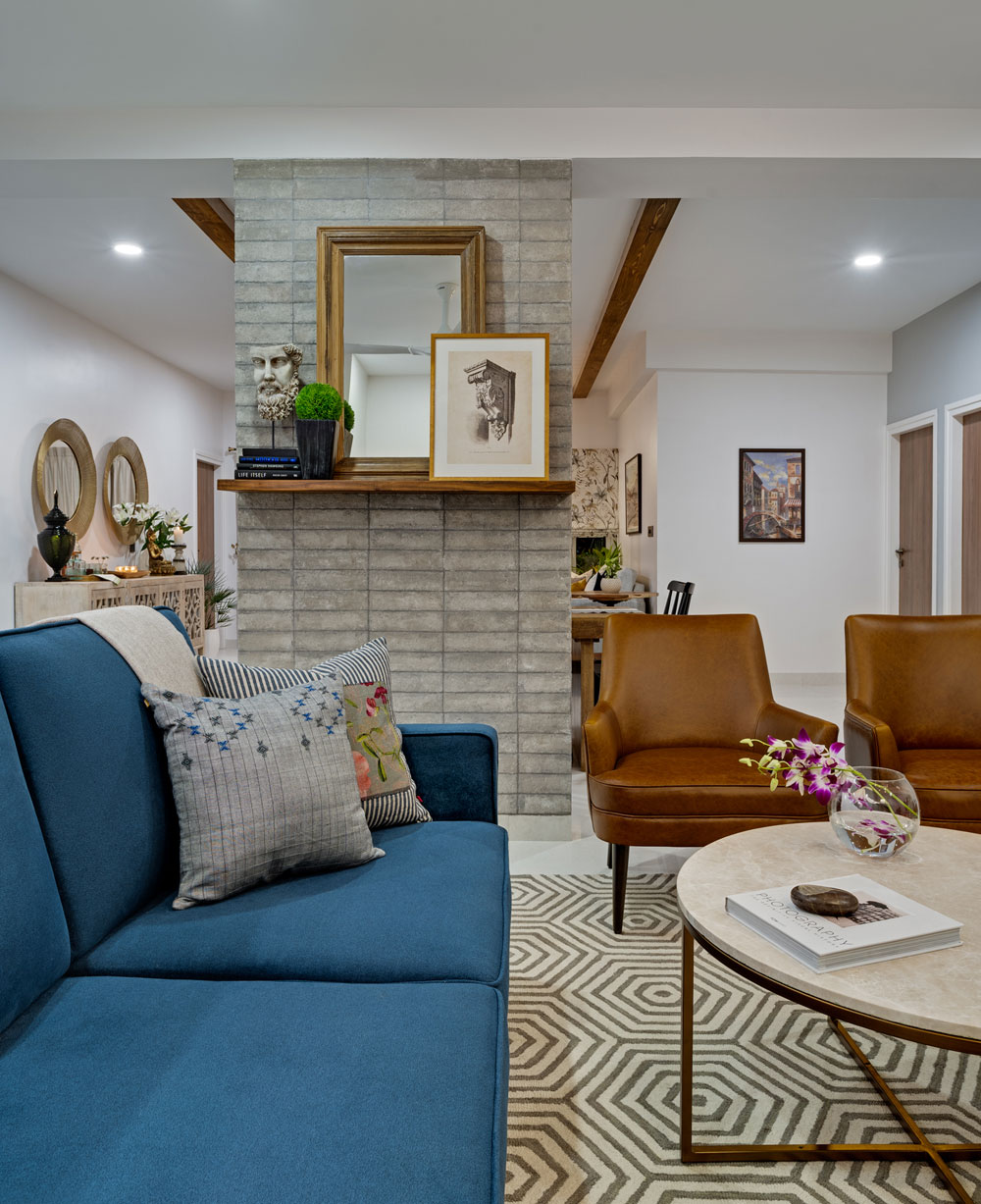
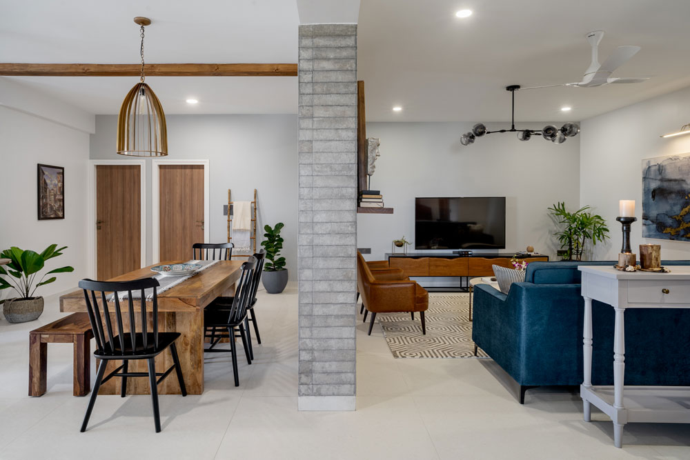
As you walk in the entryway visually extends all the way through the living which was made possible by the float ceiling we added to further define the living and dining and eventually rests at the end of the hallway where we have a beautiful custom made wall hanging.
The wall hanging is designed around a marriage of the symbols Om and the Sikh symbol which Pallavi put together. It sits on a wall painted a beautiful tone of gray.
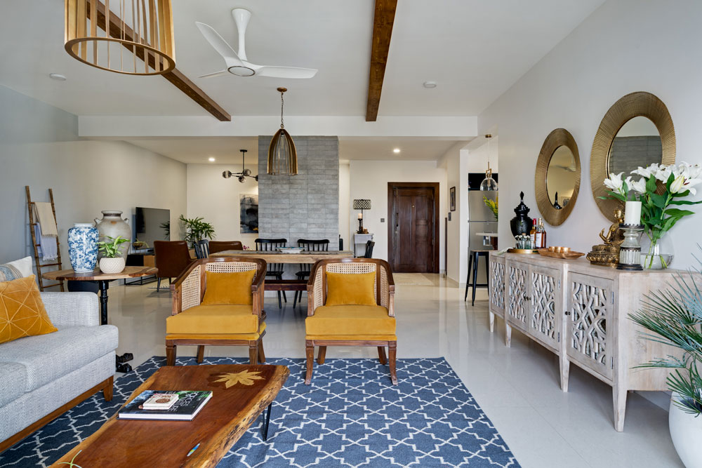
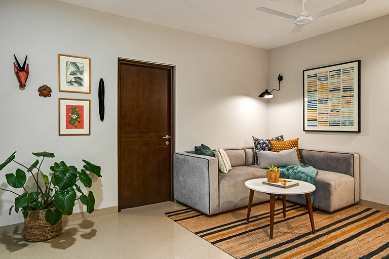
Living
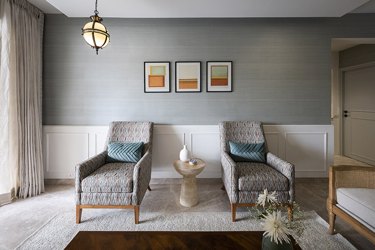
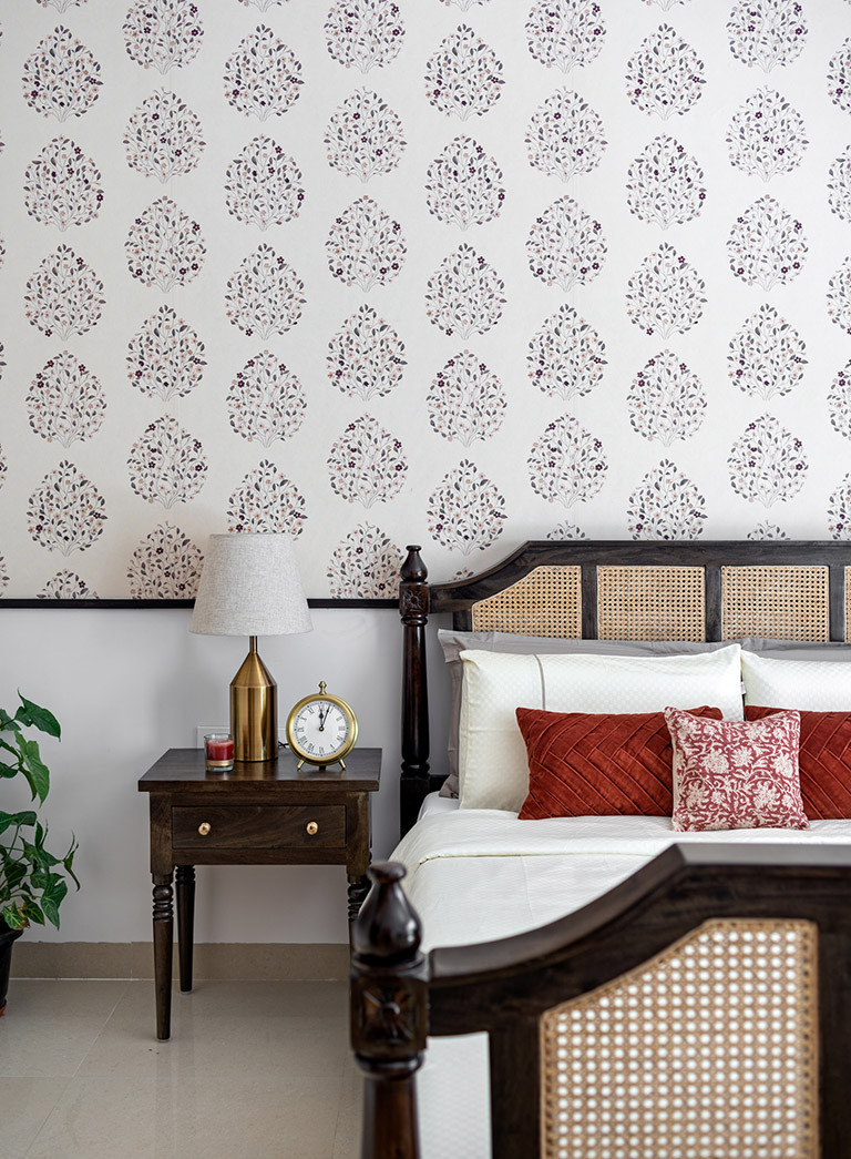
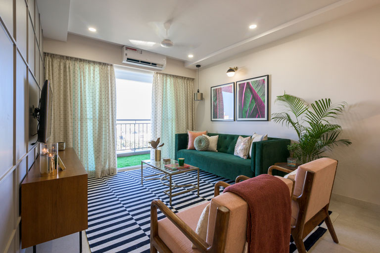
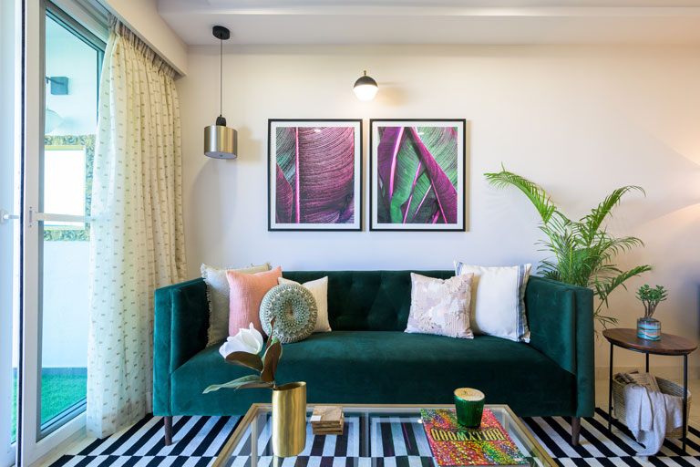
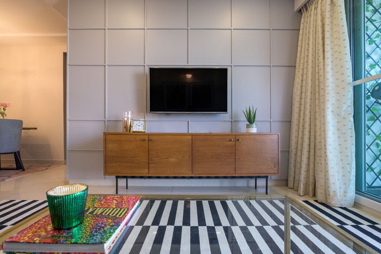
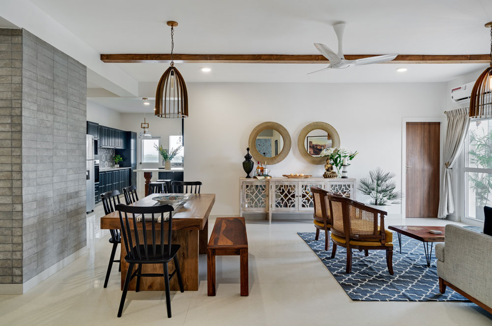
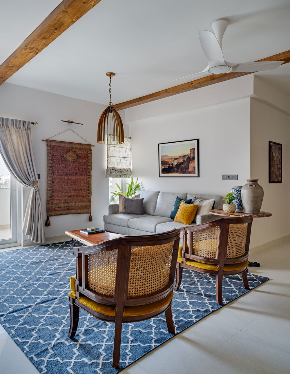
The living room is developed around a classic French country feel with a light airy palette of blues and soft grays. We wanted to define and demarcate the living area clearly and adding a beautiful wainscoting panel all through the large L shape wall allowed us to do that beautifully! A grasscloth wallpaper in tones of pastel warm blue brings in a hint of color and texture.
The seating is designed to relax, entertain, have conversations, play board games and more! A large nailhead trim couch facing the large wall and with a view of the balcony forms the main seating for the living. We added a pair of beautiful oak and cane classic French country chairs to the right and two upholstered chairs in an Ikat fabric opposite the couch. We grounded the space with a soft blue and white rug and a large wood and metal coffee table perfect for game night!
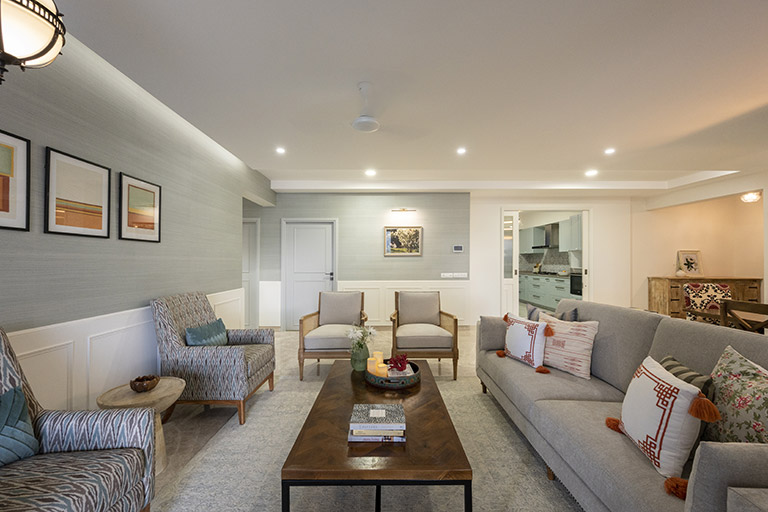
The details in this space like the curtains with an embroidered border, the milk glass pendant with filigree carving, the art and the sculptural corner table are all the little things that make this space come together!
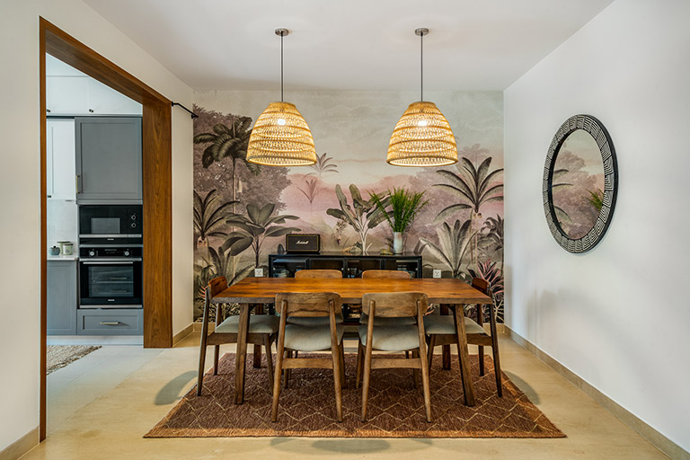
Dining
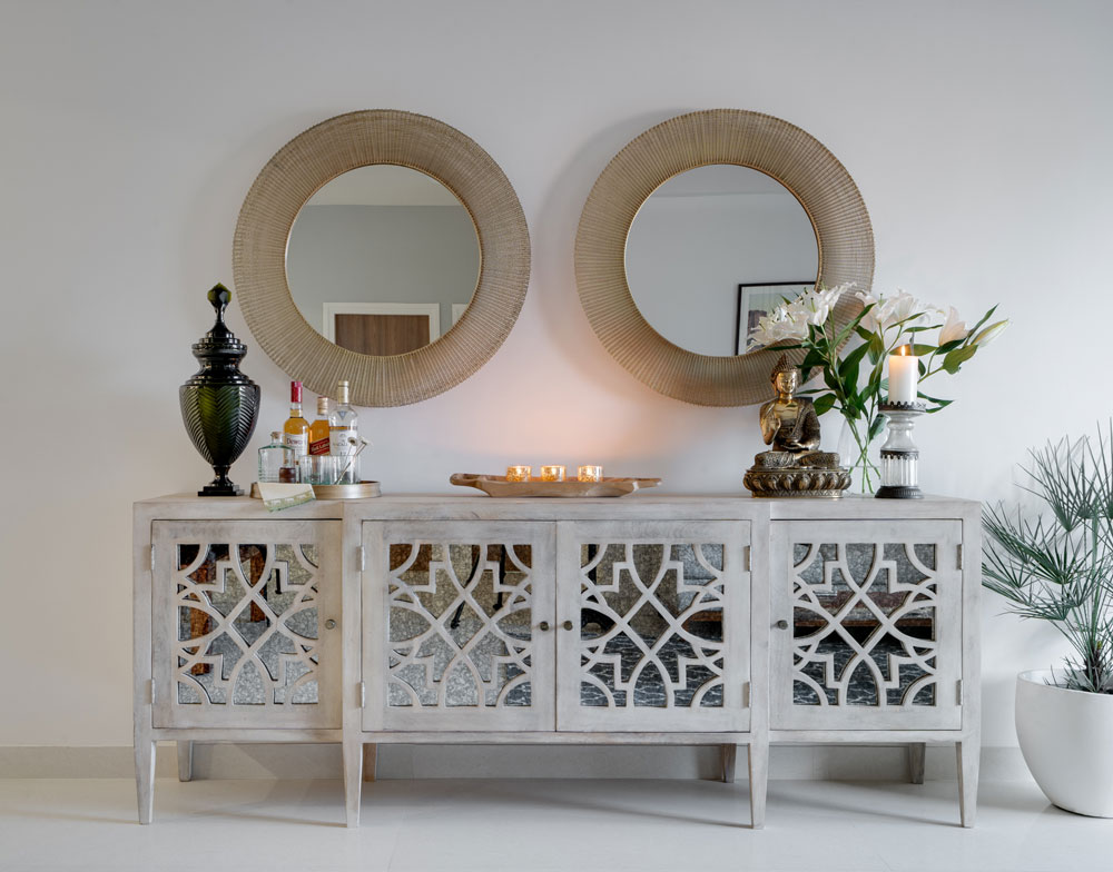
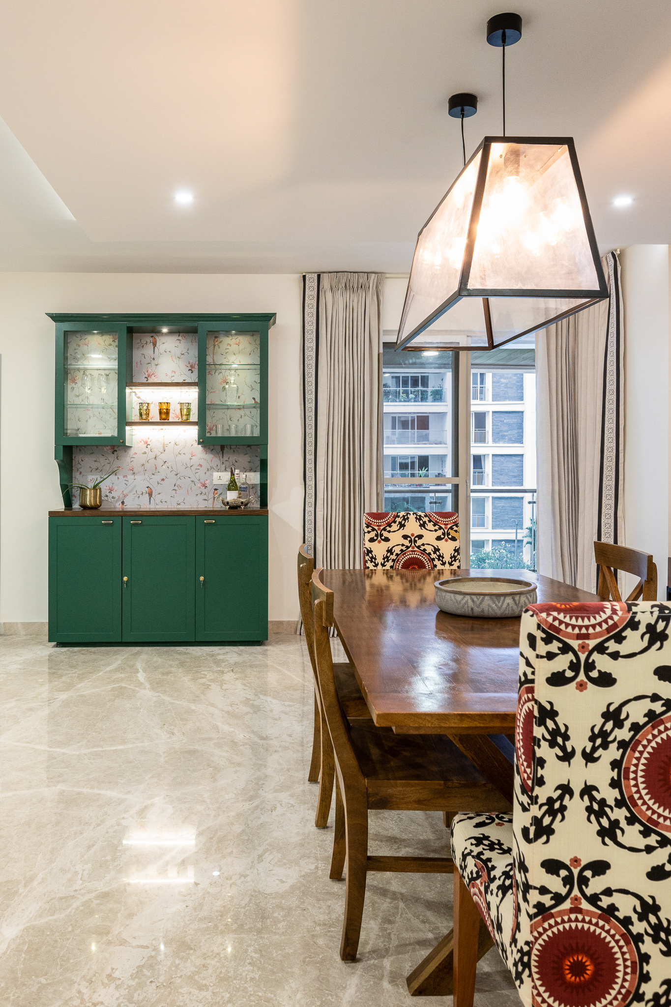
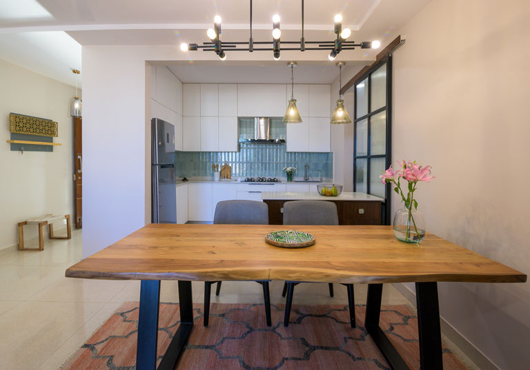
The dining is divided from the living with a large custom console that offers not just visual demarcation but brings in enhanced function serving as a buffet while entertaining and much needed storage below with baskets.
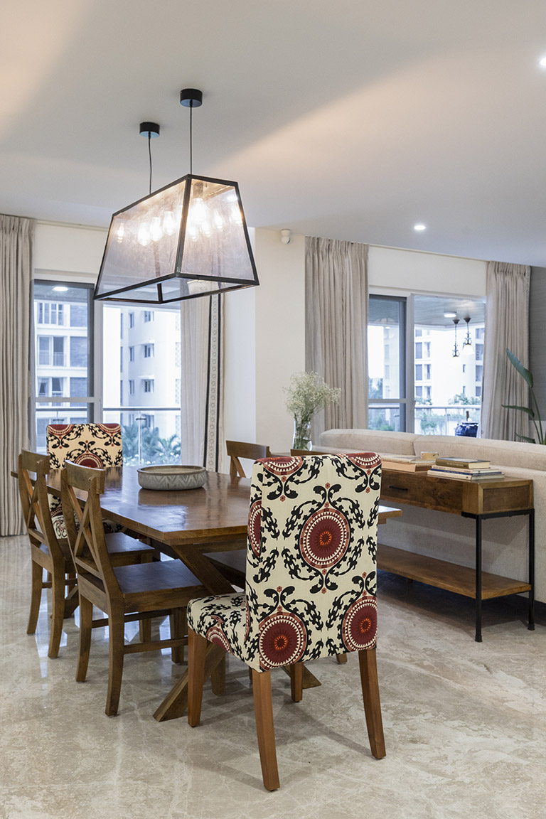
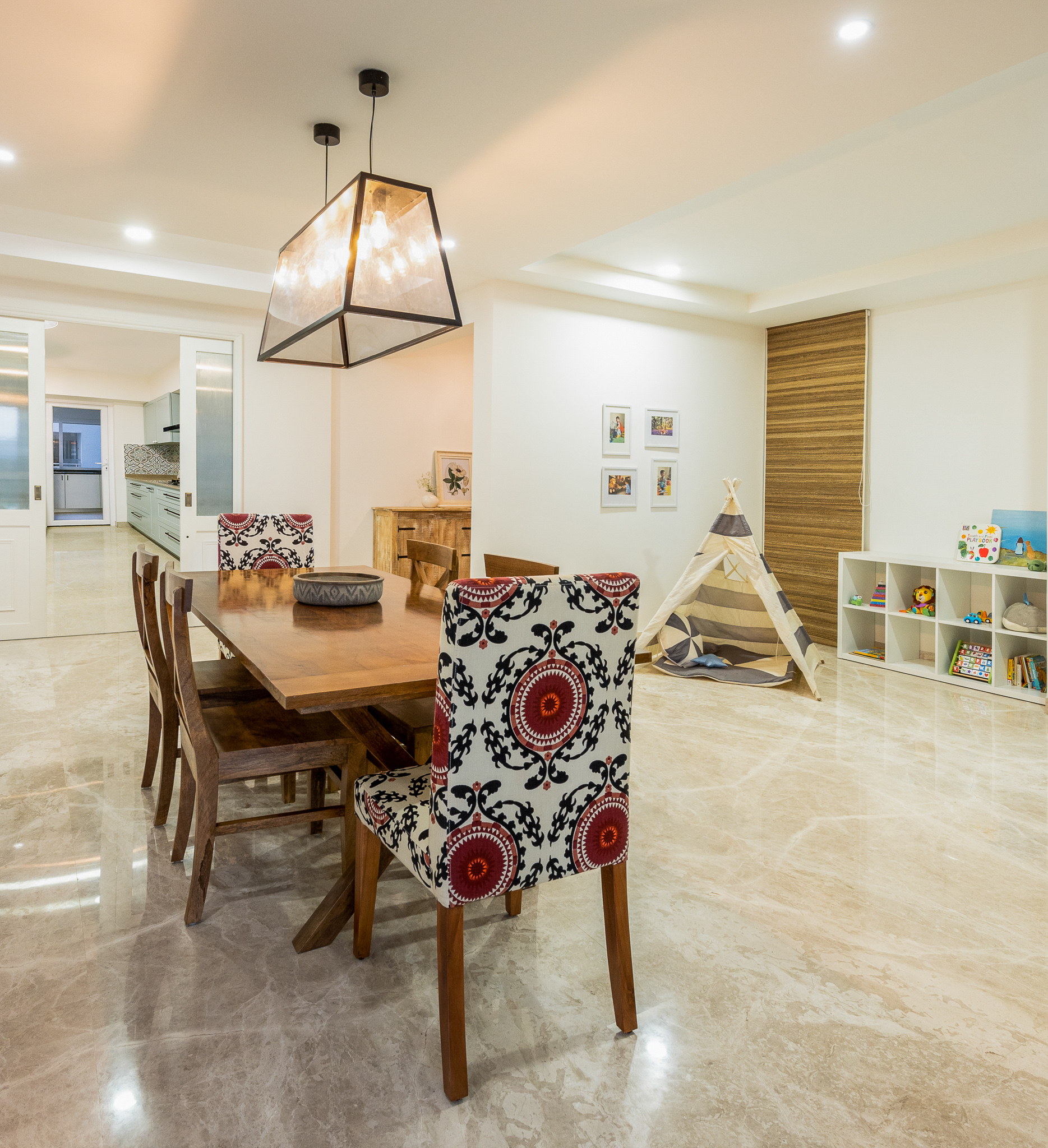
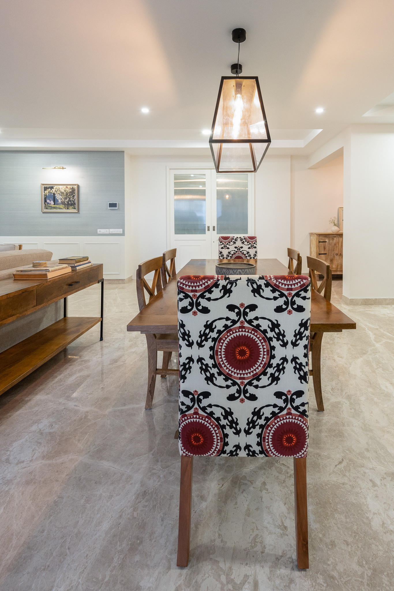
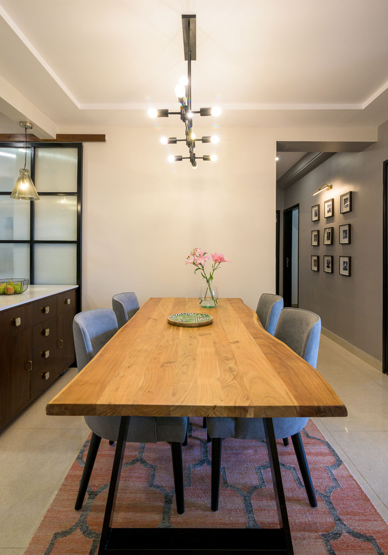
We added a large natural wood x leg dining table for a modern French farmhouse look. The dining table is grounded by a classic modern glass linear pendant. We added a splash of color with Suzani upholstered head chairs and kept rest of the chairs in a natural wood tone.
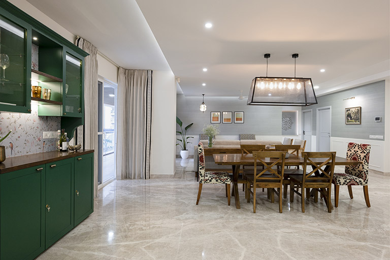
The dining area is flanked by a beautiful bold green custom made hutch with a wallpapered back for some depth and contrast. The green hutch makes a nice segue for the bold blue library to the left and also adds function and color. To the corner of the dining area is a cute kids corner with a teepee tent and simple storage for the toddler of the home 🙂
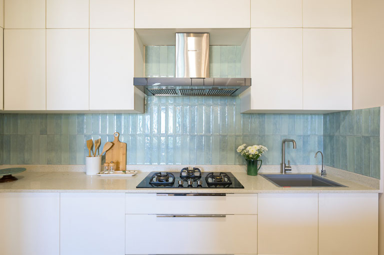
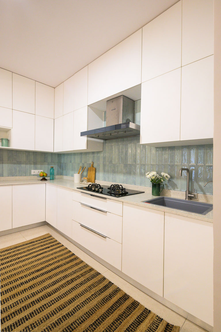
One of my favorite features is the way the dining overlooks the kitchen. The kitchen is concealed with beautiful pocket doors in white that echo the same wainscoting detail in the living and carry that through.
On that note signing out and see you all back here with all the details of the gorgeous kitchen and the other private spaces.
Happy Weekend 🙂
All Pics by Parth Swaminath
Project Reveal – The Modern Victorian Remodel
Created by Vinithra Amarnathan on December 4, 2020
I know we’re late in sharing the story of the modern victorian from our desk….but its never too late to share something so good 🙂
About a year ago a young lawyer couple approached us to remodel and design their newly purchased Bangalore home. Nestled in the heart of downtown Bangalore city, this 950 sqft 2-Bedroom apartment had a charm about itself. The home was on the first floor and all the rooms opened into views of beautiful greenery.
Our clients are co-founders of an independent firm in the city and they envisioned having a classic Victorian-style townhome residence that although harbored a traditional sentiment, was also upbeat and suited to their lifestyle. Walking into the home for the first time, I was struck by its old-world character and how the context of the home itself offered the opportunity of creating a transformative change. The fact that compared to the square footage of most Bangalore homes it was much smaller made it a pretty challenging project. But beyond the low lintels, old mosaic floors and the beams, I saw the beautiful views and the green that enveloped this beautiful home and what it could be.
From then on it was a challenging yet fun journey working on this project and watching every little change we imagined unfold!
We were inspired by the context of the home as an apartment in a small community in the center of the city location and the old-world charm of the building and the neighborhood itself. We kept a large part of the layout structurally intact except for the master bedroom. However, the design of the home in itself was transformative and led to a major gut level metamorphosis. Every built element in this home was transformed: floors, walls, lintels, doors & windows!
The color palette is largely neutral with pastels and greys forming the mainstay, a play of the trusted black and white and hints of color in the form of art, upholstery and soft furnishings in a way that’s true to our style!
The material palette is a classic mix of white marble, brass accents and the warmth of wood with a pop of bold color in the kids bathroom.
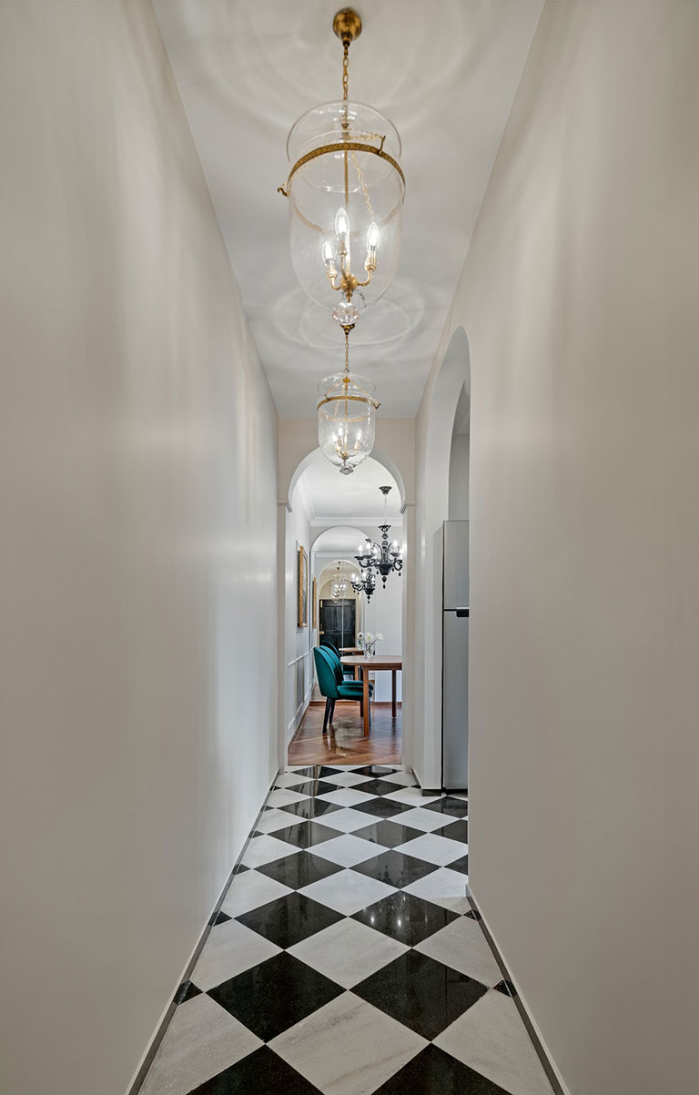
Entry Hallway
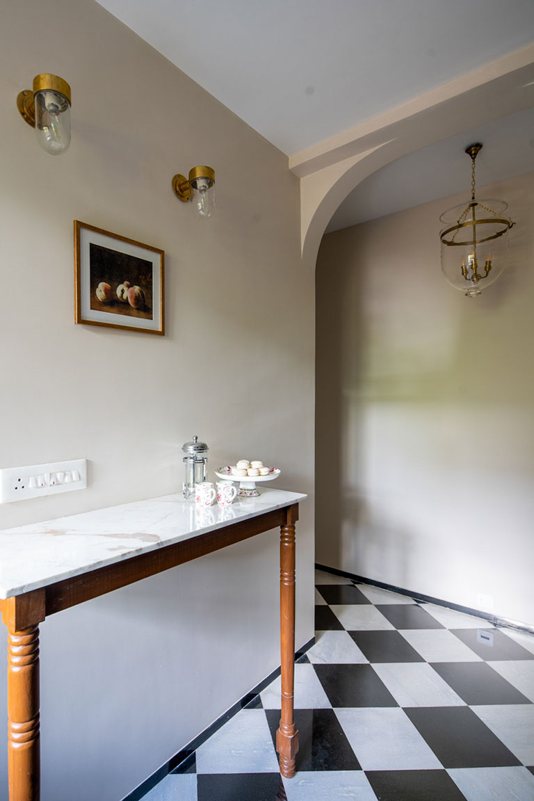
A feature prevalent in older home blueprints, this lengthy hallway space leads into various areas like the nursery, kitchen and the open dining-living room. Black and white harlequin floors with a triad of archways make for an impactful entryway. We increased the lintel levels across the home to accentuate the high ceilings this construction bore. The vertical volume of the hallway was further iterated with the three suspended glass and brass hundi pendants bring in a sense of grandeur. The statement black and white harlequin floors traverse the length of the hallway and carry through into the kitchen and are so true to the townhome sensibility!
On the far end of the hallway a beautiful arched mirror doubles up as a concealed crockery storage for the dining nook – it visually amplifies the sense of space and mimics the arched grammar that’s carried through homogenously.
Living & Dining Area
A compact rectangular space in the floorplan, each nook was designed to host a specific function that also worked with the large cohesive flow of spaces. The flooring here was changed to a rich teak-finish herringbone wooden flooring that gave the space warmth against all the blacks and whites. Architectural treatments like crown-moulding along the ceiling perimeter & wall mouldings add to the Victorian nuances effortlessly!
The snug dining nook is functional and chic! A 4-seater oval dining table wrapped in a teak veneer is flanked by emerald curved-back chairs that make for a cozy spot to gather and dine in. A sharp black Murano glass chandelier crowns this dining area and makes it regal yet minimalistic.
Anchored around an electric fireplace clad in white and grey marble, the living space is the true nucleus of this home. The fireplace has a simple mantle and symmetrical built-in shelving on either side – a piece that packs in storage yet is contemporary. A vignette that spells classic English-town home!
In a small space as this comfort and function were above all! The soft-grey tufted sofa is paired with the cane-back and leather seat armchairs that add sharpness and complement the soft pastel palette. We custom made a baby friendly split round coffee table that’s wrapped in teak veneer. Having a split table allowed to move the halves around and increased their functionality while keeping things modern!
A grey and light blue-toned Persian rug ties in the space serendipitously with the original artwork on the walls. Hints of greens, bric-a-brac and an oversized table lamp are elements that elevate the visual palette further.
A pre-existing beam oddly divided the larger living area and we decided on fashioning it as an architectural feature by creating an arch to demarcate the transition between the living and the bar alcove. The free-standing bar cabinet in bold black with brass inlay shutters sits adjacent to the expansive large windows, making it the perfect spot to unwind. The double-layered drapes add a sense of luxe and character.
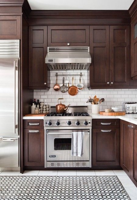
Kitchen
The small but uber functional L shaped kitchen boasts of soft grey shaker-style cabinetry, brass hardware and beautiful marble backsplash. The result is a dreamy concoction of monochrome grey and gold tones that pairs starkly well with the harlequin floors.
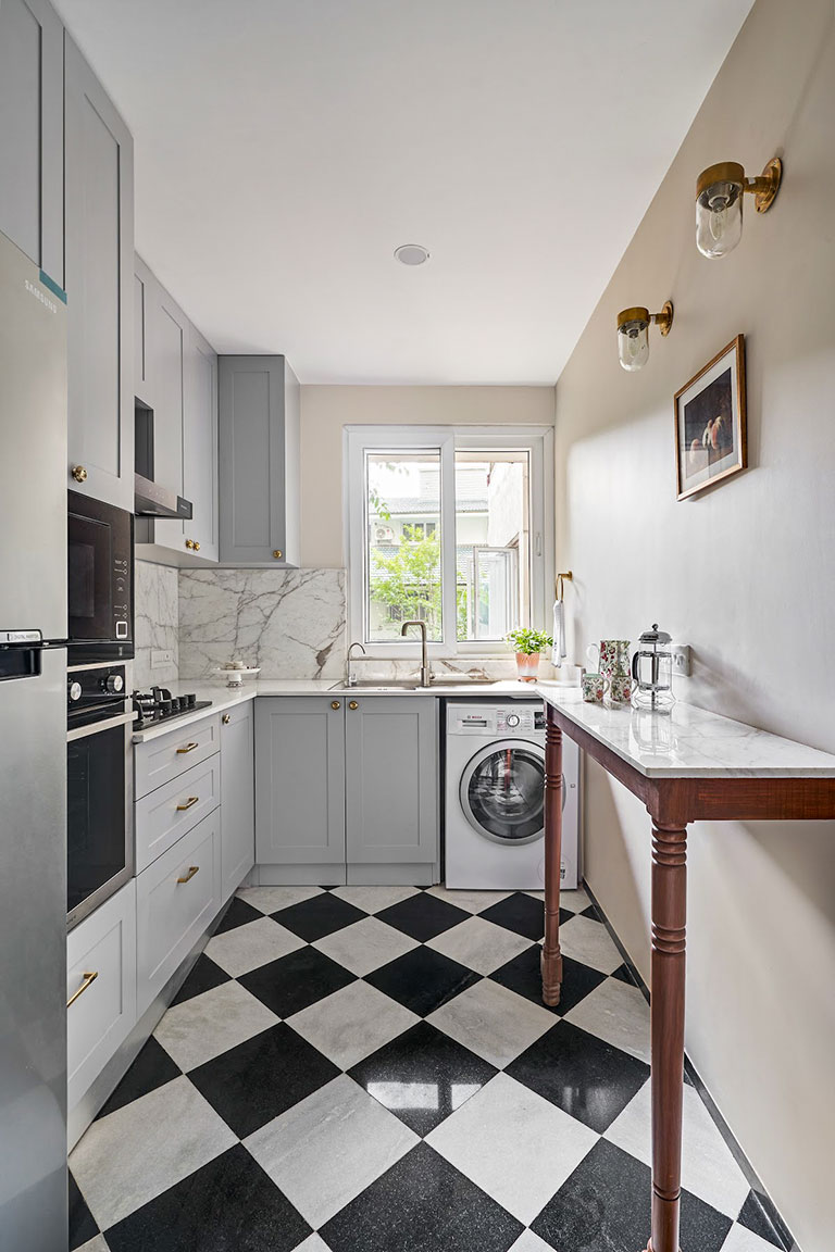
The marble backsplash ties the whole kitchen together elegantly and the extra quantity of the stone was utilized judiciously to create a worktable cantilevered on the wall with turned custom wood legs – which also adds to the counterspace effectively! A pair of hundi wall sconces crowns the worktable walls and adds vintage charm to the nook.
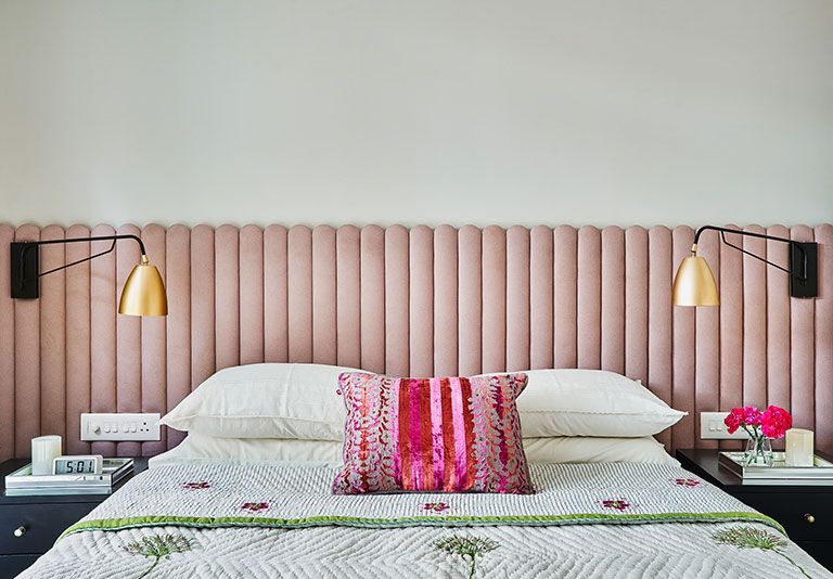
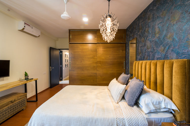
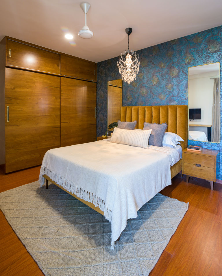
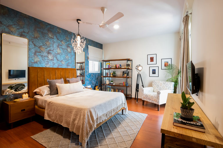
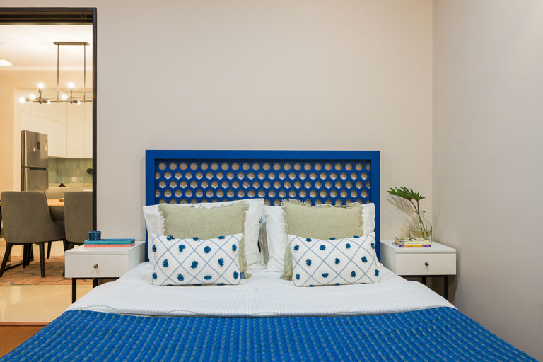
Master Bedroom
A serene sanctuary for the clients, this ensuite master bedroom anchors within its wall’s multiple functions. The original layout of the room witnessed notable changes – The headboard wall initially harbored a window which was completely closed to create a solid wall. The balcony wall was opened up to create an array of sliding doors that flushed the room with daylight and ventilation. The flooring here is a dark walnut herringbone flooring that gave the room a rich high contrast look when set against the pastels.
We took a section of the room to create an open walk-in L-shaped closet space for the couple in tones of white and light wood with brass accents. The opposite wall was clad with a floor to ceiling beveled-edge mirror that allows the niche to double up as a vanity and plays on the visual volume.
A scalloped blush upholstered headboard is the pièce de résistance and is paired with bold black nightstands. The sleek black arm and brass dome wall sconces complement the bedside composition just right! The bedroom hosts pops of hues like fuchsia and greens in the form of linens and art. The neutral toned traditional rug and double-layered drapes make for a warm and inviting space.
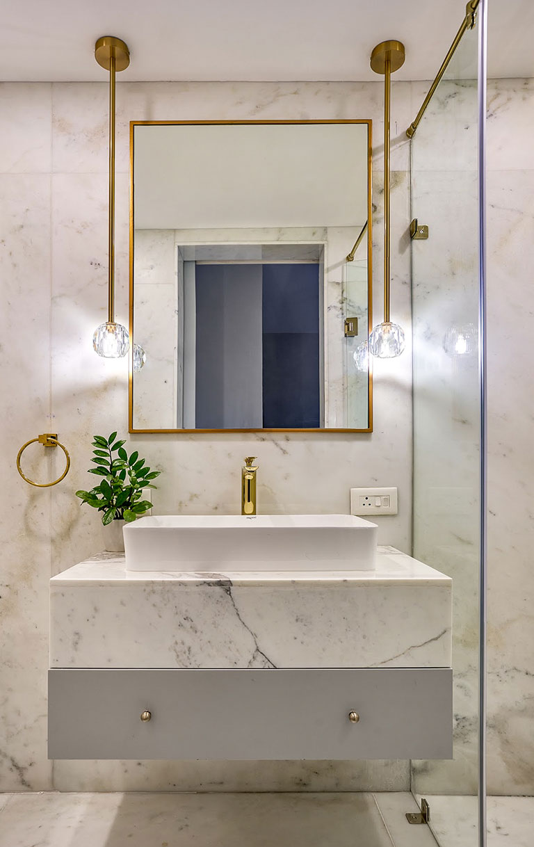
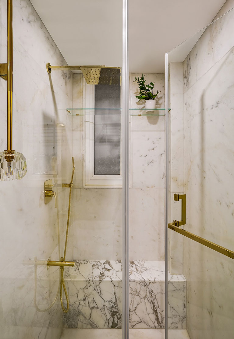
The 10’ x 4’ bathroom was sure a space that needed to be designed to a ‘t’ to get the most out of the area available. Clad ubiquitously in white marble, the bathroom has a dedicated shower cubicle with a shower bench in marble and a marble-topped vanity with gold fixtures worked into the mix.
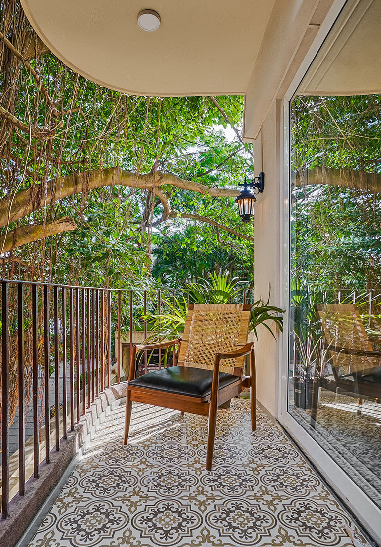
The attached balcony is adorned with beautiful traditional motif floor tiles and has a pair of Victorian lantern garden lights that make the space inviting and resonate with its character! It’s an oasis for the family as they enjoy time together shaded by the mighty banyan canopies on site.
Nursery
Pastels, geometrics and florals conjure magic in the baby girl’s nursery. Function was key as the room needed to evolve and shelter the growing needs of a baby. The pivotal pieces in the space were the crib, the dresser cum changing table and the well-designed wardrobe storage.
The custom floral watercolour wallpaper encapsulates the design identity of the nursery: lots of soft whites, blush pinks and gold accents! The flooring here is a lovely light-oak that lightens and brightens the space.
The polka rug is a winner and accompanies the pinstripe grey and white blinds perfectly!
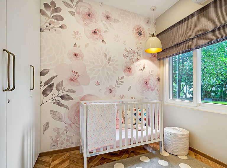
The ivory dresser cum changing table is a significant piece of furniture that combines function & storage. An array of sleek bookshelves, custom art prints and a candy pink wall sconce add some fun to the nook.
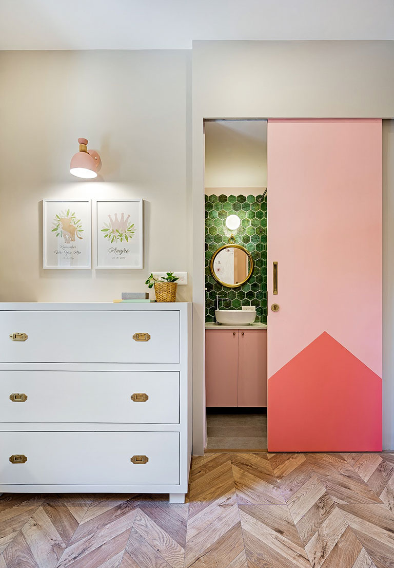
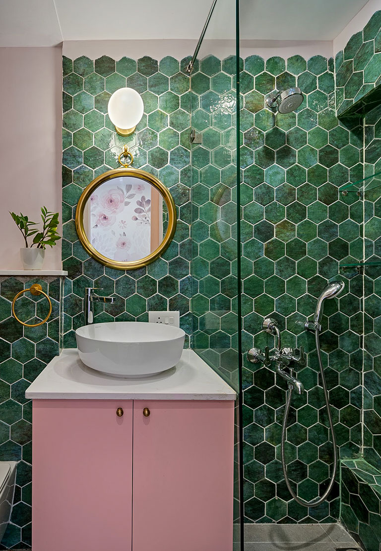
The nursery’s bathroom is cladded with gorgeous green hex wall tiles that when paired with the soft pink vanity make for a match made in colour heaven! The bathroom sliding door is an interplay of geometric compositions and bold pink colour-blocking!
The Modern Victorian Remodel was truly a creative dreamscape for a designer where a dated home was transformed with its every weave! The Victorian Town home design vision was something the clients and we stayed tethered to – resulting in a space that was a true manifestation of the mood boards into tangible reality!
“This home allowed us to have a big beautiful vision and then make it happen! It has been such a fulfilling creative journey to embark on and create a home that’s rooted to the vision but at the same time stays true to function and the clients needs! The home and the design belonged together and while we worked with a focussed brief we were also lucky to have clients who trusted in our ability to reinterpret, imagine and create in context of function and suitability”, concludes Vinithra.
All photos by Shamanth Patil
Content by Lavanya Chopra
Project Reveal Part II – The Modern Plantation Home – Private Spaces
Created by Vinithra Amarnathan on October 11, 2020
We hope you enjoyed first part of the modern plantation home reveal and we’re bringing to you today the private bedroom spaces in the home.
Before you walk you up the beautiful glass and wood stairway, lets look at the guest bedroom in the ground level.
Guest Bedroom
Located on the ground level of the home, this bedroom anchors a traditional yet contemporary look and feel. The hero of the space has got to be the wallpapered wall. The floral-motif wallpaper introduces tones of maroons, deep green and beige into the space and that was a jump-off point for the design trajectory too!
The custom cane-mesh & wood bed contributes to that vintage timelessness of the room and is paired with complementary sleek nightstands in a similar demeanor. Accents of brass find their way into the space in the form of the bedside lamps, hardware and curios.
The room has a connected walk-in wardrobe section that has shutters painted in a warm grey-beige & brass antique hardware with a vanity section that stay true to the aura of the room.
First Floor
The first floor of the home anchors the private bedrooms, a family lounge and a compact home office. The original staircase railings were replaced in the home with dark stained wood handrails and clear glass panels for a clean modern vibe. We also incorporated additional storage under the staircase on the ground level to amp up on function. The landing level hosts a composition of 4 oversized organic prints carrying through the hints of soft terra cotta that lend the transition space character.
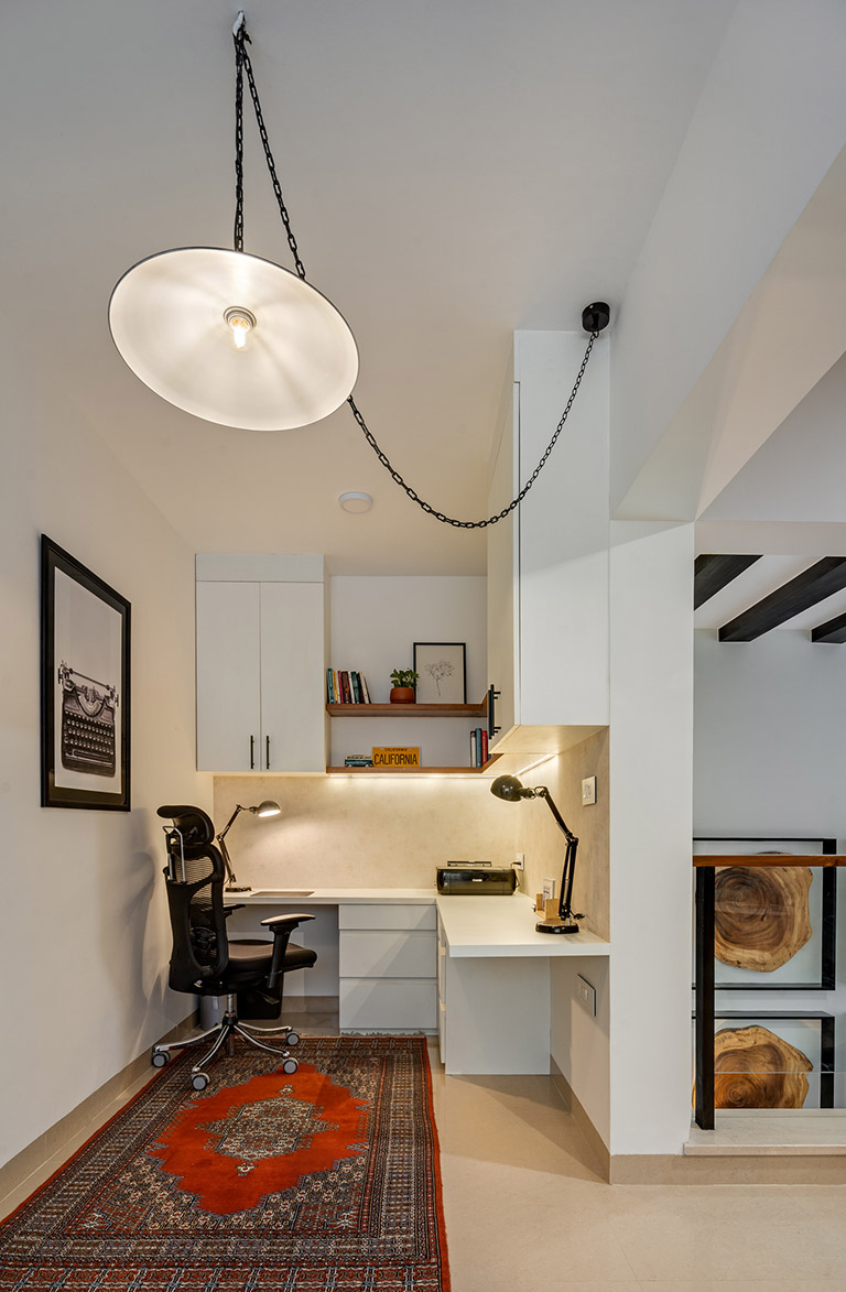
Home Office
The home office space was created out of a tight nook at the first-floor landing level that didn’t offer any function in the layout initially. We reconceptualized the space as an L-configuration workspace perfect for the couple – what a relief during these work from home times huh!
We furnished this nook with plenty storage in the form of drawers at the bottom, ceiling-height cabinetry and open shelving for bric-a-brac! The bright white cabinets and warm wood shelves make for a neutral palette and have been interspersed with a a grasscloth wallpaper for some texture! A graphic typewriter print, a suspended black metal pendant light and a rich patterned rug the client pre-owned create an impactful vignette of the space as you walk up the stairs! Truly a cozy spot to hunker down and work from home as it becomes the new normal. 😊
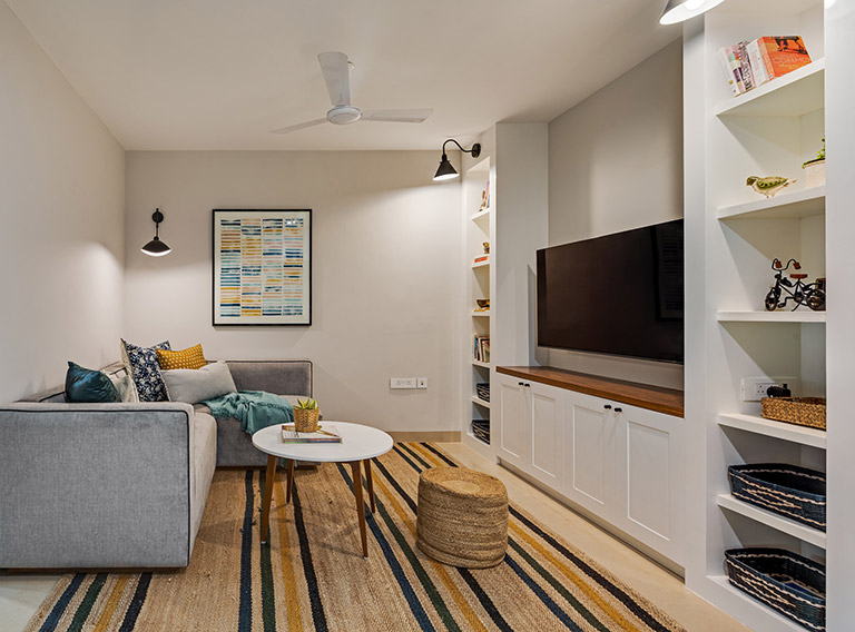
Family Lounge
Inviting, comfortable and snug – this family lounge looks into the double-height volume of the home. Positioned between the private bedroom sections, this zone is the family’s sanctuary to unwind!
A compact custom made L-sofa, jute poufs and a contemporary round coffee table make the space high on function and comfort in equal strengths. The large geometric art print in a way inspires the color story of the space in the form of the soft furnishings and the family’s collection of masks and art is collaged together in a gallery wall.
The bold striped custom made square rug fits the space beautifully. The built-in storage on the TV wall was a great way to pack in storage and display books and knick-knacks. One of our favorite elements here is the sharp black lighting and how it brings just the right amount of contrast and modern to the space.
Kid’s Bedroom
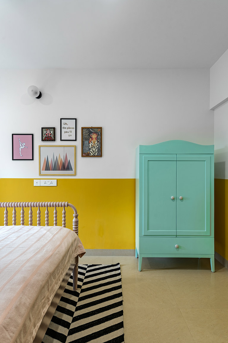
‘Pastel Paradise’ – Two words that encapsulate the spirit of the young daughter’s bedroom! We ensured that the design approach dabbled in colour, pattern and texture while also harnessing the capacity to grow with the little one. 😉
We opted for a vibrant sunshine yellow half wall across the room, that instantaneously made the space uber fun! A soft pink colour was used in the wardrobe section of the room and we paired the same with custom oval wooden handles!
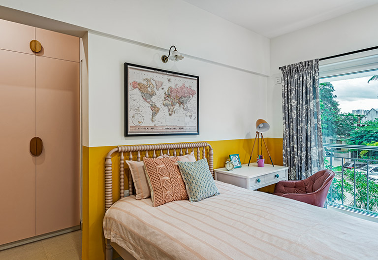 Hues like yellow, teal and pink compose the pastel inspired palette and all elements like furniture, soft furnishings and accessories followed suit. The Jenny Lind bed in a dusty rose hue with a vintage world map art print makes for a dainty vignette. We created a compact study niche with a sleek white desk with quirky teal knobs and a dreamy blush chair in the brightly lit nook by the window. Floral grey and white drapes bring in softness and pattern.
Another favorite corner of ours has the custom mint armoire created for all miscellaneous storage needs and this has been tastefully positioned adjacent to the colorful gallery wall of prints that are unique to the child’s interests and hobbies!
Master Bedroom
The master bedroom is a simplistic and modern space in which monochromes with highlights of ochre take the visual lead. We’ve worked towards creating diverse functional zones within the room’s blueprint.
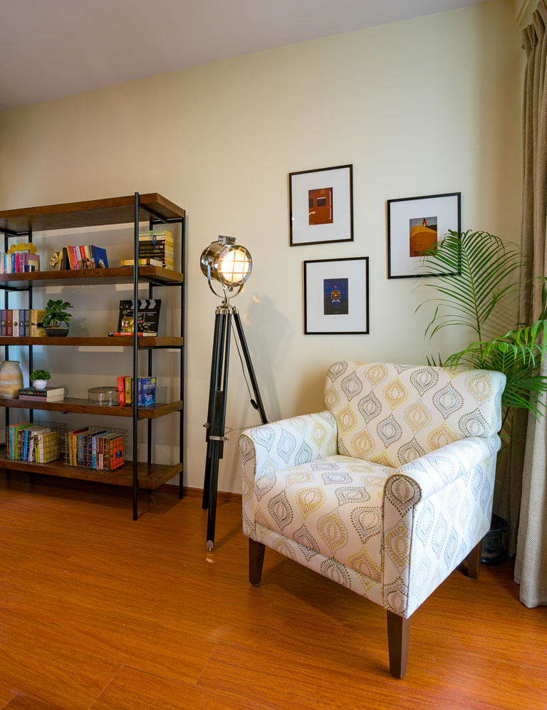
The reading nook at the entrance of the room is complete with a plush neutral wingback chair & a leaning oversized mirror, which amplifies the visual volume of the room.
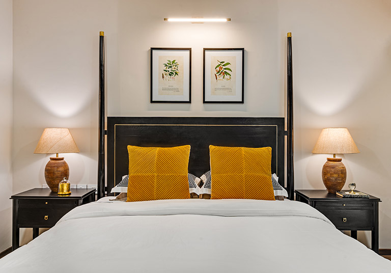
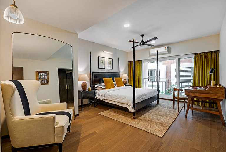 The 4-poster bed is the pièce de résistance in the space & makes an iconic statement with its black-stained wood and brass inlay detailing. Complementary nightstands create the quintessential composition when paired with the bed. Large fluted wood base table lamps, minimal botanical art prints and a jute rug add the finishing touches to this zone. 😉 The mustard velvet curtains sure contribute to the lavish character to this master suite.
A deep midcentury style desk opposite the bed adds function. The walk-in closet here is an L shaped wardrobe clad in a smoked oak veneer and brass hardware.
Designing the Modern Plantation Home has been such a wholesome experience and we hope you resonate with us through this detailed walkthrough! We were blessed with stellar clients who believed in the vision from the get-go! In times like these, we’ve come to realise that homes are truly our sanctuaries and this home has been a delight to conjure to life!
See you here soon for yet another project reveal! 😊
All pictures shot by Shamanth Patil
Content by Lavanya Chopra for Weespaces
Project Reveal Part I – The Modern Plantation Home – Living Spaces
Created by Vinithra Amarnathan on September 27, 2020
It’s been a tad silent here but we’re back with a fresh and much anticipated project reveal!
It was August – 2019 when our team first did a walkthrough of the bare shell G+1 villa in a quaint gated community. A young family that hailed from Kerala, our clients desired an abode which was strongly rooted in its identity but with a modern flair to it. 😉
Our combined inspiration came from the palatial, open floorplan tropical-modern homes that resonated with the quintessential Bawa aesthetic; the earthy goodness of God’s own country & all this wrapped in the bones of this Bangalore family home!
We were working with a great open layout, umpteen daylight, a play of volumes and a sense of inside-outside living – we couldn’t be happier! With travel plans put on an indefinite pause, come experience this residence with us! 😊
Ground Level Living Spaces:
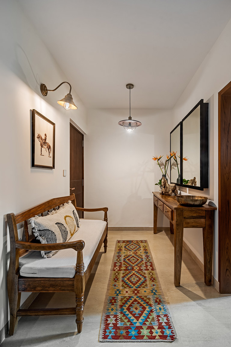
Entryway
As you walk in to the villa, the entryway is a small space that opens into the open living areas to the left and a stairway leading to the first floor. The entryway is a compact spot yet impactful in its presence! The mango wood console and a plantation style upholstered wood bench are sure the statement pieces in the spot. They add a touch of timelessness to the space.
A design hack that went miles for us were the two symmetrical black frame mirrors – while making for a design addition in the foyer, one of them also strategically conceals the electric panel. The kilim runner & vintage art print lend the space an elevated touch – small details are key! 😊
Living / Dining
The formal living section of this home is the true heart of this home – its doused in tropical modern aesthetic and each element contributes to its identity effortlessly. Bathed in natural daylight, a restrained earthy palette and organic elements, this living room is the perfect example of a modern understated take on plantation homes😊
We added dark-stained wooden rafters to give the ceiling more definition and suspended a colonial inspired wood fan with a 10ft hang to get the plantation vibes going! The sofa is beautiful modern curve back sofa in a terracotta velvet fabric, the wood armchairs have exposed woven cane backrests, the bench boasts a bold striped monochrome fabric and all these pieces come together harmoniously.
We layered 2 rugs to create visual interest considering the scale of the space and placed a clean modern coffee table that has a concrete-finish base and a dark wood top. The wall sconces and the corner floor lamp illuminate the space and set the ambience for entertaining.
Additions like the antique mirror opposite the large patio doors helps amplify the light in the space and let’s not miss the composition of the four colossal framed raw natural timber slices that we framed in a slim black frame and mounted on the wall. This was no mean feat from an idea in our heads to procuring raw wood slices and then framing them and hanging them from the double height ceiling. They truly draw the eye and hone in on the rooted organic character of the home.
The bar nook by the window is one of our favorite moments in this home. A swoon-worthy cane cabinet where we removed the wood shelves and added marble shelves keeping in mind function and a vintage inspired moody print set the mood right for those evenings meant for unwinding! 😉
The Dining section in this open floorplan pays true homage to the tropical theme with its salmon and green hues incorporated into the custom wall mural. Oversized rattan pendants hang beautifully over the midcentury style dining ensemble in a walnut finish. We created a custom black crockery console with sleek profile shutters and added a monochrome bone inlay mirror that reflects all the natural light coming in from the large kitchen window and complements the space perfectly! 😊
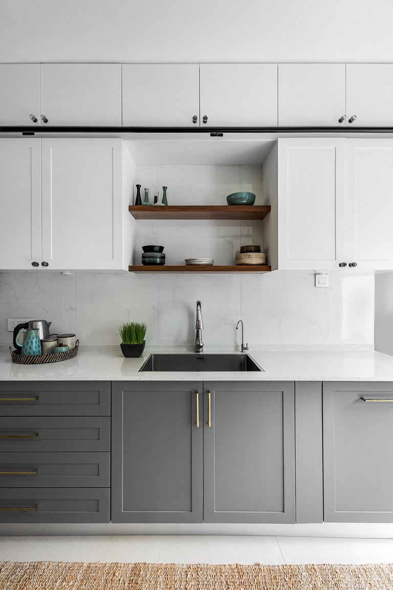
Kitchen
This dreamy dual-tone galley kitchen celebrates the classic combination of warm grey & white! This kitchen packs in maximized function and storage with its ceiling-height cabinetry and a custom walnut stained wood ladder that glides across metal rails.
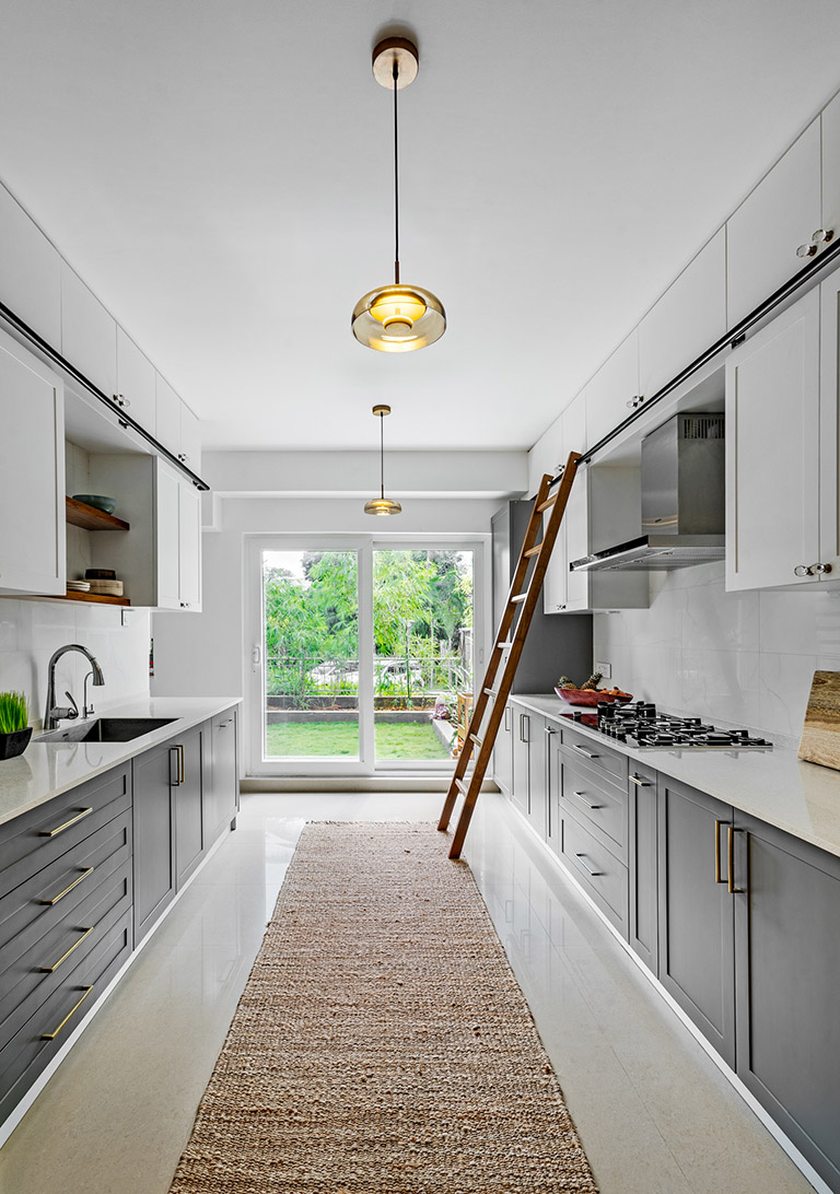
Matte brass hardware, shaker style cabinetry and glass knobs complete the look keeping it contemporary and clean. The marble tiles as the backsplash was a no-brainer choice we love!
Elements like the 10-foot jute runner grounds the space and the open shelves over the sink make for a lovely spot to display curated crockery.
The light-filled kitchen has views of the front lawn and we’ve topped the space off with two glass and pendants that accentuate the length of the expansive kitchen. 😊
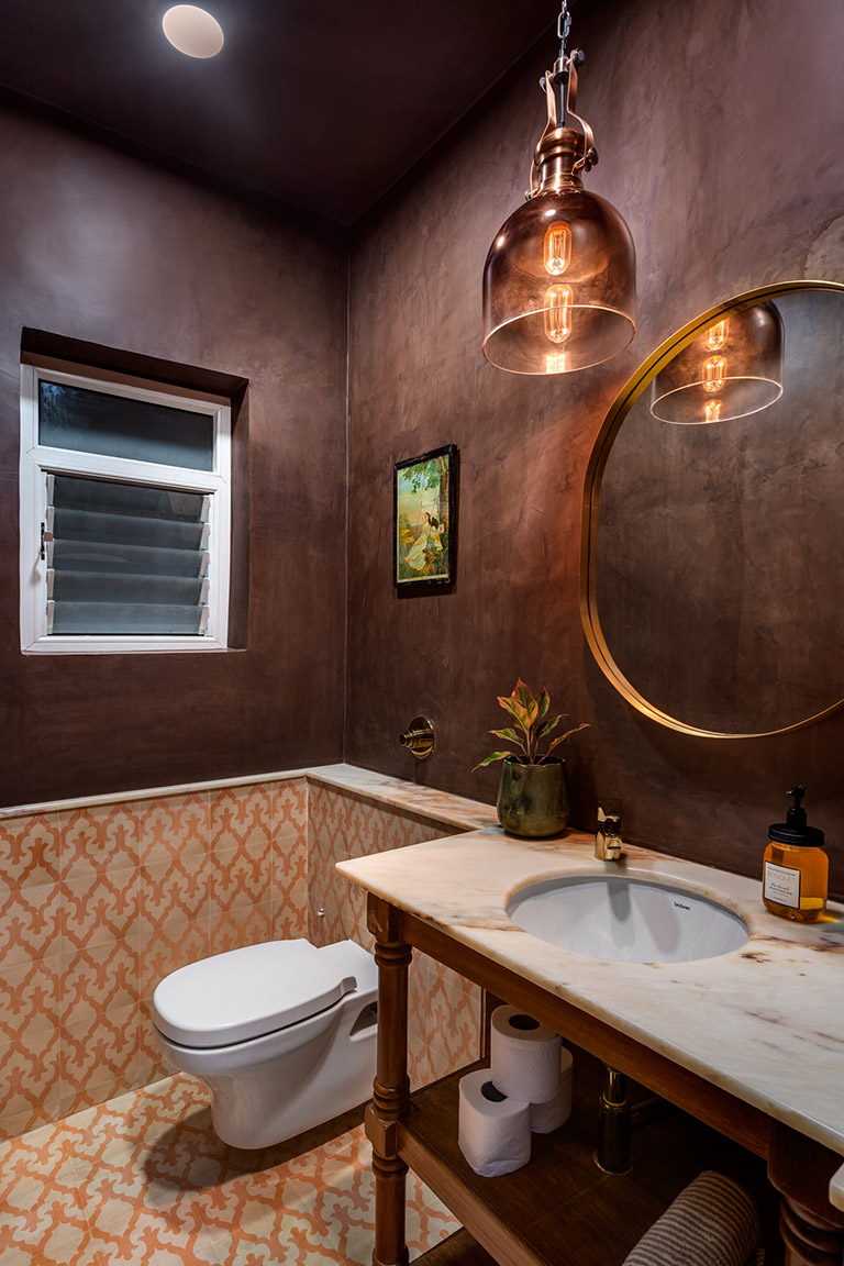
Powder Bathroom
The powder bathroom is all things moody & dramatic! 😉
We’ve gone the dual-materiality route here and how! We treated the upper half of the walls with a burnt sienna venetian plaster finish followed by artisanal traditional-motif beige and orange floor and wall tiles by Bharat Floorings. The color-palette here is all things traditional yet upbeat!
A custom wood turned leg console and gorgeous terracotta brown veined marble top create the vanity of dreams! A deep-edge custom brass mirror and a smoky-copper pendant add a hint of luxe to this vanity nook. The powder bathroom sure is a highlight that is a reflection of the home’s design narrative!
Patio
Dreamy, Whimsical, private and oh-so perfect for this family of three! 😊
The patio adjoining the formal living section has a raised wooden deck that sits over a lush front lawn. This dreamy patio nook extends the living area into the outdoors beautifully with the addition of a handcrafted wooden bench with tile-inlay. We added a collapsible kilim recliner, a bright kilim dhurrie. A cluster of three black metal chandeliers suspended at varying heights play up the double-height of the patio’s volume. The birdcage with pillar candles is a dreamy addition we love! 😊
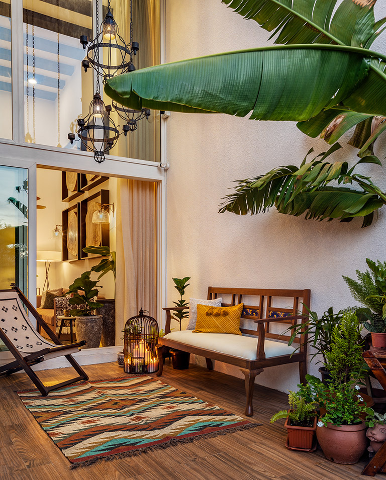
A perfect spot for the family to enjoy and entertain.
This home has truly been a treat to work on. And we hope you love it as much as we do!
We can’t wait to be back soon with more of the private spaces in this home.
Content by Lavanya Chopra for Weespaces
All Pics shot by Shamanth Patil
Project Reveal Part II – The Jewel Tone Inspired Apartment
Created by Vinithra Amarnathan on February 26, 2020
Ready to see more of the jewel tones make their way into this home? Come on board as we explore the bedrooms and hallway section of the Jewel Tone Inspired Apartment. The spaces were aimed at being cozy, comfy and representative of what our clients believed echoed their emotion of a ‘home’.
Let us just promise you a satisfying dose of color and a zestful design persona😉
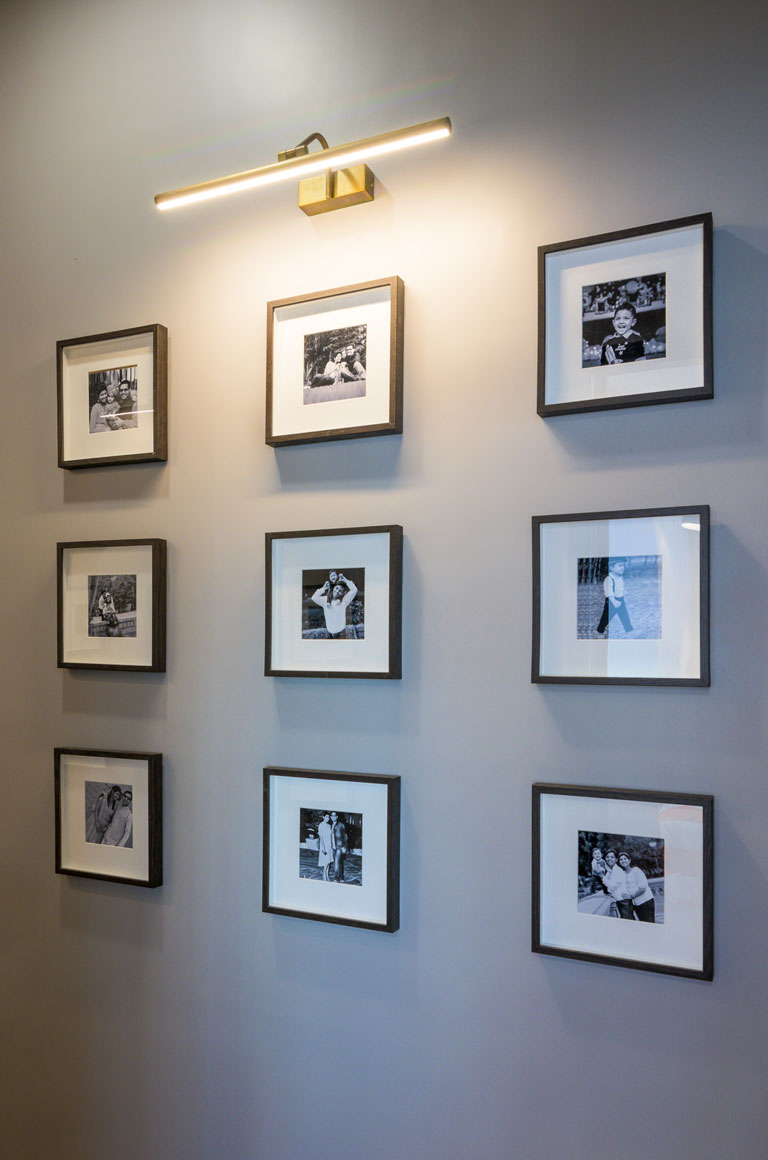
Hallway
The most common assumption regarding small and narrow spaces is that darker colors on the walls will only make it look smaller. Leave it to us to debunk dated design myths!
We’ve carried through the warm grey tone from the living section TV grid-patterned wall into this section of the home. The usage of the same hue to bathe the walls up to the ceiling gives the hallway a sense of connection that links it to the larger living section of the apartment. The grey tone in the constricted space adds visual impact with and brings in the right amount of contrast against the black and white photos we added. An earthy hemp and black striped runner rug visually elongates an otherwise small hallway.
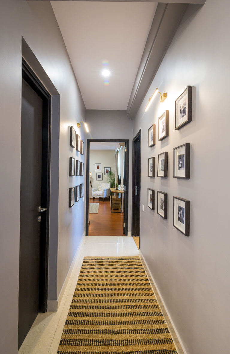
We’ve installed monochrome family photos in simple Ikea frames and antique gold picture lights that build on the emotional connect the space establishes with the home dwellers! It’s a walk down memory lane which allows one to pause and reflect on the things that actually matter in life – Family. 😊
Master Bedroom
The master bedroom was intended to be a personal retreat for the couple and one that embodied the things they most love – books, music, Bollywood and color😉
The pièce de résistance in the space is the hands down the Roberto Cavalli Ferns wallpaper that makes for the perfect backdrop to the gorgeous ochre upholstered queen bed that we’re swooning over. The charcoal base of the wallpaper makes the olive and teal toned foliage pattern pop so beautifully especially when paired with the warm tone headboard! The vertical stitch on the headboard gives the bed an impression of increased visual height. Match made in color heaven!
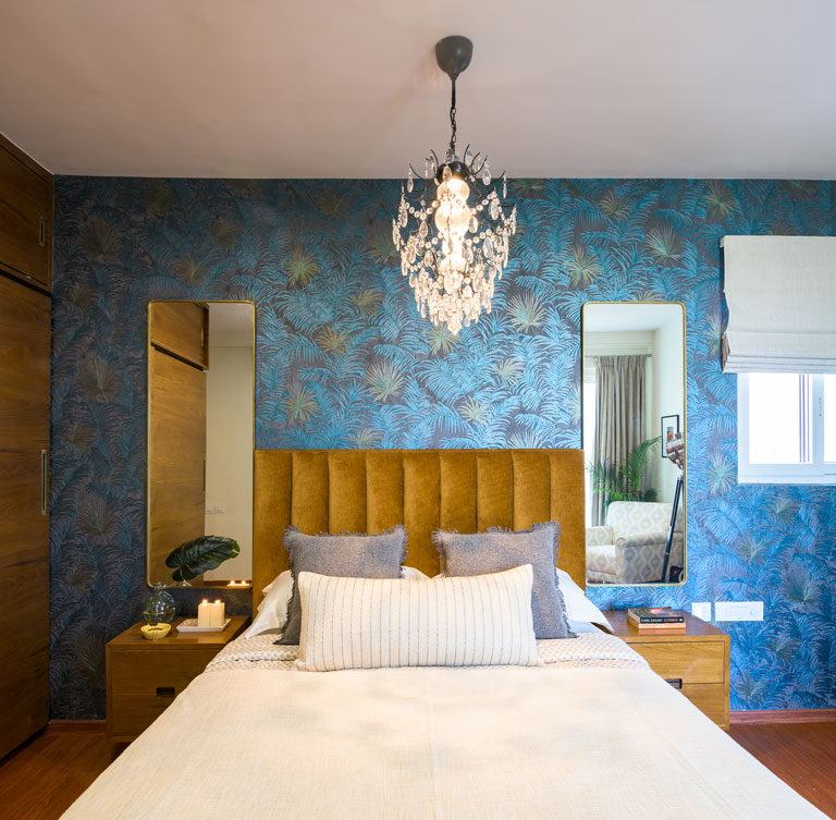
We added a set of midcentury modern inspired bedside tables that are finished in a medium teak tone veneer and rounded edge tall mirrors with brass borders. We ditched the conventional bedside lighting and instead chose a luxe chandelier in black metal with brilliant crystals.
A snug nook with an upholstered reading chair in a soft beautiful pattern, minimal wall prints that speak to the couple’s love for all things Bollywood and a camera light floor lamp which was on the list of must-haves for the lady of the house come together to complete this vignette in the master. The deep wood and black metal modern bookshelf is yet another piece that brings together function and aesthetic into the space as the husband and wife duo are voracious readers. While books took centerstage in the unit, we interspersed the same with curios and knick-knacks that gave the space a more lived-in touch! It’s all in the details. 😉
The rug grounding the room is a light grey geometric tufted one that makes for a neutral base upon which the elements of color come through effortlessly! The custom sliding door wardrobes bring in that elevated look to the bedroom. The antique brass hardware and the warmth of the wood veneer is a sheer winner!
Chic, functional and so full of character.
Kid’s Bedroom
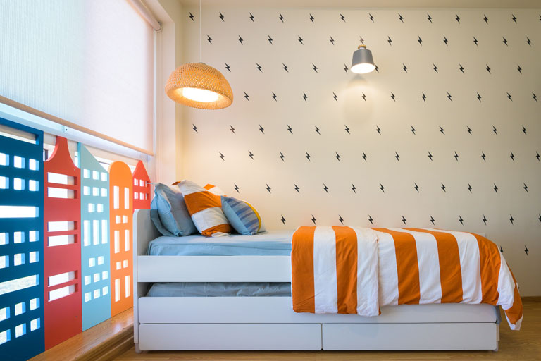
This space was designed for the 6-year-old in-house superhero! May we say it’s probably one of our favorite kid’s spaces in a long time.
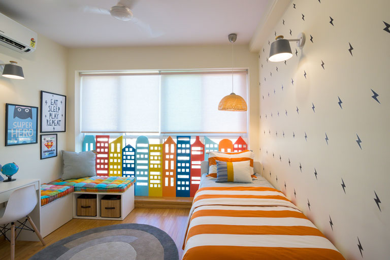
We kept the overall base neutral with pops of color to bring in that vibrancy to the space. The bed is a sleek white Slakt trundle bed by Ikea and is perfect for those sleepovers! The bed wall has been covered in black thunderbolt decals (each stuck with love by hand). 😉 Decals are an inexpensive and quick way to uplift the way a room wall looks instantly!
The other side of the room anchors the custom desk and corner seating nook that has our hearts. The seating space also houses storage in the form of baskets and a concealed drawer that’s essential to put away miscellaneous items. The custom upholstered cushions use the Modish Madras fabric by Freedom Tree and we’re loving how it packs in a punch of color!
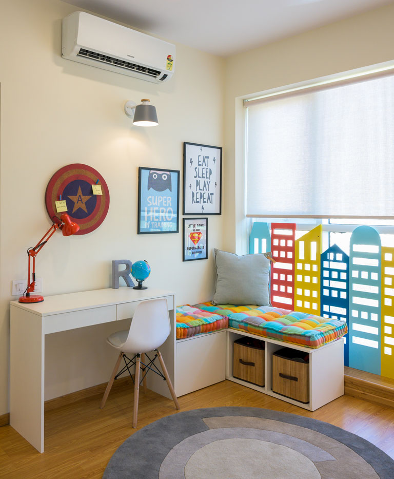
Superhero-inspired prints adorn this corner and give it a fun feel. 😊
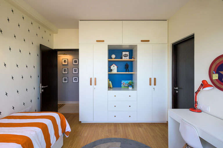
The skyline element in the room was a passion project that was designed to the ‘t’ and executed by the team with complete perfection. The room initially had an eyesore for a protection railing which we uprooted and instead replaced it with this custom city skyline installation complete with tiny openings and colors like red, orange, yellow, mint and deep blue! The wardrobe section on the opposite wall in white has wooden hardware and an open section to display items, store books and bric-a-brac that the child can easily access.
We’d even changed out the flooring here to a lighter wood tone which gives the space a lighter and brighter feel. Not to forget the neutral grey-toned circular rug by Woven Dreams that fits right in! This room was a blank canvas that let our creative juices flow!
Guest Bedroom
This bedroom had a neo-traditional sentiment to it that would be used more frequently by the couple’s parents. The walls have a soft taupe shade that adds warmth to the space instantly.
The bed has a hexagonal jaaliwork pattern as a headboard and the whole piece has been painted a deep blue tone which gives the space a common thread of hue. The bedside tables are simple white top, black metal legged units with brass hardware.
The Puja unit was a custom piece of furniture that was designed in detail to match the client’s needs. Its distressed soft bluish-green filigree latticework doors and ornate legs add to the old-world charm aesthetic of the space. On the same wall you’ll spot a doorway art print inspired from the royal Mughal architecture in the country paired with glass sconces.
The wardrobes are tall with slim shutters in an ashy-brown finish that add height to this compact space. The tie and dye inspired curtains with mint blue hints fits right into the grammar of this room. We’re feeling anything but blue in this space! 😉
The Modern Jewel Tone Inspired Apartment has been designed with a vision that ensures that the client’s needs have been understood at an intrinsic level. Designing this home has truly been a stimulating experience which was a love affair with color at many levels!
2020 is going to be such a great journey and we hope you can already tell! We’ll see you here soon with yet another design saga! 😊
All pictures shot by Parth Swaminathan
Content by Lavanya Chopra for Weespaces
Project Reveal Part I – The Jewel Tone Inspired Apartment
Created by Vinithra Amarnathan on February 14, 2020
It was July of 2019 and we’d met the homeowners of a space that was going to be one of the most fun projects that we’d design in that year! This apartment is home to a vivacious couple and their delightful young son.
Bold rich color derived from jewel tones, metallic hints and a play of textures from various materials form the DNA of the home and are the design features that give the space its sense of identity. Throw into the mix a penchant for Bollywood and cinema that the couple share and oh it was a ball! 😊
With Part – I of the project’s reveal we take you through the Entryway, Living, Dining, the Kitchen and the Balcony nook. The project encouraged us to step foot into creative territories that are outside our design comfort zone, let us experiment with a healthy dose of color and allowed us to interact with elements of pop culture! This 1760 sq ft home is unafraid of expression, sensitive to its user’s needs and the perfect balance of bold and stated.
So, Lights, Camera, Design!
Entryway
The entryway is a minimal segue with its clean-lined design sensibility that prepares the eye for all that one is about to experience. 😉
We’ve used a large round mirror that has a wooden shelf running across its length which adds that element of unexpected and function to this narrow foyer. A custom key and letter holder unit with latticed details adorns the right-hand side wall. The sleek artsy woven rope bench is our nod to texture and warmth. Not to miss the dark tone amber glass fixture that adds that touch of glam to the entryway area. It’s easy on the eye and just the right welcome into the space.
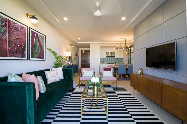
Living Area
The brief that the clients had at the very beginning always highlighted an inclination towards a statement emerald green sofa that’ll be the pièce de résistance of sorts in their space. So, we ensured that we made that element our muse as we got down to designing this zone. 😊
Blush, emerald green, the classic black & white duo and metallic brass accents give this space a bold yet layered persona. The overall look is modern and elevated and gives the space a chic vibe. The tufted emerald velvet sofa in clean mid-century lines paired with the blush and wood tone chairs make for a great combo now don’t we all agree? 😉 The striking monochrome geometric rug gives the space a sharp but simple departure from all the colour and brings in balance.
The brass frame coffee table, wood side table with a cane basket and the classic mid-century TV unit clad in a rich teak veneer tie in beautifully with the overall palette. The oversized botanical prints pick effortlessly on the green and pink strains and look like they were meant to be in this space! We added a corner pendant in brass, brought in hints of gold in the coffee table and hardware across the space to bring in the metallic touches.
Another favourite feature of ours in this area has got to be the accent wall. We chose a warm grey hue that bathes the TV wall in conjunction with a grid pattern all over. The battened wall immediately elevates the look of the area and gives the space a sense of contrast and depth!
Dining cum Bar Section
Perfect for a little Friday night shindig or a warm family dinner with loved ones.
The light wood raw edge dining table brings in a touch of modernity with its sleek angular metallic black legs. Custom grey upholstered dining chairs and an all-black metal chandelier with exposed filament bulbs keep the look crisp. The Moroccan patterned rug anchors the space giving it a welcome dose of colour and picks beautifully on the blush tones in the living chairs.
The bar section flanks the dining zone on one side and is a versatile setup. The midnight blue crockery cum bar unit is adorned with an embossed scallop design on its shutters, brass hue legs and dapper brass round hardware – oh so swoon-worthy! We’ve used a top corner of the unit as a makeshift cocktail prep section with a colossal lamp, an opulent bar tray and a leaning London city art print to echo the couple’s love for the destination! 😊
Kitchen
Translucent aqua toned tiles in unison with the simplicity of white. What’s not to love? 😉 The vertical stacking configuration of the tiles adds a sense of increased height to the space and with the all-white cabinetry, it’s a winner!
We kept the kitchen cabinetry sans hardware which contributes to the clean simple look of the space. The grey granite vegetable sink fits right into the color story of the kitchen and looks great against the aqua toned tiles.
The black metal and fluted glass barn door connecting the kitchen to the utility section was originall a half-wall between the two areas. We constructed the wall all the way up to demarcate the zones and the barn door made for the perfect addition of privacy while keeping the look so on-trend.
The custom kitchen cart is a functional as well great looking piece! It provides the clients with added counter space in the tight L kitchen floorplan with ample storage. Its body is composed of solid wood that celebrates its natural grain and we’ve paired it with aqua crystal knobs and a white quartz countertop. And oh, this baby has wheels so it makes space-utilization flexible while connecting the kitchen seamlessly with the dining! 😊
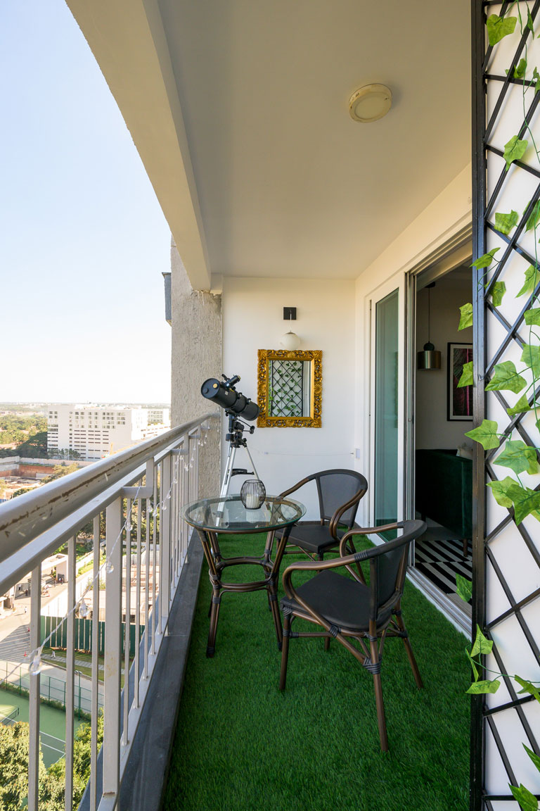
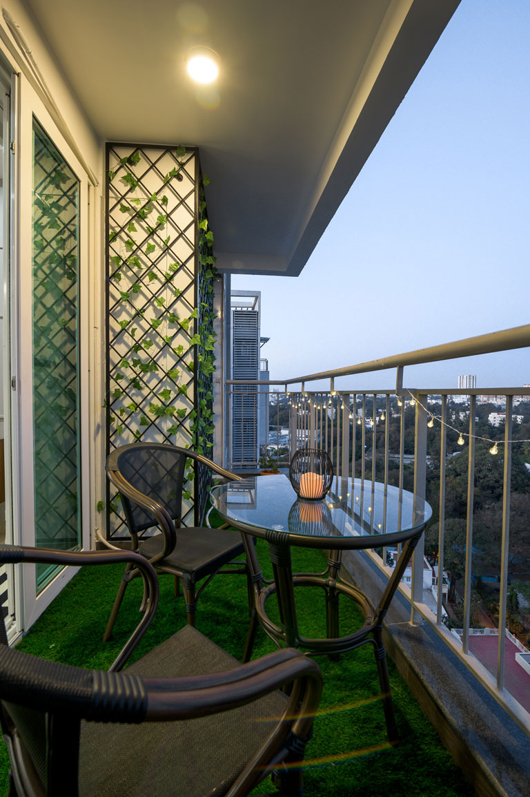
Balcony
We transformed the balcony niche into a bijou haven. A grass carpet brings in the outdoorsy feel in combination with a compact seating set. String lights in the space exude a whimsical feel and we created a latticed trellis framework with faux creepers to bring in that touch of greenery (that have virtually no maintenance). 😉 The balcony also houses the client’s telescope setup and we also would love to dream of a breezy evening stargazing from this spot.
The Jewel Tone Apartment is all things curated and detailed to the ‘t’! We’re gearing up to bring you a walkthrough of the private bedroom sections very soon. Until then, soak up these sumptuous design details and stay tuned. 😊
All pictures shot by Parth Swaminathan
Content by Lavanya Chopra for Weespaces
Our Top 5 Design Trend Predictions – 2020
Created by Vinithra Amarnathan on January 22, 2020
Another revolution around the sun, another fresh start and yet another chance to start anew! We love a new year and the endless possibilities it holds in its palms.
Our spaces are an integral part of who we are, how we live and how we feel on a day-to-day basis. With January crisp on our calendars, we thought it would be great to whip up a list of our Top 5 Design Trends that we feel will make our spaces uber-chic this year!
Read on, we got you covered. 😊
1. Bold Deep Monotones
If you love a good color, go bold or go home! We are seeing color enveloping entire rooms and creating a bolder look. The presence of a singular colour across surfaces can give a room a sense of added dimension and depth, contrary to the belief that a space can look smaller.
Monotones are a renewed take on the drama color can bring into a room. Accent walls are a tad bit passé and we love the uplift a single color can bring in any space! 😉
Take for instance our Modern Mediterranean Study cum Den. A deep forest green bathes the walls and creates such a moody and edgy ambience.
2. The Brutalist Aesthetic and Curves for the Win
We’re seeing the resurgence of the Brutalist theme in spaces with pieces of furniture, silhouettes and just a predominance of curved forms making their way into spaces.
Curved shapes like ovals and rounds will take the spotlight and replace the starkness that modern-linear pieces bring with them. Softer lines make for more cozier spaces that are inviting and warm. A great departure from the sharp minimalist trend that’s been around for a while. These pieces can look great in the living area, as dining tables and even as accent pieces in the bedroom. 😊
3. Warmer Earth Tones
We are seeing warmer earth tones like beige, rusts, mustards and olives taking over the grays and the blues. We think people are tired of seeing gray everything and it’s the time to mix warm and cool tones! Spaces are becoming smaller and people who want their homes to express their personalities and need that uniqueness in design. Also, with our busy lives and a world where people are spending more time on devices than with actual humans, a warm home that’s cozy is only more fitting. The gray on gray trend is overdone and the infusion of warm earth tones is making people feel that their homes are closer to nature and full of life!
We are seeing warm tones making a big comeback in fashion too. Beige is the new gray and mustards and olives are everywhere. Silhouettes are more flowy and less structured and it’s an interpretation of the same in design trends as well. 😊
Our Modern Mediterranean embodies a lot of warm earth tones, deep rich woods, texture and softer furniture lines. We’ve used gray stone against warm earthy rusts and mustards and deep wood & we are so in love!
4. Deep Dark Woods
It’s a cult classic, it’s timeless and a big favorite within Indian homes. There’s something about wood that’s nostalgic, durable and almost a token of heirloom that has persisted in our homes across generations.
Woodwork and cabinetry trends are going to see more walnuts, teaks and chestnuts than the lighter tones of pine and birch that was the trend supporting the cooler tones. The darker and deeper palette will witness more exposure in the year ahead. Flooring, cabinetry, doors, custom pieces of furniture – the possibilities are infinite. These add a sense of gravitas to any nook they’re introduced into and play well off the warm tone schemes we’re absolutely digging!
5. Old World Charm meets the Now
In a cluttered world where everyone is seeking unique, the old is slowly making its way back! An antique armoire here, vintage fabric there, art with character are all here to stay and the marriage of old and new over perfection is going to be a welcome change.
It’s about picking a few but significant pieces that speak to you and making them a part of the design scheme that exists in your current state of the space. Vintage and antique knick-knacks, accent furniture or even fabric in doses can give your space its sense of identity that doesn’t comply with a defined design aesthetic/mainstream style. 😉 Go on and be creative!
Here you have it! Every trend that we feel will make 2020 an even more exciting year for us as we design and share our vision with you. We’d love to know if this was a fun read and if you picked up tips and tricks for your very own spaces!
Content By: Vinithra Amarnathan and Lavanya Chopra for Weespaces
Project Reveal Part III – The Modern Mediterranean Bedrooms
Created by Vinithra Amarnathan on December 30, 2019
We couldn’t wait to share the last part of the modern mediterranean with you and so here goes…..the last but some of the best parts of this beautiful homes are in the private spaces we created.
They all have a very distinct identity yet flow with the aesthetic of the home. There’s deep rich finishes, earthy colors, a hint of lux and some moody vibes all tucked in here!
Master Bedroom
The master bedroom channels a blend of traditional pieces with modern ones and makes for a contemporary look with character. The bed is a classic dark-stained low poster bed with a solid headboard and an ornate end of bed bench builds on the intricate details with sculpted legs in the matching shade of the bed. The nightstands have a minimal yet classic demeanor. Oversized terracotta lamps in an unexpected shade of turquoise create visual impact.
A chevron teak finished veneer clads the wardrobes and vanity niche. The rich wood tone is balanced by light blush paint that bathes the walls bringing a hint of warmth into the space. I love how we highlighted the ceiling in a tone of gray and it gives so much dimension as well as balances the presence of the bed which is the focal point of this room.
A kilim pattern-inspired rug in neutral tones introduces interest into the space while grounding it. We used double layer curtains which add a sense of plushness to the whole space.
A reading nook in the corner is composed of a modern wingback chair upholstered in a forest green velvet fabric, a tropical print floor lamp and oversized geometric art in shades of terracotta.
The art above the bed takes cues from the client’s love for landscapes and is a vintage art print to go with the vibe of the space. This is possibly my favorite addition to this master and does a great job of bringing the space together!
Guest Bedroom
The guest room is a simple and minimal space that has been punctuated with the presence of a floral-patterned wallpaper. The scale of the pattern adds to the room’s volume without overwhelming it.
The color scheme is dominated by whites, dark wood and the light teal of the wallpaper. The space has a similar modern-traditional vibe.
The wardrobe section also houses a dedicated pooja niche that has lattice doors and champagne gold hardware to complement the look.
The bed was a piece of furniture retained by the client and the room was designed with that in mind. We added custom bedside tables in white and wood to match the bed.
The lighting is simple and the glass and brass wall sconces act as bedside lighting without taking away from the wallpaper which is the focal point of this room!
I love the antique wood mirror we added on the long wall for balance and it brings so much character to the space.
Home Office & Study
The study was designed as a little oasis for the husband who works extensively from home and reads voraciously.
Deep Forest Green envelopes the walls and creates a moody space which sets the tone of the room. The vibe of the room is a blend of modern and moody. A cozy den cum casual home library setup.
Three long wooden open shelves flank one side of the room and make for the perfect space to display the large collection of books and curios from the couple’s travels. Three wall sconces on top of the shelves complete the look and introduce mood light into the space.
A simple sofa cum bed in beige complements the design scheme of the room when paired with the monochrome geometric rug.
A Parisian landscape art print echoes the travel-inspired sentiment of the space and a natural fiber look floor lamp brings in a warm cozy glow!
The other side of the room anchors a sleek wood and white custom ladder desk that is modern and functional. We added a faux hide chair that has a beautiful pattern.
This space blends form and function so seamlessly and creates such a lovely vibe!
And this concludes the reveal of our modern mediterranean home. We hope you enjoyed every part of this home as much as we did 🙂
Stay tuned for more of our future posts and project reveals!
Content by Lavanya Chopra for Weespaces
Photography by Shamanth Patil
Project Reveal Part II – The Modern Mediterranean Kitchen
Created by Vinithra Amarnathan on December 19, 2019
Kitchen
Aah I love this kitchen! When we first met, Kaustubha said her heart was set on a blue and white kitchen and this set the tone for the home. I remember walking through this home and standing at the entrance of the kitchen imagining the wall gone and a big picture window with a hanging pendant over it!
When I stand now and look, to see that vision come to life is such an amazing feeling 🙂
Structural changes
We broke down the wall on the right and took the puja niche provided into the study to create wardrobes. That gave us an open view of the kitchen and a clean long wall facing the lounge and dining area.
Next we broke down the small kitchen window and created the biggest window we could and swapped out the door with a glass top door to continue the uninterrupted view!
Layout
Now that we had a large open kitchen to work with we worked on the layout. We have the sink under the window, the cooktop in the middle of the kitchen and the refrigerator and oven right behind creating the perfect work triangle.
Since the kitchen itself was large we could afford to have enough storage on the other end and a custom pantry unit that took care of most of the storage needs.
This allowed us to add open shelves on either side of the cooktop / chimney to bring in that feeling of openness and make for easy stacking of every day serveware!
I can’t miss the lovely breakfast counter we created by extending the same quartz stone countertop along the length of the kitchen supported by a custom made wood pillar leg that brings in that unexpected traditional element in an otherwise modern space!
We kept the counter open at the bottom to slide in a couple bar stools.
Color palette
Blue and white was what our client wanted….but what’s unexpected here is the midnight blue of the cabinets! The tile was a beautiful white and blue…..but we didn’t really want to pick the blue off the tile and instead went notches deep in the color range to create cabinets in a rich warm tone of blue. I love this because it was a large enough kitchen to handle that bold color and we balanced it by keeping all other elements white or wood!
The open shelves and the custom pillar leg bring in the warmth of wood.
Simple brass knobs & a grey natural quartz sink round off this beautiful kitchen 🙂
Lighting
A pair of pendants hanging over the kitchen sink and the breakfast counter was part of that vision I had and I love how that has come together! Brass and glass pendants add a clean chic look.
The gooseneck sconces above the wood shelves are different and I love how the mixing of metals and shapes in the lighting keeps it interesting!
This kitchen combines form and function beautifully and makes for a lovely statement in the modern mediterranean home.
All photographs shot by Shamanth Patil.
Project Reveal Part I – The Modern Mediterranean Living Areas
Created by Vinithra Amarnathan on December 14, 2019
Back in June of this year I met our clients for the first time in a blank apartment. It was spacious but had a large column in the middle of the house, a big kitchen space but hardly any light and a large area adjoining the kitchen with great natural light!
And that was our starting point to the modern mediterranean home! Its layered, its beautiful and the perfect mix of the modern and the traditional!
Our clients, a young couple had very different aesthetics…..she loved traditional curves, the warmth of wood that reminded her of her childhood home, deep rich colors and lux finishes! He loved modern clean lines, metal, rustic wood and cool colors!
This home effortlessly blends the two aesthetics and develops a layered look that balances both.
We have a modern formal living room right next to a warm casual lounge! The palette is defined by the mediterranean….blues and whites, earthy terracotta and browns and the warmth of wood.
One of the interesting things in this home is the use of color….the palette is restrained but the colors themselves are rich and bold!
Mustard, navy, forest green, midnight blue all make an appearance, but without distracting or taking away from the individual spaces!
In the first part of the reveal we’re walking you through the large living dining and lounge space that defines the mod med vibe!
Entryway and Living
Even though we had good square footage to work with, this home had many challenges and one of them was the lack of a distinct entryway! The home opened right into the very large space with a column in the middle.
My thought is when you can’t do away with something – in this case the column, make it a feature!
So we decided to wrap the column in a stone tile. The tile itself is a beautiful warm tone of gray with imperfections that give it a textural look. We did a clean horizontal stack to give it a nice modern feel and this stone wall now is one of the best features of this home! The living room side of the stone column has a beautiful mantle ledge we added. A large mirror and some art stacked against it bring in that modern european / mediterranean vibe we wanted. A simple geometric rug and marble coffee table ground the space.
We had the main door opening into a long area that had little natural light and we decided to use this space as the formal living area. A large comfortable sectional flanked by gorgeous custom leather chairs that have my heart and a custom raw edge wood TV console!
We added a sofa table/ console behind the sectional to bring in a visual break and create that entryway that this house did not have!
A simple runner rug and a custom made long gray console sit perfectly in harmony.
We added a large table lamp on the console for lighting and convenient drawers for keys and papers. Baskets below the console add more storage and there’s a shoe rack tucked away in the niche behind the door!
We knew we wanted to have a large piece of art sitting above the chaise of the sectional and we got lucky with this beautiful blue and white modern marble art piece with hints of gold. A striking chandelier and recessed ceiling lights complete the look and add much needed light to this space.
To have the dining sit right off the kitchen in such a way that it opens up to the lounge area as well as the kitchen for easy entertaining was a strategic choice and the stone wall acts as the perfect anchor for that!
The dining table is a clean modern wood table with black chairs for contrast. The chairs are a modern take on the windsor chairs and I love how the vertical slats sit against the stone wall!
We added two large ceiling beams in the large lounge area to bring definition and to visually bring the dining and lounge together. This feature also takes inspiration from traditional plantation homes that Kaustubha’s childhood home resonated with. Two large two striking bronze caged pendants on either side amplify the length and visually tie these spaces together.
A custom bar and crockery unit with wood fretwork and antiqued mirror glass sits on the wall facing the dining and the lounge. We topped it with two large custom mirrors with a gold wired frame and I love how it instantly brings in the wow factor in this space!
The lounge itself is a cozy comfortable area that’s awash with natural light. We brought in a lot of earth tones here with grays, browns and mustard. The charcoal dhurrie acts as the perfect contrast to the custom chevron fabric couch and the mustard cane back chairs.
My favorite element in this space is the vintage inspired art print in shades of terracotta and the dhurrie that we hung on the wall. The play of these earth tones and the wood beam along with the bronze lamp does make for a lovely space 🙂
Adjoining the lounge is a little balcony. We wanted to carry through the Mediterranean feel and brought in vibrant green and blue patterned Portuguese tiles to create a custom tile wall! Such a gorgeous punch of color against the greens 🙂
A wood balcony table and chairs make this a simple but striking spot to spend your sunday!
We are so excited to bring to you the next two parts of the reveal as well. The bold kitchen and the bedrooms in the Modern Mediterranean are full of character and an interesting take on color. We’ll be back real soon!
All photographs shot by Shamanth Patil.